Rob Adams a Painter's Blog painter's progress

February 24, 2014

On Beauty

A risky topic I suspect and rather an unfashionable one too. Roger Scruton wrote a book on it recently which I must read. You cannot say what beauty is any more than you can define joy,  love or indeed art. Concepts that are intensely personal are prone to be abused by people in arguments because due to the flexibility and nebulousness of their definitions they can be used to make points that cannot be argued against. The argument will go for example that in a particular circumstance anything can be beautiful. The weakness in these arguments is I think that a cleanly defined beautiful/not-beautiful, art/not-art boundary is assumed. However such phantasms of the human spirit can be brought more into focus even if they are not subject to an outright definition. We can for example say that for the most part we find regular faces more pleasing than ones deformed from the norm. There is a lot of research in that area that shows we like the facial features to be symmetrical and averaged. The images of many faces overlaid and blended are disconcertingly beautiful and show that we are looking for differences from the norm as a way of deciding genetic worthiness/unworthiness.

This does not always follow with real encounters of course. Someone might have a face that is transformed by character and animation. Nonetheless perhaps our underlying assessments of beauty are slanted towards the reassuring. We might admire a verdant and peaceful landscape or a dramatic mountain scene, but we might assign them differing types of beauty. For an arable farmer the verdant land would be attractive as a home whereas the rugged mountain less so. Our farmer might find them both beautiful but in contrasting ways. It is quite plain to me that the early cave painters found beauty in the animals they hunted that went beyond the straight forward desire for a successful hunt.

Thus we are immediately mired in the boggy land of the aesthetic. Hurrying on the heels of aesthetics come those who would tell us what is fitting/fashionable and what is not. Currently beauty and decoration are very much off the menu. We are supposed to like the sparse. Our dream apartments have empty spaces, plain surfaces and white walls. I cannot help but wonder if this is perhaps a choice caused by hoovers rather than aesthetic concerns! When designing exhibitions of decorative items from historical times we place them in sparse minimal cases. To me they always look a little sad in such soulless arrays, like butterflies pinned in drawers. They seem like items in a shop rather than exhibits in a museum intended to fire our imaginations.

In architecture beauty has been completely outlawed it sometimes seems. There is little built that moves beyond the grim utilitarianism of financial objectives and cupidity. When decorative items are used they are plastic panel doors with cartoon graining, the result is depressing rather than uplifting. Architects generally seem to be comfortable with repetition but not rhythm. Being uplifting and enriching our daily lives is, we seem to have forgotten, the whole point of decoration. In furniture we are in the thrall of anally retentive Scandinavians or those who wish to emulate them. I am not totally in disagreement, bad decoration is indeed often worse than none. Alas because we don’t do much training in the area of decoration the few examples that do appear are for the most part weak pastiche cobbled together from found images using photoshop. The decorative arts were once a big thing and lauded, why this is no longer true is a puzzle.

The only real thing I can think of is the advent of mechanical production. We have adjusted our aesthetic to suit the available means of production, maintenance and distribution rather than the other way round. We perhaps associate the hand made with the crudeness of DIY, some hand made objects seem to need to advertise their handmadeness by adding rusticity or similar.

We also tend to confuse beauty in a seen thing such as a mountain or an object made with no visual intent such as a worn wall with the beauty inherent in an object made by a human being who has laboured to gain a skill. If you splash paint randomly or even semi randomly on a canvas it will be nice to look at. If I wet some watercolour paper and pour colour on it I may well get a very attractive and interesting surface. This however is mostly the same sort of beauty as we get from admiring the patterns on a beach. The beauty in an art object is different because of the skill and the fact that a person has sacrificed part of their life in order to achieve the ability. Due to the arguments put forwards in the 20th century we tend to conflate these kinds of beauty. The weathered wall is not of any real cultural significance even if torn from its place and put in a gallery.

Music mostly does not suffer from this confusion. We might get an emotional surge when we listen to the wind in the trees, but we do not confuse that, except in moments of poetic hyperbole, with music. We do not confuse a person noodling on the piano in a random untrained manner with music either… the difference to a concert pianist is obvious and no one would say that the random noodling is art of the same order as the pianist’s bravura performance.

The statement that everyone is an artist is very much not true. To be an artist you must firstly be a fully formed craftsperson, only then should a small proportion of the resultant work be deemed “Art”.

.

henley on Thames, Thames, flood, river, plein air, oil painting


This is the recent floods at Henley. Some fascinating transformations of familiar scenes. We were lucky to get some brilliant light and a mostly dry day.

.

henley upon Thames, Thames, Plein air, oil painting


Another from the same day. The shadows were only momentarily thrown across the road. 8in by 10in oils.

.

Thames Henley, river flood, oil painting


Last one of the day, we found a flooded road that reflected the last light. I had to paint this very rapidly! 12in by 12in oils. The first use of my new 12in by 20 in pochade… I will add pictures of it at the end for the painting gear nerds!

.

interior, oil painting


The next day was very wet and windy so we went to and painted an interior in a friend of Steven Alexander’s wonderfully cluttered cottage. 10in by 12in oils.

.

Jermyn St, Mayfair, London, street, oil painting


This is Jermyn Street in Mayfair painted on an expedition with the Brass Monkeys. Not quite sure what to do with this one, it is a bit like an empty stage waiting for the actors to arrive! 10in by 16in oils.

.

Jermyn St, Mayfair, London, Brass Monkeys, oil painting


Another from Jermyn St. I had to add a figure to reduce the dominance of the car. 8in by 10in oils.

.

Kent, track, Aylesford, oil painting.


A day out painting with friends. This is a track above Aylesford in Kent… we went to paint the dramatic wide view of the Medway valley and ended up painting a muddy track! 10in by 10in oils.

.

East Farleigh, Kent, oil painting


This is East Farleigh, the river was in full flood but I found the light in this very attractive. I was nearly run over a few times but really enjoyed trying to make something of the split composition. Painting up a hill always produces challenges to as you have to make sure that the cues are there to explain your view point. 10in by 16in oils.

.

Trafalgar Square, London


I don’t often do this kind of sketch, but as it was a Brass Monkey day and I also had to attend the Wapping Group private view I needed to wear clothes ungarnished with oil paint! So pen and wash was the order of the day. pen and wash is a great combination and I really should do more of them.

.

St Martins Lane, London, watercolour

Last one before heading to the Mall Galleries. The day was very flat but St Martins Lane always supplies some contrast due to the height of the buildings and the narrowness of the street. 5in by 7in watercolour.

.

pochade

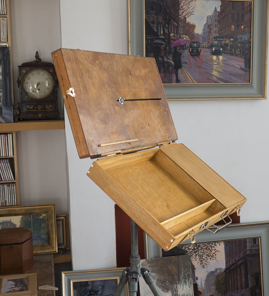
Here it is… a mighty 12in by 20in. It is still light, but would be a bit of a handful in the wind! Due to the size it has some storage so I should be able just carry this and the tripos which will make quite a light set up for its size. Next I need to work out something for 16in by 20in canvasses…

.

pochade

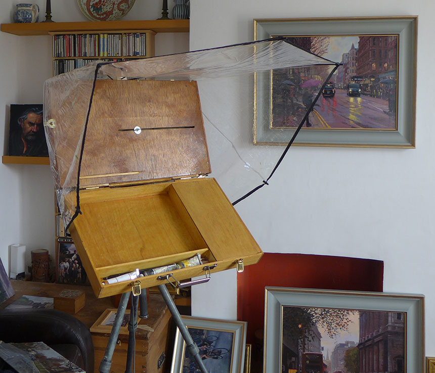
I also created some rain protection from the brolly that bit the dust in Dulwich a week or so ago.

August 22, 2013

Style Wars

I have sort of touched on this previously but a few conversations this week have sort of focussed me on the issue. People both painters and  people who enjoy looking at paintings tend to like some things and not others. Painfully obvious of course. The problem is that they also tend to go further and lean towards believing what they like is worthy and what they don’t enjoy as worthless. I myself have plotted an erratic course through the landscape of art and at different times have liked and loathed many different styles. Now however we are in an age where nearly everything in the history of painting is available at the click of a mouse.

I have a large collection of art books which now never leave the shelves as there is better and wider information online than most of them contain. Indeed I have seriously thought of getting rid of them as they are almost never looked at. The books do provide another service though. They plot the course of my interests of things visual over the years. There are books on anatomy, carpets, Irish castles and insects, to name but a few. I can still recall the excitement when I found a book that inspired. I remember the fascination of delving through George Bain’s book on the construction of celtic art, which sent me on an orgy of drawing key patterns and brain boggling interlacements. That indeed was the pattern, discovery followed by practice and then on to another focus of interest. My library is quite wide and eclectic, consider how much more grist there is available for my mill compared to that of Rubens, but is still a mere slither compared to what is available online.

Young artists today are faced with a blizzard of imagery from all of mankind’s long history of visual creation. Search engines place everything on an equal footing, they don’t care about quality or provenance only keywords. With this in mind I wonder if it is now almost impossible to do anything wholly new. We have as it were mapped out most of the terrain available to explore and only a few ever reducing (and not necessarily interesting) corners are still left uncolonised. This I cannot help but feel spells an end to the linear flow of art history much loved by academics and critics. The same thing has already happened to some extent in music. A teenager’s iPod can contain everything from Bach to Led Zeppelin to some very current offering. They have essentially treated all that was available as some kind of cultural buffet and filled their plates with whatever took their fancy. This in turn has had an effect on music production which might draw from a hugely diverse mix of influences. The same is becoming true with painting I suspect.

This I cannot but help feel spells the end to both the contemporary and the so called modern. When a categorical term becomes so inclusive that nothing is excluded then its usefulness has as far as I can see ended. The establishments at all ends of the art spectrum are bravely battling to hold back the tide, but like Canute they are likely doomed to fail. The hard thing from my point of view is to envisage what the landscape might look like once the dust has settled. I’ll make the attempt to work out the possible results though this will likely be risible once the reality is there to be considered!

Firstly, I think your idiom of painting will in the future be entirely a matter of choice. Much in the way you might choose a medium or a composition. Already you see many artists who do both abstracts and representational. This could well be the norm in the future.

Secondly differentiation of whole categories of subject matter, type of execution, styles or idioms into high and low art may end. All the flavours of painting available which are currently assigned a different degrees of worthiness or status may therefore be equalised. It always makes me chuckle when I see auction and exhibition catalogues use the word “important”. My immediate feeling is to whom, sez who and why?

Thirdly a more useful way of assigning merit might well occur. At present we have what the Art critics say is good, what the Collectors collect, and what the Curators select. Notice we don’t have what the public likes in there. Now however we have the potential to assess better than ever what the public likes. What is more we could narrow it down to what different sections of population appreciate. The tastes of visually naive and the sophisticated and their different likings can be separated out. This in turn could be used to supply rankings of relative merit in varying idioms. No method of course would be without flaws and unfairness, but it would not be hard to be better and indeed more fair than the current elitist regime.

I wonder as well what categories of painting might be useful, here is a wild stab at it:

Expressionistic, the painting of feeling and emotion.

Observationalistic, the recording and fixing of perceived reality.

Imaginistic, the painting of dreams and imagination.

Analystic, the painting of texture, pattern and structure.

I don’t see any of these as exclusive, each might in some circumstances be a subset of one of the others. So a work might have any combination of each in any order. Each might be further broken down so that “Imaginistic” could contain Surrealism, Illustrative and perhaps Metaphysical content. It is very hard to visualise, I gave considerable thought as to whether there were any other possible categories. If anybody can think of a manner of painting that would fall outside of all these categories then I would be delighted and intrigued. At first I wondered if Symbolic was a category but on the whole I think it can be contained within Imaginistic and Analystic. We could maybe sink to the depths of a diagram at this point, I can only apologise for this new low, but it shows the possible interactions better than words can…

.

Diagram

As we are painters I have chosen a colour chart approach! You can see by the way the colours mix we can have any shade or mixture of my four elements. You might I hope place any painting you know approximately in this space. Plein air for example would be leaning towards the Observation corner, with a good dollop of Expression a certain amount of analysis and only a small dose of imagination. Surrealism would have a large proportion of Imagination with maybe less of the other three. This is not I am at pains to point out a diagram of all Art, where for example would you put photography? Perhaps in Observation, I did consider Perception and Experience as that heading but felt them a little too broad. The observation is done mechanically, but the decision to observe was made as in a painting. If anybody can think of a painting that falls outside these bounds let me know what it is and why, don’t mind my wild theorising being shot down in the least. One other thing I pondered was how I should arrange the influences around the square. Unfortunately none are ideal. A truer arrangement would be in 3D with each influence placed at the corner of a tetrahedron! Enough mad theorising some paintings!

.

Faversham, Kent, plein air oil painting

I have been going out of a Sunday with friends Tony Lawman and Graham Davies to paint which is very much fun. This is Faversham creek. 8in by 10in.

.

Faversham, Kent, oil painting

Don’t quite know what to think of this one, needs softening and merging somehow. The tonal contrasts are too brash. 10in by 14in oils.

.

Faversham, Kent, oil painting

Last one of the day and the best too. Faversham Creek again, the day steadily improved. 10in by 12in oils.

.

Faversham, kent, oil painting

Faversham again but painted last winter I would guess… I was sorting all my plein air stuff into locations when I came across this, the foreground wasn’t

finished, so a plein air I would guess, but I have no memory of painting it at all! I obviously didn’t like it at the time! 10in by 20in.

.

Tower Bridge, London, Thames, HMS Belfast, oil painting, Wapping Group

A day out with the Wappers, there were two more oils but I scraped them off, the light went horrible and flat. 16in by 10in oils.

.

Pool of London, Thames, watercolour

I should have stuck to watercolour sketches for the rest of the day. There’s a lesson for me, don’t paint unless the subject grabs you!

.

Queensborough, Sheppey, Kent, plein air

Another day out with the boys. This is Queensborough on the Isle of Sheppey. Lots of great subjects this is 10in by 16in. I did an earlier one but it is in

surgery I might post it if it survives!

.

Queensborough, Sheppey, Kent, watercolour

Last one from Queensborough, I liked it there lots to paint the town is paintable too.

« Newer PostsOlder Posts »

Powered by WordPress

error: Content is protected !!