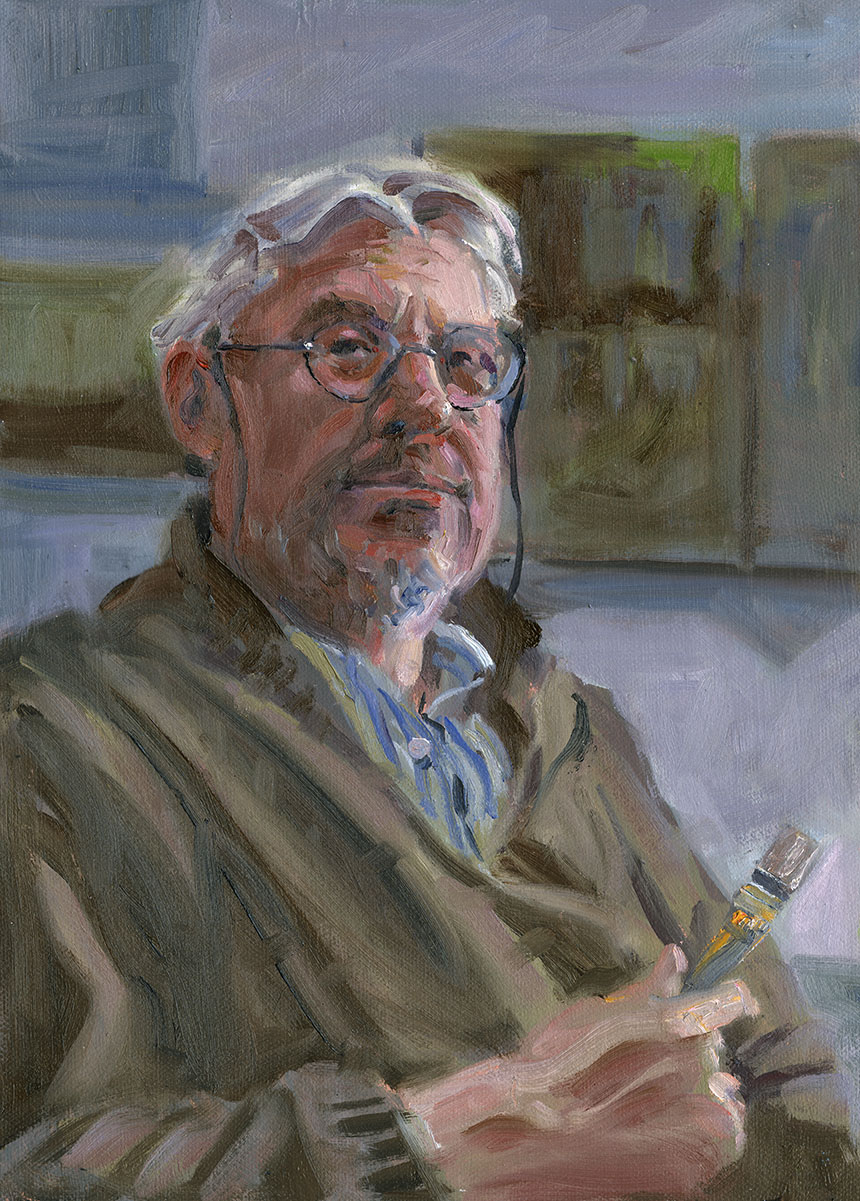
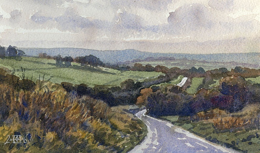
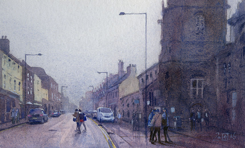
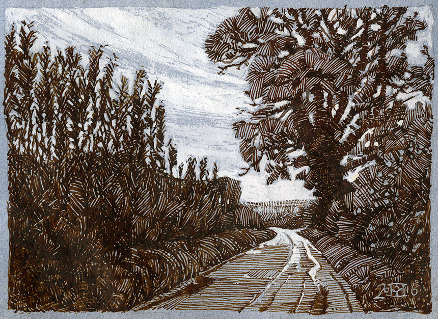
A friend recently commented after seeing a recent show that I place things in the centre of the picture too much. This of course produced an intense wave of paranoia and I went home and nervously checked my paintings! It was with some relief I found that though some did, largely they were free of this cardinal sin. However it did get me to thinking I should write something on the subject. So when considering how to tackle this post I thought I would check on paintings by the greats and see how they manoeuvred around this fearsome “Bermuda Triangle” zone that every canvas inevitably has. I thought I could post some paintings with those criss-crossy lines that art historians draw on paintings to explain the compositional ins and outs of cunning composition. This would have the added advantage of making me look more erudite than a well known epoxy glue as an added bonus.
Well there won’t be any clever diagrams… the giants of painting appear in fact to be very fond of the middle ground. I found so many examples of blatant centre invasion that I had to take a step back and consider the whole thing from scratch. Why do we landscape painters advise each other to be careful not the divide the canvas with the horizon halfway? I have done so to other painters myself, in my best irritatingly patronising manner, quite a few times. In the spirit of due diligence for this post I looked at Constable and Turner, both considered pretty nifty in the landscape department. I have to say I was taken aback, Constable loved the halfway horizon, Turner less so but plenty of examples there too.
By now I was in rat smelling mode. Who had told me of the prohibition? How had I come across the idea that the middle ground was toxic? Riffling through my old “how to paint a masterpiece in ten minutes with no boring learning hard stuff” books, I found they were very fond of raising the dread of the centre. They also were really enamoured of “the rule of thirds”. Back to the masterpieces of yore and it didn’t take long to realise that none of them gave a rat’s fundament to the idea of thirds. In looking I found a fair few criss-cross diagrams by officially clever people. I then took the same painting and did different criss-crossies… rather confusingly my amateur ones seemed to line up just as well as the professional ones! Its rather like ley lines it seems a telling property of ancient sites, but then it was found that similar lines could be drawn through the locations of telephone boxes! Things do line up but the fact isn’t necessarily significant
Another that cropped up frequently was the “Golden Mean” or phi. I had had a previous encounter with this so called magical proportion. Many years ago I had been asked to make a computer 3d model of a Nautilus shell whose spiral is the poster boy for the spiral produced by the golden section. It was to illustrate a TV program on the subject. There was to be a little animation of the spiral flying over and mapping to the shell. However on getting lots of photo ref of the beasty I found the spirals were entirely different! On talking to the producer and he suggested I cheat the shell to fit… I declined to cheat and I never heard more. Baffled I researched the whole thing further and found that the whole damn thing was myth. Irritatingly it was one I was rather fond of and had naively bought into.
I won’t go into it too much but the prime examples just don’t fly. The parthenon does it fit? Well no only with a bit of a stretch, the great pyramid well not quite the angle is a bit off. Both these cultures were superb geometers and would I reckon have got it bang on. Euclid hardly mentions it for heavens sake, if it was so important surely he would have given it more than a line. It does exist in Islamic culture, but they are very keen on Pentagons which is where phi originates. Other cultures, Chinese, Aztec etc never seem to have noticed this all conquering principle. I then found anguished articles by famous mathematicians debunking the whole thing and then getting cross that everyone went on believing the story anyhow! A fate due to be meted out to me over this peroration I feel sure.
Where do these rules come from? The rule of thirds it would seem puts in its first appearance in a book by John Thomas Smith in 1797 called “Remarks on Rural Scenery”.
I quote:
“Rule of thirds”, (if I may be allowed so to call it)…, in a design of landscape, to determine the sky at about two-thirds ; or else at about one-third, so that the material objects might occupy the other two : Again, two thirds of one element, (as of water) to one third of another element (as of land); and then both together to make but one third of the picture, of which the two other thirds should go for the sky and aerial perspectives.”
The person keen on banning “equal division” in a composition seems to be Joshua Reynolds. Bafflingly he seems to have ignored it for the most part when painting his own pictures!
You will not be surprised to find that the thirds scenario is also somewhat absent in most well known artist’s paintings… It is easy of course to find things on the thirds or the middles, there after all has to be something there… or not there as the case may be!
So why are we so keen on these so called rules? Well firstly they are easy to remember, and even easier to trot out, as I have not infrequently done myself. Beneath that I think we have a built in yearning for order and underlying meaning to make sense of this confusing world. We love binary choices, this is bad that is good, this black that is white. It allows us to feel we have a handle on this confusing and infinitely gradated existence we share. One thing I became convinced of in researching this trope is that such things only bother artists. Other viewers don’t notice and I what is more I suspect artists only notice because these dodgy rules have crept in to their beliefs without proper examination!
After that it is safer to post an update on life drawing, you can all amuse yourselves looking for golden means and thirds!

This was a great day where we spent all day working from the model. A real luxury when you are used to life sessions.
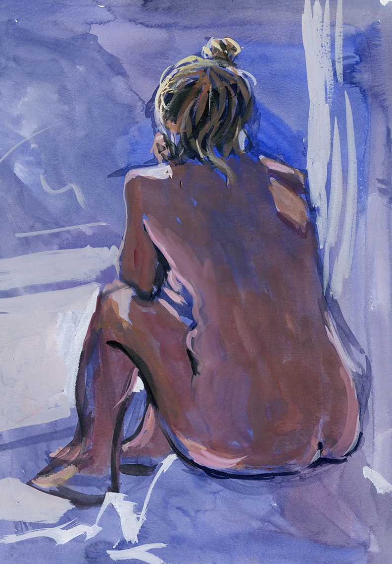
I find it easier to severely limit the palette on life sketches, it is amazing how the eye fills in the colours that it expects.

Just two colours here 10 mins I think. Most short poses go into the bin but when by luck they work they are some of my favourite things.

I have been trying to do just bits of the figure now and again, I do rather try a little too much to get the whole lot in which doesn’t really matter.
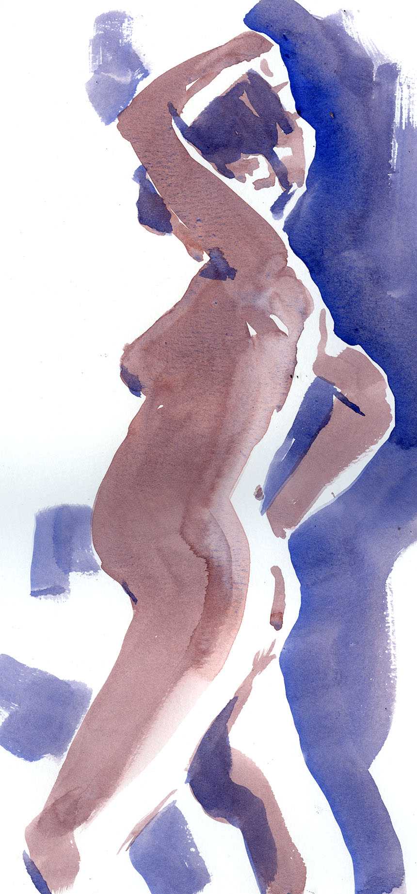
One thing I do notice looking through drawings where I have used watercolour is that the ones done with a flat sable work better that those with a round. This probably means I need to do more with the round brush alas!
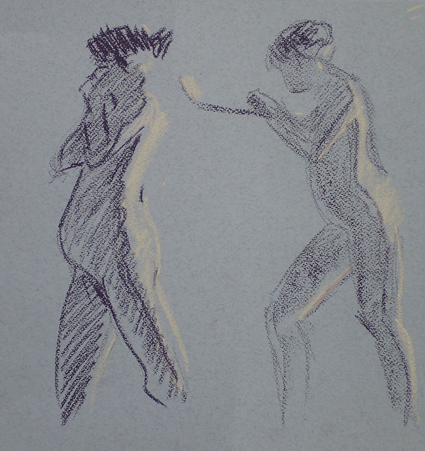
I like to change media, each time you return to a particular medium you seem to see slightly more afresh.
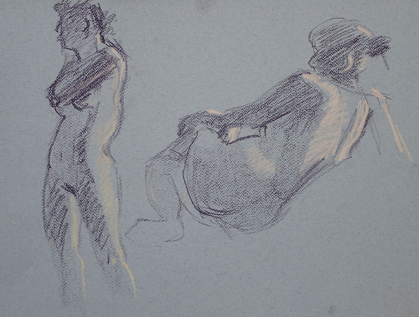
Two pastels on a toned paper are almost too seductive in the way you can get a quick précis of the pose and light.

Going wild here a whole three pastels! I loved the perspective on this pose. When faced with this sort of problem it is very easy to get the distant body parts too large. It is one of the occasions when I check proportions carefully. Another good trick is to draw the shapes that aren’t body as we have fewer expectations of them.

I was only when looking at this one I remembered I had intended to do a few sessions where I just did line. This pose seemed to call for a more definite edge, I must do some just with line as it always does good to reduce your options.

Back to the white paper and charcoal pencil. I think my favourite weapon of choice, again for its simplicity.

The medium is so good for the quick poses, you can do lines an block in tones very swiftly. I alternate between doing the tones first and then adding lines and visa versa.

Usually I like the results of the long poses the least in a session but I was pleased with this one. It is unintuitive but a good idea to allow your toning to cross right over the figures bounds. This sets the figure in space and gives a lost and found unity.

Last one and that is the life drawing caught up with. These are always the least popular of my posts but probably my own favourites!


