I said I would do this a while ago. So here it is, my take on pen and ink. Pen was really the first medium I seriously worked at. Oh there had been scribbles in pencil and daubs in the vile paint they make school children use but it was the first medium I seriously set about learning. At first I used Rotring pens. I had them from doing mechanical drawing for A levels. It seemed natural to carry on and sketch with them. There is not a lot to recommend them you have to hold them square to the surface, they give an unvarying line and block at the drop of a hat. However since I had never drawn with any other sort of pen I thought they were great. I still have a full set in a special box. My next discovery was dip pens made by Gillott compare to Rotrings they were wonderfully variable in line thickness and quality, this came at a cost of difficulty of use and the nasty habit of dropping a big blob of ink on your almost finished masterpiece! Lately after a foray into using fibre pens, (the same problems as with Rotrings) I have settled on using fountain pens with flexible nibs. They don’t quite offer the variety of line that the dip pens do but are far more convenient to carry about and sketch with.
When we think of pen and ink we think of line. If there is tone it is a watercolour wash or a simple hatch each contained within an outline. You can however use pen and ink in a purely tonal manner, which opens up great possibilities for expression and mood. Here I am just going to consider hatching. Most people seem to do stippling, hatching and cross hatching and that is all. There are however a huge variety of methods of toning areas with a pen. I have done a few examples below to try to give an idea of the variety possible. I will leave it up to you as to how you use the textures to describe surfaces. I will just say that when drawing a tree or a wall you cannot copy every little shape, you need to find equivalents. Before you jump in to draw a line of distant trees do a quick test to find out what mixture of line weights, density and variety will give the overall impression. The same with stone or brick walls. If you do every brick or every stone it will look dead and lifeless. In real life we actually don’t see every brick, the eye only needs a few hints and clues to fill in the detail for you. Lastly I have added a few examples from other artists who use pen in a tonal manner.

There we are, I hope that gives an outline of the possibilities. Experiment to find your own variations. I will deal in a later instalment with how I apply these textures and how to exploit the white paper and the use of solid blacks. Now some examples by far better artists than I to show just what can be done. If you click on the pictures you will get a high res version.
This is by Herbert Railton truly a master of leaving lines out! Look at how he has left the top of the railings white and only defined the top edge with breaking the background texture rather than by defining with a line. He also is very good at using texture in an inventive and varied way to add colour and interest.
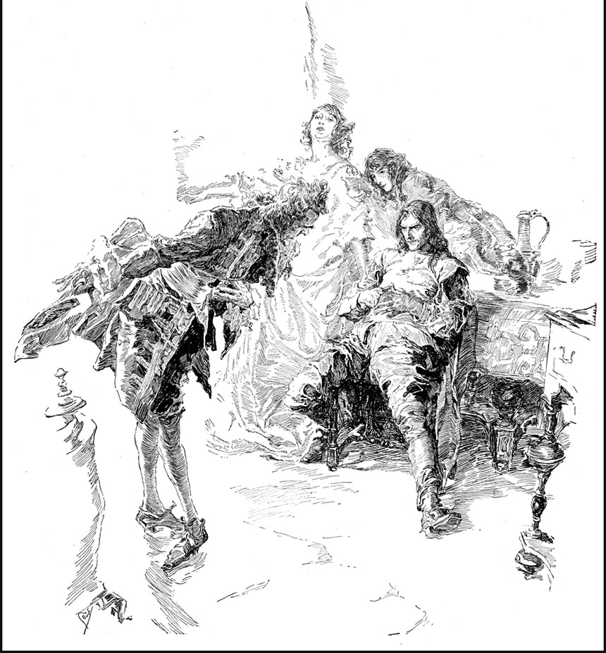
This is Joseph Clement Coll. He often defines with line but notice how he breaks it here and there on the left hand figures legs. Then on the same figure’s cuffs he leaves the edge line out making the cuff feel white. See how he uses the delicate line on the woman’s dress to contrast with the more robust line of the other figures. Above all look at what he has left out!
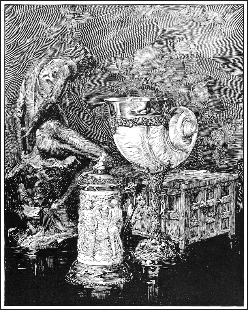
This one is by Walter Jardine and is a master class in the use of weight, direction and texture to describe different tones and textures. He uses nearly every trick in the book in this one!
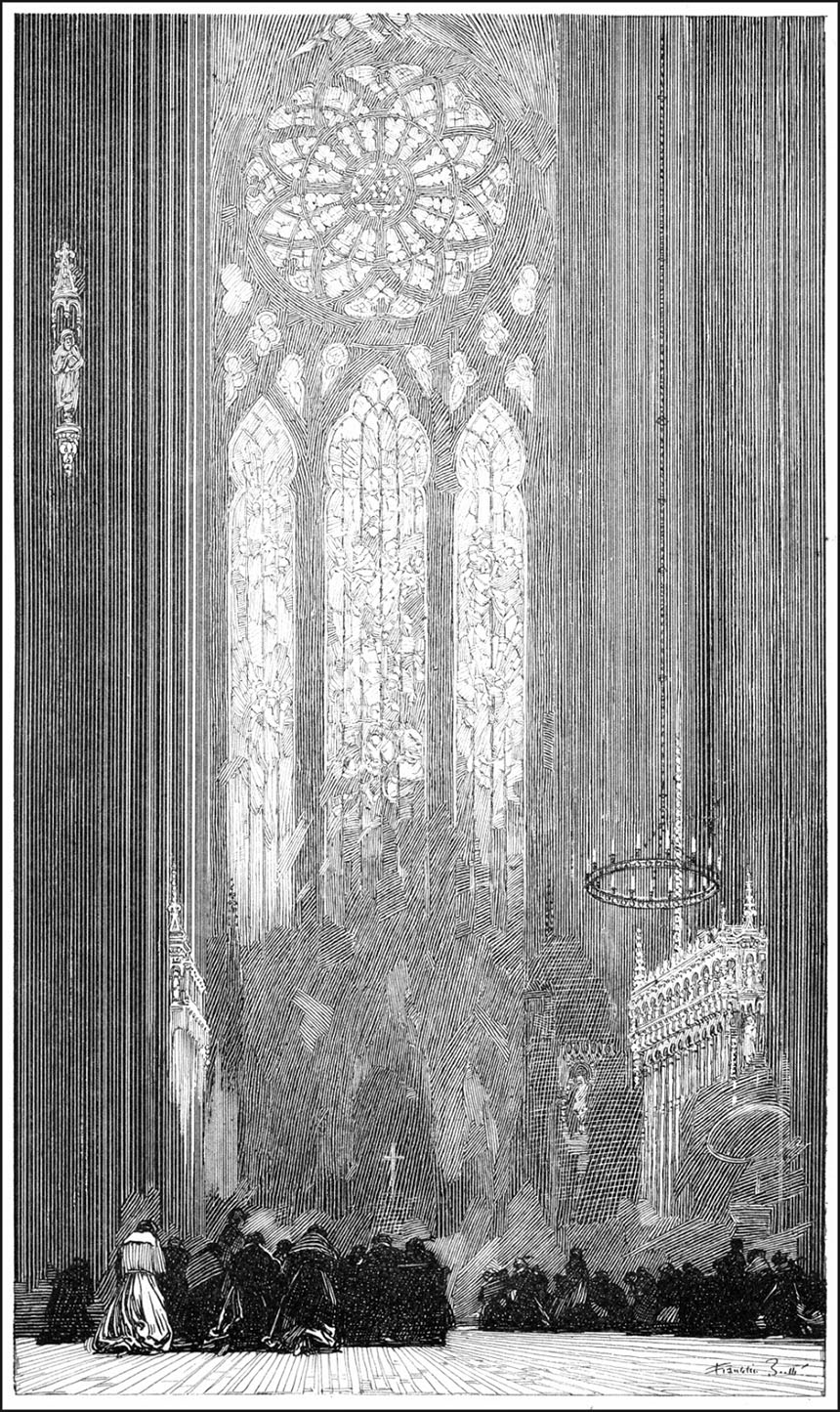
Here is Franklin Boothe in action. Here he uses a limited repertoire of hatching patterns to achieve a completely tonal effect. Very precise hatching some done with a rule. Even the ruled lines have variation however as he is using a dip lining nib. He also uses scratching out here and there. To do that you must use high quality bristol board.
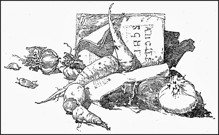
Lastly a small drawing by Daniel Vierge.
Finally some useful Links.
Drawing With Pen and Ink. by Arthur Guptill
Pen Drawing by Charles Maginnis


Great Tutorial! I reblogged you here, and if you do not approve of a reblog then write me and I will remove. Excellent!
Comment by Kate Powell — July 29, 2014 @ 4:47 pm
Hi Kate, no problem, glad you liked it. Rob
Comment by Rob Adams — July 30, 2014 @ 9:47 am
Thanks for a very informative post, Rob- very useful for someone like myself trying to get to grips with pen and ink drawing. I look forward to more on this if you have the time.
It is hard to beleive that some of these have been done with a single pen and single ink, such is the variation on tone. Whilst the style wasn’t my favourite, the drawing by Franklin Boothe was remarkablein the way he has given structure to the columns. I tried expanding the image on my Ipad, but unfortunately the resolution wasn’t sharp enough to really tellhow he achieved this-i am guessing carefully planned thicknesses akin to a technical drawing.
Comment by Karl — July 31, 2014 @ 8:17 pm
Hi Karl, yes I would guess he uses a ruling pen which is a dip pen that has very fine control over width, all plans and engineering drawings used to be done with them.
Comment by Rob Adams — August 1, 2014 @ 9:56 am
Thank you very much for this incredibly informative post Rob, the tips you’ve shared will certainly improve my own approach. It is just amazing what the medium can do in the right hands, like the drawing by Franklin Boothe, who would have thought haze and diffused light could be depicted with what is percieved to be a simple black and white medium. This is probably one of the best posts I’ve ever had the pleasure to view so again, thank you.
Comment by Kevin — August 2, 2014 @ 12:06 pm
What an excellent piece, Rob. That Railton drawing is a cracker! I could have done with seeing this 30 odd years ago – but I console myself with the fact that you also would probably have benefited from it then. Never doubt the value of these blog posts, they are of substance. (No pressure or anything)
Comment by Colin Johnston — August 7, 2014 @ 2:59 am
Yes I wish I had owned Guptil’s book on pen drawing earlier, it might have caused me to leapfrog those rather horrific dotty rotting years, maybe not though I had no taste in those days…
Comment by Rob Adams — August 7, 2014 @ 9:43 am