Rob Adams a Painter's Blog painter's progress

May 6, 2013

Painting in the Sun and battles with charcoal.

I have never got on with charcoal or for that matter pencil. Which is a pity as I love drawings done in those media by others cleverer with them than I. I think it is because I never really drew with pencil as a child as I discovered pen first. Later on pencil was for the planning stage of a painting not a finished stand alone work. I love seeing adept pencil sketches of landscape but have never managed to produce many myself. I know the basics of course, hatch and avoid shading or smudging, indicate rather than define. When I do it however it looks rather laboured, without that bravura dashed off look I would like.

With life drawing and charcoal it is the same story. Somehow me and the medium doesn’t click! So out of sheer bloody mindedness I have been trying to get to grips with the stuff. What I did not want to do is emulate how others use the stuff. That is I feel what causes the unconvincing stiffness in any drawing done with that sort of ambition. The fact that I have trouble with the medium makes me suspect that there is a weakness in my drawing that it exposes, which means that struggling to find my way with the stuff should bring dividends.

The plein air season is well and truly started and I have been enjoying the sunny days painting in good company. So not much verbiage this post… straight on with some daubs.

.

Friendly St, Deptford, London, watercolour

First another studio watercolour. I painted this twice the first one going horribly wrong when I got a bit of pure Cadmium red on my brush!

There was never going to be any disguising the streak so I had to start again. 1/4 sheet Arches rough.

.

Thames, Battersea, powerstation, river, plein air, oils

The second Wapping day of the year. The venue was Vauxhall and it delivered some fantastic subjects. This is terribly iconic but I just couldn’t resist!

16in by 10in. Oils.

.

Vauxhall Bridge, London, thames, plein air, Wapping group

I am often at a loss in the middle of the day. Many subjects look far from their best when the sun is high. So I went looking for

a subject that had good contrasts. I only had a short time to do this as the tide was rushing in but a good exercise.

.

battersea, Thames, river, powerstation, plein air, wapping group

Yes I know the same subject again! The light had totally transformed it though. This was wonderful to paint and I was completely engrossed so that it was

almost a shock to step back and see it done. I still have to adjust the wall so that the river doesn’t try to climb over it but that will have to wait until it is a bit

dry. A great day though and I felt I had earned my pint in the pub at the end of the day.

.

Strood, Medway, boat, plein air, Kent

Graham Davies and Tony Lawman invited me out to play by the Medway near Rochester. The day didn’t disappoint with great light. I messed up my first

effort and had to wipe it off, but did this straight after which went much better. This bit of the Medway is called Strood and is full of tatty boaty clutter.

No doubt they are at this very moment planning to sweep it all away and build vile flats. 12in by 10in, oils.

.

Strood Yacht club

After a bit of a hike we found a boat yard that would allow us to paint. So thanks to Strood Yacht Club for making us welcome! We painted away happily

here, I wasn’t quite sure where this was going at first but it all sort of fell into place as I went along. It is always hit or miss with plein air and each of us

had paintings that went awry. One of the great things painting in company is that you have people to listen to your despairing cries! 16in by 10in.

.

All Saints Findsbury, Graveyard, plein air

This is the graveyard of All Saints Findbury which sits high on a crag overlooking the Medway. Last of the day and getting weary but a nice relaxing subject

to finish the day. I don’t know why I paint graveyards, I know no one will ever buy one, but I just love them as a subject. 14in by 10in oils.

.

Nude, life drawing, charcoal

Here we go with the charcoal… I know it is brown but I found these sepia charcoal pencils that I rather like made by Derwent.

Also I am drawing on rough newsprint by Strathmore which has a nice tooth.

.

Life drawing, nude, charcoal

Ordinary charcoal too here. I am using thick sticks to block in and thinner to do the line work. A little progress here I feel.

.

Life drawing, nude charcoal

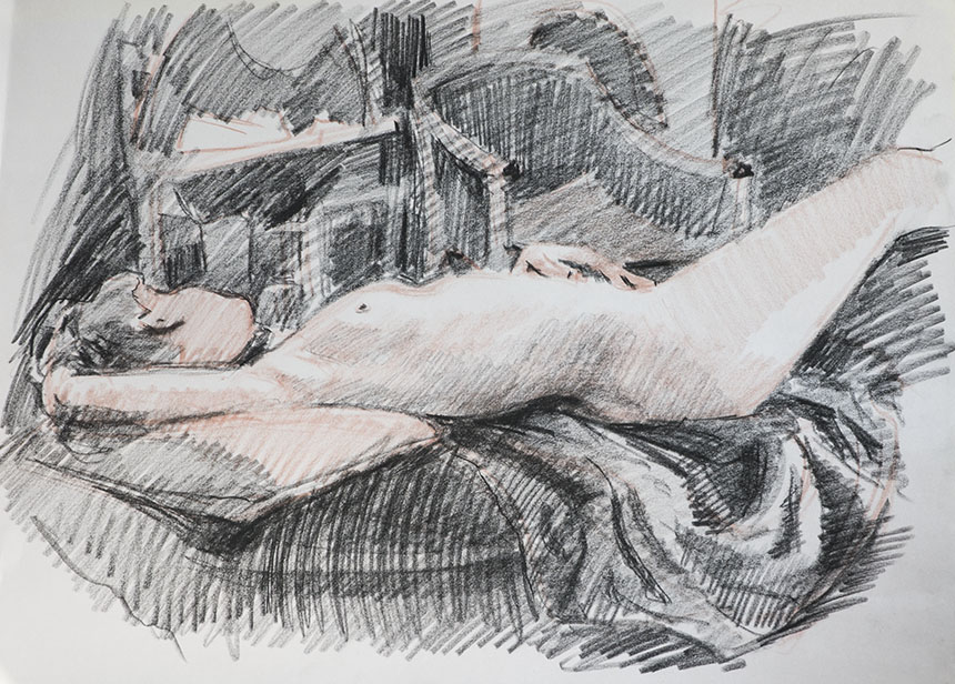
Less of a success this one, but I am beginning to get a mixture of marks from the stuff that I like. I am lifting out here with a putty rubber. I greyed

the whole sheet with the side of a chunk of charcoal before starting. I think I will make sure I leave the whites next time.

.

Life drawing, nude, charcoal

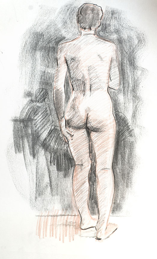
At last I am getting somewhere with this one, it feels more “me” somehow. The red and the black charcoal is an accident really but I rather like it. I am

trying to just suggest the surroundings with big broad strokes.

.

nude, life drawing

Not as good on this one. I rather over defined the surroundings.

.

life drawing, nude

Didn’t like the pose here, it looked awkward and well… posy! I am starting to enjoy the media a little more though.

.

nude, life drawing

Another one I am quite pleased with, only about 15 min but has a delicate feel I rather like. I am off to paint for a week in Cornwall so be prepared for

cliffs and sea garnished, I hope, with sunshine.

March 13, 2013

Some studio paintings, and William Turnbull.

Filed under: Art History,Drawing,London,Painting,Uncategorized — Tags: , , , , , , , — Rob Adams @ 5:23 pm

I shall have to make efforts not to rant here. Arts documentaries nearly always get my goat. One on William Turnbull had me foaming at the mouth even more than usual. It was in the standard format lingering shots drifting over the art with evocative music setting the mood. Then series of talking heads with all the usual suspects saying how golly gosh darn good he was. It was more of a eulogy than a documentary. The man himself drivelled on about how he came from working class roots and name checked the artists he met in Paris. All of which desperately ignored the fact that his work was to a large degree boring and derivative of other artists who’s work he struggled to make arid emulations of. His early spindly Giacometti phase was especially risible. The fragments of badly made Paolozzi were a giggle too.
He did in essence do everything that was needed to fit in with his contemporaries. The art establishment loved him for it and apparently still does. All the words were wheeled out: magisterial, towering, ageless, absolute integrity etc. Other artists etc popped up and made a quick curtsey, Anthony Gormley, the supremely irritating establishment flunky Matthew Collings and finally the sainted Serota himself. Meanwhile on the screen there were dodgy knock offs of Barnett Newmans with added splodges of colour in one of the fields that looked as if he had thrown a brush at the thing in despair.
What infuriated me most was the ritual genuflection to “drawing”. There was a shot which the man himself was shown reverently sorting through his own works of genius. We were quickly reassured that drawing didn’t mean just rendering what might be in front of you, oh no that isn’t drawing. Drawing is a mystical communion with the purest creative spirits, Matthew Collings popped up and told us that drawing from anything in a representational manner was just making a cartoon of the world. He meant cartoon in the Disney meaning of the word not the classical. The genius himself popped up in the early stages and reassured us as to his love of the life room. I’ll put one of his effort below, you had best hold on lest you be blasted from your seat by his raw talent. He apparently worked as a youth for DC Thompson… what as we wonder tea boy?
Turnbull
Well that puts Michelangelo in his place doesn’t it! Would it be unkind to say that it is just as well he stuck to abstraction? We were then patronised by Matthew Collings again, who told us that abstraction was just too “hard” for most people. No Matthew we understand it fine, it’s mostly just a bit dry and boring and rather too easy to do well enough to just about pass muster. Here is one of Matthew’s efforts done with the help of his partner Emma Biggs. They can’t draw or paint, but hey lets not let that hold us back! Anyway he can talk for England which is far more important.
Biggs Collings
Matthew said, “We think about visual ideas — colour and tone, and formal arrangement as a metaphor for the material world.” Emma rules all the lines and mixes the paint while Matthew does the masking and filling in. Well done Emma and Matthew! It will make lovely table cloth.
Back to the mean and moody Turnbull. He had an apparent fondness for having himself photographed in film noir black and white lurking by one of his sculptures. He is a handsome devil no doubt and I’m sure he had all the ladies aquiver in art college. I don’t actually dislike his abstract work. Most of it is inoffensively pleasant. The sculptures are adequately Hepworthy when he does Hepworth and when he does female forms he puts twee little apple like bosoms on them like other sculptors and tribal chaps do. He does a nice line in polite redefinitions of primitive figures in the ancient Mediterranean manner that would look the part in any garden. The paintings are polite scaled down versions of the American abstract expressionists, sadly though they are all better at it than he is.
He died last year at the age of 90 odd, so it is plainly the time for beatification. I’m sure they will succeed Turnbull is supremely innocuous and presses all the right art historical buttons. Indeed he is the epitome, one might almost say a compilation of approved art establishment styles, if he didn’t exist they would have to have invented him, which for most practical purposes it seems to be more or less what they did.
I have just read the reviews in the papers, not one of them does anything much else other than paraphrase the the documentary, the Independent blames the shrubbery at Chatsworth for the out door exhibition of sculptures blending in with them, which seems unfair!

On to more pleasant matters though. I have been trying to get some studio work done. I have been trying a new approach , which is to work on a set of 4 or 5 paintings at a time and maybe reworking old stuff. This means I can work at a painting for an hour or two and then set it aside and do some on another then returning to each a few days later when some drying has taken place. After a bit I have found it is quite an effective way of working. One of the big plus points is that when working away at one you can turn and consider another. Because the cunning old brain is full of the painting to hand you suddenly see yesterday’s one in a new light and a way of improving it leaps to mind. It also seems to help with overworking as you don’t get carried away with less important factors and can keep the bigger picture, as it were, to the fore. So here is the first batch!

City of London, urban, oil painting
This is a reworking or more like a finishing off of a picture painted last year. It is in the City of London near Mansion House. I reworked the tones from left to right so that the flow of light was more unified and generally richer. Below is how it got left for a year nearly. As the picture was dry I could glaze broadly to enrich the colour without effecting the underlying brush work. 24in by 18in Oil on canvas.

Mansion House, oil painting, London, city
The old version looks very palid!

Royal Exchange, London, city, oil painting
This is the Royal Exchange, I have painted this many times. It was based on a very quick plein air done early one morning on the way to a client. The little sketch had a magic I wanted to catch. I decided to alter the mood to winter but other than that I let myself be guided by the sketch. I went up and photographed again and also I had some snaps of traffic and cyclists taken on the day of the sketch. All together quite a lot of information to glue together. 36in by 18in oil on canvas.

Mansion House, London, city, plein air
Here is the wee 5in by 7in sketch. I really tried hard to keep the feel of this.

Charing Cross, station, platform, railway, oil painting
This is Charing Cross station. All from photo ref this one no chance of setting up an easel here! I have done a few of these, there is something fascinating about railway stations both in the rush hour and in quieter moments. Not quite finished but needs to dry before glazing.

Mary Le Strand, London, Strand, oil painting
Another one from a plein air sketch. I am really pleased to be getting some work done from plein air sketches that keeps the mood. It is something that has always seemed to elude me but I seem to have found the beginnings of a way forward. This is Mary Le Strand looking up the Strand towards Charing Cross. 24in by 18in oil on canvas.

mary le strand, london, plein air
Lastly here is the original sketch that is a tiny 5in by 7in painted standing holding my wee pochade.

« Newer PostsOlder Posts »

Powered by WordPress

error: Content is protected !!