Snow has appeared in London, a fairly rare event so I try and get out to paint it. Only four survivors of the six I started, but I suppose that isn’t too bad considering the conditions, which verged on the comical at a couple of points. I have been trying as I mentioned in the previous post to be more cavalier in adjusting reality. It is not really improving the content but merely the arrangement and relative dominance of the subject matter. The subtle even dare I say murky tones on offer in the snowy weather gave plenty of opportunities to subdue or highlight areas. The art I suppose is not to paint what is actually before you but what you feel ought to be there. That’s a sentence I might come back to and reconsider mind you!
The other constraints of painting outside in such conditions are not inconsiderable. Aside from the painter getting cold, the paints get thicker and harder to brush, whites go a bit “stringy”. The snow was a real nuisance and I had to make two visits to two of the locations. On the plus side the light was amazingly constant allowing you to paint for far longer and so be more considered. One of them indeed I painted initially at about 2pm and then returned next day to finish up at about 9.30am and the light was barely any different!
In many ways painting snowscenes is relatively easy. The palette is restricted and the shapes simplified. I find sunlit snowscenes one of the easiest sort of pictures to do, the only real pitfall is overdoing the white on the snow. If you do add any full white it should be at the last moment and homeopathic in quantity. The pictures I have been battling with however are done when the snow is falling or in mist which simplifies areas even more but makes getting the balances of the tones extremely hard. When all the tones are quite close the subtle differences become more important and thus the colour mixing more difficult.
One of the main things that beginners hit with oil painting is the picture going “chalky” this is partly because it is very hard to overlay a dark over a wet light but also because only a very small amount of light is needed to lighten a dark hue. Conversely sometimes it takes a great deal of a strong hue to darken a light one. Due to this if you wish to strengthen a mix separate out a small bit of the colour to be adjusted and then add the strong hue to that. Otherwise you will end up with an excess of that mix by the time you are done. As a general rule I would advise mixing any hue too dark and then bringing it to the correct value by adding small touches of your white. This policy is less important when using flake white as it is less potent in mixing power than titanium is.
The snow scenes below have been painted with quite a restricted palette. Aside from Titanium White I used Cobalt Blue, Raw Sienna, Burnt Sienna, Cadmium Red, and Paynes Grey. Not quite the obvious palette, but I arrived at it by adding colours as I needed them. I find it a good policy to only add hues as they are required rather than putting the whole lot at first. If they are there you will dip into them which in turn can weaken the harmony in the picture.

This is Royal Hill in Greenwich, where the posh folks shop. I got very cold after an hour on this so I went and had breakfast and then came back and did another hour. The light was amazingly constant. I was also taken aback by how warm all the tones were, the instinct for coldness is to go blue, but as you see here it still feels chilly even though the overall colour is very warm. 16in by 10in Oils.

I moved straight on and blocked this out, but got into trouble with the buildings. I returned next day to finish. I rather over did the road but all the variations were fascinating. I think the longest I have ever spent on a plein air, nearly 5 hrs. 20in by 10in Oils.

Next day and the snow was constant. I had started another on Blackheath but the snow was blowing in everywhere and the paint was turning to mayonnaise! I moved on and did the first laying in on this then gave up as it was about 3pm. I went back the following morning to find the light was barely any different which was very odd. I have been considering this scene for a while and was glad to be able to get it painted at such an interesting moment. It looks great on a sunny evening so I must do it again. 16in by 10in Oils.

Last snowy one. This was just blocked in on site the snow was just too much. I finished off in the nice cozy studio! I did have a figure in this but it distracted so the poor fellow got painted out! 16in by 10in Oils.
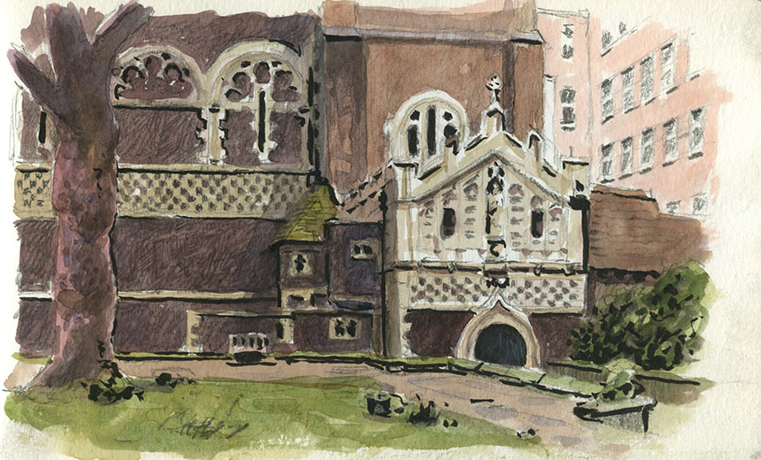
I was the only Brass Monkey on patrol I suspect. I don’t blame people it was a bitterly cold windy day. This is St Bartholomews The Great In Smithfields I was out of the wind but still freezing. I did quite a detailed pencil sketch before adding a few washes. 7in by 5in.

This is the doorway of the Old Bailey. A very tricky bit of drawing but fun to do, again I did a lot of pencil before washes. I rather over did the pen. 5in by 7in.

A step back to New Year. I visited a life session in Galway which was a nice change after all that eating. Interesting model almost as wide as she was high, with a beautiful pale skin tone.

Here is Keith one of the Galway life drawers. He was beautifully lit by the window and I couldn’t resist sketching him. 5in by 7in.
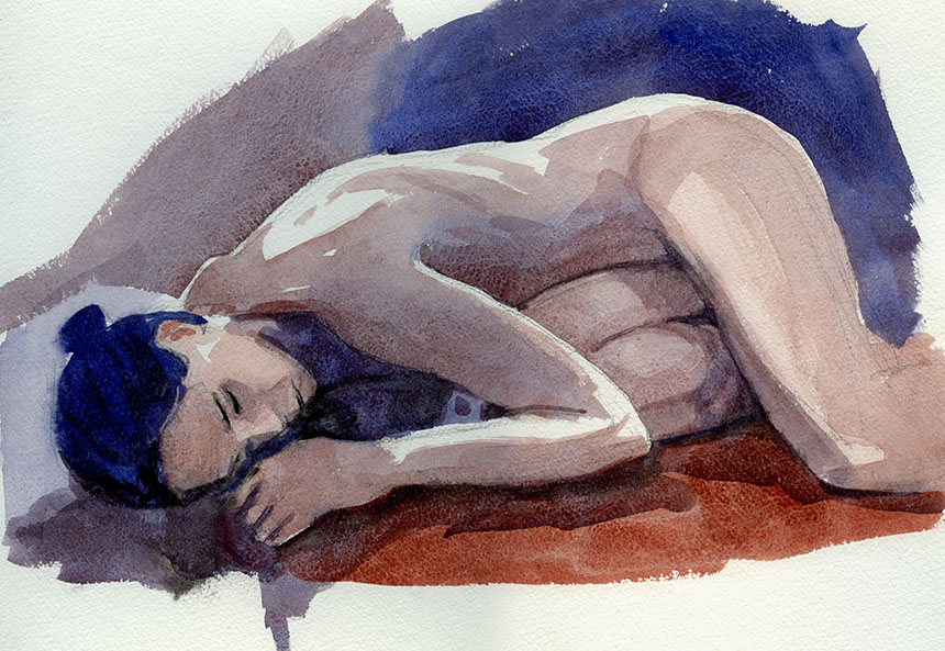
Life drawing started again in London. Despite it being one of my favourite models I just couldn’t seem to get going. This was the only one worth posting. 15in by 10 in.
Super work Robb, great insights into colour mixing. Have you written a book?
Doug
Comment by Yorky — January 25, 2013 @ 7:12 pm
Thanks Doug, a book? No but am vaguely considering it, I’m not sure I have that much new to offer, but as the blog stuff mounts up there might be enough worthwhile material. I’m not that keen on how to do’s or step by steps as they never really catch how it feels to paint. Reading other painting books I find it always goes swimmingly with no slips between cup and lip, whereas we all know real life isn’t like that. I might do a book on damage limitation for painters I suppose!
Best
Rob
Comment by admin — January 26, 2013 @ 10:06 am
I think you could pass on your experience Robb, you work in various mediums and a wide range of subjects.
Your plein air experiences alone would make good reading.
Doug
Comment by Yorky — January 26, 2013 @ 10:12 am