I went to see the Constable exhibition at the V&A. I was painting in a very wet Knightsbridge and took refuge from the rain for an hour or so. I nowadays try to distance myself from all I know and have heard of an artist when I look at their pictures. What would the reaction be, I try to think, if an unknown posted this on an online painting forum… how many “likes” would it garner. It is not easy to look afresh, this is after all Constable, one of the greats of British landscape. The exhibition is well worth seeing as it includes paintings by artists who influenced him, both from the past and his contemporaries. So we had Thomas Girtin who he admired hugely and Ruisdael who he copied with great attention to detail. The exhibition also included the sketches and so forth where they when available, which I always like because they show how an artist sets about his business.
Firstly there was much I very much liked. The small plain air sketches and pencil studies. One or two of which have a lovely immediacy and delicate touch. It was here that the heretical thought occurred… if I found an unknown one of these and posted it under an assumed name on UKPleinair (a Facebook group with many fine painters as members) would it stand out? After racking my brains I had to conclude most would not. Indeed many were well below the standard that some artists currently post. The very best would I expect garner praise and positive feedback of course but not I have to conclude adulation. A few examples would be appropriate I suppose.
Here is a middling quality painting. You have to say though perfectly pleasant it is ordinary. Other painters of the time such as Turner and Girtin were doing far better work on the average in my opinion.

Here is another from later in life. Some nice enough bits but the trees to the left are clumsy as is the composition. The distant blue is a good touch but once again nothing remarkable.

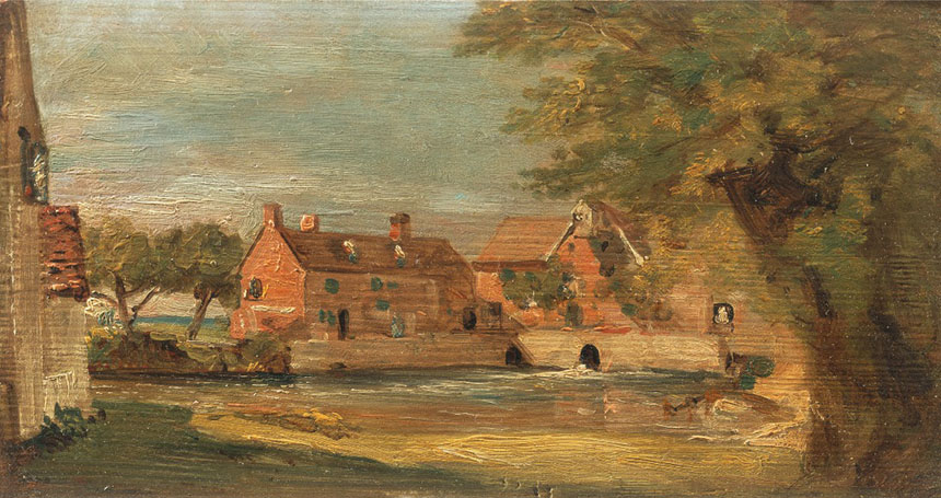
Here is another, very briskly painted but heavy handed with some ugly brushwork. If it was not by Constable you would possibly throw it out! Because it is by Constable we earnestly peruse it, but to my eye it is just a poor painting.
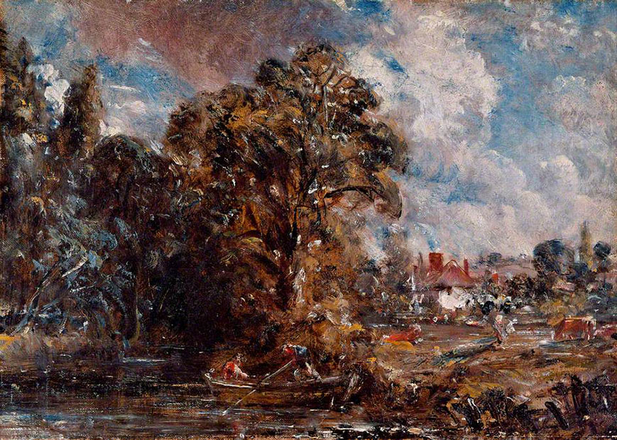
This is a sketch for a bigger picture. I find, as Turner and the other Academicians did, that the crude muddy brushwork and the shotgun white highlights just don’t work. The red browns also overwhelm the painting and sit unpleasantly with the blue.

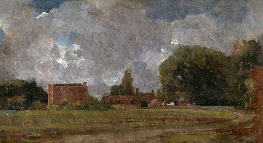
Now to dig myself a deeper hole still I will consider one of his iconic later paintings. Here is the sketch. There is very little good here. The drawing is poor with Salisbury cathedral toppling to the left. As for the stand of trees on the left, what was he thinking? The sky usually one of his stronger points also is marred by ugly fussy and ill considered white highlights.

Here is the final result. It looks better here than in the flesh. The whole picture is smothered in distracting white speckles. He used to call this his “snow” and knew that other painters disliked it. The drawing is a little improved but the river on the right climbs impossibly up the picture plane and there appears to be a miniature village built into the undergrowth on the far bank. Once again the trees are terrible especially the overworked branches at then top. Is it just me but those horses look more like Shetland ponies rather than cart horses!
Poor Constable I hate to say it but I think he has been built up greater than he really was. It is not his fault of course he has been taken by art historians to represent the precursor of impressionism. He is in fact, I feel, a very hit or miss painter who struck a few very high points here and there but struggled in later life to find his way. I liked his Water-meadow near Salisbury far more than his Haywain and some of his oil sketches more than both. He was of course influenced as all artists of the period were by Claude Lorraine and there was a fine example there. His real contribution was pioneering the working out of doors from life, though the curators of the show didn’t appear to notice that several of the so called plein air sketches had glazing over impasto white which makes it unlikely that they were actually done on site. I will end with my favourite thing from the show. A small oil sketch on a bit of millboard.
This is altogether delicious with a light touch and subtle colouring.
Ah! Cruel. You’re right of course, many of his paintings were splodgy and speckled with white but Constable is still my favourite. A treasured book of mine is Constable by Jonathan Clarkson published by Phaidon. Over 200 pages, a biography with beautiful reproduction plates. I’ve only ever seen one of what he called his six footers in the National Gallery years ago, but where I live in Margate, the Turner Contemporary had a few on exhibition recently of smaller paintings. He did a lot of sketches and finished them like you illustrate above with much more care. In Mike Leigh’s new film Mr Turner, there’s a brief scene between Turner and Constable, if you haven’t seen it, showing his Opening of Waterloo Bridge. I went to a talk last week at the Turner. Very interesting, and the two people taking it were the artist who taught Timothy Spall to paint for the film, and another artist who did all the preparation canvases for it who said he had a couple of days to prepare the Constable canvas that was used, whereas it took Constable ten years!
Comment by Tony Lampert — November 24, 2014 @ 2:35 pm
Inviting opprobrium indeed Rob! The examples you show are indeed not very strong on any level, particularly in their confused tonal sequences but of course it is known that the great man often sent apprentices off to make sketches for him so I suppose we may not even be discussing his own work?
Curiously his legacy seems to live on in Europe more than the UK as this muddy and overworked Impasto is still popular particularly in Germany and Holland.
Knitting a big scene together from multiple reference is never easy but the Salisbury painting does show dreadful errors of scale. Perhaps he needed a woman with an artistic eye to shove the worst ones under the sofa?
Comment by Michael Richardson — November 24, 2014 @ 4:24 pm
Rob – you have said what I have often thought about some of Constable’s work. Because I an an amateur and late starter as a painter, I have felt inhibited in expressing opinions as surely those who gush about well known artists’ works must know what they are talking about.Perhaps not all of them do. Your article encourages me to have the strength of my own convictions!!
Comment by Michael Trask — November 24, 2014 @ 4:39 pm
It’s always tricky trying to look at an icon afresh. I myself don’t think that any artist’s high points are devalued by the lows. What I do find irritating is the tendency of art pundits to elevate the whole of an artist’s ouvre to the legendary. In reality even the greatest stumble which should give us ordinary mortals hope!
Comment by Rob Adams — November 24, 2014 @ 5:07 pm
A most informative blog and a nice mix of personal painting experiences and insight into other artists’ works. Encouraging for a Plein Air novice! Would like to subscribe to further blogs. Thank you.
Comment by Gayle DuJohn — December 6, 2014 @ 4:03 am
I almost fought with myself about whether to read this blog. Would you burst my bubble, or not?
I went to the Constable exhibition a couple of weeks ago and to this day, that experience has been going round my head. As I’m not an English native, I wasn’t raised in the Constable, Turner and Gainborough atmosphere. I went to the exhibition fairly ignorant about what to expect. I also really didn’t know where ‘Constable country’ was and googled it before my visit.
On one level, I have to agree with you about the hype vs. the artistic output of this gentleman. To my slightly trained eye, I could pick up on some strange decision-making on the canvas and the odd cloud study that was, frankly…odd. I did however, enjoy his cloud comparison sketches, and could easily see him as a contemporary member of the Cloud Appreciation Society.
Some paint strokes were beautiful whilst other we’re just…eh. I guess what has been swimming in my head since my trip to the museum, is -how- Constable was exhibited. I came away more impressed with the Museum’s interpretation: the way Constable worked, the sketching, the altering, the copying, the influences he had on others, but even more so, those that influenced him and his work’s trajectory over his life – most of this happening in a small corner of England. On top of this, plein air painting is given a massive boost with this exhibition. Whether one agrees with Constable as a primo English artist or not, I think what you take away with you is the process of the art. There are so many art exhibitions out there that hang the art expecting admiration from its visitors. This one tries to convey the artistic effort….something that never changes. The V&A, I believe, can be proud of this achievement.
Comment by Elizabeth King — January 20, 2015 @ 7:53 pm