Rob Adams a Painter's Blog painter's progress

March 13, 2014

Style

This is something that has caused me a certain amount of grief. Many years ago I was warned by a really well known illustrator that a very distinctive personal style was often a problem. He pointed out that once you had established and were known for a distinctive style you wouldn’t be asked for anything else. What is more if your style was a hit and then went out of fashion you were left high and dry with very little work.

This in the event was not a problem for me. I am a born mimic and can usually paint in most styles in a reasonably convincing way. Indeed a lot of my illustration work came with the requests like, “Could you do this in whatshisname’s style as he isn’t available.” I became quite useful and garnered a fair bit of work on this basis. It broadened the range of skills that I had which was I suppose a plus.  The disadvantage was that I didn’t develop much of a distinctive personal style myself! I would have an idea and think that it would suit this style or that, swopping between them as if changing hats.

This problem was brought into focus when I started to paint pictures for myself not for commission. At first my acrylics were so varied in style that if they were hung on the wall side by side nobody would guess they were by the same painter! In watercolours I had more to build on as I had been filling small sketchbooks for years with topographical paintings from holidays etc. Here at least my style was reasonably consistent. With oils however I tended to swing between the finished and sketched or the broad and the detailed. Looking at my wall of recent paintings I do at last see a style emerging, which has led me to think on it further.

I now think the matter of style can be a very thorny issue. The same problem occurs with easel painters as it does with illustrators. If your style is very distinctive, say you outline most things with a primary or some such, then if you stop that practice then the pictures won’t be what people expect of you. Also you will only be able to do such pictures where that particular quirk works well. A subtle misty mood for example would be nigh on impossible. You have in essence painted yourself into a cul de sac, you can only paint the subjects that suit your style.

It happens I think because people wish to reprise past successes. They paint a nocturne which is very much of a hit and thereafter do nocturnes until they turn up their toes!

Looking back at art history you can see examples of artistic type casting. De Chirico is quite a good one. He became famous for his surreal paintings, but later in life attempted to paint in a more classical manner. (much to the horror of art historians who really don’t like you to step outside your box!). He came to the other style without the required skill and so visibly struggled. The technical hurdles of drawing, observation and paint handling for the classical inspired work being far higher than for the surreal ones. No one really wanted his new work so he had to keep on knocking out the old surreal stuff to make a buck. The problem for De Chirico was he had become type cast, his style had become a straight jacket that imprisoned him. De Chirico is laudable I feel because he at least tried to throw off the chains. Other artists having established their own comfortable little walled garden never thereafter step beyond its bounds.

Another example would be Samuel Palmer, in his youth he had mental problems and painted in a visionary style. But later he settled on to a more even keel and painted in a fairly straight observational manner. In both styles he is very good, but due to the existence of his hallucinatory and romantic early work the later efforts will never be really appreciated. Indeed books on him often only feature later work briefly at the end!

Other painters, just peg away at the same dreary stuff year after year. Oddly the art world gives brownie points for dogged persistence. If you spend 30 years arranging pine cones into mandalas in the depths of Siberia it must they argue be more than a passing phase. I can’t imagine what a dreary existence it must be to be someone like Bridget Riley knocking out the same Op art tedium year after year. Mind you she no longer bothers to do them herself but has helpers do the donkeywork. Not that the end results aren’t very decorative, but I’d prefer to have a William Morris on my wall any day!

So I now feel that too strong a personal style is a bit of a handicap. We all hope to be different and noticed but in a world where everybody is trying to be just that, different becomes the new same. What you hoped might separate you from the crowd does just the opposite. The real rare thing in life and art is not someone doing something different but someone doing something really well.

.

Greenwich, Royal Hill, pen and ink, Drawing, London


I have as I believe mentioned before decided to draw more in pen and ink. This is already paying dividends as by reducing your  choices of tone and mark you are forced into finding ways of explaining your subject that only require line and tone. With such a limited menu of marks everything has to earn its keep. Hatching with its strength order and direction becomes very important. If you do a building wall in just vertical lines then it becomes dead and featureless. In real life there are many variations so if you break up mostly vertical lines with the odd angled group then you are showing both that it is vertical and flat but also that it is varied in its surface. For a smooth concrete wall you would add very few disruptions, for a worn dirty tenement far more.

This is Royal Hill in Greenwich. I have decided that dip pens though lovely are too much to fight with en plein air so this is done in fibre tip. I am using a watercolour Moleskin as I quite like the fact that if you move the pen quickly you get a faded dotty line.

St Pauls, London, City, Pen and Ink, drawing


Another one, quite a fearsome subject but it only took about an hour to render. It is one of the hardest things to learn to leave enough white to allow the subject to breath. In reality the sky was much darker than the sunlit dome but IMO the drawing would not have been improved by hatching the sky area.

Greeenwich, Royal Naval Hospital, watercolour

A very quick sketch done battling the wind. It was a super day with wonderful light, hopefully I will get some studio pictures from the day. This is the entrance road to the Royal Naval Hospital in Greenwich. It is now a music college so you draw to the sounds of music issuing from various windows!

Watercolour 5in by 7in.

Blackheath, London, Oil Painting


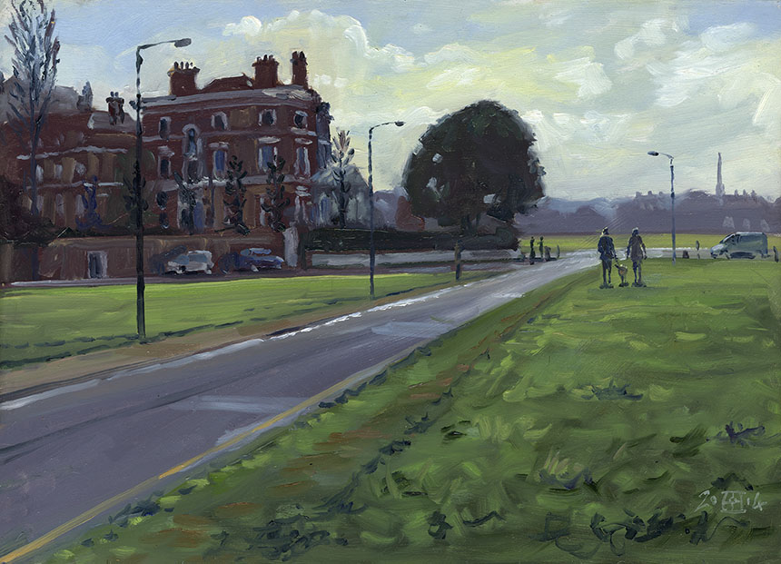
This is Blackheath, painted on an early morning expedition with Graham Davies. I had spotted this subject looking very beautiful several times but never been able to stop. I have to sort out the figures as they make an “M” it is odd how things like this can strike you several days later when your eye passes over a painting.

Oils, 10in by 14in.

Fleet St, London, City, Urban, Oil painting, plein air


This was done on the most gorgeous day with the Brass Monkeys. We arrived at dawn and were faced with the most astonishing light. The problem with painting at dawn is that the subject starts out gorgeous and then gets less so as the light increases. As result this had to be painted very quickly. I am attempting to paint a little bigger so it was the first serious outing for my new larger pochade. I must say it worked very well, I was surprised that painting a notch bigger did not really take that much more time. This is St Pauls from Fleet St. I will do a studio painting from this but decided not to work up the sketch any further.

Oils 12in by 16in

St Pauls, London, plein air, oil painting


The next one of the day. I had textured my board more than I usually do as an experiment. It works well but I got it a mite to strong I shall have to experiment to find a prime finish that suits me. Up until now I have been painting on quite smooth boards. Which is quite difficult but good for you as the brush strokes must be well thought out. But for this sort of atmospheric subject a textured surface works better.

Oils 12in by 12in.

St Pauls, Oil painting, London, plein air


I don’t know what kind of coffee I had early that morning but I painted like a demon all day! Partly it is being out with a group of fellow painters which is very pleasant and inspiring. Another that would be worth taking into the studio. As I posted this I noticed the tower cutting the sky was too strong so had to stop typing briefly to soften it! St Pauls again, which means I did it 4 times in the day!

Oils 12in by 20in.

December 7, 2013

Art Education.

In a conversation recently I took the position that art colleges teach drawing very poorly. I was quite fairly asked how do you know that? To which I had to admit I only had my own experiences from three decades ago and word of mouth from current art students to whom I had talked. So quite casually I started to look at art college’s websites and then looked at the work of the tutors who might be expected to teach the students to draw. The results were truly depressing. Almost no colleges had an even halfway competent draughts person on their staff, some of them had professors of drawing, who spouted guff about how important it was to them. They did not seem however to have found it important enough to spend the time learning the relevant skills.

Everywhere was the opinion that drawing was some kind of metaphysical prayer state where you could commune with the inner self in the purest way. I downloaded staff lists and pictures of the tutor’s work with the intention of posting them in this page, but really I only found one tutor with a reasonable skill level and that was at Falmouth. No where else was there a person who would have had the ability to teach a student drawing skills if they wished to learn. Below is a list of attainments that a student of art will be taught. This one is from the University of Kent:

Subject-specific skills

You develop the following subject-specific skills:

  • effective deployment of terms and concepts relevant to understanding art in a contemporary context 
  • the ability to locate evidence from a wide range of primary and secondary sources, and interpret it in relation to the aims and conceptual framework of fine art practice
  • the ability to present, explain and defend a visual art project, in both its developmental and final states, employing argument and interpretative skills relevant to professional practice
  • the ability to draw upon understanding of the materials and processes central to a variety of fine art media, as well as the technical skills necessary to produce practical work in these contexts
  • the ability to critically evaluate a range of different conceptual and practical methodologies and approaches to both understanding and making art in a contemporary context
  • the ability to competently perform the tasks necessary for contemporary professional artistic practice, including skills of display and dissemination of work, fundraising and gallery negotiation
  • the ability to manage a fine art studio and studio project, including time management, budgetary control, space management and the acquisition and maintenance of equipment
  • the ability to place art works produced by the learner or others into a historical, and conceptual context, employing analysis and critical interpretation to forge connections between practices that elucidate the process of creation.

Transferable skills

You gain transferable skills in the following:

  • communication: articulate ideas and information comprehensibly in visual, oral and written forms; organise information effectively respond to written sources; adapt style for different audiences; use of images as a communication tool
  • information technology: source, navigate, select, retrieve, evaluate, manipulate and manage information from a variety of sources; select and employ communication and information technologies; produce written documents; employ advanced software for module projects and tasks
  • working with others: interact effectively with others, for example through collaboration, collective endeavour and negotiation; accurately define and review the work of others; skills of negotiation and persuasion in relation to the planning and execution of a project or the dissemination of its outcomes
  • improving own learning: study independently, set goals, manage workloads and meet deadlines; explore personal strengths and weaknesses; develop autonomy in learning; ability to listen effectively and so to learn from and participate constructively in discussion; update knowledge and skills, seek and use feedback, critically reflect on and improve performance
  • problem solving: identify and define intellectual and practical problems; explore alternative solutions and discriminate between them; creative experimentation; focus and apply attention to detail; gather, organise and deploy ideas in order to formulate arguments cogently and to express them effectively both orally and in written form; make subtle and discriminating comparisons of texts and visual artefacts; research and evaluate sources in the process of carrying out independent study.

There is a hint that practical skill might be learnt at bullet point no 4, but don’t get your hopes up, I could see no tutor at the college who had any competence at all in the area of drawing.

You might think I am exaggerating, but the evidence due to the internet, is there for all to see. So if you doubt me it won’t take you more than 10 minutes to check. If you do find a good drawer let me know and I’ll post the fact here with pleasure! I might also add that some colleges seem very coy about their tutors and what work they do. With good reason in my opinion, very few would have any chance of making a living at art outside the cushioned oasis of the education system. There is a requirement that art tutors exhibit occasionally, but in most cases this seems to be very perfunctory.

I know that the colleges would respond that I am talking about an outdated skill and what students need is skills in video, self publicity and curation. I don’t disagree, those skills are needed, but drawing is more important and fundamental in my opinion. The evidence online shows they do not appear to have the resources to teach in this area even if a student requested it. If these colleges were private I would have no complaint, but they are not, they are funded by the state.

In the other arts a music student would be expected to have some skill in playing, even if they were going to compose not perform. This is because of the insight and understanding of the subject that learning to play brings. A creative writing student would be expected to be competent in grammar and sentence construction. Oddly I found that fashion departments taught drawing on the whole quite well. I have said before and will repeat. Drawing is important not necessarily for what it results in on paper, but for the understanding it brings to the person learning it. Drawing gives a vital and unique insight into the nature of looking and seeing, as well as the skill to explain what you might have learnt to others. This in my opinion is of huge value even to video and abstract artists as such knowledge and competence cannot as far as I can see be gained in any other manner. Drawing is not in itself art it is only a practical and intellectual tool, but for the visual arts at least it is a vital one and should be taught to a high level by any self respecting art college.

Here is Leeds College of Art who claim to make drawing a central plank:

FINE ART DRAWING STRAND

Working in the drawing strand allows you to elevate your drawing from being a well understood core discipline in art practice to being the distinct and exciting art form exhibited in museums and galleries across the world. Our artists will introduce you to processes and visual drawing systems whilst also exploring the integral expressive nature of drawing which is primal, elemental and our most immediate form of image making. You will be encouraged to extend your drawing practice widely in two, three and four dimensions in a range of of materials, media and techniques.

They are distinctly coy about who might teach you but I found the information hidden away under “research”. Alas none of the staff as far as I can see have any drawing skills whatsoever…

A tiresome conclusion people seem to jump to when I make these arguments is the, “You want us to go back to drawing from plaster casts.” Nothing could be further from the truth. I find the teaching methods and intellectual stance of the so called modern ateliers absurd and equally as bad as the current state art schools. I do not want to throw out contemporary art thinking I want to enlarge and enhance it.

After that rather depressing round up a few paintings might be in order.

.

Nude, life drawing, watercolour, figure

I took watercolours to life drawing which is always scary. 30 min is a very short time for a study! It does however concentrate the mind wonderfully.

There is only so much that can be said in that time, only so many marks that can be set down. This means that your choice of what to explain and what

to let go of are very important. The first one was a write off but here I got the key things delineated and nothing to much overstated. Accuracy in such drawings

has to be somewhat done on the fly though I do try and get three points in a triangle placed accurately. Here I made a triangle from where the shoulder touches

the cheek to the dark of the pubis then down to where the bangle on the rt arm touches the red throw. I’ll sketch that in below.

.

Nude, life drawing

I hold up my brush to determine the angle of the first almost horizontal line and then get that placed. I then decide how long I wish it to be and mark the

two ends. Next I get the alignment of the long side down from cheek to wrist and gently mark the rt hand end. Finally I take the angle of the lin from pubis

 to wrist which fixes that point. The advantage of a triangle is that it is fixed in shape so you can be confident of its proportions. Once this imaginary triangle

is in place it is far easier to estimate positions and angles of the rest of the body. You could of course proceed to mark more points but in the sort of time scale

these paintings have to be done that is not an option! A final tip, make your initial triangle cover as much of the body’s area as possible.

.

Nude, life drawing, watercolour

The next one, another half hour. I ended up with some rather over sharp edges in the back. As always overstating is worse than understating for the

most part.

.

Nude, life drawing, watercolour

Last one that is fit to post! I often find that the last drawing of a session is the best. You get into the zone and start to make decisions

more efficiently and with greater confidence.

.

Deptford, Church, graveyard, pen drawing

I took my pen and ink out to draw plein air which was an experience. I think I will use technical pens to sketch out doors as dip pens are better in the

studio. They can be very finicky and have this ambition to dump a large blob of ink at any gust of wind! This is St Paul’s Deptford designed by Thomas

Archer.

.

Battersea Bridge, Thames, london, watercolour

On a Brass Monkeys outing as I was heading home the view from Battersea Bridge was fantastic. I did a very quick sketch which is below and then this

studio painting. Very simple with only two colours Quinacridone Burnt Orange and Ultramarine. 10in by 10in. Watercolour.

.

Battersea, Bridge, Thames, London, plein air

Here’s the sketch done in less than 15 min. I pretty much stuck to this only refining the drawing from the photo. The photo was quite dark and very

vibrant, which isn’t what the eye saw at all.

.

Maldon, Essex, watercolour

Famous scene of Maldon in Essex. Really just a colour test I only used Ultramarine, Cadmium Red and Quinacridone Yellow, all Daniel Smith.
1/2 sheet, 140lb Arches Rough. Not sure I like this, it could be from any era! I softened the line of the water later which here is too dominant.

.

Deptford, Station, watercolour

I am trying to get some London watercolours done for the up coming shows. This is Deptford Station 9in by 9in. Super sun this time of year it beams

down this road like a search light!

.

Mary le Strand, London, oil painting, plein air

A favourite scene, this is St Mary le Strand. The day was very flat so I could take my time. The best one I have done of this, it is a deceptively difficult subject.

I’ve done it zoomed in but this time I wanted to get in the big block of quieter stuff to the right. 10in by 16in oils.

.

The shard, thames, London, plein air, oil painting

This and the previous one were on a Brass Monkey day, we were all surprised to find ourselves faced with a glorious sunset! I decided to revel in the colour

and not hold back. I only had 20min at the most to get this down. 8in by 10in oils.

.

painters, thames

Here are Mike Richardson and Terry Preen finishing off, it is so pleasant to go painting in a group!

« Newer PostsOlder Posts »

Powered by WordPress

error: Content is protected !!