Rob Adams a Painter's Blog painter's progress

June 13, 2014

Convention

Someone recently commented in a slightly disparaging tone that my work was very “conventional”. Slightly miffed, but not showing it I hope, I asked them to elucidate. After a little probing I found that in this case conventional meant old fashioned and dated. Modern cars, I pointed out, hoping for a re trial. Alas no reprieve for automotive contemporaneity. What you are doing is better done by photographs, my nemesis concluded.

So, convention, what is it? All through my art education following one was considered a negative unless you were “playing with conventions” or even better subverting them. If you adhered to any of them it was plainly a bad thing. Conventions though are, to my understanding, rules you adhere to by choice. We have social conventions, we do not spit on the floor of a friend’s kitchen, though we might on the ground if walking in the country. We shake hands, kiss each other on the cheek etc, etc. Conventions are everywhere as a sort of framework to guide us along.

Art conventions seem as thick on the ground as they ever were. We put pictures and other art objects into galleries, once the object is placed in the approved gallery situation it can then be appreciated as art. This is quite a recent convention of course, hardly more then a few centuries old. It is especially necessary now when much art could not be discerned as such without the explanatory context of a gallery space.

So rather hesitantly I am proposing that conventions are often positive things. Also that working within them rather than subverting or ironically playing with them is a perfectly valid thing to do. They give you a framework within which to work. Where would the novelist be without the conventions applied to books? A novel with the pages arranged randomly rather than sequentially would not be much of a seller. It would, somewhat oddly, be I suspect quite acceptable as a conceptual artwork, it’s that playing with convention thingy!

Georg Baselitz shocked the art world by putting his rather cack-handed portraits upside down. Why this made them more interesting is a puzzle. True they were pretty grim the right way up, but I could discern no improvement by inverting them. As a challenge to convention it was pretty weak. If they had been abstracts no one would have noticed or cared. I could argue I suppose that through following certain conventions by choice I am breaking the current convention of ignoring convention… bleeding edge or what?

What my critical friend really meant of course was that I was unfashionable. A crime to which I plead guilty M’Lud. Fashion is I suppose partly convention, but it is more a guide to tell you how to be perceived in a good light by others. If your furniture is fashionable you are not necessarily purchasing it for its utility or craftsmanship, but for how it will be perceived by others and what status they will ascribe to you in consequence. People’s choices as to what they like or dislike in art are often driven by the same wish to shape how others will see them. If you say you like Francis Bacon, people will assess your sophistication differently to how they will if you say you like Constable. Whether you actually give a fig for either is moot of course.

So I work within the conventions of observational picture making. I mostly fill a flat right angled quadrilateral. I adhere within limits to one or other of the geometric conventions for depicting an immersive three dimensional world upon a flat surface. I mostly, but not always, use materials that have a long pedigree. I use these conventions not because they are just what I was given and I can conceive of no other way, but by choice. Not only that I choose them by informed choice. If some better way that suited my purpose came to my attention I would adopt it without a second thought. I did this I suppose with computers and the amazing possibilities they bring to constructing an image.

A complete hodgepodge of work this time. I am at some kind of crossroads but won’t know what kind until a way down the road. I am still avoiding oils but am taking them on my next trip to France so I hope for a rapprochement.

Upnor castle, medway, kent, pen drawing

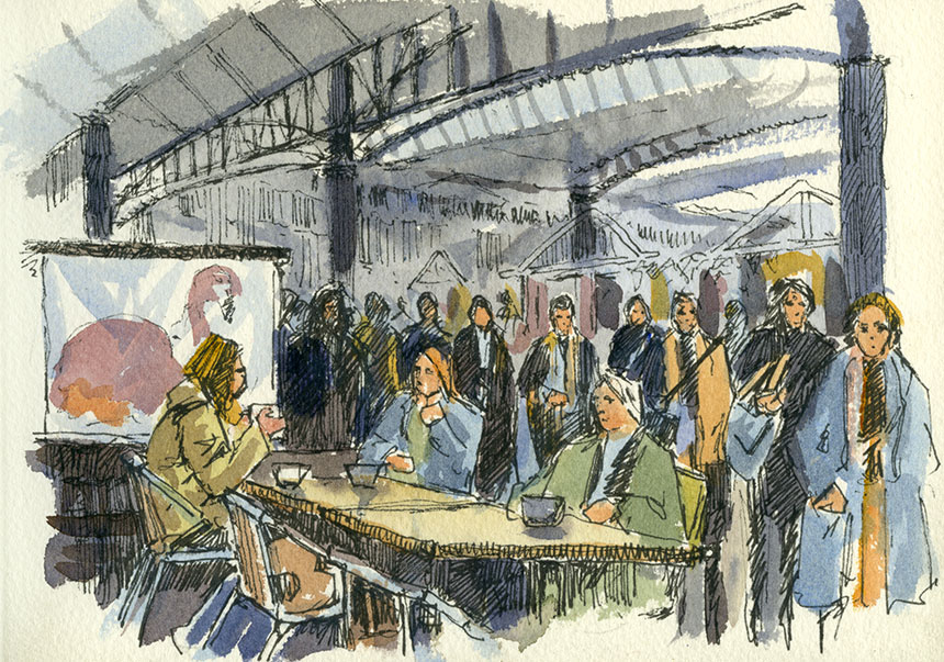
I’m still on my pen drawing kick. I dusted off my Rotring Art Pen to do this. What a horrible pen! How could a pen company design such a crappy instrument. Ink flow is terrible requiring you to draw at a snail’s pace and the nib is an insult to a thousand or so years of nib making. The nib has no flexibility at all so produces an unvarying line, so zero points to the Art Pen I won’t even bother keeping it. Now I have that off my chest I can tell you that this is Upnor Castle on the Medway in Kent.


Upnor, Medway, Kent, boat, drawing, pen

This is Lower Upnor which is distinctly boaty. This is the front of the local pub. I reverted to Fibre tips for this, nasty but better than the appalling Rotring.


tower bridge, thames, pen and ink, drawing

In desperation I have bought some fountain pens to draw with, not least because of cost! Decent pigment fibre tips come in at 3 quid or so. They also have a very unvarying line. This is done with a Noodlers Nib Creeper which cost a very reasonable twelve pounds and have a decent amount of flex in the nib. I must say they are amazing value for a pen that draws really well. Their ink is good too. I did the pencil outlines for this a week or so back and as I was passing by after an ink buying mission I set too with my new pen. It is such a relief to get the variety of line that I am used to with dip pens. Also the Noodler is so fast to draw with, no matter how fast you move the pen it keeps up and delivers ink to the paper. I needed it on this too as I underestimated the work and had to scribble frantically to get the thing done.


Florence, Italy, Arno, motorbike, watercolour

A studio watercolour from my trip to Florence. This was early in the morning before the mad tourist rush. It is done on the Girtin style paper which is very interesting to paint on. Quite different to a modern paper. It is very hard sized, I think you could scrub the whole thing back to white if you chose! Not altogether comfortable with it yet but has a lot of potential. It does give me a clue as to why 18th and early19th century watercolours look as they d0. This is the end of the Ufizzi where the Vasari passage comes out. 10in by 15in


Florence, Italy, tuscany,

Another studio watercolour. This is the Piazza della Signoria, the Statue is The Fountain of Neptune by Bartolomeo Ammannati. The man is cleaning off chewing gum, the hour is 5.30AM! 12in by 10in.


Kings Cross, st pancras, London, Brass Monkeys, pen and ink, Whidborne St

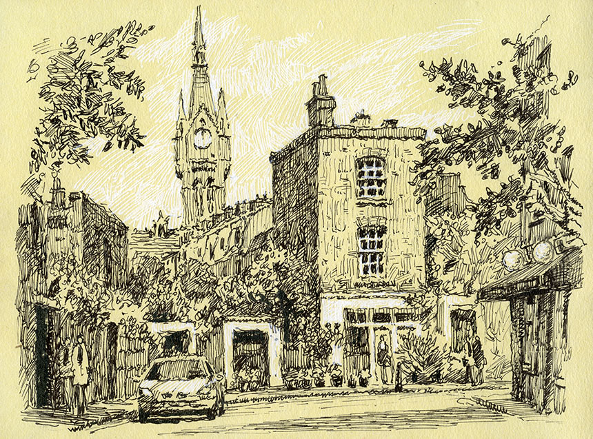
Further exploring the possibilities of fountain pens I bought a 100 year old Waterman 52 which has a wonderful flexible nib. They needed them then so people could write in copperplate. Better than the Noodler it is effortless to draw with. This is Whidborne St near St Pancras on a day out with the Brass Monkeys.


Grand Union Canal, Kings Cross, pen drawing, London, barge

My new old pen really flew when used on bristol board, just so much easier and faster. It would have taken at least double the time to draw this with my Sokura pens. This is the Grand Union Canal just behind Kings Cross.


Queenborough, Kent, Sheppey, church, holy trinity, graveyard, pen drawing

More pen… sorry I am getting addicted! This is Holy Trinity church in Queenborough on the Isle of Sheppey. A Wapping Group day.


Queenborough, Sheppey, watercolour, church, graveyard

The light was being a little here and there so I stayed where I was and very quickly splashed this in. On Saunders Waterford, better than the Arches pads at least the washes have some life in them.


Queenborough, Sheppey, estuary, boats, watercolour, Sheppey

I had met up with Mike Richardson and we went out on the long slipway at Queenborough to paint the light and the mud. The light was getting better minute by minute so as I felt this was a little too polite I did it again with more verve.


sheppey, queenborough, watercolour, plein air estuary

Here it is again with a bit more splash and dash!

May 24, 2014

Focus

This is a subject I am very much feeling my way with. Having been painting pictures for framing for a little while now and looking at a huge swathe of paintings by others I have come up against the issue of hardness or softness of edges. People talk a fair bit about the importance of edges and getting the mix of lost and found edges right, but no one talks a great deal about why this might be so.

If you stand before a scene in ordinary light then the edges of everything look pretty crisp. They even look crisp in fog! So why would we like blurry edges in paintings if we don’t have them in real life? Indeed can you think of anything other than a bank of fog that actually has a blurry edge? Some close too things have soft edges such as curved surfaces where one eye sees further round the curve than the other. This incidentally only happens on vertical or nearly so curved surfaces such as a cylinder sitting on its round end. If you rotate the cylinder to lie on its curved surface then the now horizontal edge will be sharp due to out eyes being side by side.

The other effect we see in photography is soft focus. Our eyes do it too. This is what is called depth of field. Depending on the light levels if we focus on a nearby object then the distant one will be soft and if we then focus on the distance the nearby object will in turn become blurred. The human eye does a different sort of soft focus in that objects in the centre of out attention will be sharp but those on the peripherally will be soft and ill defined. Try it your self, I am amazed at how amorphous even objects a little off the central axis become. It is a little hard to stop your eyes following your attention and moving!

How we actually take in the world is by scanning our surroundings in little darts and jumps called saccades. Our brains are not fast enough to process fast movement, if you try waving your fingers in front of your face you will find that they become blurred quite soon. So the eye moves in sudden jumps and pauses as it picks out information from our surroundings.

Yet another aspect of visual definition is specificity, so a tree will not usually be as visually defined as a person. If you did a picture with blurry people and sharp trees then people would find it a little odd. The same painting with blurry trees and defined people would however be quite unremarkable.

So as you see we have a quite a few reasons to be blurry in our paintings! This in turn makes softening and hardening of edges quite a powerful tool in the painter’s tool box. When I look at other painters and indeed myself I suspect people learn to use softening of edges in an empirical, this works, that doesn’t manner. Having thought it through a bit I think it might be exploited in quite a few interesting ways.

An extra layer of complexity is caused I think due to the fact that the same visual system is being used by the viewer of a painting as the painter. If the trees in a painting are soft then a viewer will appreciate mood and colour but not so much form or botanical detail (painters of course will admire the soft edges but they are just weird!) . The non painting eye will move on to whatever in the picture is more defined but the softer areas will still be supplying mood. It is immediately apparent to me that having things inappropriately over-defined in an area of a picture can be a distraction and weaken the overall impact.

I am of course talking about a certain type of picture, the impression of time, place and weather. People tend to confuse the different ways we can read a picture, so a detailed picture is inviting a different sort of looking and appreciation than an impression. They are not I feel better or worse per se. Indeed you could maybe mix the two if you were very clever.

Where I need to improve the control of focus is in my oil paintings. With watercolour I tend to use wet edges and so forth automatically, but with oils I have to think it through. Also with watercolours you are often working from the very amorphous to the definite as a matter of course. There it is that is the nature of painting there is always more to learn and deficiencies to make good! Enough complaining, a few drawings and paintings.

Tower Hill, London, watercolour

I am in a quandary with paper at present. Arches, my favourite paper has become very poor in quality of late. I have a couple of rolls which will keep me going a few years in the studio, but for painting en plein air I used the glued blocks. These alas have become very poorly sized as have the single sheets, making the washes dry dull and lifeless. The surface of the paper is not as tough as it should be either so lifting out becomes a risky process.

As an experiment I have bought some paper from the Ruscombe Mill in France. They make recreations of historical papers. So I bought a few sheets of David Cox and some Thomas Girtin types. The paper is much lighter in weight than we use now and must be stretched. Also it has more inclusions and is less white. I must admit I was slightly horrified at the uneven surface when I first unpacked it. None the less I stretched up some and took it out.

The one above is done on the David Cox. The paper contracts fiercely when stretched so I had to use my Artmate. As always when using a new paper you have to just dive in and I found it hard going at first. It doesn’t react well to wet into wet so washes must be laid cleanly and in one go. The scene above was done in around 45min and could have done with more careful drawing out. Altogether though it has quite a pleasant quality and now I know what it does well I can try and exploit its qualities. The paper is very very tough so lifting out is easy. Its weakness is that washes even when quite concentrated dry a little pale.

I did this sitting just by the Tower of London looking towards the city. 10in by 14in.


St Katherines Dock, London, watercolour

Second one of the day. It was a Wapping Group day so I sat near the Dickens Inn at St Katherines Dock. This is the Thomas Girtin paper. It is less white a sort of soft buff colour. Unlike the David Cox it took to wet into wet well as you can see by the softer feel. Also stronger tones were easier to achieve. All in all very pleasant to paint on, I shall be intrigued to try a larger painting as this one is only 5in by 10in. Strong whites will need to be painted in with body colour, which is of course just how Girtin often worked.


Spitalfields Market, London, drawing

The Brass Monkeys were at Spitalfields. We met at one of the cafes in the Market. While I drank my coffee and chatted I drew the passers by. I am going to try and add a little more character to the figures in my drawings to make them a little less architecty . Generic figures are OK but ones that tell a bit of a story are better I am beginning to think. 5in by 7in.


Spitalfields, London, Hawksmoor, drawing, pen

This is the view down Brush St to Nicholas Hawksmoor’s Christchurch. I had to hatch the sky later as no time to do on site. 7in by 9in. Here generic figures are fine as the church is the star.


Brush St, Spitalfields, London pen drawing, shop

A smaller pen sketch also in Brush St. Here I could have done with some more definitive types of people. 5in by 7in.


South Bank, Thames, London, pen and ink, Drawing

Sorry, yet more drawing… it is just a way of avoiding the oil paints maybe! Here I struggled to find something to make a picture of and abandoned two at the pencil stage. Then this confident young man walked past plainly on a mission unlike the dawdling tourists. I drew him in first and then built the rest of the picture around him. This is also on Ruscombe paper, quite resistant to draw on but gives a nice quality in the final result. This is the South Bank and another day out with the Wappers. 6in by 8in.


South Bank, Thames, London, Ice cream van, pen drawing

I am off to Florence for a painting trip so my next move was to go shopping to stock up on pens. I found this odd white pen which allowed hatching on the cream paper. Interesting effect, I shall be using it more. 6in by 8in.


Nude, Life drawing

A few life drawings to finish off. I was trying to keep things simple so just black and white.


nude, life drawing

I added red here and regretted it slightly.
Life drawing, nude

Last one, learnt my lesson and went back to black and white! Next post should be the glories of Florence…

« Newer PostsOlder Posts »

Powered by WordPress

error: Content is protected !!