In a recent forum debate the topic came up as to whether art had a point. The debate was quite varied with some saying it didn’t need one and others saying that shared culture benefitted all mankind, most seemed to say it was a sort of therapy for the artist, a few that it was a focus for meditation for the viewer and the more hardheaded souls thought it was to make an investment item. I don’t necessarily disagree with any of these, but neither do I think any of them tell the whole story.
There are I think a couple of aspects that are separate. There is the “treasure” factor. A work of art if accepted as such is a store of value and enhances the status of the possessor. Then there is the aesthetic, where looking at the art item brings pleasurable or otherwise feelings, either way a reaction in the thoughts of the viewer that could range from delight or disgust to quiet contemplation. These are obviously not exclusive. A person attempting art appreciation wishes a return for their perusal. It could be appreciation of skill, it could be appreciation of subject matter, or an aid to meditation, a doorway to contemplation. This is the story from the consumer’s point of view. These are if you like the niches in the market that are available to the artist to fill with appropriate works.
Most contemporary artists would I suspect feel that it is the therapeutic or otherwise effects of the art’s creation upon and by the artist that are important and any effect it had on others was a side effect. The artist would make the act of expression and then leave others to make of it what they will. All very elevated of course but in my opinion untrue and wrong headed.
Recently the Times printed a list of 20 paintings that anyone should know. I won’t bother to list them as the idea of such lists seems to me entirely crass, rather like those books that reduce War and Peace to 20 pages so you can pretend to have read it. The pictures listed of course followed the tired old art historical arc pedalled by current art historical wisdom. Abstract art was rather oddly represented by Pollock. The blurb below the picture read, “…any critical confusions about his stature have long since been cleared up.” followed by some daft waffle I shall not bother to unpick. It does say earlier that Pollock had become interested in the paint splashes on the floor when he worked as a (very bad) muralist. A rather dubious tale to my mind as Pollock flirted with a fair few in vogue styles before becoming splashy. What is interesting is how Pollock’s early and very undistinguished career has been air brushed out, here is a site devoted to him: Pollock. You would think they might be keen on his early stuff… but no there is a gap and he springs into existence almost fully formed. There are examples from his days with Thomas Hart Benson, they are pretty average for a 23yr old but not wholly awful, he also does a few years later some Picasso inspired scribbles. I’ll put them below, they are very hard to find so the images aren’t great.
They do seem to show he didn’t have any real idea of where he wanted to go. Even though I suspect the drips on the floor story is apocryphal I quite like it as I have had a fair few admiring the paint frame floor moments myself over the years and painted many abstract backgrounds created by flinging paint around for use behind fashion shoots. I was once, if you can believe it, quite in demand for such canvasses by the great and the good of the world of photography. We sometimes joked at the time about how the floor would make a good Jackson Pollock if we could but rip it up and mount it on the wall. I have also painted fake Pollocks a fair few times for adverts, I have read in art books about how Pollock had some sort of mastery and it was hard if not impossible to mimic him. It is I assure you not true. Pollocks are relatively easy. Thick paint for big dribbles and splashes, thinner for finer dribbles. Then just layer them up, thin thick, thin thick in four or five colours. The hardest part is to do it randomly without too much thought. Due to this of course fake Pollocks are a big problem with the fakes essentially just as good as the real ones. If the experts at the big auction houses are struggling how is a mere gallery visitor to know?
So what are Pollocks for? They are quite nice to look at, but so are any paint splashes. As a visual focus for meditation they are no better as far as I can see than a bit of much repaired pavement or aged concrete. You could argue indeed that the pavement carries a more interesting embedded history, more trodden in chewing gum for sure. If it was just their meditative qualities that were key then it would hardly matter whether they were by Pollock or someone else, so it is I would say the “treasure” aspect that is the defining one. Their cultural significance is mainly historical rather than aesthetic.
Another of the art items listed by the Times is the Lindisfarne Gospels. On the surface they do much the same job as the Pollock. They are treasure, and also made as an aid to meditation and devotion. They also have a good historical story with the Bishop Eadfrith in place of a depressed drunk. Though we don’t know if he or his scribes hankered after renown as Pollock did. Here is a page from the Gospel.

You can click on the above for a bigger view. Pretty funky stuff you have to admit. It is pretty much abstract, with only a few zoomorphics here and there. Easy to loose yourself in the textures and patterns. So what are the differences. Well for one I have tried to create these. It is not impossible, but it is also not in any way easy, as the dire art produced by many new-agers shows. To produce a fake Gospel page would be a tremendous labour. First gaining the skills, researching methods and other technical knowledge, then practice to gain the dexterity and finally but not least the execution of the page itself. It would in other words take years. It is hard to say what the final page would be worth if it took in the experts. A single carpet page ripped from the book of Lindisfarne would I suspect fetch millions, so why are there seemingly no fakes of the great carpet pages? Well it is simply that they would be too hard to make even at that kind of money. The same is evidently not true of a Pollock. I could and have knocked up a pretty good Pollock take off in a single day. I studied and practiced drawing stuff similar to the manuscript above for several years and still could not do it as well as the 7thC scribes!
I would hold that what makes a lasting aesthetic object and sets it apart from one that has mostly historical and ephemeral cultural significance, is the amount and degree of a person’s life needed to create it. There is very little in this life made by men that does not require skill and the effort of learning and practice to have lasting value. If you do not believe me just go to the British Museum and look at what has made it into the display cases from each era. Do you really think that in a thousand years’Equivalent VIII’ by Carl Andre will sit in a glass case to represent our historical era? Well going by what we have chosen to represent earlier centuries it will be examples of beautiful things created by high skill and lifetime’s worth of practice and learning. Tracy Emin’s scribbles and I’m afraid Jackson’s dribbles are I suspect rather unlikely to be there to be representative of the hopes and dreams of our wonderful and varied age. I might vote for an Aston Martin, a Spiderman comic, a mobile phone and a Hollywood movie! Engineering, technology and mass media are the crown jewels and the highest achievements of our age, I doubt any paintings at all will be present. On thinking about it I would not be ashamed for my times to be so represented, though I am a little sad I can’t see many paintings making it.
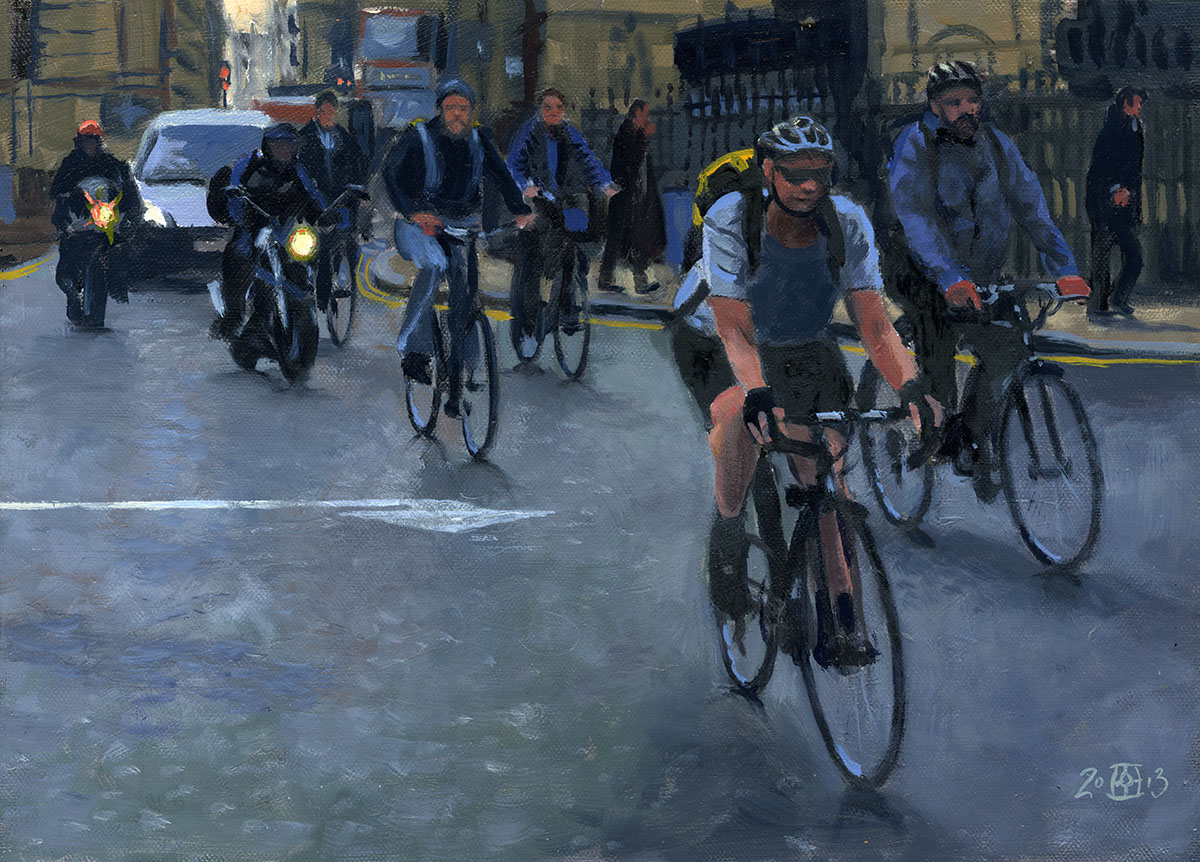
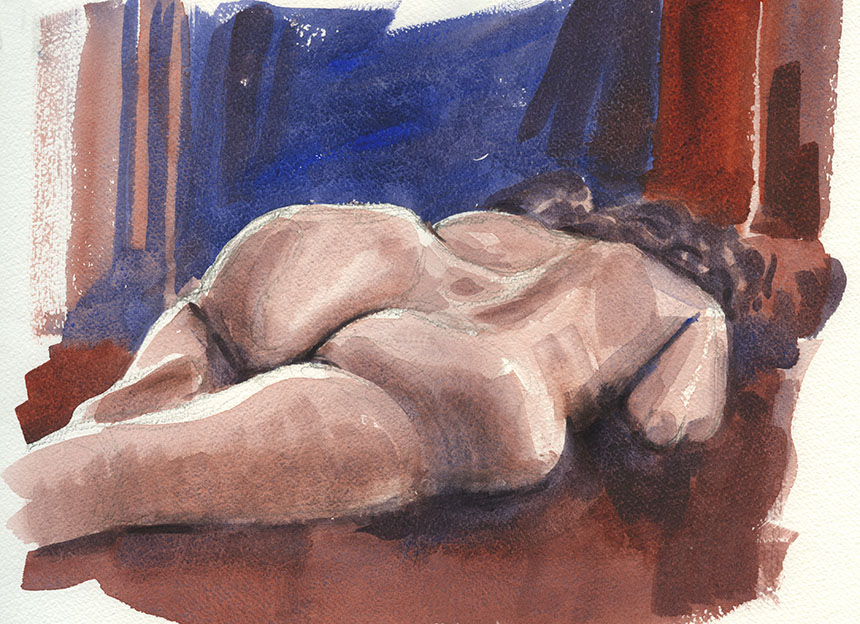
Life drawing has returned after a gap. It is always a shock how hard it is!
.

The second one of the session, the first went badly wrong! Serves me right for taking water colours to the first evening! This one came out a bit
better. Half an hour is only just enough time, you have to be very focussed on the exact order you do things in so that you always have a bit you
can work on. If you get the whole lot wet then you just have to stop and can run out of time. Just two colours, transparent red oxide and ultramarine.
.
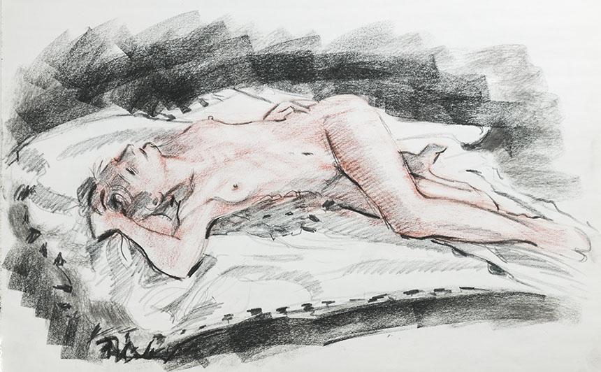
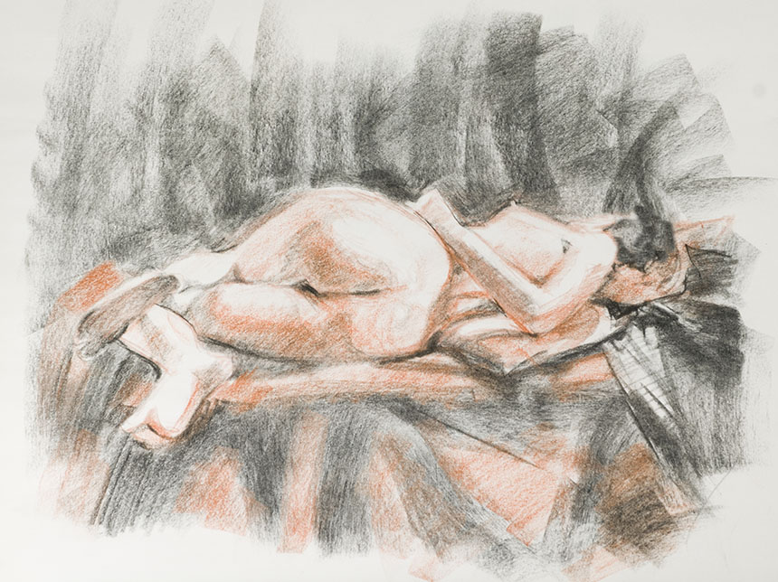
Not the most flattering angle! I enjoyed painting this though as the shapes were so interesting. I like it when the human body looks
like a set of abstract sculptural forms.
.
This is actually the last evening of the previous session before the break. Esther our model posed outside in the garden looking I thought like a very lovely dryad.
The natural light was magical and as the evening wore on got better and better. Hard at first as it is quite diffuse and without any hard shadows. This
is two sorts of charcoal and some black conte.
.

It did get quite hard to see as the light levels dropped. I just tried to hint at what I could see and not define what was
lost in the gloom. Hard to see the paper too!
.
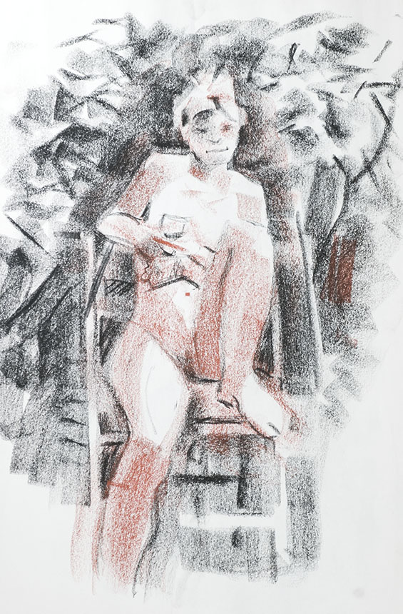
I think this was done before the standing one. I remember puzzling over how to indicate the shrubbery without
over complication. The result is a bit futurist!
.

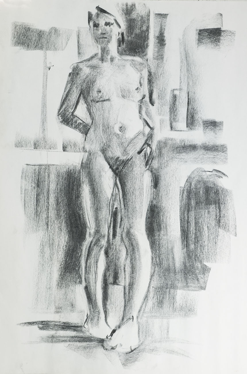
Ran out of time and didn’t quite get a chance to unify the whole thing. I usually adjust the general tones of areas with light strokes of the side of the charcoal
which helps define the form and so forth.
.
Quite pleased with this one. I built the whole thing out of carefully considered strokes trying to be as economical as possible. It meant working a little more
slowly than normal but I like the spare effect.
.
Last one, I love the news print to draw on but it does yellow very fast. The drawings from six months ago are quite a bright yellow. I must find something
similar that takes the charcoal in the same way. Cartridge doesn’t have enough bite and pastel paper has too much. Any suggestions welcome!