You have to be careful using terms like “good”. Because any one who hears a statement like “Good drawing is the key to good painting.” could jump to conclusions. My drawing is fairly straightforward, I draw what I see for the most part roughly where I see it and in the general proportions I see it. So when I make statements like the one above people assume I mean that good drawing is going to look like mine. They also assume I can only draw that way, not that I have chosen to work in that manner. In reality I have made my living from drawing and have been asked to draw in quite a few different styles for many different purposes. The one I use now is just the one I have settled on in my dotage.
The key to good drawing in my opinion is in my last sentence: Purpose. A drawing is good when it is fit for its purpose. That might be planning out a kitchen, or a study of hands for a pieta. Each will require a different approach. Each may require similar set of skills but in differing proportions.
Many people seem to approach drawing like writing a signature. They do it the way they do in their own manner and that is it. This can be fine but it is very limiting. When I was at college there was someone we knew who had what I now call a lovely line. His sense of how a line should move across the page was exquisite. I on the other hand had a rather clumsy and laboured line that struggled to flow. Even when I tried to make the shapes elegant they somehow didn’t really sing. I now realise that was perhaps just as well. My friend could only do that line, he would struggle to do an ugly one. I on the other hand had the ugly one well and truly nailed down and so had plenty of room to make the long journey to a certain degree of improvement!
I would like to report that I set to and systematically worked to improve my line but I didn’t. Like most people I struggled on with the one that came naturally and thought that I was stuck with it. It was not until years later that I noticed after years of drawing stuff for work occasionally an elegant line crept in here and there. Just the process of drawing all day every day had wrought a change.
It is hard to look back and work out how your own progress came about and for what reason. My first love with drawing at about 15 or so was architecture. I loved drawing churches, castles and cathedrals. Buildings are generally on grids so tracking where lines ran, their angle and where they met was something I became pretty good at. Unwittingly I had taught myself the beginnings of accuracy.
Accuracy. Now this is an unfashionable quality. If I was to poll my life drawing group they would mostly I suspect put accuracy very low down on their scale of important things to learn. When I mention it I get the reply, “Oh, I don’t do accuracy!” The majority would I suspect put “expression” at the top of their wish list of attainments. Yet I suspect the thing that is most standing in the way of their expressiveness is their weakness in the very area they dismiss so airily.
So what do I mean by accuracy? People tend to jump to the conclusion that it means getting things in precisely the “right” place. Like a sort of graph or the imitation of the tracing of a photo using direct measurement and observation. However that is not what I understand by accuracy. For a start the artist is a quivering mammal. Swivelling head, eyes and torso. Shuffling and bobbing about from here to there. They might be drawing another mammal who is also shifting about albeit unintentionally. The result of all this is that a line in a certain place one second is in a different place the next.
So accuracy is about getting something in a plausible and possible place, or more often recording several of them in the same area. You then have the option of strengthening or suppressing various lines to best express the changing form. However in order to collect these varied lines you need to be able to measure proportion, distance and angle in order to get your mark within the zone of beleivability. With figure drawing you do not just have placing individual marks, you have to relate each to the whole. Your first mark will always be right, it is the second and following marks and the relation ship between them that is critical. So it is possible to make an acceptable mark and then undermine it with another less well chosen one.
Quality. As well as where a line is there is also “how” it is. This can be how hard or soft it is. How assertive or tentative it is. How it changes along its length. How wide it is, what texture… there are an infinite number of combinations of all of these. Quality of line or mark is an area where I see great deal of confusion and once you think of all the variables then some sympathy is due! This is not helped by muddled teaching. I hear a great deal of, “Draw with a long stick dipped in ink.” or a badger dipped in tomato sauce… As if changing the medium or difficulty of application could somehow magically lead you to an expressive transcendence. The result is often an ugly mess, sometimes a quite nice looking mess, but only rarely has a great deal to do with the subject. This approach is so ingrained and hallowed I no longer really try to argue with it. Different media and means of application are a very powerful set of tools to express information or emotion on paper, but there must be intent, accident is not good enough. It maybe that an accident is the result of attempting to carry out an intention, it may be a happy one or otherwise, but the original intent needs to be there, not random activity hoping to get lucky. Which brings me to:
Intent. Why are you doing the drawing? Will you use the information collected to paint a picture? Use it as an accurate guide to build a kitchen? Is it a practice piece to hone your ability? Is it an experimental thing to find out what might be possible by some different approach? Is it finished work to hang on the wall? I think you can see that each of these might require a different type of drawing. The important thing is that you actually have an intention and are not just setting out randomly as you might on a doodle on the corner of an agenda during a particularly dull meeting. A drawing is as far as I can see always of, or for, or about something. You might well start out with one intention and discover as you work something else to focus on, but that still requires the original intent to be there.
Uncertainty. When we see things we take in a quick general assessment and then scan over in detail with a part of our eye called the fovea. This means we cannot see the whole figure all at once in detail. So if you resolve and make definite every part of the figure then the result will be stiff and lifeless like those laboured drawings from ateliers. In navigating the world we are unsure about quite a bit of what we see and one of the hardest things to learn in drawing is to reflect that uncertainty and its different degrees. If you have difficulty in estimating an edge that say runs around and out of sight then you can leave it vague. It will look better and even more realistic because when looking at the world our eyes and brain are dealing with this sort of thing constantly. This is why we are quite happy with sketches with bits unfinished or just hinted at. As Braque said, “If there is no mystery there is no poetry.”
When drawing you have an important factor on your side. The viewer wants to see something in your scribbles and will do their very best to fish some sense out of the morass of possibly ill considered marks. They will even pat themselves (and you) on the back for extricating some sort of vision from your effort. Don’t be fooled though they are really patting themselves on the back for being perceptive, not you for being a genius. When people look at a really good drawing it zips through their eyes and into their brains and evokes a response before they can do any analysis. If anyone looks at your drawing and then they are plainly taking a moment or two to formulate a response then it probably means your expressive marks have possibly not quite made the grade! Of course drawing is so hard that most of everyone’s effort will fall Ito this category. Every now and again though one will take flight and if you master the skills behind the art then that will happen more frequently.
I should follow that up with some examples of my life drawing OKish and not so OKish so you can see by the duff ones how hard it is to put all the above into practice!

Here is a very unresolved one. I doubt if there is a single thing in the right place. It was done in 1min so I’m not too upset about that. What it does show is that your eye is very very good at picking the human form out of a set of approximate blobs.
Here is a more resolved one done in 30min. You can see here that I leave each mark to stand. I don’t try to erase the ones that have gone astray. Nonetheless I can see I have over explained the closest arm and under explained the turn of the shoulders compared to the hips.
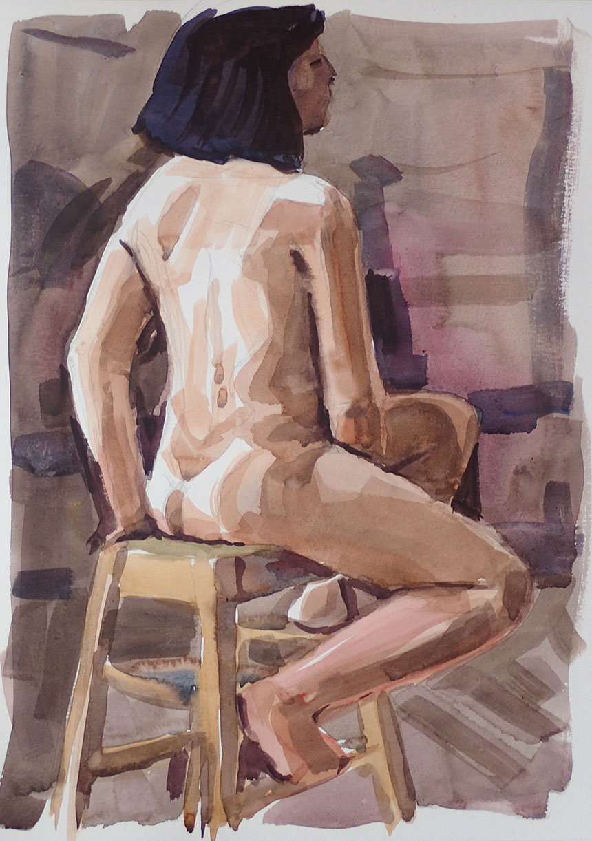
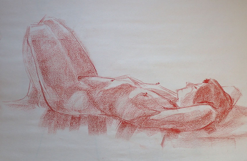
Another 30min done directly after. Here there is less resolving and more uncertainty about edges but somehow the whole thing works better. The previous one was sketched out in pencil but this one was just painted. A painting done very quickly like this is a collection of different observations each observation varies in accuracy and certainty. The success or failure hangs on how these parts relate. You might get two parts that are really well described but not in the right position relative to each other. A worse painted bit in the right place might work better!
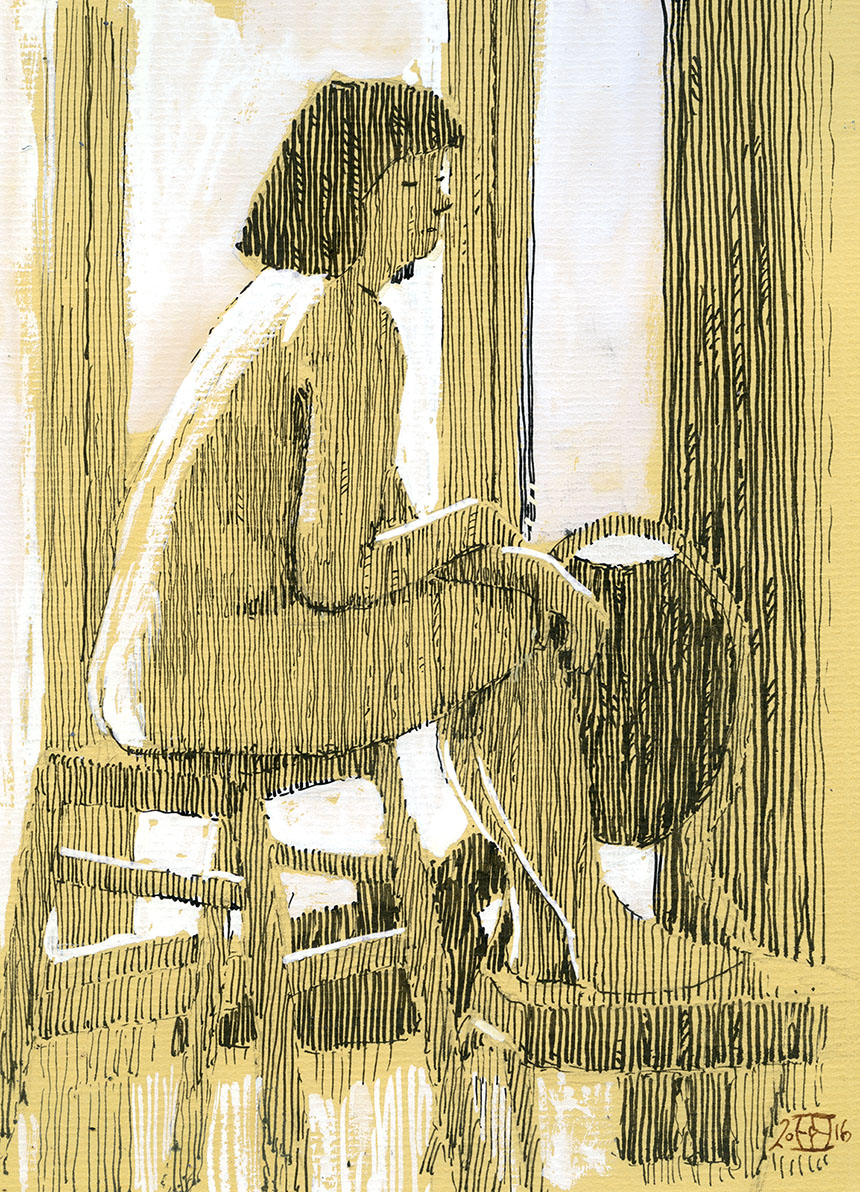
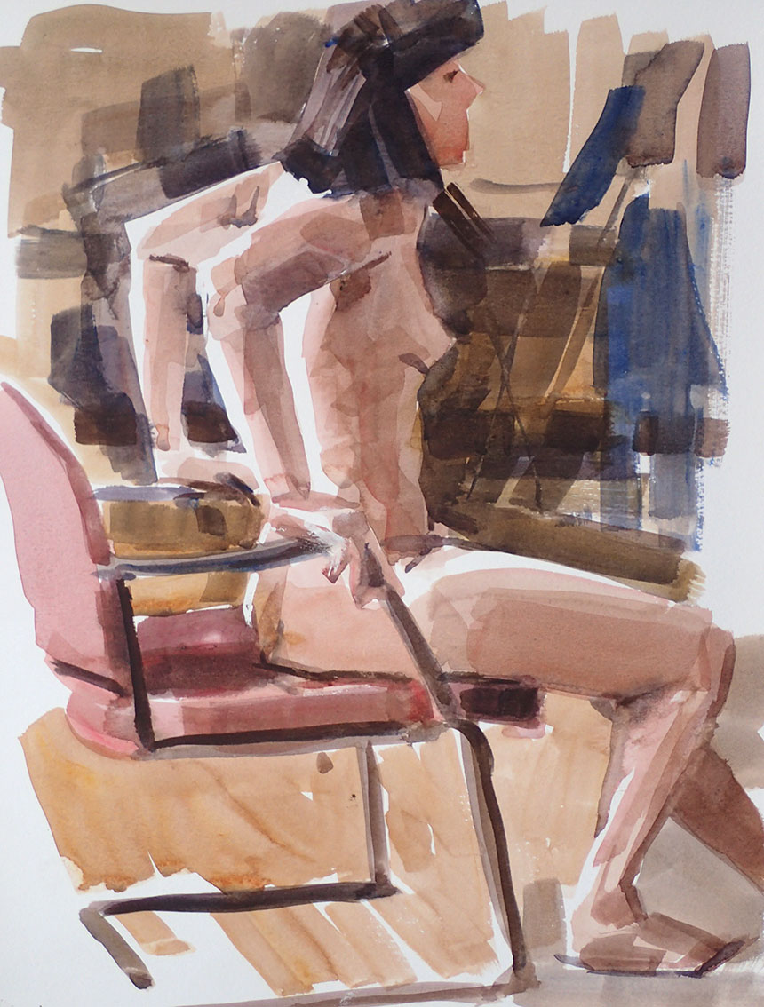
Here is a 30min drawing done with a specific intent. I was describing tone only and leaving the interpreting of volume and edge to the viewer. I intentionally reduced my options to a vertical hatch with only a few erratic fills to prevent it from being too mechanical. I allowed myself a very few lines under forms which were put in only at the last minute. The white adds a further step up in tone that allows the paper itself to play a major role. I notice I did in this case pencil out, as this sort of drawing is not “free” but analytical.

Here is a 3min one using the same mix of media. Here though line is of greater importance and the initial pencil plays more of a part. The white is really there just to push the paper back and the hatch to indicate shadowed areas. There is no attempt to show accurate tone values.

Here is a sort of halfway house done in 15min. The difference to the previous two is that I am using the hatch to describe form and pick out direction and indicating the angle of planes. You cannot show everything in a drawing so you have to apply limits at least initially. When I fail to do this or cannot find anything in a pose that I can see how to explain, then a poor result is more or less certain.

Another day another medium. For me it is important to chop and change my medium. Conte stick is very adaptable allowing you to use both line and flat tonal marks. This only a couple of minutes and you can see where I am testing out lines in different places. Once you have one line down it is easier to see where it should have been and add another.

This was 2min but actually 1min, I spent the first minute wondering how to start! When you draw a line try to make is do as much as possible in a single stroke. Actually think about varying the pressure to make it change over its length. In this sort of time frame there is no possibility of accuracy so this drawing is made up of about 50 marks attempting to represent 50 rapid observations.

20min This was done in tone with only a few lines here and there put in at the end. Many people start with the delineation then “fill in” or shudder… “do shading”. It is so much easier to do the lines last as you have all the tonal shapes already there to guide you. People feel I suppose that you need the lines to plot the form, but there is no reason you cannot place tonal blocks and shapes in roughly the right places.
10mins. Here the tonal blocks are quite clear and the line less insistent. When I am looking for blocks of fairly consistent tone I often, at least for the first key shapes, softly mark out the boundary and placement and then try an fill that area with a single stroke. I see many people going in with marks that are to strong too soon. The feeling is I suppose that pressing hard expresses confidence. That however means you are possibly trying to say something about you and how you would like to be seen to draw, rather than your actual purpose which should surely be to say something about what you have seen in the model!

Here is one where I rather lost the plot! There is at the same time too much and too little information. You can tell I am struggling by the addition of directional lines to existing toning. I was I think distracted by the foreshortening whereas the real story is perhaps about the tone values.

Back to the pen and ink. Note I have been careful to break my lines if I am delineating an edge. If they are too certain as the one on top of the nearest shin is then they undermine the whole. The little touches of white here are very important for such tiny areas of tone they make a great deal of difference to the whole. Always remember any added marks makes a difference to every other mark already there.

This was one from a whole days life drawing which is a real luxury. My plan here was to retain the whites at all cost to describe the light flooding in over the figure. It is always fun when something really strikes you about a pose. The hard bit is sticking to it and not getting distracted and putting too much in. About 20min I would guess.

Here I remember trying to keep it all to single brush strokes. Of course what you sacrifice by this approach is flow the result is more like a mosaic in feel. I had decided from the outset to describe angularity as that was what struck me about that particular pose. To that end I didn’t allow myself curved strokes only lines and blocks. As to whether those decisions were the best ones, who can say?

Another from the same day. It is amazing that as I post these and see the image I immediately remember how I felt when doing them on the day. With this one I thought, “What the hell do I do with this?” Being very unsure I just stopped and looked. Eventually what took my eye was the fact that the bum and hips made an almost perfect circle! A very thin twig to hang a painting on but once I had that imaginary circle placed the rest sort of followed along. It is very hard to do a painting of a pose that looks weird from the outset. Even in a photo this pose would have looked quite abstract. So I was quite pleased to have got something down that made sense.

Here is one where I really struggled. Almost in desperation at the end I added some body colour which unusually staved off complete disaster. Sometimes drawings get to that stage where nothing is particularly wrong but nothing really right either. Still, more like a battlefield than a work of art!
That’s it for life drawing for a while, these life drawing posts are always the least popular which is a little sad as I would always encourage any painter to regularly challenge themselves with attempting the seemingly impossible. As you can see from the images above only very rarely will you get a result that could be chalked up as a success, but the striving will teach you a tremendous amount that will help in any other painting you attempt whether observational or abstract.