Rob Adams a Painter's Blog painter's progress

July 11, 2013

Working from Photos, Working from Life

It is a subject many artists are sensitive about. I am a bit myself, if I am to be honest. There is nothing more disheartening than the supposed compliment: “It’s just like a photo!”. Just as with tracing there is a hint of the cheating about it. Just as with tracing there are pitfalls that come with using photographic source material, but that does not mean you should not use them, only that you need tactics to avoid the difficulties that they can cause. There is I feel a problem with working only from photographs and never from life. Though I am sure there are artists that overcome the hurdle. My main issue would be with those who can work from photos but cannot paint easily when sitting in front of a real subject. I would encourage all such painters to give it a go and paint from a first hand view rather than the processed flat image that a camera produces.

Once again it is not so much about what it does to the canvas but what it does to the artist. Painting from life gives you a set of tools and a perspective that will in my opinion lift your studio work even if it is mostly derived from the photographic image. You may not produce anything but scrap in your work from life, but the experience will enlarge your perspective and make you look at other work with a more educated eye.

For many years when working as an illustrator I was dependent on trawling newspapers, books and magazines for reference photos of whatever it was that I was commissioned to paint. Then there was the laborious process of merging this various information into a coherent image. My working sketches were done on tracing paper and often had many layers as I juggled with different elements. I had a vast Grant Enlarger the size of a fridge that enabled me to blow up and reduce images. All in all a cumbersome process that I grew to dislike. On my days off I would go out and sketch in watercolour and enjoy the blissful simplicity of just painting what was before me. It is only now when I am trying to establish myself as a picture painter that I find myself using photographs to do paintings to please myself. Before this period I had only painted ten or so “Studio” landscapes from photos all my other work was plein air.

Oddly this means I come fairly fresh to the act of painting framable pictures from photos. There is not the problem of disparate elements, I am working from images of scenes I have captured myself. It makes me very aware of the gulf between a photograph and a painting,  also how rare a thing a photo that will make a good picture is. When I was first out and about I snapped anything that took my fancy; but doing a lot of plein air in the last few years have made me much more selective. The other thing is that my “painting antennae” have become much more sensitive. I habitually squint and assess the tonal balance of possible subjects. I now only take a photo if it passes the simple squint test, IE does it simplify into a pleasing pattern. Bit by bit I have become better at selecting bits of the real world that have that certain something.

Once I have my photographs home I find that 90% can be ditched. Once they are away from the subject they have lost their resonance. Just a few then are “possibles.” Every now and again I get a very likely candidate and that will go on to the next stage. I am not that interested in doing paintings that I could easily do directly. What I am looking for is some ephemeral moment that was there just for a few seconds, a trick of the light an arrangement of figures and occasionally a figure that can hold a whole picture together as a focus. These also are rare things. Indeed very few pictures of people look “right”, to be useful they need a certain balance and above all a good silhouette. I trawl through photos looking for them and put them in a separate file. I might stay in one place once I have found a scene I am interested in and photograph passers by for 20 min or so. I just watch the LCD on the camera as the people pass and capture likely moments. Then when I come to make the painting I have plenty of likely subjects to populate the picture!

The main thing I need to decide is what the painting is to be about and hone that focus, it is easy to get distracted during painting and stress areas that need to be quiet and unassuming. For me also mood is very important and I often shift the palette from the original to bring a colour harmony to the picture that the photograph didn’t have. Tone also needs to be adjusted to support the composition. As you can see by this list it is much more straightforward to paint a scene from life! It is in my opinion pretty worthless to just to copy from a photograph. All the photo-realists, hyper-realists and droves of amateurs doing photographic pencil renderings leave me completely cold. To copy a photo takes far less skill than interpreting one. The former is mostly time and patience the latter is skill and experience.

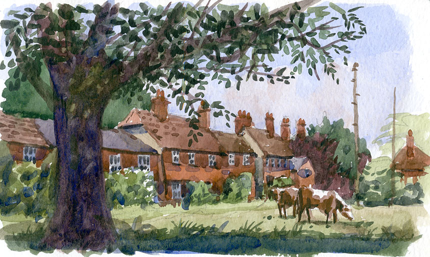
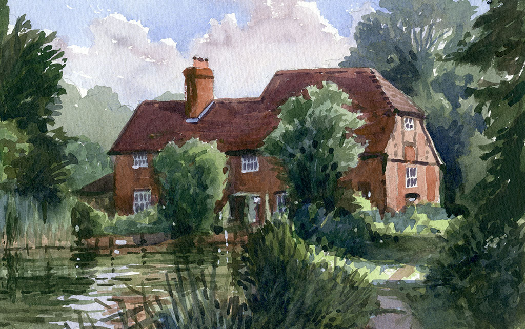
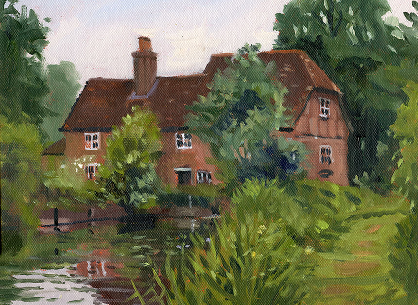
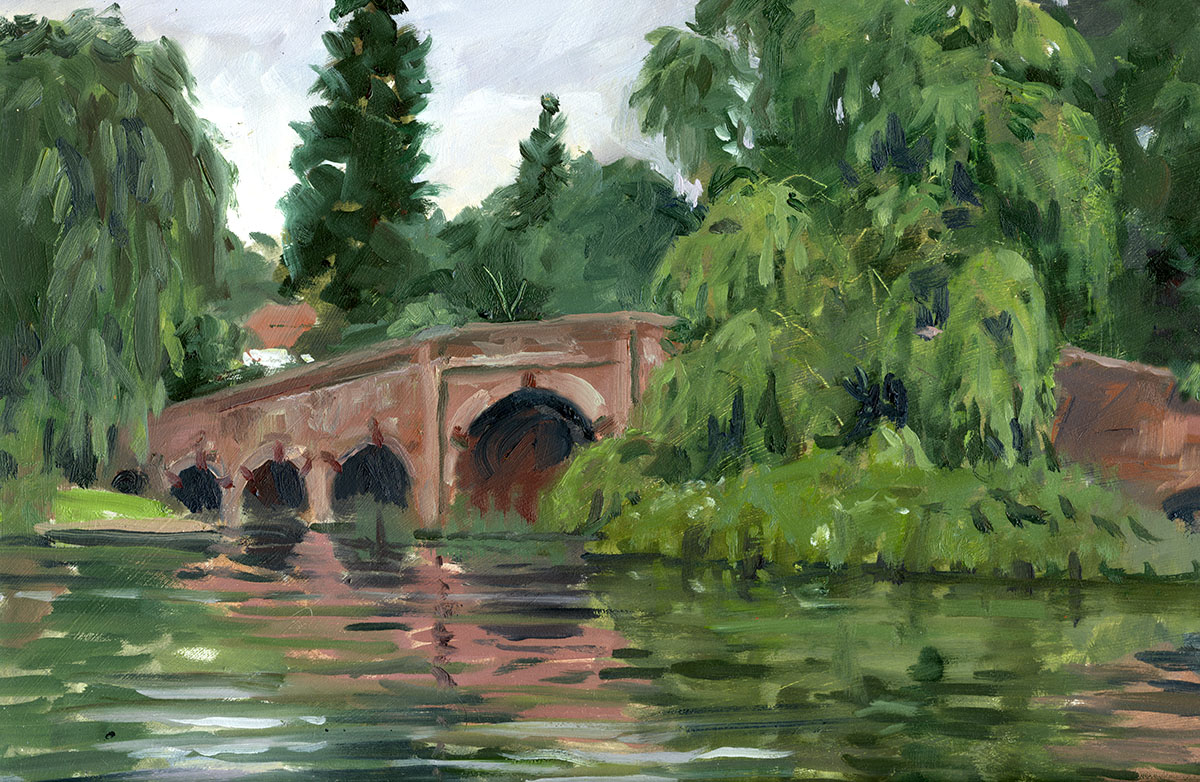
A bit of everything in this post. Studio, plein air and life drawing. Alas most of my time has been taken up doing commercial work so less pictures than usual.

.

Soho, London, bicycle, sun, oil painting

A sketch for a bigger painting, somewhere in Soho I think. This is 14in by 10 in but the final one will be 36in across. I am trying to do preparatory paintings

like this for all future studio works as it should make painting the final one that much easier.

.

Cyclists, bicycle, Royal Exchange, London, City, oil painting

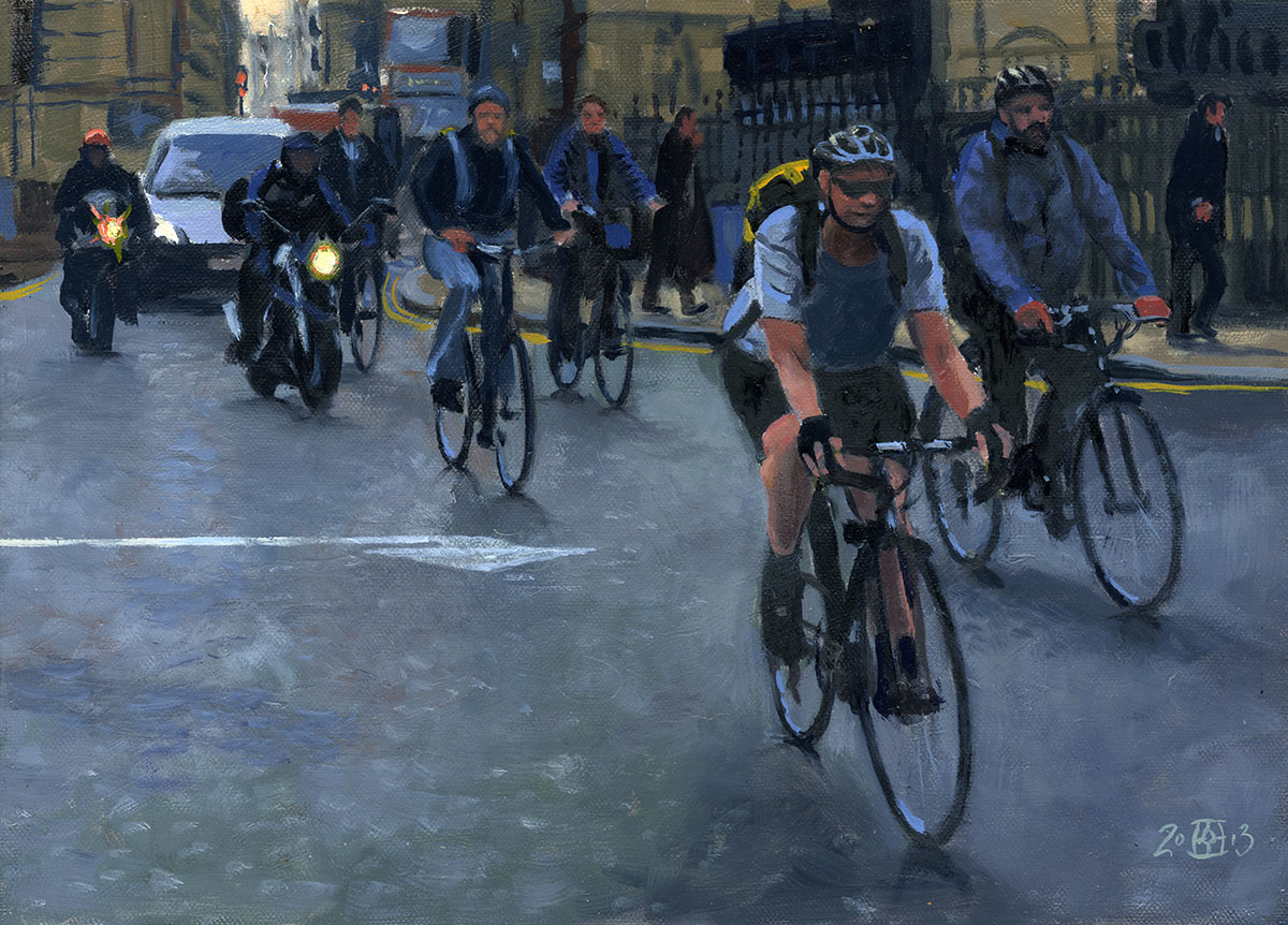
Another 14in by 10 in sketch. I stood for quite a while photographing the morning rush at the Royal Exchange in the heart of the City. When the lights

changed it was like the beginning of the Tour de France with the cyclists and motorcycles away first! I have a couple of others of these planned. I rather

like the odd mood because it is very early and the people all quiet and self absorbed despite pedalling fiercely. Below the snap that I took it from.

.

Royal Exchange

I have shown the whole frame here so you can see what I have done. The little group of commuters was perfect so I left them alone, just playing with the

tones to enhance the mood.

.

London Memorial Gardens, Embankment, plein air, oil painting

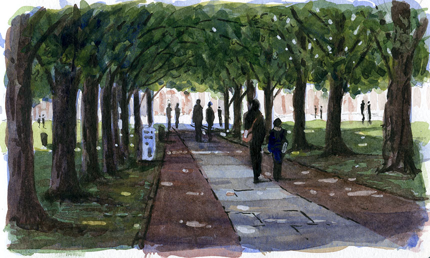
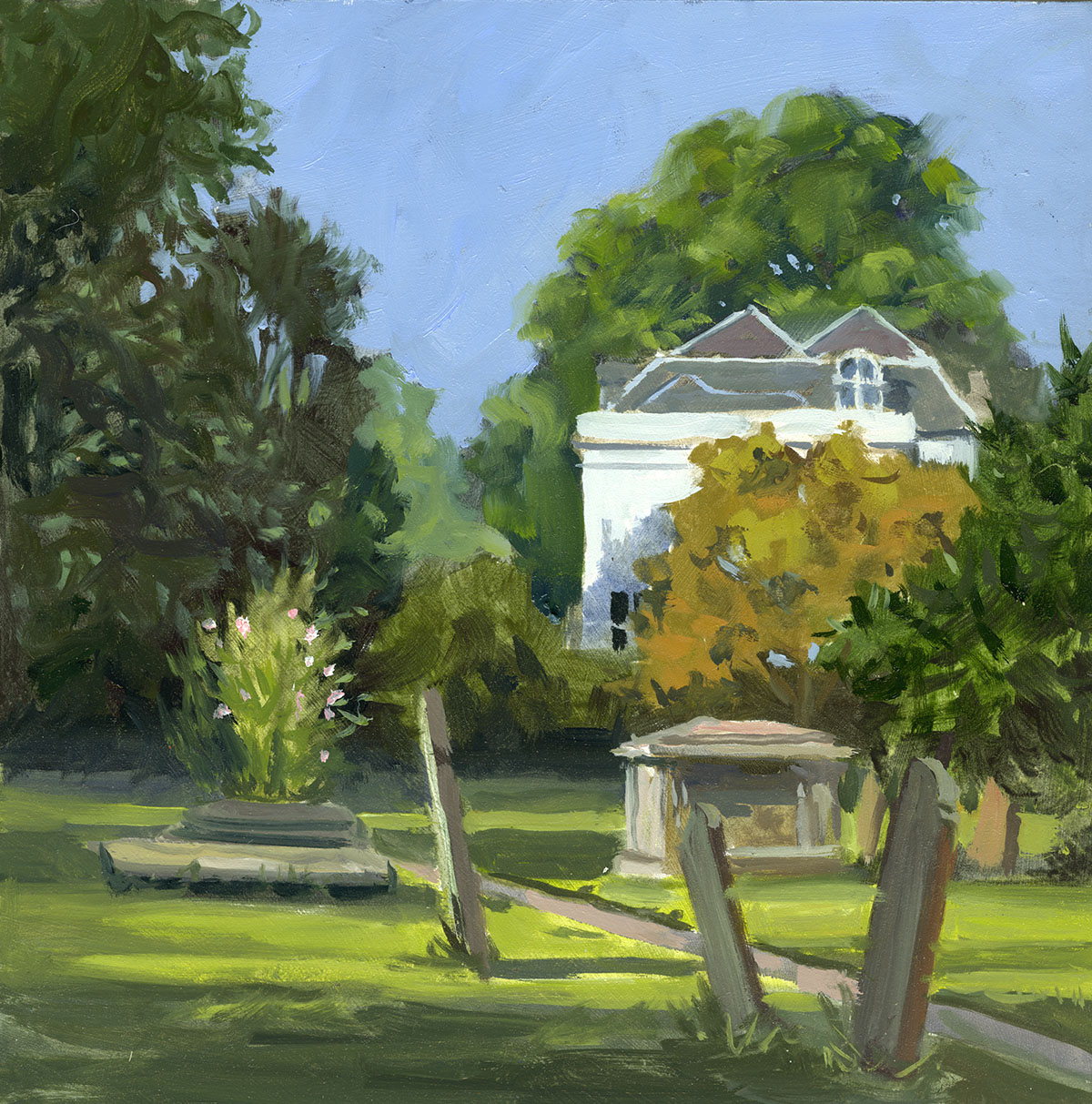
Back to the plein air. A wonderful day out with the Wapping Group. This is London Memorial Gardens near Charing Cross. I got there early so this is

7.30 am. A constant stream of people on their way to work, no tourists at this hour. About 10in by 10in. I have since muted the green on the left a little.

.

Whitehall Gardens, Big Ben, London, Park, Plein air, oil painting

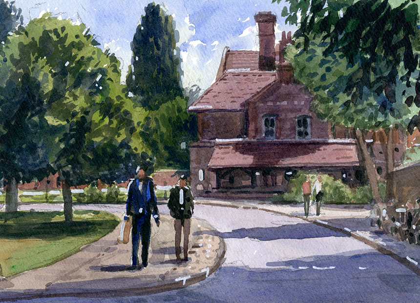
After a coffee I moved straight on as the light was super. This is Whitehall Gardens , and unusual view of Big Ben. 14in by 10in.

.

Victoria Tower Gardens, Houses of Parliament, plein air, oil painting

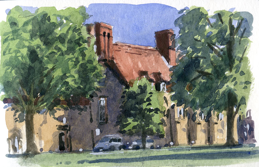
Took on a monster here! Something not quite right but good practice. This is Victoria Tower gardens. 14in by 10in.

.

Thames, watercolour, plein air

I couldn’t resist a quick watercolour sketch, even though I am meant to be practicing the oils.  I was chased up the steps by the tide as I did this. 7in by 5in.

.

Nude, Life drawing, figure, charcoal

Only one session of life drawing left after this. This is done in brown charcoal.

.

Nude, life drawing, charcoal

More experimenting, I am starting to get the hang of this charcoal stuff a little more.

.

Life drawing, nude, charcoal

I am getting the balance of broad fill and detail better, which makes the drawing hang together more. 20min.

.

Life drawing, nude, charcoal

Another one I am pleased with, using the side of the sticks more works well on the rough newsprint. 30min.

.

That’s it I’m off doing the Pintar Rapido….. so wish me luck!

July 1, 2013

The Fear of Green

Degas said, “What a horrible thing yellow is!” the same could be said by many people about green. Many artists avoid it altogether and go for a sort of khaki. If you look at the works of Edward Wesson and others you would think the colour didn’t exist! I am not saying that the pictures don’t look nice but when I go out into the English landscape I can’t help noticing a fair bit of stuff around that has a distinctly greenish tinge! Now I think of it the stuff is practically wall to wall…
So why are greens so very hard to paint? The fashion for just making all the trees beige like a sort of permanent dull autumn really comes from old pictures where the greens have faded to a dull olive. Many pigments they had, especially in watercolour, were fugitive so these pictures would have been considerably greener originally. There is a strangeness however in the way we see greens. For some reason we see green in nature as a bright colour. Maybe in ages past when we lived on dry savannahs being able to spot a bit of distant green was a lifesaving ability. For whatever reason our perception of green is not quite as for other colours.
I was recently painting in the graveyard at Cookham with fellow artist painting friends and I was attempting to explain this in my usual irritating manner. I could see by the glazed eyes that words were not really getting through so I went out into the scene and collected a mixed sample of the leaves we could see and laid them on the palette. The effect is quite startling everybody should try it! The real greens looked dull and brown next to the paint greens which looked positively lurid in comparison.
So how is an artist to deal with this conundrum? Well when painting en plein air a good lesson is collect those leaves put them on your palette and just try and mix the same colour! What you find is that natural greens are far more red than we expect. Our Emerald Green, Viridian etc are much too vibrant for a naturalistic representation of landscape. The trouble being that our eyes pump up the greens in any case so if you do that in your painted colours then the greens get so bright that they poke holes in the back of your retinas!
The temptation then is to do as I described above and mute them completely. Which is what many very good painters do. I find however that for me this looses a vital part of the subject. The result of very muted greens is very tasteful and harmonious and I might often take just that approach in a studio painting, but for plein air where I am trying to evoke what I see before me in paint in doesn’t really appeal. I will go into a few mixing tactics, but I’ll add them to some pictures below as that will be clearer.

.

Essex, East End Paglesham, plein air, oil painting

This is East End Paglesham in Essex, very much of a backwater with decaying barges and all sorts of marine clutter beloved of the Wapping Group. I set

myself the task of getting two 20in by 12in panels painted to a finish. This meant I had to choose a not too complex subject and just focus on the basics.

Here we see a lot of warmed greens in action. If placed next to a straight from the tube colour any of these would look perhaps more brown than green.

Here I am using Terra Rosa for the warm addition which is a bit strong.

.

East End Paglesham, Essex, Barge, OIl painting, Plein air

I just shifted a bit for the second one and the sun had come out. As you see the sun has increased the contrasts but I have barely increased the strength

of the green hues. I am using Alizarin to warm the viridian hues and adding some cobalt blue also.

.

Dorset, waterclour

A wee 7in by 5in sketch of a very verdant bit of Dorset.

.

Stour, Dorset, River, Watercolour.

Here we are on the Stour in Dorset. Plenty of greens to battle with here! I am taking exactly the same tactic and warming the greens but mostly using

Quinacridone Red as the mixer. I find it a very good red for the purpose in watercolour as it has very little yellow in it. 1/2 sheet, Arches Rough.

.

Leigh on Sea, watercolour, plein air, fishing boat, mud

A brief respite from the greens. I blocked this in at Leigh on Sea but had to stop as the light was too brief. I finished it off from a snap I took as the sun

cut through the stormy clouds. 1/4 Sheet, Arches Rough.

.

Dorset, church, oil painting

This is a tiny church by the river Tarrant in Dorset. I very much wanted an extremely quiet mood. It was a temptation to add a dash of bright across the

centre but I decided not. 12in by 10in.

.

Grey Well, Surrey, watercolour

This is another small one of Greywell, I think in Surrey, but might be in Berkshire.

.

Grey Well Mill, watercolour, plein air

Here is the Mill at Greywell, I did three of this. Almost too pretty but fun to paint. In my A4 sketch book but the last I will do in it as the paper is horrid

and deadens any wash.

.

Grey Well, mill, oil painting, plein air

Here’s the second one a 10in by 8in. I was really working hard trying to keep the brightness of the greens in check.

.

Grey Mill, Surrey, painting, plein air

Here it is in the rain! This was done in 15 min at the very end of the day. A better composition I think than the other two. 10in by 7in. Oils

.

Wargrave, thames, Berkshire, oil painting, plein air

This is the Thames at Wargrave on a dull threatening day. Only about half an hour . As you can see in the overcast light the greens become browner still.

It is a very fine line between just right and moving the season on to Autumn! 10in by 7in Oils.

.

Sonning, Thames, river, plein air

This is the bridge at Sonning, the board was wider than is shown here but looks better cropped. I have painted this bridge a few times with poor results.

This one is the best so far, but a very difficult subject in flat light. I did in enjoy doing the willow though… maybe a bit too much as it has taken over the

picture! 10in by 14in oils.

.

Winchester, watercolour

I got the scale of the figures completely wrong here, hey are about double the size they should be! This is Winchester the day was beautiful and sunny.

Something ran up my trouser leg and bit me ‘orribly, yet another of the perils of plein air. 7in by 5in. Watercolour.

.

Winchester, watercolour

Another duff one, again I ruined it with badly drawn people. It really is worth taking time to sketch the figures in a separate pad and then add them once

resolved. However here I just dived in and paid the price! Winchester again A4 watercolour.

.

Winchester, wtercolour

A really tiny one of Winchester in my mini Moleskin. Only 5in across but great for catching the light in a quick 10 min.

.

Winchester, watercolour

Another teeny one a bit to the right of the other, the left hand tree is in both.

.

Winchester, watercolour

More of Winchester. The light was getting gorgeous as the day wore on. This was a delight to paint. 7in by 5in. Watercolour.

.

Winchester, oil painting

At the very end of the day we set about doing a street scene as the light faded. A real rush done in no more than 30min. Oils 10i by 10in.

.

Here is a feast of green, still dropping in red but a little less here to try and catch the brilliance of the day. Not far from Eton. 7in by 5in.

.

Cookham, graveyard, plein air, oil painting

Here I painted in the under colours on a white board using glaze medium and no white.It was rather like doing a watercolour. A very nice way to lay in

and has the added advantage that the first layer is dry in minutes. This is the scene that prompted the green lecture! The bright greens were washed in

just with pure colour and were far brighter than they are here, which just goes to show what a scary colour green is. 10in by 10in oils.

My thanks to Steven and Anne Alexander who invited me to stay and paint in beautiful Surrey and surrounding regions!

« Newer PostsOlder Posts »

Powered by WordPress

error: Content is protected !!