Later in the year I am to give a talk at a local art club. The previous year I had done Pen and Ink and as I left they asked me back and wondered if I could do one on Plein Air painting the same time next year. A few weeks ago at an exhibition of the group’s work I picked up a leaflet that listed the upcoming talks and found I was scheduled in to do a talk on Pen and Wash… A slight panic then set in after I went through my old, ancient and then antediluvian drawings. It seemed that bar about 6 illustrations pen and wash had not been a big feature of my 40 year career!
Now I have always admired pen and wash as a medium and 2 of the examples of my massive output in the media were recent where I had washed colour out of the ink in a pen sketch. However I could not help but conclude that I was about 20 slides shy of the full Powerpoint. No matter I thought with a sudden gush of over-confidence I’ll do some it will be fun! After all how hard could it be?
Very… perhaps another to get the point over…VERY!
Its beguiling simplicity might be the problem. You first think, “Oh I’ll just do a pen drawing and colour it in.” Then you think, ‘How much pen?”… “How much wash?… Pen first, wash second?… Wash first, pen second?… Waterproof ink?…Non-waterproof ink or a mix of the two?” The only way forward was to look at what others had done and then experiment.
The first technical problem I hit was paper. I tried hot pressed Arches Satin, in one of those glued pads. Not too bad but the surface is quite soft. Wash took well though, so a contender. Next a Moleskin sketch pad that bore the legend on the outside “for fountain pen”. Bah! The ink went straight through it feathered like mad and was so soft the nib tore up the surface. It rejected watercolour, but sort of interestingly in a way you might exploit.
By now obsession was setting in. On my shelves sit many pads, sketch books, glued pads… and loose sheets. They go back to about 1910 with old sheets of paper my granny had. Indeed I could probably fill a medium sized “Paper Through the Ages.” museum. Cue a pseudo scientific face off!
Below are the scanned tests, I won’t go through them individually if you click there is a hi res image so you can form you own opinion. I scribbled with 3 inks one a waterproof and non waterproof mix which I tested with a wash of clean water. Of the other two inks one is a dilute 6:1 water to ink and the other a Red with the Zebra “G” nib which is sharper and more prone to catch but lovely to draw with.

The results are mixed. Some failed the G nib test so I excluded them. The worst by far was the Moleskin, worse even than bargain laser paper which is a technical feat. Surprisingly good was 100year old white wove writing paper. Bristol board old and new was very good with the pen but not so hot with the watercolour. Frisk CS10 from the 70’s is the best as far as feel with the pen but the very high china clay content means the waterproof inks don’t dry waterproof. Arches was poor with the pen catching very badly with the G nib, good with the watercolour though. Of the commercial papers the cheapo Fabriano 100 sheet drawing and watercolour pad 250gm was easily the best with the colour washing out very cleanly and hard enough to withstand the G nib. My favourite Ruscombe mill paper also passed with flying colours the paper is so hard sized that the G nib worked despite the texture of the surface. I used the blue but they make other colours. Below is the vile Moleskin…

Below is the back or verso of the sheet… as you might guess it also destroyed the page behind… the dark spots are where the pen went through entirely… not the sharp G nib by the way, a soft tipped fountain pen nib.
Next my efforts old and new…

This drawing has appeared before a few years ago. It is Honfleur, I did a few pen and washes on this trip, I can see I kept the penwork quite open so it would accept the wash. Also some pen is under the wash and some on top which adds variation.

This was done after I got back. It is Leadenhall Market in London. Again I am dividing up the work between the wash and the line. I think I resorted to wash here because of the complex subject and lack of time.
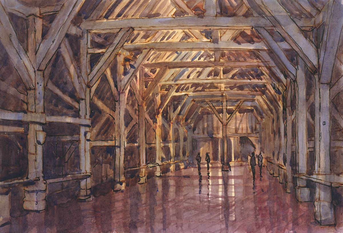
France again, Normandy this time. I well remember doing this I penciled carefully then started with the watercolour and it slowly lost definition and structure. So I added pen to accent the main beams and trusses. I remember being quite chuffed at the result.

I am starting to see a trend here… I resort to pen and wash when in dire need! This is Portobello and another watercolour that went off the tracks. It was wet and I remember having to finish in a rush as the downpour started. The result I have to say is probably better than if I had carried on with just the paint.

Honfleur again. Not a rescue job this time thank heaven. This pen and wash at its simplest with the colour being washed out of the line. As it is on the blue Ruscombe paper the added highlight gives a relatively full toned image. Here the pen is definitely to the fore.
Well that is the past efforts in the medium. Having looked at these I decided to do more to explore the variations possible. The first thing was wash first or pen?

This is Hanford house, here the drawing is done in pencil then most of the wash work laid in. The pen was then added. The advantage of this is that the pen work is only added where it is needed so I stuck to line with little or no hatching. A few bits of final watercolour darkening caused the red in the ink to run which I quite like.

Another one, this time of Wells, where the wash went in first. Less successful here I feel. I have overdone the pen work and the line is too heavy on the cathedral itself. I am unconvinced by the wash first method now. I think some pen at least has to go in before.

This recent drawing of Kimmeridge is much more like what I am aiming for. This is pen then wash with most of the colour coming from the line itself. A few areas of pen were restated but I like the balance of hatching and washes. I left far wider gaps between lines than I would normally do so as to leave paper for the wash to show. A very quick way of working about 40min whereas a pen drawing could take double that.

This is Milton Abbas in Dorset. I wanted to try using waterproof ink and go for a subtler atmospheric feel. I used hatching much in the way I would when producing a tonal pen drawing with no outlines but just dropped the line density to accept the wash.

This is from an afternoon expedition to sketch on Hambledon Hill. I am frustrated that these fantastic vistas I have on my doorstep are so difficult to make into paintings. You get the same with photos, when you take a picture of an amazing panorama from one of those official viewpoints. Somehow the results always disappoint, even though the scene itself when you were there was amazing. On this one I did the watercolouring first. I laid in all the shadows in a blue which decided the structure and lighting. Next I defined and toned with a pen loaded with grey ink. That was then overlaid with some more watercolour to unify the masses, finally I strengthened with a black pen.

I set about this one with a bit more urgency as the weather was looking threatening. Hambledon Hill has lots of intimate subjects as well as the huge vistas. Once again I did the watercolour part first then, as it looked as if I was in for a soaking, I set about it with a reed pen dipping directly into the ink bottle. The rain shower conveniently deluged Shroton in the valley to my left rather than me so I then added black fountain pen to define the masses and lighting better. A4 Pen and Wash.

I then headed home only to spot another squall approaching from the other side. As I was definitely not going to make it home or even off the hill before it broke I set about trying to bash in an impression of the rain arriving. I used the reed pen again but with my red brown ink this time . I drew very broadly the basic forms and started to lay in tone with watercolour before the ink was dry so as to wash lots of colour out of the ink. I then skipped back and forth between wash and pen until it felt done. To my astonishment it once again rained in the valley rather than the hill so I even got home dry! A4 pen and wash.
I have enjoyed my foray into pen and wash so far and I think it has done me good. I was getting a little too comfortable with the pen and white highlight on the blue paper so it is good to ring the changes.


