Rob Adams a Painter's Blog painter's progress

March 31, 2017

The Internet

Filed under: Dorset,Painting,Portraits,Uncategorized,Watercolour — Tags: , , , , , , , , — Rob Adams @ 12:20 pm

I was reading an interesting article about the ghettoisation that is beginning occur on the web. The gist was that the search engines try to find out what you like and what you believe in and then attempts to build a profile and feed you stuff that you would approve of. A little research showed it to be a strange truth. The internet is dividing us up not drawing us together. So eco folk tend to get only stories about how the planet is being ruined and fracking was invented by the devil, presumably deniers get stories about how the global warming theories are wrong and its all a plot by pinko liberal commies. You can try it yourself search for something balmy like chemtrails and it will bring up lots of views for and against. If you just click and browse the sites of the chemtrail believers then next time you search the loonies will come higher up. So people tend to exist in a tailor-made bubble of information they broadly tend to agree with rather than the full spread of wildly conflicting information.

How does this relate to art? Well as a representational painter with certain preferences I will tend to be served images and information I approve of. Also my posted images in turn will be served to those who have previously shown similar tastes. I do not mean this will be a 100% correlation, just that things that fit my profile will predominate. This process is just getting started and will I assume become more effective and widespread as time goes by. So people interested in conceptual art will get the sort of fodder that they approve of and plein air artists the same. There is nothing specifically wrong about this but it does tend to split human interests into separate bubbles that have very little cross talk. Just look at any discussion forum that propounds any view political, religious or otherwise, they consist almost entirely of people who are true believers plus a few trolls, who only serve to emphasise what horrid people those who disagree with the local majority view are.

The other thing that effects me as a painter is how much time the internet eats. You see a picture you like by a painter you hadn’t heard of and off you go searching for more and then maybe finding other related artists that painted in the same place or time. Next thing you know an afternoon has gone. It seems to speak directly to our hunter gatherer instincts. I now have folders and folders full of paintings that may, but probably won’t in some unforeseen future, inspire me to paint a better picture myself. I suppose to look at them all has been educational, but possibly not as much as painting something myself. It is much the same with kit, I recently wasted almost a whole day looking at etching presses. Reading about which types  were good and which were less so. Looking at sites that sell them (and other tempting goodies of course) or scanning ebay for a bargain second hand one.

Of course the evil web has some bonuses. As I put my paintings on line they are seen by more people than they ever would have in a previous era. It is however possibly easier to go unnoticed due to the sheer quantity of others doing the same thing. This blog is apparently the 13th most popular painting blog, the 6th if we are just counting artists. This is the result of the 10,000 or so hits I get a month. Is this all due to my nifty painting skills? Well my ego would like to think so, but a little bit of me knows that much better painters than I languish in the lower regions of popularity. So my web skills have to take some credit, I know how to make life easy for the search engines and how to attract their attention in the areas I wish them to notice.

I have written before about the feeling I get that I am only painting and drawing to supply images to be seen on screen. I don’t think that is necessarily bad though. After all musicians are mostly heard second hand in a recording, their actual live performances are in many cases never heard at all as they don’t play any gigs. Painters often forget that they are a part of the entertainment industry, not as many would like to think part of the spiritual and philosophical world. We do sensory gratification not ideas.

So hopefully here are some images that gratify more than just me in the painting of them!

dave, portrait, oil painting, zorn palette

Another portrait of Dave, who featured in my last post. Here I was trying out the Zorn palette of Yellow Ochre, Ivory Black, Cadmium Red and White. I actually liked it a lot. Reducing you choices actually smooths the process, it certainly makes remixing colours a lot easier. I intended to only do an hour on this but went about 20 min over. Annoyingly this is a better likeness than the ones where I tried harder to get his character to show through. 10in by 12in oils.


rob adams, self portrait, oil painting

A self portrait here, I was interested in doing a different angle again with a restricted palette. This one is Naples Yellow, Cad red, Ultramarine Blue, Burnt Umber and Tit White. I intended to just do an hour, but as the light outside was flat and unchanging I only stopped when the sun came out and realised I had been painting away for two hours! Interesting what adding a blue does. 12in by 10in oils.


Wareham, Dorset, river, boats, plein air, oil painting

This is the view down the river Frome at Wareham. It was very flat and hazy which rather suited this view. Only 30 odd min as it didn’t really grab me as subject. 10in by 6in oils.


Wareham, Dorset, church, plein air, oil painting

Wareham again, this time seen from across the marshes I actually worked on another painting (below) at the same time with the boards one above the other on the easel. The second scene was straight ahead of me and this one at right angles. 10in by 5in oils.


Wareham, oil painting, plein air, dorset

Here’s the view 90 degrees to the left. Amazing how the change to looking more into the light transforms the mood. You would hardly think the were painted simultaneously if they were hung side by side. Such lovely tones and subtle hues at this time of year. Soon I will have to wrestle with the spring greens. 10i by 5in oils.


Satans square, Sutton Waldron, oil painting, Dorset, landscape

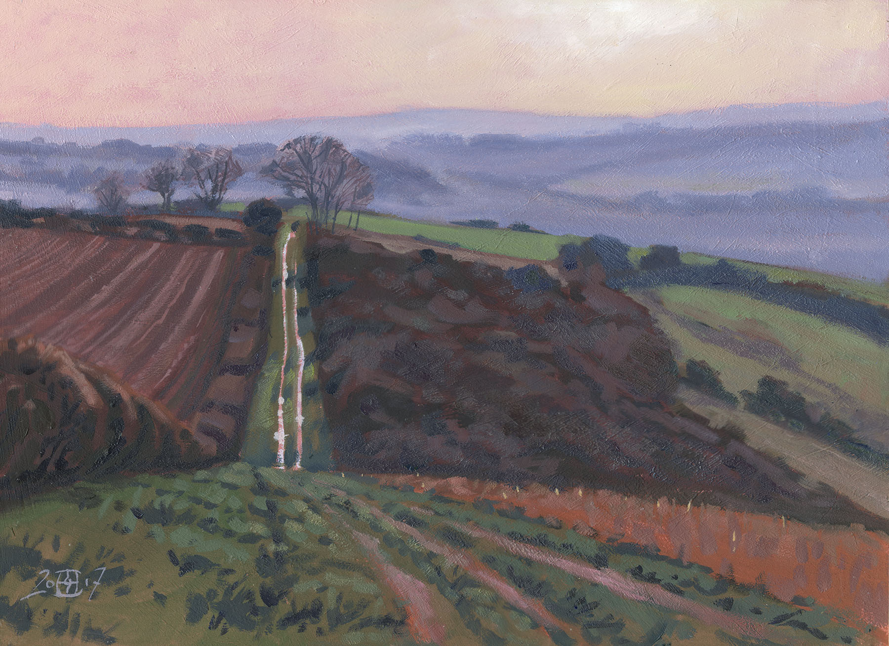
A studio painting this time. I did this from a watercolour (below) which is something I should do more often. This is the a path that runs to the dramatically named Satan’s Square and is near Sutton Waldron. I drew it out from a photo then painted it from the watercolour, hard to resist checking the photo as you work initially, but as you get into it the temptation fades! 16in by 12in oils.


Sutton Waldron, Dorset, watercolour, painting, plein air

Here is the watercolour for comparison. This is mostly plein air I just did a few bits of darkening and delineating later. I love this view and will be back to paint it in some different lights. 10in by 7in Watercolour.


Fontmell Down, watercolour, painting plein air

This is Fontmell Down and painted just before the previous one. I wish I had taken a much wider view, which is a lesson to me to put a few differently proportioned bits of paper in the car. Went a bit grubby as I got the tone in the foreground wrong twice and had to overlay more washes than I like to normally. I was working under some strain though as the wind was attempting to blow everything up to Glasgow! Watercolour 10in by 7in.

That’s it, some London stuff next. I have sadly resigned from the Wapping Group as I now live too far away to get to their painting days on a regular basis. I owe them a great deal of gratitude for prompting me to go out and paint the river and the city which has really transformed the way I paint. Hopefully I will still join them occasionally on an ad hoc basis so it will not mean the end of cityscapes!

October 18, 2016

Authenticity

For an artist it is a bit strange to consider what might happen to a painting after it leaves your care. I suspect long dead artists would be bemused by what is said and paid for their works. Each painting carries with it a story, a bit of history true or false, that makes up its provenance. As well as this there is the story attached to the artist, which may or may not represent the true course of his or her’s life. The difficulty arises of course in that all this information is not actually attached to the physical work of art and the connection can get lost, forgotten or forged.

Where I wonder is the visual value of the work itself? Indeed it seems the actual appearance of a painting is of a lesser importance than the story attached to it. So you might have a terrible Monet (and there are plenty of pretty average ones) with a cast iron paper trail from artist to current owner and it would be worth far less that a brilliant painting by a lesser known soul. The fact that the Monet hung on the wall would disappoint and the other painting reward on every viewing seems irrelevant.

Paintings can fall from grace, a Van Dyke can be demoted to “School of” and the painting will be dismissed with a brief glance rather than admired. Again this is seemingly unconnected to the actual painting. What about the people who admired the picture before its fall from grace, was their aesthetic appreciation wasted… wrong or misguided? You can imagine after research a label being changed by a gallery assistant. A visitor who had been particularly taken with the painting could return ten minutes later for another look and might find that the “Van Dykeness” of the painting had evaporated!

I can only conclude that the only guide is your eyes and the less back story you know the better. All those words only obscure and don’t illuminate the actual object. They do change how we view a painting, but sometimes not in a useful way. It might be better indeed if galleries didn’t label pictures at all. The could just have numbers and if you liked a picture you could call up its known history.

With some painters the mystique of the artist completely overwhelms the artwork. Andy Warhol’s work I find after first impressions dreary and dull, like a quite good one liner repeated ad nauseam, but his story of decadence and nihilism and his place in his milieu is fascinating. Except for a very brief period Van Gogh’s was I feel pretty uninspiring, but his life story and monumental self pity make a great story.

Really we should be looking for those brief moments when an artist by some confluence of skill, inspiration and luck creates a masterpiece. This might be only once in a career, or indeed for most of us, never. It is fine to give extra admiration to artists like Rembrandt who scaled the heights more than others, but not alright to inappropriately elevate works where he fell short. It is unfair to the artist also. Imagine if you came back from the dead to find everyone admiring some complete stinker you painted!

I have got a bit behind with posting, I was vaguely thinking of splitting post into oils watercolour or prints but I think it is best to stick to a vaguely linear storyline. I vary between thinking I do too many different media to thinking I must try some others. Printing is occupying my thoughts a fair bit as it is new territory and now I have got started I begin to see all sorts of exciting possibilities. So I’l start with that.


Hammersmith Bridge, London, linocut, print

So this is a reduction print of Hammersmith Bridge. For those who are not linocutters the reduction method is where all the colours are produced with the same block. The palest colour is cut first and all the edition printed, then more of the block is cut away for the next colour. So all the colours overlay. I based this on a plein air rather than the photo of the same scene as the painting already had a simplified tonal scheme and I did not want it to be too precise. Next I am going to attempt a double reduction print where two plates are cut away to produce one image.

It is holiday time and this year I went to Newport, the one in Pembrokeshire  Wales. As the holiday was a social one only a few scribbles got done, but I came back with plenty of photos and ideas.

White Sands, pembrokeshire, wales, watercolour, plein air

This is literally 20 min splashing away at Whitesands near St Davids. The wind was so brisk that holding everything was a nightmare. I had to hold down my palette with my food to prevent it taking to the air! It is also quite tricky when the wind is constantly fluttering your paper. The odd thing is though that when painting outside all this somehow adds to the result. The impossibility of being precise made me just go for the brilliant autumn light, which was really all the scene needed. 7in by 5in watercolour.


Hambledon Hill, dorset, hill fort, watercolour, painting

On my return I was determined to get up Hambledon Hill which is directly behind my house. I do not go and sketch up there enough. I decided the very end of the day would be best and very lovely it was. It is one of those scenes though that looks astounding to the eye but is very hard to translate into a painting. I settled on this as it had great flowing structure. 7in by 5in Watercolour.


Hambledon Hill, Dorset, blackmoor vale, watercolour, painting

I started this more in hope than expectation. I couldn’t get into a position where the hill would figure in the composition so I just did a square on job attempting to catch the light. I must start to mark down compositions on the hill I like and return to them, rather than trying to find a new picture each time. 7in by 5in Watercolour.


Old Harry, Dorset, cliffs, sea, oil painting

At last a chance to sit down and get some studio pictures done. I wanted to do an oil of Old Harry based on the drawing I had already done. Remembering how nice it was how the cliffs came out of the blue on the paper in the pen drawing I wanted to do the same here but more dramatically. After drawing out I spent a lot of time mixing the tone base of the sea. It had to be dark enough to allow the cliffs to be brilliantly lit, but light enough to take dark reflections. Once I had decided on a tone I swept it right across using a 2in brush and then wiped out the bits where the stacks were to go. I don’t take this approach often enough really. It does have some disadvantages though as it can look too slick and pat, which is why I usual paint round rather than through. But in this case it worked well. 16in by 10in oils.


Newport Bay, Pembrokeshire, wales, oil painting

Here is the first of the Welsh ones. This is the view over Newport Bay which I have painted many times before. It is one of those views I always find something new in. It would be great to do a whole series through the seasons. I love the tone of the greens this time of year they become a warm olive colour which was a great contrast to the hillside where the grasses and bracken were already in there autumn colours. 16in by 10in oils.


Newport sands, beach, wales, pembrokeshire, oil painting

This is Newport sands, wonderfully reflective as the sea had only just withdrawn. Scanning makes it rather more contrasty than it really is, it is very hard to catch subtleties in images to go on line. 12in by 12in Oils.


Porthclais Harbour, wales, pembrokeshire, oil painting

I started this picture of Porthclais Harbour near St Davids thinking the distance and wedge of sky was the main thing. The painting soon informed me I was wrong and the water was the main event!  16in by 10in oils.

That is all for Wales, I find it very hard to paint from reference after the memory of the real place fades.


Hambledon Hill, dorset, hill fort, oil painting

Hambledon Hill again. This was done the next evening after the earlier watercolour. I had intended to do the same view but decided to try to catch the milky light. Not helped by the fact I forgot my brush roll so only had a 1in sable that was in the bottom of my bag left over from life drawing. Still the soft brush was oddly appropriate and allowed me to drag in the subtler tones in broad strokes. 16in by 10in Oils.


Hambledon Hill, Dorset, oil painting, hill fort

Last one, a studio oil based on my earlier watercolour. I had to put away the watercolour in the end as this became quite a different painting. I decided in the end what I wanted to do was contrast the texture on the foreground right with the hazy smoothness of the distance. Quite pleased with the result as it emphasises the wonderful flow that the hill has. 24in by 12in Oils.


« Newer PostsOlder Posts »

Powered by WordPress

error: Content is protected !!