Rob Adams a Painter's Blog painter's progress

November 29, 2015

The Importance of Drawing

Filed under: Drawing,Life Drawing,Uncategorized,Watercolour — Tags: , , , , — Rob Adams @ 3:21 pm

Looking back over past posts I have not really dealt with drawing. Not techniques more the whys and wherefores. In some ways I write this blog to sort out my own opinions on things. All too often once your words look back at you from the screen you think, “I’m not sure that I really agree with myself!” Indeed reading back there are more than a few of my own posts I would not entirely agree with. Not that I will change them I would not like to develop a reputation for intellectual consistency.

So, drawing, what exactly do I think about it? Firstly I suppose I need to ask: What is drawing? Making a mark on a surface that can be interpreted by others is a fairly catch all definition. This implies an actual transfer via the medium of information from one individual to another. So abstract squiggles and random mark making are out I’m afraid. They may be beautiful but not in my view drawing. So writing is drawing. Not the information contained in the writing but the information that identifies the character. So the individual letters are drawn. Plans and schematics are drawings. Indeed we perhaps need to arrange the types of drawing by what cargo of information they carry.

So a drawing can carry abstract information as letter shapes do. Symbols perform a similar function.

A drawing can carry information about a three dimensional object such as building or a planet as in a map.

Drawings can plan a two dimensional image such as a painting or a poster.

Here of course as with all art subjects we run into boggy ground. Drawing is both a noun and a verb. Is a finished painting a drawing? Certainly drawing is used in its creation. Is that drawing somehow different to the drawing that was used in the same painting’s planning? Are cave paintings drawings? Can finished things be drawings or only the preparatory work?

Perhaps we might say that only preparatory drawings should be given the noun a “drawing”. Does that mean my pen and inks aren’t drawings? There is no doubt in my mind that the meaning for the noun is muddy indeed and I haven’t even mentioned sketches!

So perhaps the verb will be more helpful. Making a mark to convey information. Once that mark is made then it is something else. A painting, a drawing, letter, a plan, all these things can be made by the act. This line of reasoning makes me also feel that the act means making marks that can in general be consistently interpreted by others. So if you were to show the item to a panel of viewers you would get a fair degree of congruency in the replies.

From there it is a small step to grade our results in the success of transferring information with our mark making. So if we draw a girl and our panel only replies that it is a girl we plainly haven’t been as capable as if the panel reports that it was a sad young girl. If we got the report back that it was a sad young girl by using a thousand marks it plainly would not be as efficient as if we got the same result by only using ten. Of course some moods might be conveyed by using many marks in groups, what we call shading or hatching, but perhaps they might be considered as a composite rather than individual marks.

Now to move on to what might make a good drawing. I tentatively might say brevity of means. I think this is best illustrated by the sort of atelier drawing where every nuance of shade is noted down. They are an attempt to convey the full visual experience of seeing a body in tone. However they fail miserably to convey any information about moving or breathing let alone sadness or joy. Despite the claims of the Atelier system of roots back to the past none of the so called old masters draw in such a constipated manner. The 18th 19th century history painters are the ones really to blame.

So how do we learn to draw as best we may? The secret, if such there is, is in training the brain to do most of the work in the background. If we are struggling in placing things, controlling our medium etc then the battle is lost before it has begun. We might manage a creditable drawing of a building or still life, but drawing a person would be a step past that and likely not a success. Many artists I talk to scorn accuracy, to my mind this just means they cannot be bothered with the sometimes frustrating business of learning. The art establishment’s unfounded ideas that such skills are irrelevant don’t help either.

Whether you like it or not the first steps will be tight and more of a graph than a drawing. That is necessary however to train the brain to do all the measuring unconsciously. Inexperienced artists see an experienced draughts person knocking in a figure whilst seeming not to measure, but that is because they have spent so many years measuring that the process has become internalised. The same is true for the assessment of tone etc.

This is why life drawing is so important. It is the mixture of long and short poses that forces us to quickly select the key elements in a pose. At first it seems impossible, but as we practice more and more of the process is taken over by the unconscious. Once that happens then the whole thing becomes more manageable. So the message is predictable I’m afraid, practice, practice, practice!

So a few life drawings to show that I’ve got a long way to go too. However good you get, a good life session will cut you down to size and deflate the ego!

life drawing

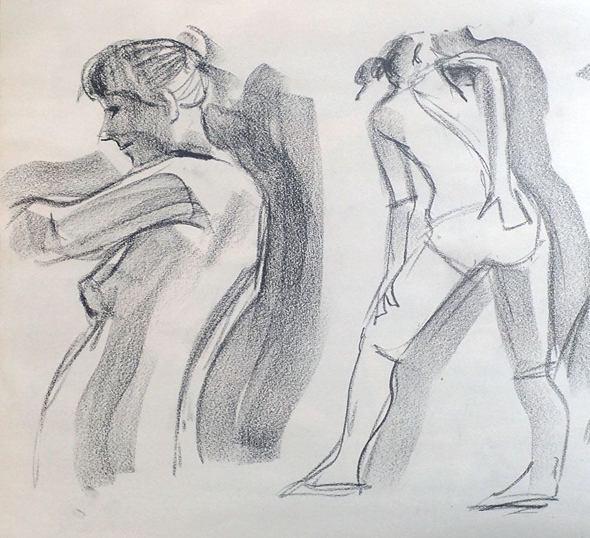
15min here I drew deliberately slowly, trying not to make a mark unless I had a purpose for it. It is very easy with life drawing to scribble and hope. Get into the rhythm of, observe, assess, make a mark, observe assess, make a mark etc. You so often see people only occasionally lifting their heads to observe. You should spend longer observing than drawing.

life drawing

In comparison a 3 minute effort. Again I will be pausing between each mark or set of marks.


life drawing

More very quick ones. I am using 2 ingredients only here. The flat of the conte for tonal blocks and the end for delineation. You can vary these ingredients but easier to just stick to one or two. Just doing the while thing in tonal blocks without line is a very good exercise.

life drawing

Here all the tonal areas were drawn first and the few key lines added only in the last minute or two of the 15min we had.


life drawing

I regularly change medium. Here I have just used tonal areas with no line at all. 20min

life drawing

Here is a 5 min one done the same way. There are only two layers, a dilute first shape then a darker to reinforce and correct.

life drawing

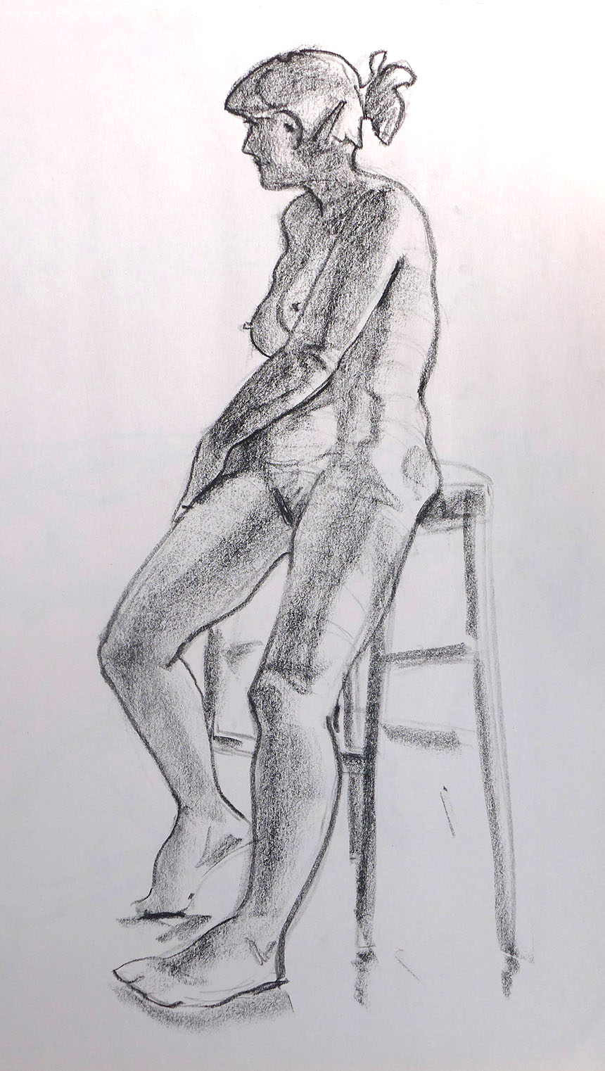
A whole half hour!! I try to start a longer pose in exactly the same way as a shorter one. I then lay repeated layers of observations down on top of each other, each one getting more defined. Whenever you stop a drawing it should look finished. To help with that it is a good idea to do sets of poses where the model just changes pose randomly. Whenever the model changed however long or short the pose was your drawing should look finished.

life drawing

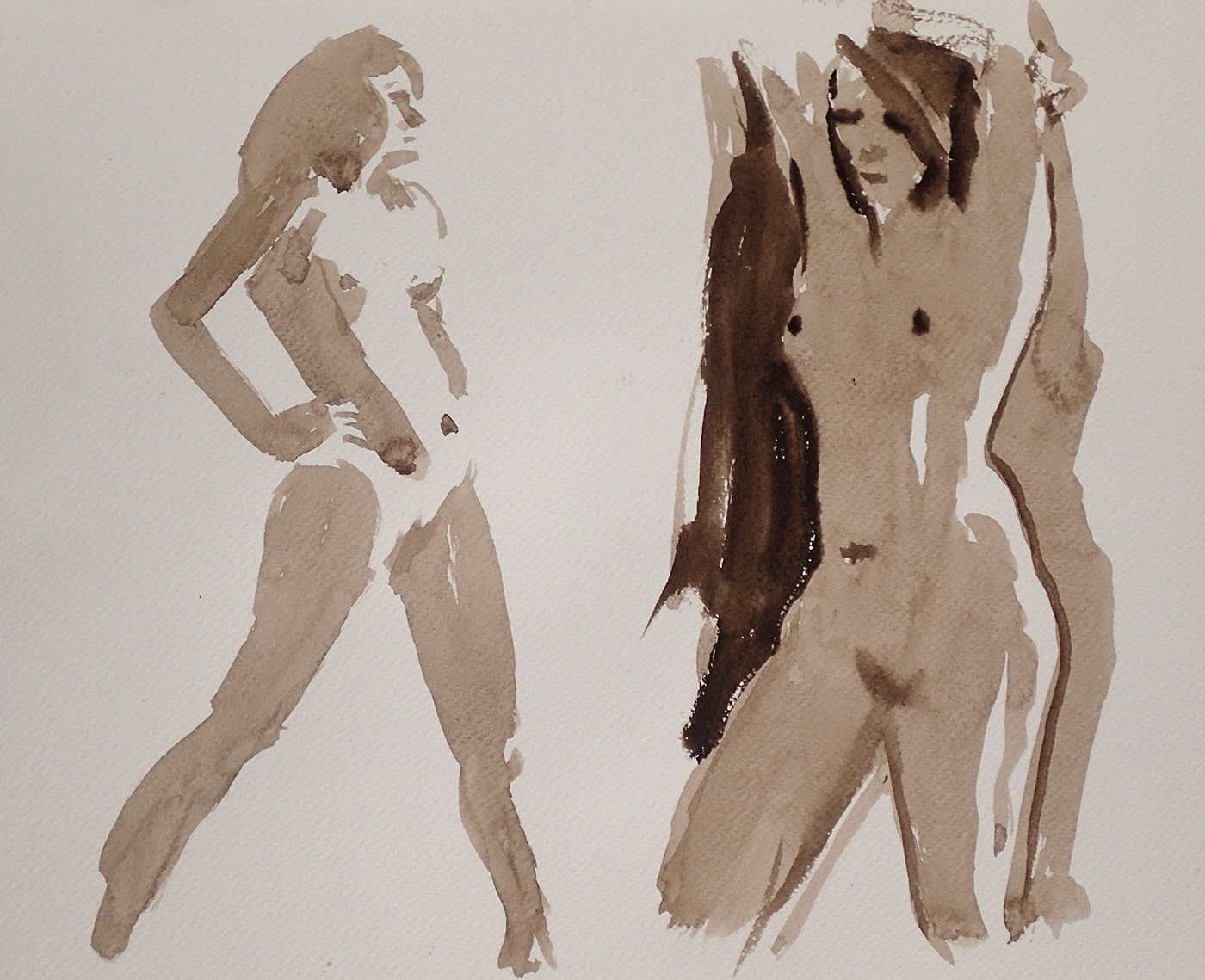
Two 2 minute ones. At first it will seem impossible to get anything worthwhile down in that sort of time. Mostly it won’t be of course and many efforts will go in the bin. What you lose in accuracy you gain in vivacity. These brief splashes say more in my opinion about a living breathing being than any atelier drawing laboured over for a week.

life drawing

Here is one that is perhaps unfinished, I was miles away and not following how the 15 min was passing. I literally jumped when the timer went off! Now though it is incomplete it is not to my mind unfinished.

life drawing

Here is one where I stopped before the end of the pose. It would have been a better drawing if I had stopped earlier! You should always keep an eye out for when a drawing is complete, that will only rarely be when time is called. I often spend the last 5 min doing a lot of looking and very little mark making.

life drawing

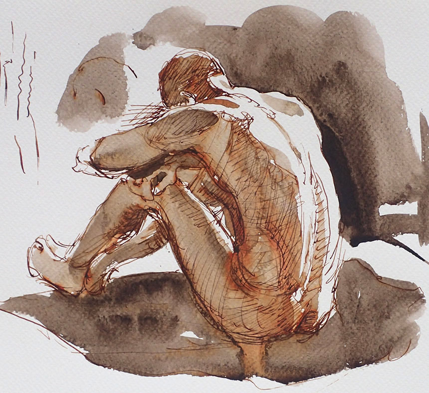
Last one, have started to introduce pen. Adding an ingredient like an extra medium always raises new problems.

July 3, 2015

A Trip to France Part 1 The Drawings

No philosophy or art babble in this post! I have been on my yearly trip with the Wapping Group and friends to France. Despite having all my paints with me I spent a lot of time drawing. Not an intentional decision, but often a sketch book is just the thing for recording your impressions. Sadly original drawings are a disregarded commodity, if you do a print series from them each print could fetch more than the original would! I have always loved drawings myself, they seem to illuminate what an artist is about more than anything else. With an artist like Rembrandt it is like seeing his mind at work. I think maybe it is that the artist didn’t really think anyone else was going to see the work so the result is unselfconscious. Certainly Rembrandt’s landscape sketches inspired me from when I first saw some in the 70’s at the British Museum. I now know that he was perhaps the first to head out with his reed pen and bottle of ink and sit in a field and draw what he could see. Not as a reference it would seem as they don’t appear as backgrounds to etchings, but just for fun.

The other thing about drawing is that it is minimal. With pen you have a line and groups of lines and bare paper and that is it. Whatever you are seeing before you has to be defined in a combination of those three things. This in itself is a good way to learn how to break down a scene into equivalents… there is no real possibility of producing a full rendering so each part must be pared down as much as possible and areas that are similar combined. Although this is limiting it is also in an odd way liberating. It is a halfway house between representation and calligraphy.

In the drawings on this trip I used a toned paper so I have the luxury of one more element, heightening with white. This is for the simple reason that to do a tonal pen drawing on white requires many more layers of hatching all of which take time. With the soft blue of the paper supplying a mid tone far fewer lines are required. The paper I have used is Turner Blue from Ruscombe Paper Mill this is a reproduction of the kind of paper Turner might have used in his small sketchbooks. The paper is slightly textured, about 130lb in weight and very strongly sized. The texture means the pen grips the paper a little supplying resistance whilst still being fine enough to draw rapidly without catching. The heavy sizing means the white highlights sit on the surface and stay very bright and clean.

The pens and the inks I use are made by Noodlers. The drawings below are mostly made with and Ahab fountain pen which has a huge ink capacity which is very much needed as drawing uses ink like no tomorrow. These pens have flexible nibs which allow far more variety of mark than a standard pen would. Indeed they are very similar in feel to Gillott steel drawing nibs, but without the dipping and blotting! The ink is Noodlers too, in this case Bulletproof Brown which is both lightfast and waterproof.

The white used for heightening is Dr Martins Bleedproof White. Most of us have used Chinese White or White Gouache and found they look great when you apply them but then dull to a dirty grey. Bleedproof white however does not do this and stays just as white as when you apply it. It also makes a dilute wash that looks very clean when dry, which adds interesting possibilities.

So that’s all you need, I’ll make a list: One pen, pencil, putty rubber, small sable brush, Bleedproof White, sketch pad, small vial of water to moisten the white. All this goes in my waist coat pockets leaving only my lightweight Walkstool to sling over my shoulder. I use the Walkstool because it is very light has a big comfortable seat and is quite high at 26in. In townscapes especially sitting on a low stool gives you a poodle’s eye view of the world and backache to boot!

Before we get to France however we start the day before in Dorset…


Stourpane, Dorset, pen and ink, drawing

This is Stourpane on a really hot day. I loved the contrast between the ideal Dorset village and the spider’s web of wires. Although is seems odd the picture would be dull if they were not there. They act as a compositional glue holding the picture together. All these drawings are about 9in by 7in.


St malo, france, pen and ink, drawing

France! We arrived in St Malo after an overnight ferry. It was overcast and the light was very diffuse. These are the sort of conditions that make painting quite difficult. Strangely pen drawing is perfect for this sort of light. Areas are defined by texture as much as tone. I use vertical hatching for the walls always inserting a few breaks to indicate that the walls are old and not perfectly smooth. Roofs are horizontal if square on to us but angled if receding. The trick is that once you have assigned a style of hatch to a type of surface keep it consistent. Also you want the line to do as much work as possible, so direction should relate to the direction of the surface if it has one. Objects that have no particular direction like a tree for example can be rendered with a dotted and scribbled texture. Cars are more tricky but I just indicate a few major surfaces and leave the rest to the imagination. The pavement and streets are slightly different in that I want to show recession or depth. So the ground surfaces are done in a mixture of perspective parallel hatching and almost horizontal to indicate both flatness and direction.


Le Croisic, France, pen and ink, drawing

This is Le Croisic where we were based for the first week. Here I have quite a lot of different surfaces to indicate. I have used more or less the same mix as before. The exceptions are the harbour walls and the water. The walls are very rough and vary a lot in tone so the hatching is varied too. I am not drawing every course of stones just giving hints that there may be courses and variation in angle of hatch to show variation. Added weight is got by including a few crosshatched areas. You have to be careful not to loose all the paper as a very solid black would be wrong here, though they do have their uses. The water cannot be dealt with like a road surface because it is reflective. The almost horizontal hatching indicates both the surface and the occasional disruption from a wave. Then the reflections are indicated by variations of density. A very few wandering vertical lines complete the feeling that the surface is water.

I add the whites at the very end and use as little as possible. Here the sky needed lightening in areas both to indicate cloud but also to add the feeling of the buildings being predominately backlit. The boats are picked out too and also the key division of the road surface which is directly sunlit.


Le Croisic, France, pen and ink, drawing, sketch

Later I did the same scene again but at a different time of day. I have used all the same methods but here reduced the highlights to represent the softer lighting. All the tones are arranged to allow the plain paper to represent sky. The building below the church is left plain also to supply a focus and a route down for the eye to the harbour and the boats.


Le Croisic, France, pen and ink, drawing, sketching


Le Croisic again. I had just mad a complete dog’s dinner of an oil of this scene so I sat down to sketch it quickly to recover some of my pride. I only had 20 minutes so I vignetted it strongly. In the oil I made the mistake of loosing track of the fact that the lit gable end was the focus around which the rest of the picture had to be built. Instead I got over involved in the boats and the cafes. A vignette shows just how brutally you can reduce the periphery and still have a perfectly comprehensible scene.


St Nazaire, France, harbour, pen and ink, drawing, sketch

This is the port of St Nazaire. I drew it from the top of one of the huge U-boat pens. At first seems impossible to get down such a complex scene. What I looked for here was what tied the scene together. After looking a while I decided that the water was the key area to get right. That and the sky are the only quiet areas so needed to be dealt with in as minimal a fashion as possible. Nonetheless the water still had to carry the information of depth flatness and reflectivity. A great deal to express with very few marks! There is a lot of leeway in the busy harbour detail, a wrong line or bit of erratic drawing will not stand out. The water was a different matter and I added lines very carefully and stopped as soon as I had enough hints to tell the story.


Le Croisic, salt pan, pen and ink, drawing

A very simple sketch. I was wondering how to make anything of the pools where they store the live oysters when a tractor headed out do drop a load of tasty molluscs in the drink. I only had time to scribble in a horizon line and sketch the tractor before they left. Once they had gone I had to decide what to do with the rest. The paper needed to stand for the still pools so I lightened the whole sky with a thin white wash. Then I could apply full strength white for the rest of clouds. I kept the distant shore mostly vertical to make it a little abstract. Only broken by a couple of highlights and the tower of the church in Guerande on the other side of the salt marshes.


Guerande, pen and ink, drawing, sketch, France

This is the same church in Guerande close to. What interested me here was the clutter of the cafes and the vans clearing away the market. I was sitting in a wildly exposed spot and getting baked by the sun. There was no getting around the fact that to get to the bit I was interested in a whole church needed to be drawn. People often find such subjects forbidding to draw and are put off by the morass of detail. If I had put in all the detail it would have taken forever and looked awful so I had to decide which bit to build it around. I chose the window and positioned it very carefully by holding my paper up to the scene and marking key levels off on the side of the paper. You can measure with your pencil, but I find it far more accurate and simple to hold the paper up to the actual scene. I don’t mark many things just the main architectural breaks and the tops and bottoms of things. Once the window was positioned I worked out from there. I stopped adding content as soon as each part of the building looked complete. In this way it appears that there is a lot of detail, but most of it is actually in the viewers mind’s eye. Once the hard labour of the church was done I got to draw the bit I was really interested in! I indicated the ground with as little as possible. Just giving hints of paving and perspective. No more is needed as the imagination supplies the rest. This minimal approach also helps with the impression of the sun light beating down and bouncing back up again. By the time I had done all the pen work and erased the pencil the light was fully on the church facade. I had to remember back to how I first saw it where only a few parts of the tower were catching the sun.


Honfleur, pen and ink, France, drawing, sketch

This is Honfleur where we spent a couple of days on our way home. I was a little lost as to what to draw when this very large lady and her tall thin companion came down the street. I suddenly saw how they might be set against the shadowed facades. This was a very busy spot so I had to just scribble in whichever bits I could see between the crowds of tourists. Most of the work here is in the facades with lots of hatching. It is important to vary the vertical hatch to add interest. With pen you can make the same tone with close thin lines or more widely spaced thick ones. This results in the same overall tone but gives quite a different quality. With the windows you must be very careful not to over detail and also not to make each identical. Again the white was kept to a minimum.


Honfleur, France, pen and ink, sketch, drawing

After a hard day bashing away with the oils it was a relief to dump my kit and go out with just my pens. Much of the character of Honfleur is in the fashionable and not so fashionable folk parading to and fro. I liked the simple backdrop of the building with the empty sky beside it so I just sat and scribbled people that took my fancy as they passed. You can’t get a whole figure in with one bite so most of these are composites of several passers by. Once I decided that the population was high enough I set to work inking over the pencil. The man still has to have his stick added as I forgot to put it in!


Honfleur, france, pen and ink, drawing

Last one from Honfleur. I wanted to do something out of the tourist zone and this took my eye. The avenue of trees was tricky as I would have liked to have left the sunlit areas plain but for the rest of the image they had to be darker. I decided to use an abstract hatch, which was a bad move I now feel, a simple vertical one would have been cleaner.


wappers, sketch drawing, faces

Lastly some of my fellow artists on the coach. When people are moving about I start several faces at once and fill in bits as they return to the pose I want. You soon find that everyone has typical positions they return to so bit by bit you can get a drawing done. Just the pencil was enough here. I was tempted to add ink but the softness of the pencil seemed just right. The few highlights just give enough of a lift to hint at volume and light.

That’s it, Oils and Watercolours next…

« Newer PostsOlder Posts »

Powered by WordPress

error: Content is protected !!