Rob Adams a Painter's Blog painter's progress

April 19, 2011

The Problem With Columns

Filed under: Drawing,How to do,Perspective — Tags: , — Rob Adams @ 12:42 pm

This is the second of an occasional series of posts about perspective. Many people believe that geometrical perspective, single point, two point and three point are actually an accurate representation of what we see. Cameras see in this way after all so it must be right mustn’t it? Well actually no, it is a compromise as are all methods of making our very three dimensional world fit conveniently on a flat surface. Here I am going to deal with a very old problem that perplexed Renaissance artists as they struggled to find solutions to the problems of illusory painting. Vredeman de Vries and other artists published learned books full of geometrical construction but certain problems seemed impossible to resolve. Columns were a big feature of architecture of the time and they often occurred in long arcades, perfect fodder for the perspective method you would think. However it turns out that round columns are exactly the type of object that causes the neat geometrical rules to fall apart. What I intend to do here is highlight the issues as clearly as I can and then point the way to the various solutions that later artists arrived at. It is a sad fact that all modern books on perspective that I have seen do not even seem to realise that the issues are there, let alone giving any practical advice to overcome them.


.

perspective, drawing, tutorial

Here we have a plan view of a simple set up consisting of a row of columns, a cube and a green triangle which marks where our viewer is standing. Below is what we get if we construct using one point perspective what that viewer would see.

.

perspective, drawing, tutorial

Well here we are, at first glance it seems sort of OK. Look more closely though and we have some problems. In our plan we can clearly see that all the columns are the same size. That does not however seem to be the case in our perspective projection. The column on the far left is a lot wider than the one straight in front of us. Worse when we look at the plan the far left column it is actually further away from us and should appear smaller not larger. Something is plainly awry. Looking more closely still the base of the far left column seems oddly tilted. This is exactly the result a camera would give on a fairly wide angle lens giving a viewing angle of about 70 degrees. So when you wonder why you looked so fat in that group photo this is the cause and in future you would be best to make sure you are in the middle  of the line! Lets take another case.

.

perspective, drawing, tutorialHere is the plan of a simple set up, as before the green triangle marks our viewpoint. We often get rows of things receding from us, looking down a romanesque church nave would be an example. Below is how traditional two point perspective renders the scene.

.
perspective, drawing, art, turorial

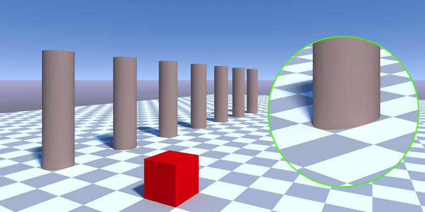
Once again at a quick glance it all seems well but a closer one shows that the left column again shows problems. These are clearer still when we isolate that part as in the green circle. There is a weird tilt which is plainly not how we would really see the base of such a column. If you then tried to add capitols and bases you would find it very hard to get them believable. Below is an example from an old perspective manual by Jan Vredeman de Vries printed in 1599.

.

perspective, drawing, tutorial

As you can see the problem is still present, and remains over the centuries up to the present day. This is because there is no right way to solve this problem. Whatever we do it will still be wrong. The trick is to be pragmatic and make the unavoidable departures from how we really see the world as subtle as possible. Lets look at the dilemma more closely.

.
perspective, elipse, drawing, tutorial

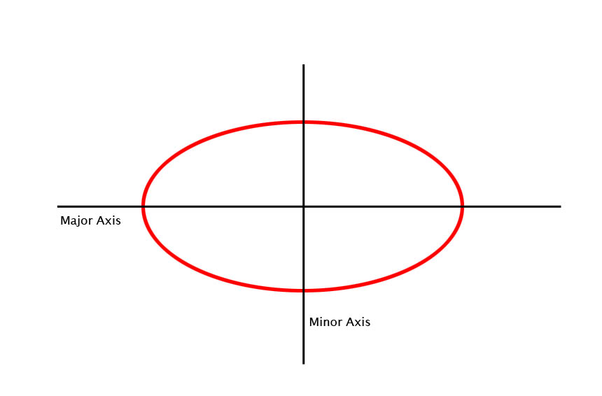
Here is our old enemy the ellipse, I won’t go into how to construct one as there are many methods freely available on the web if you are interested. In the real visual world as seen by our eyes when, for example, we look at a coffee mug on the table or any circle that is parallel to the ground, the major axis of the resulting ellipse is always parallel with the horizon line. Try it, put a plate on your table and slide it around. But cameras and 2 point perspective construction produce ellipses that have the major axis tilted. It is this that produces the odd distortions. All we can do is come up with a compromise, a sleight of hand adjustment that is not perfect but improves the believability of our drawing.

.

ellipse, perspective, drawing, tutorial

Here is a circle constructed in two point perspective. The problem is that cross and the ellipse with it need to be parallel to the horizon line to look right to the eye. Yet at the same time it needs to fit into the blue box.

.
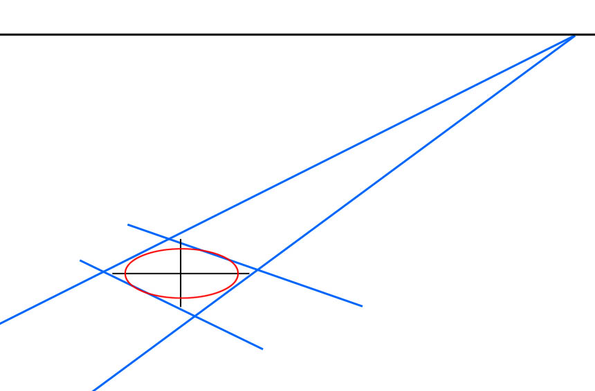
ellipse, perspective, circle, drawing

Here is our compromise. The winners are the ellipse which is now properly aligned to the horizon and also a wee bit narrower to correct for the first problem of “fattening”. The losers are the chequer board floor on to which the column no longer perfectly fits. But as you see the mis fit is quite small and far less worrying to the eye in my opinion. Below is the correction applied.

.perspective, circles, drawing, tutorial

It would be easy to tweak the lines of the floor to make the adjustment less noticeable, but I have left it alone as it shows where the changes have been made. Returning briefly to the very first example of the over wide columns left and right one solution here is to make all of the columns the same as the central one. Again a compromise that may throw up other problems but a good starting point. Chequer board floors of course make the whole problem worse. When I was designing for television advertising I once put a chequered floor into a shot that was to be filmed on a wide angle lens. The cameraman was not at all happy and the Director made me paint it out! The next instalment on perspective matters will be how to place arches, doors and windows into buildings in a scene by a few rule of thumb tricks.

April 17, 2011

Spherical Perspective

Filed under: Drawing,How to do,Perspective — Tags: , — Rob Adams @ 11:30 am

This is the first instalment of a few posts on perspective and how we can use it in making images. This post is quite advanced but I do intend to do a “rule of thumb” perspective guide for those not of a mathematical bent. For now we are in the world of curved perspective which can be scary but explains a little about why even when we follow the construction rules of perspective things can look “wrong”. This is especially true when we use what in photographic terms is called a “wide angle”.


.

Spherical, Perspective, drawing

So here we go… We might assume from what we are taught about perspective that this is the way we actually see. But it’s not. In the outside world there are straight lines, so we put them that way into our pictures. We have developed complicated schemes of geometrical rules to guide us. We take photos with cameras that have lenses that carefully distort the world to make it fit with the expectation that straight line should be straight. But visually they are not. Have you ever tried to draw that really large checker board floor? Somehow at the far right and left it goes all stretched. Do the same thing with circles on the floor and it gets really wild. Just look at those ellipses on the far left they get really funky! Have you ever tried to stitch together that big panorama? They never quite fit do they. But if you take lots of pictures say every 5 degrees and just use the middle strip of each, it’s sort of easier. And when they’re all stuck together, well… those straight lines look distinctly curved. In camera terms we call this a Fish  Eye lens effect.

.

Spherical, Perspective, drawing

Spherical, Perspective, drawing

Let’s find out why this happens. Take the set up above. Simple enough, a railway track, a station and you. Now perspective and our eyes tell us that things get smaller as they move further away. I’ve no problem with that. So here goes. If we look straight ahead Say “B” then the track is quite close. If you drew it it would go straight across the page left to right. If we look to our right say “C” then the track in the center of our vision is a lot further away. On the right the track vanishes at a point on the horizon. These pictures are both fine but you wouldn’t want to try and join them together! But wait a second, the track really is joined together. And we haven’t moved. We just looked to our right…If we looked to out left then we’d see the track go to a point at the horizon again. So what have we got? one set of parallel lines and two that meet at points. This isn’t looking much like a railway track!

.

Spherical, perspective, drawing

Let’s see what’s really happening. Imagine if we do a whole set of tall narrow drawings turning our heads a little for each one and then stitch them together. This gives us the result above. If we were a chicken – or even a fish- this is actually how we might see it. We are not quite so different from them as you might think. You don’t, after all, keep your eyes still when you look at a scene. Indeed your eyes only do detailed looking with a small patch of our retina called the fovea. The brain then stitches all the bits together rather like you do in a photographic panorama. On top of all this we turn our heads. In real life we can soak up a huge vista of visual information and glue it all together seamlessly. Our problem as artists is to get some of this down on a piece of flat paper. So let’s try find out what’s really going on and how we might use it.

.

spherical perspective, drawing

So if we take our camera and take tall thin pictures of an endless gridded floor and see what we get. I’m using a virtual one as endless gridded floors are a bit thin on the ground around here. The image above is the result  in which everything joins up neatly. It looks pretty fisheye when it gets very close to us, but every paving stone joins every other where it should and is the right size for its distance from us. It’s also plain that It will repeat all the way round 360 degrees. That’s good too because it’s a well known fact that endless gridded floors do just that!

.

spherical, perspective, drawing

Here is the same method applied to our polkadot floor which looked so weird in the first example. This is a 180 degree view so very wide, but none of the ellipses are tilted and everything joins up in a logical manner. The problem of ellipses in perspective is a very old one which renaissance artists puzzled over a fair bit. This was due to their often needing to draw long rows of receding cylindrical columns which using linear perspective would look distinctly wonky on the far left and right. They devised a simple cheat which modern artists seem to have forgotten, but I will deal with that in the next instalment.

.

cylindrical, perspective, spherical, drawing

Here is our grid joined up so you can see how verticals work, you could easily imagine laying out a cityscape on this grid. You can repeat it endlessly if you mirror it left or right. This is the most useful curved perspective and is called Cylindrical perspective it is the equivalent of two point perspective, I will deal with the horrors of full Spherical perspective next! But first below an example of Cylindrical perspective by the wonderful M C Esher.

.

Escher, perspective, cylindrical

This is called House of Stairs and is made using the same grid I drew above, but swivelled through 90 degrees.

.

Spherical, perspective, drawing

Now we are entering the strange world of Spherical perspective. The above grid can as before be duplicated endlessly, I know it looks like an impossible spiders web but it is the same as the cylindrical one except the verticals curve too. This is the equivalent of 3 point perspective as when you look up at a tall building and the top diminishes. The image above can be clicked for a larger version.

.

spherical, perspective, drawing

Here is the same grid used to place a few very simple forms. I takes a little while to get your head around it but if you print out the grid and scribble on top of it you will soon get the idea. For the mathematically minded the geometry of the Spherical grid is Hyperbolic whereas the traditional straight line perspective is termed Euclidian.

.

spherical, perspective, drawing

Here it is used in anger. You can click for a larger view. As with all spherical perspective the nearer you get to looking down at your toes the odder it looks!

.

spherical, perspective, drawing, panorama

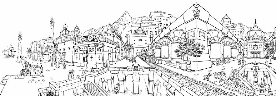
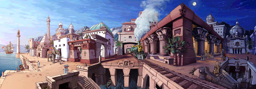
Here it is finished. You can click for a larger view. The examples I have given are extreme ones in order to show the principles involved. We don’t often draw or paint 180 degree panoramas. But the same principles can be applied to good effect in more ordinary views where to the casual viewer the underlying curves would be to subtle to notice but they will unconsciously find the painting just that little bit more believable especially in townscapes and other subjects with a lot of man made rectilinear content.

Older Posts »

Powered by WordPress

error: Content is protected !!