Rob Adams a Painter's Blog painter's progress

January 31, 2018

Chocolate Box

Since moving to Dorset I have been faced with a seemingly endless pretty villages with comfortably settled thatched roofs crowning rose wreathed cottages. I have to date not painted many of them, but feel that I perhaps should. I tell myself that I need a new angle on them that will lift them above the twee. A well placed skip, a sewage lorry pumping out a cesspit, a recently deceased pensioner lying unremarked in the road while the Range Rovers power by. Please God don’t let me become Helen Allingham, a snobby part of me cries.

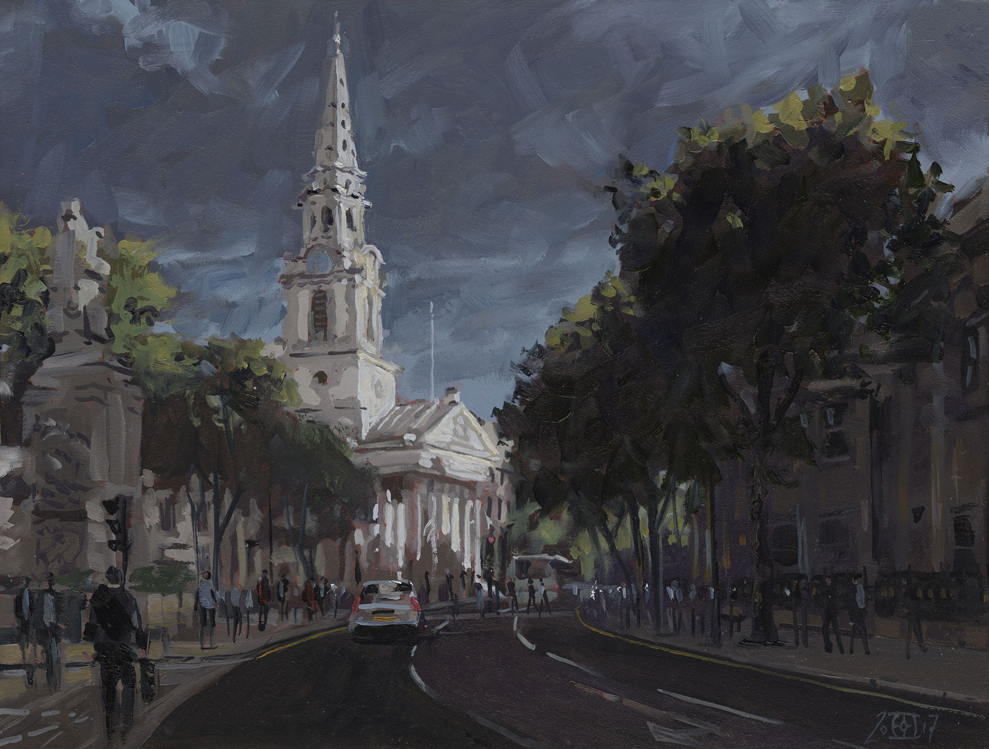
I am going to Venice in the coming spring and that has brought a similar problem to mind. Venice has been painted and painted. In every mood from every angle it has beguiled generations of artists and made them produce… well pretty pictures. A few have broken the mood, Whistler, Sickert and Sargent but only if you are careful in your choices, they each painted some pretty pretty ones too. Turner as usual scorned his subject matter and just made it up, moving palaces and indeed entire districts around to suit his compositional needs. Later Thomas Moran one of the Hudson River school did many Turnerish views of Venice with overexcited skies and a mixed salad of all sorts of dramatic lighting, perplexingly occurring all at the same moment. I started to randomly put in artists names with Venice, Monet, Renoir, Parkes Bonnington, Allingham, Myles Burket Foster… it would be almost shorter to list those who didn’t have a splash at it!

Which makes me ask the question, what do I do in Venice? To be honest I have been avoiding the place. Which prompts the next question, does it matter if I don’t produce anything that is particularly new and distinctive from painting the city? Should I take to the outskirts and paint the industrial estates that house the service infrastructure needed to deliver food and goods to a roadless city drowning beneath the flood of millions of hungry visitors? On the surface of it the place is absolutely clogged with things just up my street, churches and palaces ad infinitum and maybe that is the problem.

The Dorset villages present much the same issue, but closer to home. They are determinedly chocolate box and that is irredeemably uncool to much modern sensibility. The term chocolate box was coined from the pictures painted to adorn Cadbury boxes. Before Helen Allingham painter Myles Burket Foster churned out many a saccharine image that got used for such purposes. Although a little research shows that the manufacturers spread their net pretty wide with even Velasquez getting pressed into service!

So why do we shrink from pretty? I do, my Mother used the term “chocolate box” frequently and when we went to the Birmingham art gallery she bemoaned the sentimentality of Victorian art in general. We shrink a little from Murillo and his sentimental Virgins and street urchins. I have only with a certain reluctance painted Gold Hill the iconic Hovis hill in Shaftesbury. It’s a great view it has everything going for it… except it is eyewateringly pretty. The resulting paintings would look dandy on a chocolate box too. I see fellow “serious” artists shrink from them. They do not see the painting, the subject overwhelms, or should I perhaps say that their educated sense of taste does.

It is very hard to look at these or the images of sentimental syrupy Victoriana without your inbred sense of kitch kicking in. It is even harder to view them as a Victorian might have done. Did all Victorians have bad taste? We can’t say they were all visually naive and ignorant. Lots of clever sophisticated eyes looked and liked. I can look at the absurd confections of Tiepolo or Tintoretto with a great deal of pleasure even though they contain many of the same elements. Are these images OK just because they are safely insulated by a reassuring quantity  of time? I am forced reluctantly to consider the problem might be with me and my cultural indoctrination, not the subject matter or overt sentimentality.

People really do have syrupy sentimental feelings, just look at people crooning over babies, cute toddlers or wide eyed kittens. We are told to paint our inner feelings, are those particular ones exempt? A besotted artist might gaze adoringly into their muse’s dewey eyes, then paint their perception thus shaded by sentimental adoration. Is that interior transfiguration not a perfectly bonafide subject? It is part of being human after all. Maybe as artists we are just scared to tread such dangerous and potentially embarrassing emotional territory or admit any weakness that it might hint at. You might after all be thought “soppy” and who could bear that? Give me pain and torment, misery and nihilism, but please don’t threaten me with pleasure or pretty! It’s OK if it is “ironic” though… a cop out in my mind, perhaps a lack of the courage to face it head on…

Is all this going to provoke a string of kitten and baby pictures… well no, but I will perhaps try to do a few of those scary villages. As to Venice, well I just have to wait and see and try to achieve the impossible which is to put out of my mind all preconceptions.

I am very behind with putting work up as I am painting and drawing faster than I blog! So we have to go back and imagine it is Christmas again… picture it: pushing a trolley through a Tescos packed with crazed shoppers, the sound of “One horse Open Sleigh” ringing in your ears…

Tenby, Wales, watercolour, plein air

I had a two part holiday this year and the first bit was in Wales. This is Tenby, which abounds with fascinating views. This is the harbour which has great viewpoints from the steep road that leads up out of it. Here I have done everything you shouldn’t do. The initial washes were dashed in after 15min, but it soon was apparent they wouldn’t be dry until late in January! So I move on and did a drawing and had a glorious fiddle to finish it off in the evening. Watercolour 7in by 5in.

Tenby, Wales, Pembrokeshire, pen and ink, drawing

I moved a bit further down the hill and sat doing a drawing as my abandoned watercolour slowly dried. The sun even came out throwing fascinating shadows across the buildings. 8in by 6in, Pen and Ink.

Newport sands, watercolour, Wales

This is the marvellous Newport sands, the weather had swept it clear of even the most hardy dog walkers, only a single lonely parked van was left, probably waiting for a break in the weather to exercise the pooch. Being a hardy bunch from Worcestershire we walked our dogs anyhow but I was rather taken by the solitary van and did this later in the evening. Watercolour 7in by 5in.

Fishguard, old town, Wales, Pembrokeshire, watercolour

At last a breezy day when my paint would dry. I had not realised my watercolour sketch book was on its last pages so this is done on vile W H Smiths watercolour blotting paper. Oddly it rather suited the scene which is of the old town of Fishguard. I did lots of washing and wiping back here but had to be very gentle as the paper was so soft. Watercolour 7in by 5in.

Fishguard, old town, Wales, Pembrokeshire, pen and ink, drawing

Next I went down to the harbour and sketched on the quay. I have drawn this a few times but never really got it how I want it, partially because you can’t set up where the view is best. That is my excuse anyhow. Pen and Ink, 8in by 6in.

Ruan, Ireland, pen and ink, drawing

Next I moved on to Co Clare in Ireland, I barely did a thing I am afraid… to busy catching up with friends and carousing! This is the road to Ruan, as you can see it rained enthusiastically nearly every day…  Pen and Ink, 8in by 6in.

Sheep skull, drawing, pen and ink

Last one, an ex-sheep. Skulls are fascinating to draw and I have done this one before, a very tricky subject in pen and ink. The table took longer to do than the actual subject! Pen and Ink 8in by 6in.

That’s it for Christmas, put the tinsel away, back to Dorset for yet more rain…

October 10, 2017

Sight Size and other tricks

I find it odd how particular techniques in painting get a fan club type following. Wet into wet for watercolour is one and I suppose plein air another. Sight size is an interesting one. It comes from academic training where you set up your drawing of a plaster cast so that from a certain position both cast and drawing appear next to each other at exactly the same scale. All observations need to be made from this viewing point. It was much used by portrait painters such as Singer Sargent to get good likenesses and accurate tones. Although it appears Sargent only set up the painting in this way for parts of the process and to check progress. It was never intended however to be a method used in all circumstances. Here is a link that gives a good description of the method: Sight Size.

If for example you want to paint a wide view then getting both your scene and the painted image the same scale would be pretty tricky. Also if you were painting a subject that was far away then your picture would have to be very small or your viewing point would have to be a very long way from your canvas! Sight size drawers tend to use plumb lines etc though a threaded frame over the subject would seem to be easier and quicker IMO. This is not a debunking of the method, I think everyone would benefit from learning and trying it. I do however feel over reliance on the method can produce rather stiff soulless paintings. The method shows it’s weakness in the work of atelier students who tend to produce identikit sub Sargent paintings and academic drawings that all seem to be from the same dead hand. That said many of those students move on and successfully establish their own identity.

Really the method is part of a whole suite of techniques to get the perceived and very 3D world down on 2D paper. Plumb bobs are good if you have never used one then I suggest you give it a whirl. If you use a black thread you can put little blobs of white paint every inch which helps transfer information. Their main use though is to make it easy to determine how things in your subject relate along a line. You can use it to translate horizontal information or angles as well. All of these methods depend on you returning to the exact same position to make your measurement. The easiest by far to use but more tricky to set up is the threaded frame. Really you need a separate stand for the frame, but as with the plumb line I would encourage everyone to try it out.

What I would not advise however is to make any of these methods into  your everyday standard painting procedure. Their use is to teach you how to make comparisons of scale angle and alignment. Your aim in using them should be to evolve the ability to do those measurements by eye, this may seem hard but it is surprising how quickly the brain catches on and eventually they become second nature. Nonetheless I still get out my frame for work where it is very important that exact proportion are achieved.

Its disadvantages are that it is a monocular method, it allows you to see the world pretty much as a camera does. In turn this means it has all of the problems associated with camera images, the distorted proportions at the edges of the frame which become impossible to hide as the view widens. The method assumes we should only see what we can see with our head fixed, but to my mind this is only a small part of the visual experience, it is literally too narrow. To paint wider or higher than convenient views requires a whole other set of skills including constructive perspective both linear and hyperbolic. Also a number of adjustments such as sliding vanishing and eye points. Although this sounds hifalutin and complicated the actual application can be taught to anyone in a day or two.

A very mixed bag of work in this post as I have been dodging between media .

Blandford Forum, Dorset, drawing, pen and ink

This is Blandford Forum in Dorset. The challenge here was to reduce the busyness of the scene without loosing the impression of complexity. If you succeed in doing this people come up and say, “Oh look at all that detail” and “Just like a Photograph!” For windows it is important to get both consistency and variety into them. So I try to keep the position and rhythm accurate but vary the mark made to indicate them. Pen and Ink.

Blandford Forum, Dorset, pen and ink, drawing

Here is one where sight size would let you down! You would have to have your nose touching the paper to get this view. The camera could not produce it either, the building on the left would be very distorted. It is really a composite view as I am both raising my head to look up and turning my head to look left. A point that is vital to fix is the one where you look straight ahead. People assume that in a drawing the straight ahead point must be in the middle but here it needs to be far to the right where the road ends. Each of these movements causes swings in perspective that result in distortion. So what appears a simple scene is actually quite complex to construct. In practice I sketch in the rectangles of the facades and adjust them to find the best compromise between observation, what I “know” is there and the restrictions of a flat surface. Here the key line to track is the join to the walls and roofs. Pen and Ink.

Cardigan, Llanchaeron, Wales, pen and ink, drawing

This is Llanerchaeron in Wales a beautiful walled garden. I only had time for this quick sketch but would have been happy drawing there all day. I decided in the end it needed slight touches of colour. This is always tricky as the temptation is to add more, but I think greens would have been too much so I left them all out. Pen and wash.

St James, Shaftesbury, Dorset, watercolour

This is St James in Shaftesbury. I very rarely do a half sheet en plein air in watercolour as splashing it on with big brushes is the only option so the drying time becomes key. The other reason is that they are expensive to frame, rarely sell and if you do sell they get a lower price than a far smaller oil. This subject was a gift though and it was great fun to paint as is often the case the light improved as I worked but with watercolour you cannot easily chase the light. Once I got home I felt I could get more atmosphere in by washing back and as it was a 1/2 sheet  I  used the garden hose! It is nearly always worth taking such risks I find even if a few almost alright watercolours bite the dust. Watercolour.

Worbarrow bay, Dorset, oil painting

This one put me through the mill and I nearly abandoned the whole thing. It is Warbarrow bay near Tynham in Dorset. I find these looking down at bays type compositions very difficult especially when they include foreground. I had a plein air watercolour and photos but I still ended up trying several different tonal arrangements over a few weeks. It still may not be finished, I might cut it down as I think a better picture could be had by loosing a 1/3 rd of the right hand side. 24in by 12in Oils.

St Martins, London, oil painting

I recently visited London to see some exhibitions and just before the heavens opened the light on St Martins in the Fields was fantastic. No paints with me so this is done from phone snaps. Another one that might loose a couple of inches from the top! 16in by 12in Oils.

Newport, Wales, Pembrokeshire, plein air

I escaped to Wales for a few days and was greeted by blustery weather and fantastic skies and seas. This is Newport in Pembrokeshire and I had very little time to paint before being chased off the beach by the tide. I got rather too involved with the ruffled surface of the water which seemed to have every colour under the sun in it. 10in by 8in oils.

Moylgrove, Ceibwr Bay, Wales, Pembrokeshire, plein air, oil painting

This is Ciebwr Bay near Moylgrove in Pembrokeshire. This is painted sight size  as I hadn’t used the method in a while. I can’t say it made much difference as far a judging things goes, a little easier to judge relative tones maybe. I did use my tone guide which is just a bit of very black plastic with a dab of titanium white on it. This allows you to more easily judge how far away the darks are from being black and the lights from white and their average  hue. It was astonishingly windy and I had to anchor my easel to some big rocks. It makes it impossible to do really accurate brushstrokes as your board is flapping like mad! 12in by 10in Oils.

Wales, cliff, plein air, oil painting

Done on the same day but a bit down the coast. I had almost given up finding something to paint when I spotted a patch of sand that made an interesting contrast. Even windier than the last but very interesting to paint. 12in by 8in Oils.

Wales, Pembrokeshire, plein air, oil painting

Another day another cliff top. After a rough block in I kept my eye on the changing sun light sparkling on the sea, the whole key of the picture had to be organised so that the highlight would eventually be punchy enough.  This meant keeping the landscape tones within quite tight bounds. To much highlighting would have ruined the balance. Another very windy one it was only possible by backing up close to a wall. 14in by 10in Oils.

Llangrannog, Cardigan, plein air, oil painting

Yep it’s another windy beach! This is Llangrannog near Cardigan. Sight size again as it was convenient, it did help here in getting the drawing in quickly, the method makes drawing errors very easy to spot. Many pauses as the rain came down, though I loved the muted tones the foul weather created. I still far prefer painting on a stormy day than a bright sunny one. 14in by 10in Oils.

Newport, Wales, Dinas Head, plein air, oil painting

This is Dinas Head from Newport. Only a very quick sketch. The light was changing rapidly as the cloud shadows brightly lit or threw different areas into shade so I might do a studio one or over paint this one using the various photos I took as it changed as reference. 16in by 10in Oils.

Newport, parrog, Wales, plein air, oil painting

More Newport and more very muted light. I might chop this one down and frame it tighter. I loved the tone of the yellowy house, very hard to get right and I wiped and redid it at least 5 times. 16in by 10in Oils.

Porthgain, Wales, Pembrokeshire, oil painting

I took my time with this one, it is Porthgain which  would like to do more of as it has very interesting part ruined industrial buildings. I was nice to paint a calmer brighter moment with the storms over. 16in by 8in Oils.

For the visit to Wales I used a quite restricted palette heavy on the earth tones as follows: Cobalt Blue, Unbleached Titanium, Titanium White, Naples Yellow, Raw Umber, Burnt Sienna and a tiny bit of Cadmium Orange on the last one.


« Newer PostsOlder Posts »

Powered by WordPress

error: Content is protected !!