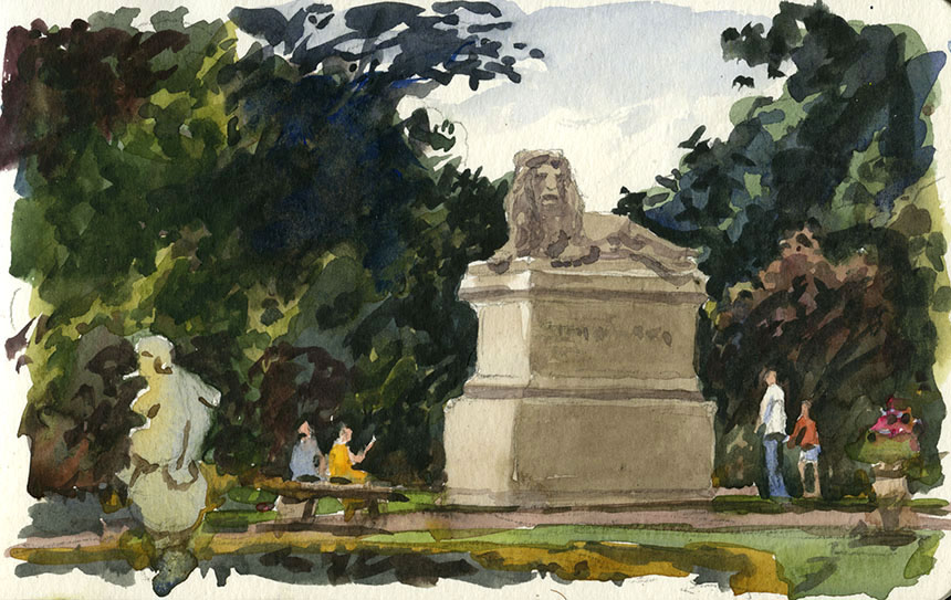
Imagination is something I use differently nowadays. In the past much of my work was derived from my imagination. For work I had to paint things that either didn’t yet exit, had never existed or didn’t exist anymore. Painting from life however doesn’t require the subject matter to be conjured up from the imagination. There it is in front of you every detail in place. So much so indeed that I spend most of my mental effort winnowing out the important bits from the mass of information that the world presents me. Imagining stuff away is one way to think of it I suppose.
I do wonder though if I have rather gone too far down the road of the literal. I don’t want anymore to paint things that are implausible but that does not necessarily mean I need to paint the world just as it presents itself to me. I feel I need to perhaps adjust the way I evaluate scenes. I need a bit more “That scene would be great if…” and if an idea presents itself there is no real reason why I shouldn’t act on it. I was in Jermyn St a few week ago and it rained making the scene very beautiful with the wet street bringing the sky tones down into the road and pavement surfaces. Alas I had no camera with me. A few days later I had to visit it again and the light was very much the same but it was dry. The rain made all the difference though and Jermyn on a grey day with no rain didn’t inspire me. I took photos nonetheless and am considering making the street wet using imagination rather than observation. Part of me though says this would be untrue to the scene.
There is I suppose a question of degree here. I quite often see people paint a scene on a grey day as if it is sunny. Indeed some painters seem to always paint the same day whatever the real meteorological conditions are. This doesn’t mean to say the paintings aren’t nice enough it just causes me to be a little puzzled. However I think in Jermyn St case there is a decent reason to re-imagine the scene, after all I did see a possible painting on the wet day. I cannot however claim to have enough of a photographic memory to recall exactly how it was. So I am left with either waiting for a wet day and returning or just imagining the rain.
As I am keen to get on with this one I will have to go about this somewhat as I would do for an entirely imagined illustration. I will get reference of other wet days on different streets and work out what the reflections would do. It is actually quite easy to work out where reflections will fall. Below is Jermyn St sans reflections.

This is typical of how I plan a studio picture. I have arranged the figures etc and blocked out all the salient information without getting into any real detail. I have also shifted stuff around a bit to reinforce the diagonals as the composition is almost square. I now need to rough out my reflections. As a general rule anything reflected is mirrored about a line where it touches the ground plane. There’s a sentence to make you think! Below is that simple rule carried out.

Take a moment to see what is going on here. The red indicates the lines about which things are mirrored. So Our nearby couple are flipped vertically about their feet. As are the next two figures. You can also see the line I have flipped the post box about. The car is parked level with the tree so I have flipped both the tree and the car about the same line. This tells me where the dark reflection of the tree will fall in the road. Obviously because all the surfaces are rough not like glass none of these reflections will be perfect which gives me quite a bit of leeway. I will also stretch the reflections a little further down as it is a rule that the rougher the surface the further the reflections will stretch down. This is especially true with water so I will do another little sketch to show why this is so.

Here we have a simple scene with a maritime flavour. A fishing boat on a day where the sea has gentle swell and our painter on the shore. If you follow the blue line you can see that close to the boat a fair bit of the wave will reflect the boat and only a small part of the sky. So that near to the boat the reflection will be pretty solid with only thin slithers of sky. If you follow the red line however you should be able to see that less of the wave will reflect the boat making the reflection a slither of dark in mostly bright reflected sky and also that you can still catch glimpses of reflected boat quite close to the shore. This is what stretches the reflection down, it is also what causes the reflection to fade out as the chances of a bit of ship appearing in the reflection diminish. Above I have scribbled a rough idea of the result.
As an aside you often see a bright streak cut through the reflection, this is where the wind has ruffled the water so that small ripples cross the larger waves at an angle. These ripples reflect mostly sky with only a very small line of boat so they appear bright in comparison. If the sun is say of to the right they might catch the direct rays of the sun and appear considerably brighter than the surrounding sea.
.

Here is the Jermyn St painting mostly done. I shall leave it to consider for a week or two before glazing here or there to either knock back or strengthen. I
always seem to need that time to give emotional distance with studio paintings. 20in by 20in oils.
.

This is the wonderfully named Bugsbys Reach near Greenwich. A blustery and changeable day with the Wapping Group. When the light is changing rapidly
oils is far easier than watercolour, you can dash in the the sudden shafts of light on the water when they occur. Any plein air is really an impression of a
period of time not just the snapshot of one single moment. 10in by 16in oils.
.

Next I went further East and panted the Thames Barrier, a very hard bit of drawing I wish I had had a wider board. Not one to frame but good practice.
It was very windy for the last half hour forcing me to paint with one hand steadying the pochade. 10in by 12in oils.
.
 An experiment using white acrylic and watercolour. I deliberately laid in the washes too strongly as I intended to add lights after. The acrylic is better
I find than gouache as it gives cleaner whites. Also you can overlay washes to tint it. I was careful to use a cheap sable for that bit of the work as acrylic
is death to brushes! Most of it is plein air but I reworked the figures a fair bit. All in all a good way of painting city subjects as they can be too much for pure
watercolour making it slow and so you can miss the passing light. A small pot of premixed acrylic adds nothing to the weight of my kit. I pre mix it to the
consistency I like and put it in a screw top jar, I also put a ball bearing in so it will mix when shaken. It is of course St Martins Lane, 1/4 sheet.
.
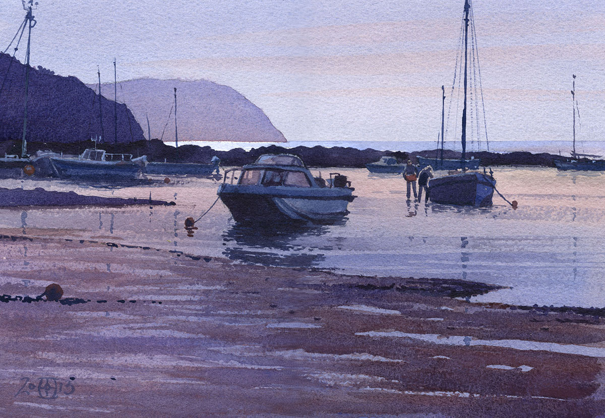
This is Newport in Pembrokeshire. An exercise in keeping those washes clean! I had to be very careful to keep the tones close and subtle.
1/4 sheet watercolour.
.

The last meeting of the season for the Wapping Group. This is a hazy morning on the Thames at Isleworth. The haze stayed most of the day which made
the light really interesting and allowed for quite leisurely working. 1/4 sheet watercolour.
.

Here’s a picture of them hard at work. Near to far Karl Terry, Rowan Crew and thinking about starting Derek Daniells.
.

The tide was far down allowing us to sally forth onto the fore shore. This allows some great perspectives on the buildings on the bank. The pub is
The London Apprentice at Isleworth. 1/4 sheet watercolour.
.

Last one. Done in my Moleskin as the light faded. To finish the day we went into the pub for the traditional Wapping Group end of season meal of whitebait.
Not for some but I rather like it. Very pleasant to end the day with food, beer and banter!