Rob Adams a Painter's Blog painter's progress

November 24, 2014

Constable

Filed under: Art History,Painting,Watercolour — Tags: , , , — Rob Adams @ 2:05 pm

I went to see the Constable exhibition at the V&A. I was painting in a very wet Knightsbridge and took refuge from the rain for an hour or so. I nowadays try to distance myself from all I know and have heard of an artist when I look at their pictures. What would the reaction be, I try to think, if an unknown posted this on an online painting forum… how many “likes” would it garner. It is not easy to look afresh, this is after all Constable, one of the greats of British landscape. The exhibition is well worth seeing as it includes paintings by artists who influenced him, both from the past and his contemporaries. So we had Thomas Girtin who he admired hugely and Ruisdael who he copied with great attention to detail. The exhibition also included the sketches and so forth where they when available, which I always like because they show how an artist sets about his business.

Firstly there was much I very much liked. The small plain air sketches and pencil studies. One or two of which have a lovely immediacy and delicate touch. It was here that the heretical thought occurred… if I found an unknown one of these and posted it under an assumed name on UKPleinair (a Facebook group with many fine painters as members) would it stand out? After racking my brains I had to conclude most would not. Indeed many were well below the standard that some artists currently post. The very best would I expect garner praise and positive feedback of course but not I have to conclude adulation. A few examples would be appropriate I suppose.

constable sketch

Here is a middling quality painting. You have to say though perfectly pleasant it is ordinary. Other painters of the time such as Turner and Girtin were doing far better work on the average in my opinion.


Constable sketch

Here is another from later in life. Some nice enough bits but the trees to the left are clumsy as is the composition. The distant blue is a good touch but once again nothing remarkable.


Constable sketch

Here is another, very briskly painted but heavy handed with some ugly brushwork. If it was not by Constable you would possibly throw it out! Because it is by Constable we earnestly peruse it, but to my eye it is just a poor painting.


constable study

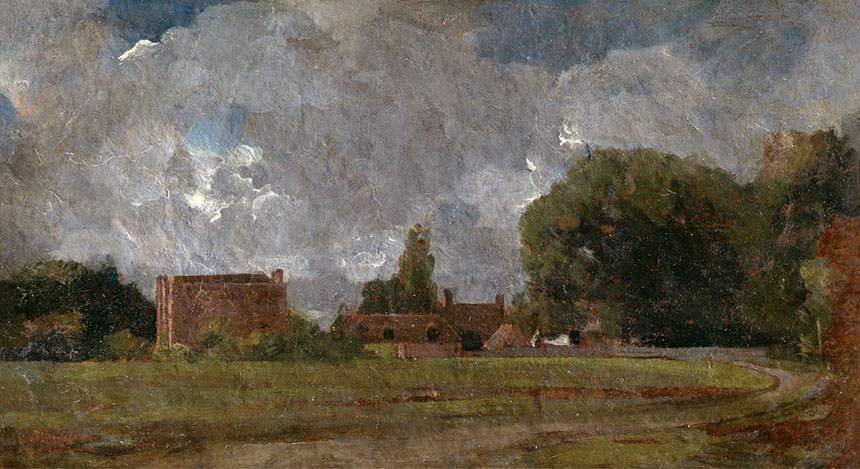
This is a sketch for a bigger picture. I find, as Turner and the other Academicians did, that the crude muddy brushwork and the shotgun white highlights just don’t work. The red browns also overwhelm the painting and sit unpleasantly with the blue.


constable salisbury

Now to dig myself a deeper hole still I will consider one of his iconic later paintings. Here is the sketch. There is very little good here. The drawing is poor with Salisbury cathedral toppling to the left. As for the stand of trees on the left, what was he thinking? The sky usually one of his stronger points also is marred by ugly fussy and ill considered white highlights.


constable, salisbury

Here is the final result. It looks better here than in the flesh. The whole picture is smothered in distracting white speckles. He used to call this his “snow” and knew that other painters disliked it. The drawing is a little improved but the river on the right climbs impossibly up the picture plane and there appears to be a miniature village built into the undergrowth on the far bank. Once again the trees are terrible especially the overworked branches at then top. Is it just me but those horses look more like Shetland ponies rather than cart horses!

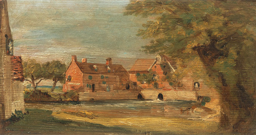
Poor Constable I hate to say it but I think he has been built up greater than he really was. It is not his fault of course he has been taken by art historians to represent the precursor of impressionism. He is in fact, I feel, a very hit or miss painter who struck a few very high points here and there but struggled in later life to find his way. I liked his Water-meadow near Salisbury far more than his Haywain and some of his oil sketches more than both. He was of course influenced as all artists of the period were by Claude Lorraine and there was a fine example there. His real contribution was pioneering the working out of doors from life, though the curators of the show didn’t appear to notice that several of the so called plein air sketches had glazing over impasto white which makes it unlikely that they were actually done on site. I will end with my favourite thing from the show. A small oil sketch on a bit of millboard.


oil sketch, constable

This is altogether delicious with a light touch and subtle colouring.

October 14, 2014

Distractions

Do you find that everyday chores and responsibilities get in the way of painting? Even someone like myself with no family responsibilities finds it hard to get “easel time”. I take my hat off to those that manage it with job, house and kids to juggle with. Often I find these interruptions are painting related. I have to take paintings to galleries, attend private views, write blogs, I have just spent 3 days framing! I have a painting that has been sitting for 2 weeks on my easel waiting to be finished off, but I haven’t been able to find the 4 hours that would take. It does however have a lovely frame… This is exacerbated recently by moving to the country. An old house to refurbish, studio to build at the bottom of the garden, it all eats time. As I am about to hit 60 time is all the more precious.

I wonder in reflective moments if I had painted for all the hours I watched telly, or more recently floated round the inter web, over the years just how many more paintings I would have got done. Also having done them, how much better at the whole business would I be? The odd thing is I can get up and paint all day without interruption if I am doing an illustration for a client, but find it harder to do that for myself. I suppose that if you don’t get the commercial job done there will be immediate consequences but if you don’t finish that landscape then no one will tick you off!

I think I ought to implement an organised regime, but am not sure I have the will power to stick to one. Even if I set a regime of 5hrs a day 5 days per week I would I suspect still improve my output. Twenty five hours, I doubt if I am making 15hrs at present. Discounting commercial work of about 10 weeks leaves 46 weeks in the year so 690hrs of painting time. I have completed 200 works of various kinds. So I am being a bit unkind as I think maybe an average of 4 hrs per work including studies, preparation and finding subjects on location. Which means I have put in about 800hrs of painting and drawing this year or about 20 forty hour weeks.

Exactly why I feel I have to put in this labour is another matter. I am fortunate in that I do just enough commercial work to feed and keep me. Many I feel artists overstate the importance of their art in order to legitimise the work they produce as being the result of some irresistible drive. Mostly we tend to look upon obsessive behaviour as a negative thing, but if you are an artist then you can wear such behaviour on your sleeve. I don’t think I am obsessed, I have said before I could stop painting and just write or play music, but what pushes me along in interest and fascination. The more I learn the more I wish to learn.

So here is what I have got done despite distractions! A mixed bunch, but I feel it is important to post the misses as well as the ones nearer to the target.


Queenborough, Sheppey, Kent, Oils, Brass Monkeys, plein air

This is Queenborough on the isle of Sheppey. A very fine day out with the Brass Monkeys. This was such fun to paint and unusually I took it to a finish on site. 14in by 10 in Oils.


Queenborough, Sheppey, Kent, drawing, brass monkeys

Queenborough again, very pleased with this one. Pen and ink 9in by 7in.


Royal Hill, Greenwich, Brass Monkeys, London, oils, plain air

Another Brass Monkey day. This is Royal Hill in Greenwich. 10in by 16in oils.


Greenwich, London, Observatory, park, brass monkeys, oil painting

Very quick sketch of the Observatory in Greenwich park, not one to take any further but fine as a sketch. 10in by 10in oils.


Isleworth, watercolour, Wapping Group, Thames

This is Isleworth on the Thames. My heart wasn’t really in this it doesn’t have a natural focus. With plein air it is sometimes impossible to juggle all the requirements that make a good picture, but sketches I feel have a charm of their own. 10in by 8in, watercolour.


Isleworth, London, London Apprentice, drawing, pub

This is Isleworth again on the river terrace at The London Apprentice.


Shaftesbury, Golden Hill, Dorset, Pen and Ink, drawing

This is the famous Gold Hill in Shaftesbury in Dorset. This is the “standard lazy view” but I hope to return and find a few more original angles! Pen and ink A4.


Lastly a few life drawings, I have found a new group in Dorset so will be able to keep up the figure work which is wonderful.

Life drawing


Life drawing


Life drawing


Life drawing

The above are 5min each. The village hall where the session is held has wonderful light so I am looking forward to future days.


Life drawing

30min


The model view was no good so I sneakily did one of my fellow artists! That’s it for this episode, there may be a bit of a gap asI am rather thinly spread of late!

« Newer PostsOlder Posts »

Powered by WordPress

error: Content is protected !!