I have been out painting with others a lot recently, and it is very interesting watching people paint the same day as you are. One of the things I see people having difficulties with is tonal value. So I thought I would pick apart one of my pictures to show how I assessed the subject and how I ended up with the tones I did in the final picture. First here is the scene as the camera saw it.
.

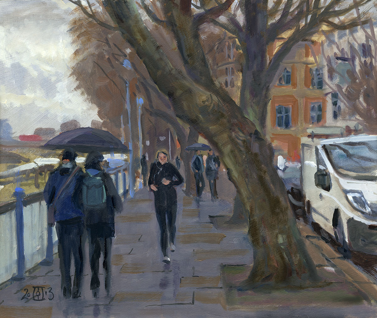
This is the splendidly named Coldbath Street in Deptford. The camera sees the whole thing in more contrast than the eye does, but the tone
areas are if anything clearer in the photo than to the eye. To this end I often look at the camera display for any hints as to the tonal arrangement
of the scene. I don’t remember if I did in this case but I often do. After squinting I decided the image breaks down into three tones and white board.
.

This is taken from a scan of my final painting so the lay in tones were pretty similar. I did not block in with flat colour as here but used a variety to give interest.
However the basic tonal values were much as above. I only drew out the areas as I knew that any drawing would be covered by the blocking out. I use a mix of glaze
medium and turps so this first layer dries pretty quickly. Once this is dry I did a bit more drawing to define the pavement etc. Once you have these basic areas in
then the rest is fun and pretty straightforward. I did put a fair bit of time though getting these three tones mixed. I did this on my palette so I could see the tones next
to each other. So first I mixed a white with a hint of Naples yellow in it. Then I mixed the sky colour and put it next to my white. This took a few goes as the blue had
to be darker than I expected. I find it best to decide tone from light to dark, so the blue has to be dark enough for the clouds to be bright. As the clouds are one extreme
they are a fixed tonal point from which you can work. I added a hint of yellow to the blue also. With these two tones in place I mixed the dark of the buildings. I knew the
distant ones would be bluer and lighter but that is easily done on top of the base tone. The tone of the buildings has to be dark enough to give a believable contrast with
the sky yet light enough to take a dark. Once you have these tones side by side on the palette you can make fine adjustments. Finally I mixed my road which was hardest as
it had the most variation. The road tone needed to be darker than the sky but distinctly lighter than the buildings. It would also eventually have to take a highlight that
was bright but not quite as bright as the cloud highlights. By making a ring with my fingers and isolating areas I could tell that the road was generally darker than the sky
even though to the eye it looked almost brighter. If you make a hole in a bit of card you can also check tones. Move the hole rapidly between the two areas and it will
immediately show which is lighter or darker by the “jump” in value. You can then do the same between the colours on your palette to see if the strength of the “jump”
is similar.
.

Here is the final painting. As you can see it does not take much variation within a tonal area to hint at structure and light. The blues of the distant
buildings were simply achieved by painting into the still wet darks with the sky tone. This particular subject has simple strong contrasts a grey day
will have a narrower tonal range and so the distinctions between each area are more subtle. With such subjects a careful assessment of tone is even
more important. Once you have gained some practice it becomes easier to pick apart the subject. Squinting is a very useful tool as it simplifies and
shows which areas can be combined and which need to remain distinct. 10in by 14in oils.
.

Here we have one of those grey days. This is Dulwich Village in Sth London. The process was exactly the same as the more dramatic Coldbath
painting. I first established the relationship between the brightest area (the white building) and the sky. I next mixed a warm and cool grey for
the trees and buildings. The road was again the most difficult. The eye wished to see it almost as bright as the sky, but on checking I found that very
far from the case! I had no more than 30min to block this in. I probably spent as much time mixing as I did painting. 10in by 16in oils.
.

Another one from Dulwich. Painting in the rain is hard enough but it was windy too so this again was done in 30 min or so. Here the key tone
relationships are the warmth of the background trees and brickwork against the slightly lighter and cooler pavement. Also the relationship of
both of these to the vertical bar of light made by the shop fronts. 8in by 10in oils
.

Not had a great deal of chance to get out due to paid work… I was a relief to dash this down on my way back from the market in Blackheath.