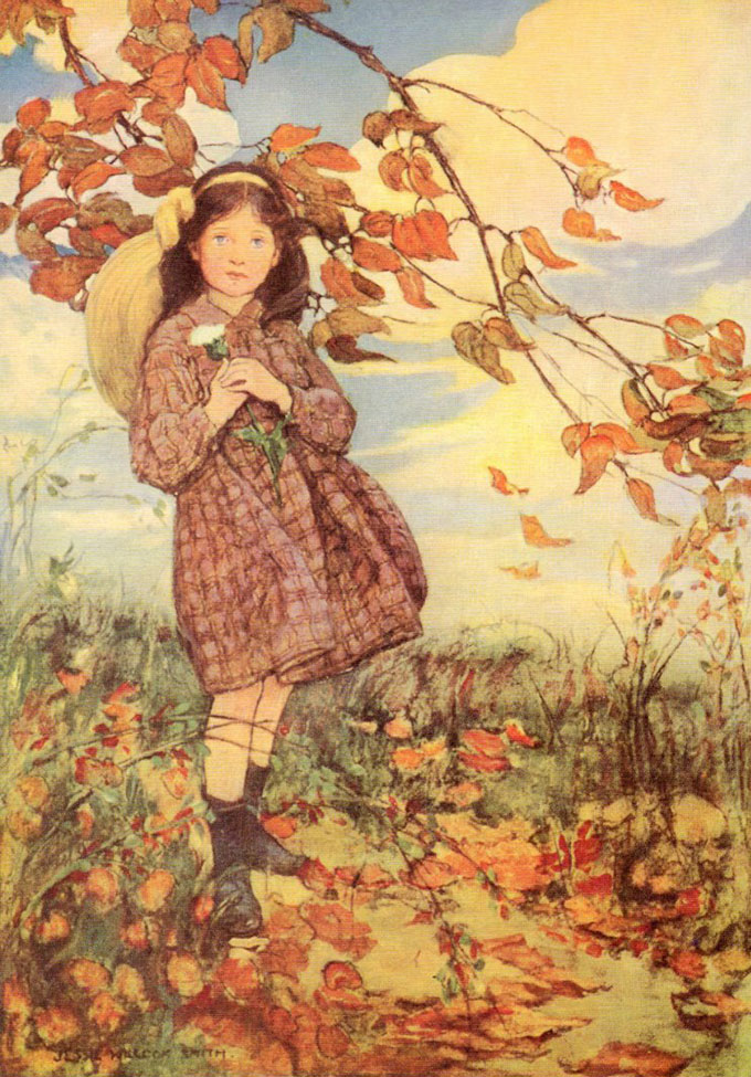
In a conversation recently I took the position that art colleges teach drawing very poorly. I was quite fairly asked how do you know that? To which I had to admit I only had my own experiences from three decades ago and word of mouth from current art students to whom I had talked. So quite casually I started to look at art college’s websites and then looked at the work of the tutors who might be expected to teach the students to draw. The results were truly depressing. Almost no colleges had an even halfway competent draughts person on their staff, some of them had professors of drawing, who spouted guff about how important it was to them. They did not seem however to have found it important enough to spend the time learning the relevant skills.
Everywhere was the opinion that drawing was some kind of metaphysical prayer state where you could commune with the inner self in the purest way. I downloaded staff lists and pictures of the tutor’s work with the intention of posting them in this page, but really I only found one tutor with a reasonable skill level and that was at Falmouth. No where else was there a person who would have had the ability to teach a student drawing skills if they wished to learn. Below is a list of attainments that a student of art will be taught. This one is from the University of Kent:
Subject-specific skills
- effective deployment of terms and concepts relevant to understanding art in a contemporary context
- the ability to locate evidence from a wide range of primary and secondary sources, and interpret it in relation to the aims and conceptual framework of fine art practice
- the ability to present, explain and defend a visual art project, in both its developmental and final states, employing argument and interpretative skills relevant to professional practice
- the ability to draw upon understanding of the materials and processes central to a variety of fine art media, as well as the technical skills necessary to produce practical work in these contexts
- the ability to critically evaluate a range of different conceptual and practical methodologies and approaches to both understanding and making art in a contemporary context
- the ability to competently perform the tasks necessary for contemporary professional artistic practice, including skills of display and dissemination of work, fundraising and gallery negotiation
- the ability to manage a fine art studio and studio project, including time management, budgetary control, space management and the acquisition and maintenance of equipment
- the ability to place art works produced by the learner or others into a historical, and conceptual context, employing analysis and critical interpretation to forge connections between practices that elucidate the process of creation.
Transferable skills
You gain transferable skills in the following:
- communication: articulate ideas and information comprehensibly in visual, oral and written forms; organise information effectively respond to written sources; adapt style for different audiences; use of images as a communication tool
- information technology: source, navigate, select, retrieve, evaluate, manipulate and manage information from a variety of sources; select and employ communication and information technologies; produce written documents; employ advanced software for module projects and tasks
- working with others: interact effectively with others, for example through collaboration, collective endeavour and negotiation; accurately define and review the work of others; skills of negotiation and persuasion in relation to the planning and execution of a project or the dissemination of its outcomes
- improving own learning: study independently, set goals, manage workloads and meet deadlines; explore personal strengths and weaknesses; develop autonomy in learning; ability to listen effectively and so to learn from and participate constructively in discussion; update knowledge and skills, seek and use feedback, critically reflect on and improve performance
- problem solving: identify and define intellectual and practical problems; explore alternative solutions and discriminate between them; creative experimentation; focus and apply attention to detail; gather, organise and deploy ideas in order to formulate arguments cogently and to express them effectively both orally and in written form; make subtle and discriminating comparisons of texts and visual artefacts; research and evaluate sources in the process of carrying out independent study.
There is a hint that practical skill might be learnt at bullet point no 4, but don’t get your hopes up, I could see no tutor at the college who had any competence at all in the area of drawing.
You might think I am exaggerating, but the evidence due to the internet, is there for all to see. So if you doubt me it won’t take you more than 10 minutes to check. If you do find a good drawer let me know and I’ll post the fact here with pleasure! I might also add that some colleges seem very coy about their tutors and what work they do. With good reason in my opinion, very few would have any chance of making a living at art outside the cushioned oasis of the education system. There is a requirement that art tutors exhibit occasionally, but in most cases this seems to be very perfunctory.
I know that the colleges would respond that I am talking about an outdated skill and what students need is skills in video, self publicity and curation. I don’t disagree, those skills are needed, but drawing is more important and fundamental in my opinion. The evidence online shows they do not appear to have the resources to teach in this area even if a student requested it. If these colleges were private I would have no complaint, but they are not, they are funded by the state.
In the other arts a music student would be expected to have some skill in playing, even if they were going to compose not perform. This is because of the insight and understanding of the subject that learning to play brings. A creative writing student would be expected to be competent in grammar and sentence construction. Oddly I found that fashion departments taught drawing on the whole quite well. I have said before and will repeat. Drawing is important not necessarily for what it results in on paper, but for the understanding it brings to the person learning it. Drawing gives a vital and unique insight into the nature of looking and seeing, as well as the skill to explain what you might have learnt to others. This in my opinion is of huge value even to video and abstract artists as such knowledge and competence cannot as far as I can see be gained in any other manner. Drawing is not in itself art it is only a practical and intellectual tool, but for the visual arts at least it is a vital one and should be taught to a high level by any self respecting art college.
Here is Leeds College of Art who claim to make drawing a central plank:
FINE ART DRAWING STRAND
Working in the drawing strand allows you to elevate your drawing from being a well understood core discipline in art practice to being the distinct and exciting art form exhibited in museums and galleries across the world. Our artists will introduce you to processes and visual drawing systems whilst also exploring the integral expressive nature of drawing which is primal, elemental and our most immediate form of image making. You will be encouraged to extend your drawing practice widely in two, three and four dimensions in a range of of materials, media and techniques.
They are distinctly coy about who might teach you but I found the information hidden away under “research”. Alas none of the staff as far as I can see have any drawing skills whatsoever…
A tiresome conclusion people seem to jump to when I make these arguments is the, “You want us to go back to drawing from plaster casts.” Nothing could be further from the truth. I find the teaching methods and intellectual stance of the so called modern ateliers absurd and equally as bad as the current state art schools. I do not want to throw out contemporary art thinking I want to enlarge and enhance it.
After that rather depressing round up a few paintings might be in order.
.

I took watercolours to life drawing which is always scary. 30 min is a very short time for a study! It does however concentrate the mind wonderfully.
There is only so much that can be said in that time, only so many marks that can be set down. This means that your choice of what to explain and what
to let go of are very important. The first one was a write off but here I got the key things delineated and nothing to much overstated. Accuracy in such drawings
has to be somewhat done on the fly though I do try and get three points in a triangle placed accurately. Here I made a triangle from where the shoulder touches
the cheek to the dark of the pubis then down to where the bangle on the rt arm touches the red throw. I’ll sketch that in below.
.

I hold up my brush to determine the angle of the first almost horizontal line and then get that placed. I then decide how long I wish it to be and mark the
two ends. Next I get the alignment of the long side down from cheek to wrist and gently mark the rt hand end. Finally I take the angle of the lin from pubis
to wrist which fixes that point. The advantage of a triangle is that it is fixed in shape so you can be confident of its proportions. Once this imaginary triangle
is in place it is far easier to estimate positions and angles of the rest of the body. You could of course proceed to mark more points but in the sort of time scale
these paintings have to be done that is not an option! A final tip, make your initial triangle cover as much of the body’s area as possible.
.

The next one, another half hour. I ended up with some rather over sharp edges in the back. As always overstating is worse than understating for the
most part.
.

Last one that is fit to post! I often find that the last drawing of a session is the best. You get into the zone and start to make decisions
more efficiently and with greater confidence.
.

I took my pen and ink out to draw plein air which was an experience. I think I will use technical pens to sketch out doors as dip pens are better in the
studio. They can be very finicky and have this ambition to dump a large blob of ink at any gust of wind! This is St Paul’s Deptford designed by Thomas
Archer.
.

On a Brass Monkeys outing as I was heading home the view from Battersea Bridge was fantastic. I did a very quick sketch which is below and then this
studio painting. Very simple with only two colours Quinacridone Burnt Orange and Ultramarine. 10in by 10in. Watercolour.
.

Here’s the sketch done in less than 15 min. I pretty much stuck to this only refining the drawing from the photo. The photo was quite dark and very
vibrant, which isn’t what the eye saw at all.
.

Famous scene of Maldon in Essex. Really just a colour test I only used Ultramarine, Cadmium Red and Quinacridone Yellow, all Daniel Smith.
1/2 sheet, 140lb Arches Rough. Not sure I like this, it could be from any era! I softened the line of the water later which here is too dominant.
.

I am trying to get some London watercolours done for the up coming shows. This is Deptford Station 9in by 9in. Super sun this time of year it beams
down this road like a search light!
.

A favourite scene, this is St Mary le Strand. The day was very flat so I could take my time. The best one I have done of this, it is a deceptively difficult subject.
I’ve done it zoomed in but this time I wanted to get in the big block of quieter stuff to the right. 10in by 16in oils.
.

This and the previous one were on a Brass Monkey day, we were all surprised to find ourselves faced with a glorious sunset! I decided to revel in the colour
and not hold back. I only had 20min at the most to get this down. 8in by 10in oils.
.

Here are Mike Richardson and Terry Preen finishing off, it is so pleasant to go painting in a group!