Rob Adams a Painter's Blog painter's progress

July 1, 2013

The Fear of Green

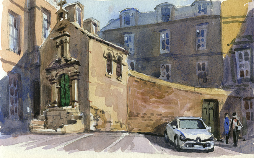
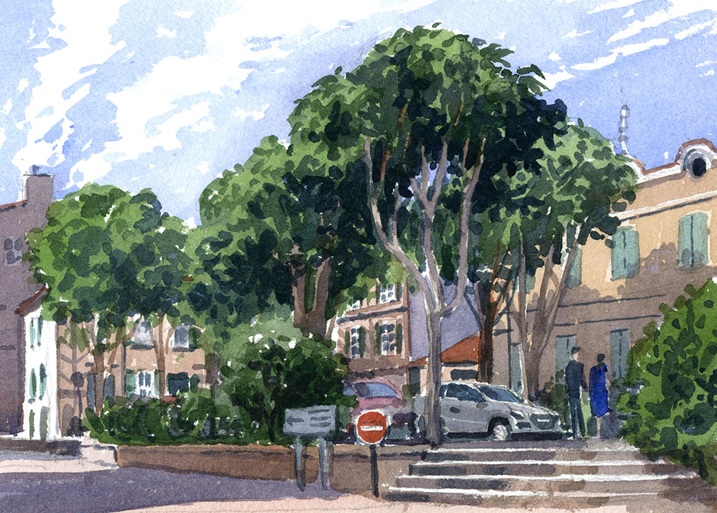
Degas said, “What a horrible thing yellow is!” the same could be said by many people about green. Many artists avoid it altogether and go for a sort of khaki. If you look at the works of Edward Wesson and others you would think the colour didn’t exist! I am not saying that the pictures don’t look nice but when I go out into the English landscape I can’t help noticing a fair bit of stuff around that has a distinctly greenish tinge! Now I think of it the stuff is practically wall to wall…
So why are greens so very hard to paint? The fashion for just making all the trees beige like a sort of permanent dull autumn really comes from old pictures where the greens have faded to a dull olive. Many pigments they had, especially in watercolour, were fugitive so these pictures would have been considerably greener originally. There is a strangeness however in the way we see greens. For some reason we see green in nature as a bright colour. Maybe in ages past when we lived on dry savannahs being able to spot a bit of distant green was a lifesaving ability. For whatever reason our perception of green is not quite as for other colours.
I was recently painting in the graveyard at Cookham with fellow artist painting friends and I was attempting to explain this in my usual irritating manner. I could see by the glazed eyes that words were not really getting through so I went out into the scene and collected a mixed sample of the leaves we could see and laid them on the palette. The effect is quite startling everybody should try it! The real greens looked dull and brown next to the paint greens which looked positively lurid in comparison.
So how is an artist to deal with this conundrum? Well when painting en plein air a good lesson is collect those leaves put them on your palette and just try and mix the same colour! What you find is that natural greens are far more red than we expect. Our Emerald Green, Viridian etc are much too vibrant for a naturalistic representation of landscape. The trouble being that our eyes pump up the greens in any case so if you do that in your painted colours then the greens get so bright that they poke holes in the back of your retinas!
The temptation then is to do as I described above and mute them completely. Which is what many very good painters do. I find however that for me this looses a vital part of the subject. The result of very muted greens is very tasteful and harmonious and I might often take just that approach in a studio painting, but for plein air where I am trying to evoke what I see before me in paint in doesn’t really appeal. I will go into a few mixing tactics, but I’ll add them to some pictures below as that will be clearer.

.

Essex, East End Paglesham, plein air, oil painting

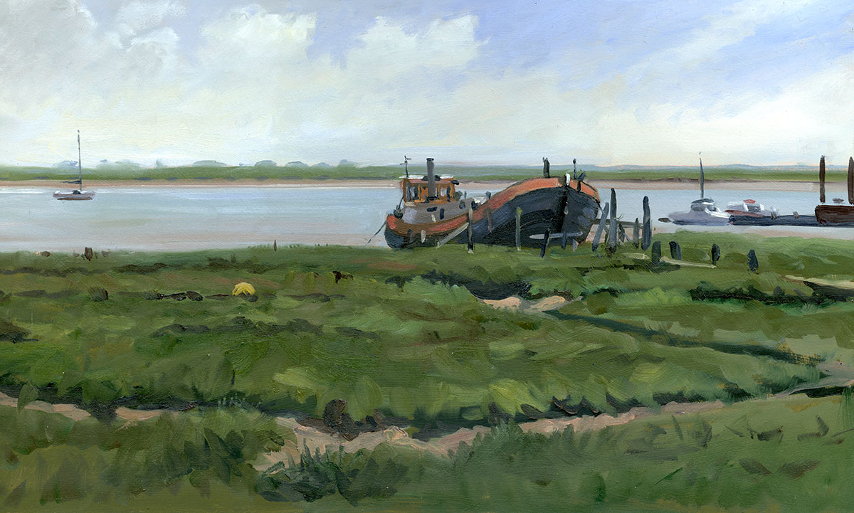
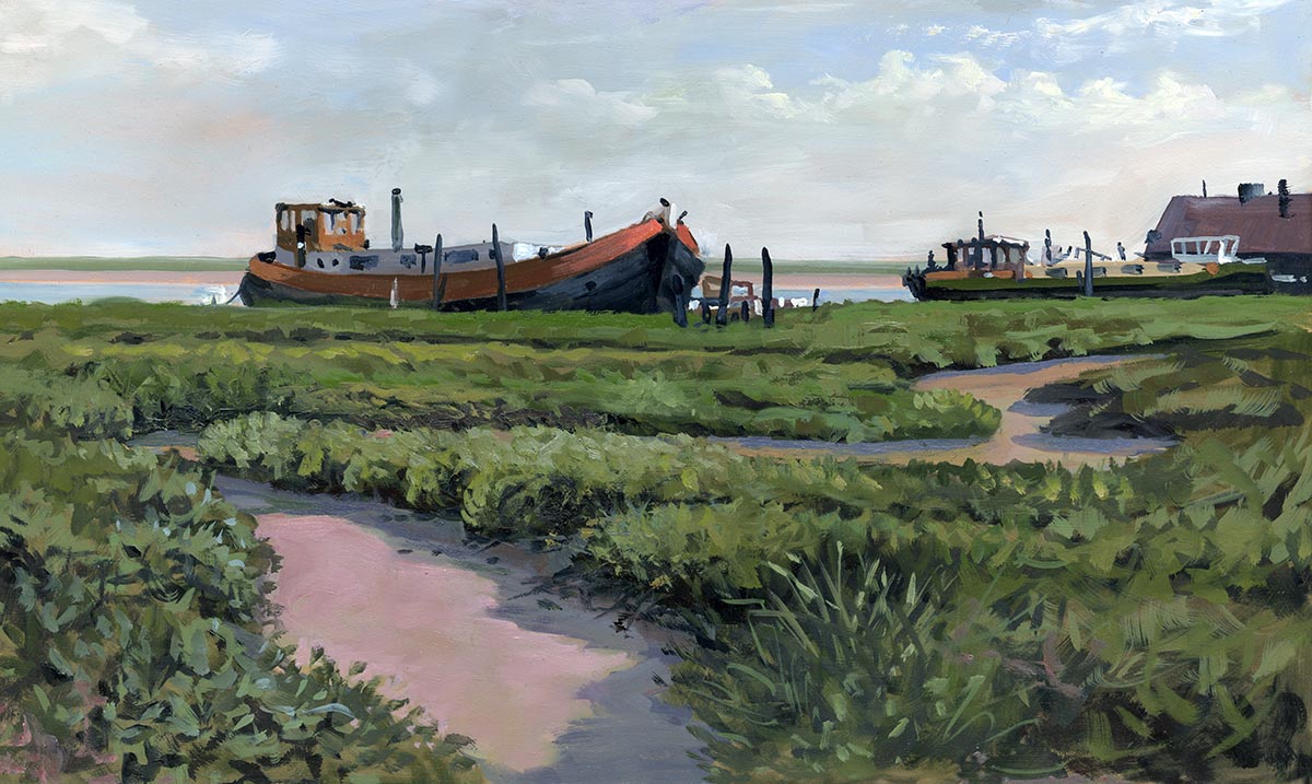
This is East End Paglesham in Essex, very much of a backwater with decaying barges and all sorts of marine clutter beloved of the Wapping Group. I set

myself the task of getting two 20in by 12in panels painted to a finish. This meant I had to choose a not too complex subject and just focus on the basics.

Here we see a lot of warmed greens in action. If placed next to a straight from the tube colour any of these would look perhaps more brown than green.

Here I am using Terra Rosa for the warm addition which is a bit strong.

.

East End Paglesham, Essex, Barge, OIl painting, Plein air

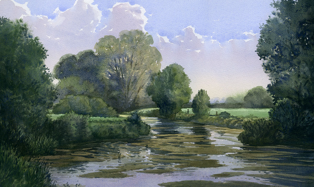
I just shifted a bit for the second one and the sun had come out. As you see the sun has increased the contrasts but I have barely increased the strength

of the green hues. I am using Alizarin to warm the viridian hues and adding some cobalt blue also.

.

Dorset, waterclour

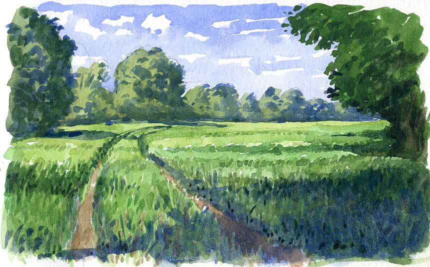
A wee 7in by 5in sketch of a very verdant bit of Dorset.

.

Stour, Dorset, River, Watercolour.

Here we are on the Stour in Dorset. Plenty of greens to battle with here! I am taking exactly the same tactic and warming the greens but mostly using

Quinacridone Red as the mixer. I find it a very good red for the purpose in watercolour as it has very little yellow in it. 1/2 sheet, Arches Rough.

.

Leigh on Sea, watercolour, plein air, fishing boat, mud

A brief respite from the greens. I blocked this in at Leigh on Sea but had to stop as the light was too brief. I finished it off from a snap I took as the sun

cut through the stormy clouds. 1/4 Sheet, Arches Rough.

.

Dorset, church, oil painting

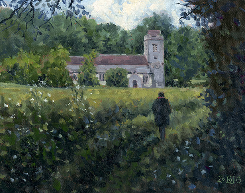
This is a tiny church by the river Tarrant in Dorset. I very much wanted an extremely quiet mood. It was a temptation to add a dash of bright across the

centre but I decided not. 12in by 10in.

.

Grey Well, Surrey, watercolour

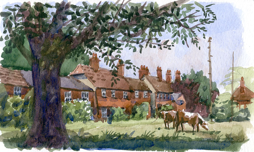
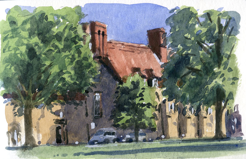
This is another small one of Greywell, I think in Surrey, but might be in Berkshire.

.

Grey Well Mill, watercolour, plein air

Here is the Mill at Greywell, I did three of this. Almost too pretty but fun to paint. In my A4 sketch book but the last I will do in it as the paper is horrid

and deadens any wash.

.

Grey Well, mill, oil painting, plein air

Here’s the second one a 10in by 8in. I was really working hard trying to keep the brightness of the greens in check.

.

Grey Mill, Surrey, painting, plein air

Here it is in the rain! This was done in 15 min at the very end of the day. A better composition I think than the other two. 10in by 7in. Oils

.

Wargrave, thames, Berkshire, oil painting, plein air

This is the Thames at Wargrave on a dull threatening day. Only about half an hour . As you can see in the overcast light the greens become browner still.

It is a very fine line between just right and moving the season on to Autumn! 10in by 7in Oils.

.

Sonning, Thames, river, plein air

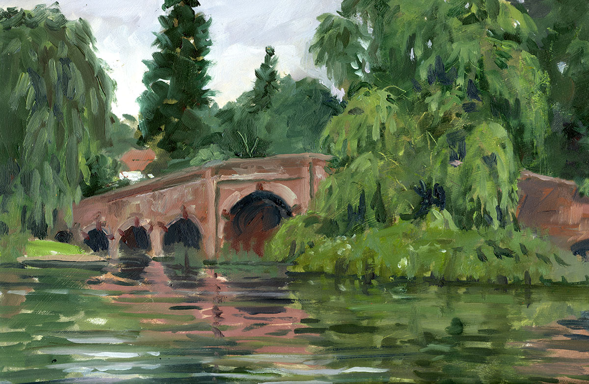
This is the bridge at Sonning, the board was wider than is shown here but looks better cropped. I have painted this bridge a few times with poor results.

This one is the best so far, but a very difficult subject in flat light. I did in enjoy doing the willow though… maybe a bit too much as it has taken over the

picture! 10in by 14in oils.

.

Winchester, watercolour

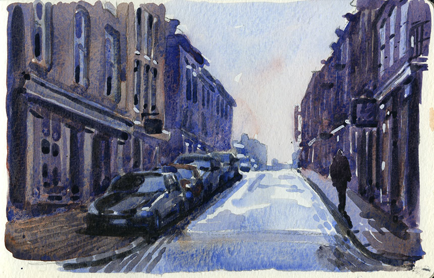
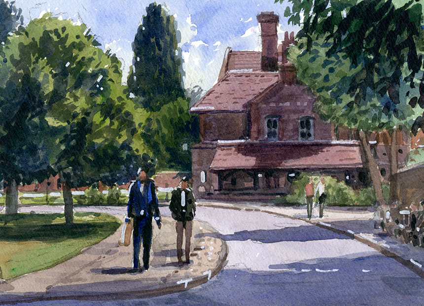
I got the scale of the figures completely wrong here, hey are about double the size they should be! This is Winchester the day was beautiful and sunny.

Something ran up my trouser leg and bit me ‘orribly, yet another of the perils of plein air. 7in by 5in. Watercolour.

.

Winchester, watercolour

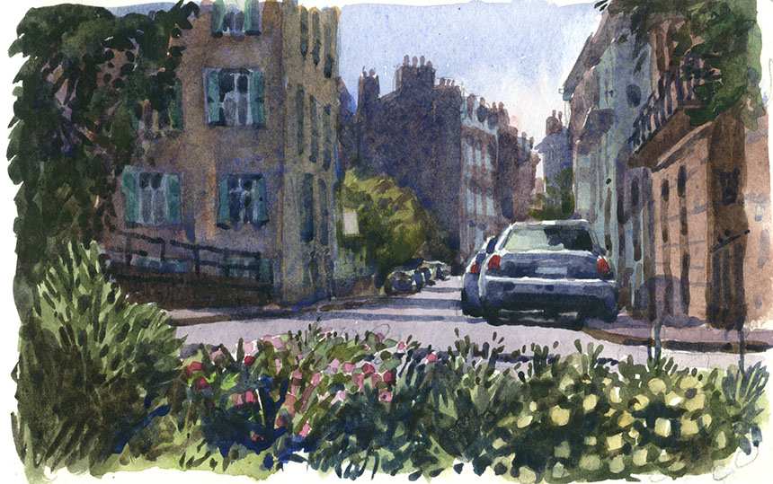
Another duff one, again I ruined it with badly drawn people. It really is worth taking time to sketch the figures in a separate pad and then add them once

resolved. However here I just dived in and paid the price! Winchester again A4 watercolour.

.

Winchester, wtercolour

A really tiny one of Winchester in my mini Moleskin. Only 5in across but great for catching the light in a quick 10 min.

.

Winchester, watercolour

Another teeny one a bit to the right of the other, the left hand tree is in both.

.

Winchester, watercolour

More of Winchester. The light was getting gorgeous as the day wore on. This was a delight to paint. 7in by 5in. Watercolour.

.

Winchester, oil painting

At the very end of the day we set about doing a street scene as the light faded. A real rush done in no more than 30min. Oils 10i by 10in.

.

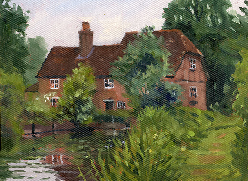
Here is a feast of green, still dropping in red but a little less here to try and catch the brilliance of the day. Not far from Eton. 7in by 5in.

.

Cookham, graveyard, plein air, oil painting

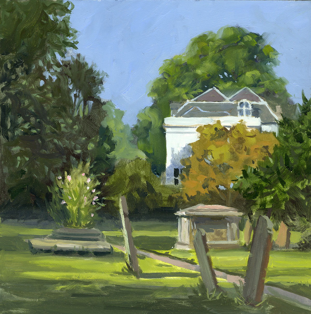
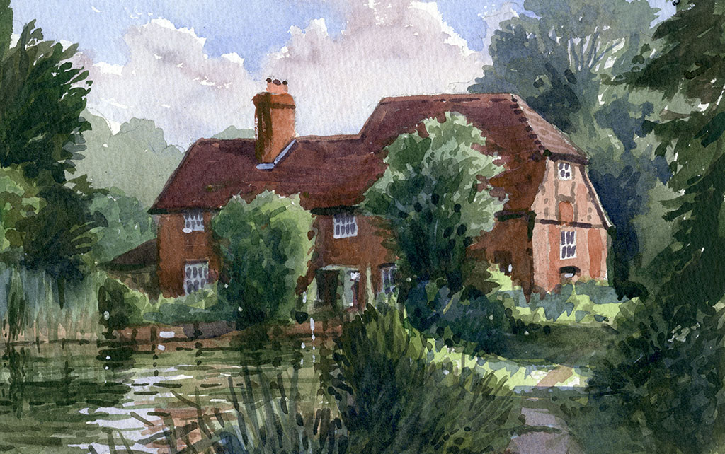
Here I painted in the under colours on a white board using glaze medium and no white.It was rather like doing a watercolour. A very nice way to lay in

and has the added advantage that the first layer is dry in minutes. This is the scene that prompted the green lecture! The bright greens were washed in

just with pure colour and were far brighter than they are here, which just goes to show what a scary colour green is. 10in by 10in oils.

My thanks to Steven and Anne Alexander who invited me to stay and paint in beautiful Surrey and surrounding regions!

June 11, 2013

A Different Light

Filed under: France,Painting,Uncategorized,Watercolour — Tags: , , , , , , , , , , , , — Rob Adams @ 2:11 pm

Well, I have returned after 10 days painting in Brittany. It is always a mixture of pleasure and disappointment when you view the results of such adventures. Before I set off I always research my destination on Google to see what might be there. This might be a mistake as it gives you ideas of paintings that might not be there in reality. Although you need a good subject or motif, good lighting and mood is probable more telling. I have found that an unprepossessing road in London with a great moment of light makes a better picture than all the towers and battlements of Windsor Castle on a dull day! The trip this time was organised by Michael Richardson and his partner Kate Borg, who do a great job of shepherding 20 or so painters around a foreign land. I always take far too much painting stuff, a simple calculation should tell me that 30 oil boards is too many, but better than too few I suppose.

Once you arrive  of course reality takes hold. It is impossible to go from one painting to another, there is always the wandering about looking for something that might make a picture. So 3 paintings a day is about all I can manage. Most of those are small sketches and oddly the small quick impressions are nearly always my personal favourites.The Île de Ré was this year’s destination. After last years weather I took a suitcase full of inappropriate rain gear… which I didn’t use. Trevor Chamberlain was with us and it is rumoured he can control the weather so it was sunny throughout.

I always find it a little tricky to adapt to a new place. The light seems different somehow and the local colours always are distinctive. This means a new palette has to be found by trial and error. Some colours go out and others are added. This time Burnt Sienna got the chop and was replaced by Terra Rosa. Cobalt blue went into storage and Ultramarine and Turquoise were added. Cadmium red was too potent so it got replaced with Magenta. Despite this change around I really struggled with the oils, and despite my packing 20 or so boards only 5 or 6 rather poor oils got completed. My oil painting is really at an early stage and although I can usually get what I want in the studio the rigours of plein air cause rather a lot of misses. This was compounded this time by the fact that I just could not find the right hues for the buildings. The trouble is that after the first few go wrong you loose confidence and that makes the next effort all the harder.

In contrast the watercolours were flying off the brush! There is something in that bright light and warm hued buildings that is easy to catch in transparent media. You always have the light of the paper shining through suffusing the painting with light. I did one subject twice once in oils and once in watercolour, the comparison was a little painful with the watercolour far superior. This means I will have to mostly to put the watercolours to one side for a while and concentrate on the oils. This may seem illogical but getting better in any area means a certain amount of pain and in order to do good paintings in a different media  the requisite number of bad ones need to be painted!

I’ll do the paintings in order as best as I can remember, but some were done on two visits. There are a few complete car crashes which I will keep private!!

.

HMS Warrior, portsmouth, ship, watercolour, plein air

I travelled down to Portsmouth to meet the coach and was a little early. No trouble passing the time though as HMS Warrior is moored at The Hard and

the light was spectacular. This is a very quick 7in by 5in but I shall be attempting a bigger one similar to this.

.

St malo, France, Brittany, street, watercolour, plein air

The ferry docked at St Malo and I was eager to paint there as my last visit was pretty much a washout due to rain. This was a bit of a monster of a scene

but I wanted to feel I was properly started. This is one of several streets stuffed with posh shops. Rather a lot to squeeze into 7in by 5in but great fun.

.

St Malo, Brittany, France, watercolour, chapel, plein air

This is a little chapel we came across. The sun was only there for a moment so I had to try and keep it in my mind as I painted. I sketched the line of the

shadow on the building to the left of the chapel in the first few moments of drawing. Once you have that clue it is possible to work out what the rest of the

lighting would be. I couldn’t resist the car, people laugh at me for putting them in but they are a feature of our world and bring the picture up to date. You also

have to consider that in 40 years time that oh so modern car will look quaint! Easier to draw too than the horses and carriages that earlier painters were stuck

with. 7in by 5in again.

.

St Martin De Re, brittany, france 2cv, watercolour, plein air

The next morning I bounced out of bed at dawn to do this quick sketch, then settled down and painted a truly execrable oil which I wiped off before going

to have my breakfast in a somewhat chastened state. To add insult to injury the next watercolour was a stinker too! 7in by 5in.

.

St Martin de Re, brittany, France, watercolour, plein air

The next morning it was a relief to paint this which was fun to do. I spent the rest of the day wandering about to get the feel of the place. I did start a pen

drawing of a nearby street but a shop keeper placed a huge post card stand right at my feet so I had to abandon it! 9in by 7in in an old Whatman pad.

.

St Martin de Re, brittany, France, watercolour, plein air

Next morning I settled to painting this larger picture. The close streets are quite hard to find subjects in I find and I didn’t want to do a straight architectural

study. Not a complete success but quite interesting. 14in by 10in.

.

St Martin de Re, Brittany, france, plein air, watercolour.

The next victim was a more conventional view of the same scene. Done on the last of an old Whatman pad that must be 50 years old. 10in by 7in.

.

Citadel, St Martin de Re, Brittany, France, watercolour, plein air

Before heading to the restaurant Graham Davies and I walked out to the old citadel now a prison that has this magnificent gate. It is easy to get caught up in the

architectural detail in a subject like this. If you are doing a study of the carving themselves this is fine, but in an impression you are trying for the effect of a

briefer look even a glance. In this case the detail must be indicated rather than defined which is in some ways harder but no more or less worthwhile in my

opinion. 7in by 5in.

.

St Martin de Re, Brittany, France, oil painting, plein air

The first of the oils I can bear to post. It is a collection of parts that just doesn’t make a picture. There are passages I like but if it doesn’t coalesce into a

whole then they are worthless. Some of the problems are compositional a good figure or two would help focus the picture. I knew it wasn’t working and

started to pack up only to realise my camera had been stolen. Either filched from my bag or I might have carelessly left it on view after snapping possible figures.

Fortunately I had transferred most of my pictures to my ipad but I still lost a day. When things like this happen there is no point in letting them ruin the trip,

that would mean they had stolen more than just a few circuit boards and a bit of glass! 10in by 8in oils.

.

La Flotte, Il de re, France, Brittany, watercolour, plein air

Nowhere sold cameras in St Martin so I had to go to outside La Flotte the next town along the coast where there was an industrial park that had a camera

shop. The walk along the coast was lovely but I was focussed on getting a new snapper. After a great deal of looking, asking and a fair few kilometeres

I succeeded and on my way back through la Flotte I very quickly painted this. It’s only a note really but such 10 minute scribbles are amazingly useful

if you come to do a studio version from a photo. When I got back and we had all eaten we did a nocturne of the harbour… the result seen next day was

interesting but probably not art! 5in by 7in.

.

St Martin de Re, Brittany, France, Watercolour

This was done over a few days. The drawing was done on my way back from La Flotte. I then next day did most of the washes and finally

finished it off from memory in my room. It needs its tree shadows simplifying now I see  it on screen, but that is easy to do. 10in by 9in.

.

St Martin de Re, harbour, france, boat, ship, oil painting

Another go at an oil. This was done over two days as well. I wrestled with the building tones, wiping out and repainting I forget how many times. The

composition is irredeemably lopsided a ship on the left might help I suppose. Once home I toned down the blues a little as they were a bit “tubey”.

Again some nice enough bits but no cigar. I never really finished the boats but probably won’t bother now. 14in by 10in.

.

St Martin de Re, Brittany, France, oil painting, plein air

I decided to give myself a bit more of a chance and do an oil of a subject I had already done in watercolour. It mostly went well, certainly

an improvement on previous oils. I am still struggling with the building tones especially the lit ones. This will be OK I think with a bit of cropping

an inch off the bottom and the right will improve the picture I feel. 10in by 12in oils.

.

Nocturne, St Martin de Re, Brittany, France, oil painting, Harbour

It was nocturnes again that evening. I had taken the precaution of removing the more dangerous colours before starting. The light is only there for 10

minutes and thereafter it gets increasingly difficult to see either the subject, your palette or indeed the painting! A bit over the top on the Turquoise but

great fun as there were ten or so of us lined up on the harbour wall much to the amusement of passers by. 10in by 8in.

.

St martin de Re, Brittany, France, watercolour, plein air

Very near to the first oil. Oh so much easier for me in watercolour. To a large degree confidence I realise but watercolour just catches the feeling of Light.

10in by 8in.

.

St Martin de Re, brittany, watercolour, plein air

This is another of the great fortified gates into St Martin, the citadel is to the right. 7in by 5in. The last one from St Martin.

.

Dinard, Brittany, France, watercolour

We had a few night in Dinard near St Malo to finish off our stay. The weather had broken and I did this quick painting of the wet streets in the evening.

A coach whipped along the narrow road and nearly removed my brolly and left arm so I finished this off back at the hotel! 7in by 5in.

.

Dinard, waterclour, France, beach

Up soon after dawn again.The beach at Dinard, so posh that the beach huts have stone columns. So beautiful at that time of day. 10in by 8in.

.

Beach, Dinard, France, oil painting, plein air.

After stuffing myself with coffee and croissants I went down of the beach. The tide had dropped and the reflections in the sand were lovely. The wind however

had gone in the opposite direction to the tide and was blowing at 40 knots! I had to hang on to everything and my paint rag is still there somewhere! I did much

better on this one. I had ideas about what I would do in the studio after but in the event I just left it as it was. 10in by 14in oils.

.

Dinard, france watercolour, plein air

Later I walked over to the other side of the town with Mike Richardson. He painted the bay but I was taken by this odd scene. 7in by 5in.

.

Dinard, brittany, France, watercolour, plein air

Dinard is strewn with mad gothic mansions all around the bay. I could not resist painting a few of them. I nearly got cut off by the tide doing this one.

.

Dinard, france, watercolour, plein air

Last one another mansion against the fading light. A fantastic trip which I enjoyed hugely despite ups and downs. Such a pleasure to paint

in company and spurs you on to greater efforts. I must set to and get some studio work done before the memories fade.

« Newer PostsOlder Posts »

Powered by WordPress

error: Content is protected !!