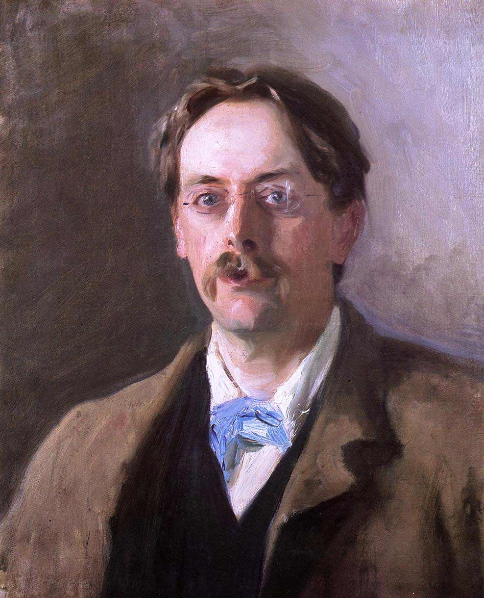
I had an opportunity to visit the National Portrait Gallery where they had an exhibition of John Singer Sargent, I had of course gone to see the Grayson Perry exhibits where he wonderfully sums up the nation’s beating heart by having a computer darn some words on a bit of cloth. It was more overwhelming than I had expected with all the words in different colours, a real treat. Having a bit of time spare I thought I would take in the Sargent too. It was fascinating, showing just how far art has advanced in recent decades. For a start every picture is ruined by the gratuitous use of skill. This takes them immediately beyond the reach of the ordinary man and into the muddy waters of elitism. He may be sublimely talented, but does he really have to push it into our faces? A more subtle artist would have painted them really clumsily, thus showing us the inner monsters we all wrestle with. Indeed standing in front of some of them you even feel as if there is a real person there who might start breathing. This is fundamentally dishonest to the materials of paint and canvas. There was also no excrement that I could see, which would have helped a lot I feel.
One of the first pictures he had obviously given up on it, and I could well see why.

I quite like the passage bottom left and wonder why he didn’t do it all the same way. He plainly wants to impress us with the way he has indicated the glasses with hardly any marks. Her name was Violet Paget but went under the name of Vernon. This is good gender aware stuff, but Sargent takes it nowhere, you only get the feeling of her character and that the painter was fond of her, rather than the deep political waters that ran under society’s polite upper crust. The drawing is worryingly precise, but still lost and found, distressingly clever. A more confident painter would have put all the lines in the wrong place. Not for the first time Sargent’s skill lets him down.

Here for comparison is how a real artist paints a person with red lips and glasses. This is by the astounding John Bratby. Here the paint is good honest paint not trying to pretend to be flesh. The drawing as well is wonderfully incorrect with no edge at all in the right place. He carefully avoids all subtlety here and if he has any skill at all he wisely hides it.
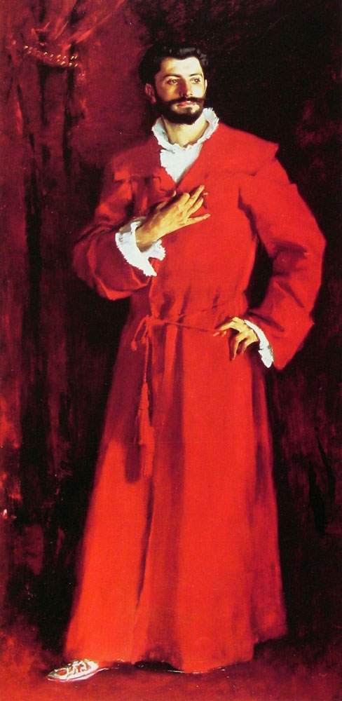
The artist travelled a lot in Europe and met many of the Impressionists. Here he makes a good beginning in using just the one colour mixed with black. Then he ruins it all by making the paint take on the illusion of a man. This catastrophically undermines the redness of the red. Most of my favourite artists just use colour straight from the tube, just adding a bit of white or black maybe. Here alas Sargeant wanders of into many subtle shades of the colour thus being untrue to what was written on the side of the tube and introducing unnecessary complexity and depth.

I tried to imagine what the immortal Rothko would have made of this subject matter. Even with my poor photoshop skills I produced something far better than the oh so talented Mr Sargent. I might actually do a canvas of this for next years RA show.
I was starting to feel pretty grim by now but spurred on by the memory of Grayson’s lovely pots with wobbly thick rims and crude sgraffito I persevered.
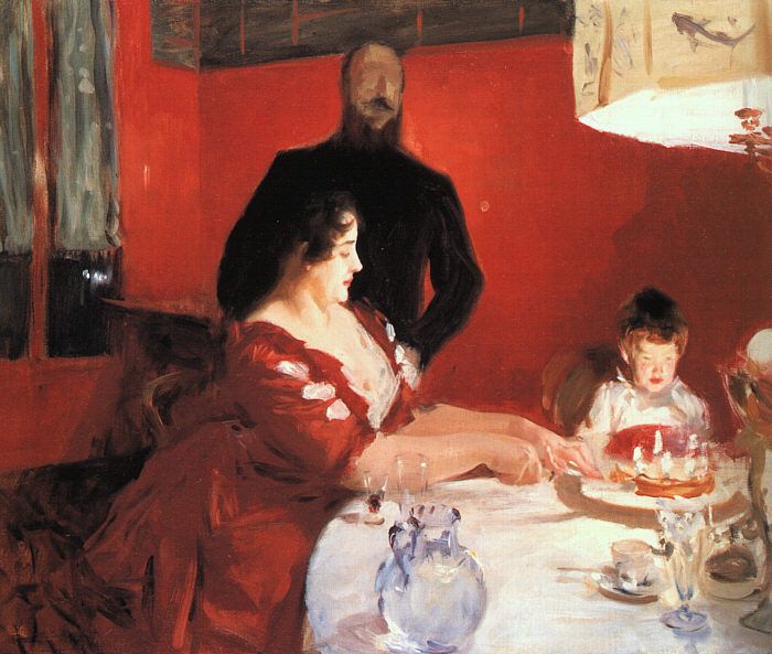
I had hopes of this one. The bloke in the background has no face. The other two do which rather ruins it all. He just can’t resist painting things well. Of course he is using brushes, I think here I would have used a mountain bike.

There were a few drawings. I didn’t bother to read the titles as I was loosing the will to live. What right has this man to push his superiority into our faces? Thank God we no longer torment our art students by forcing them to gain any of the skills that can produce such monstrosities as this. If they don’t have the skill or the ability in the first place then it saves so much work unlearning it later on.

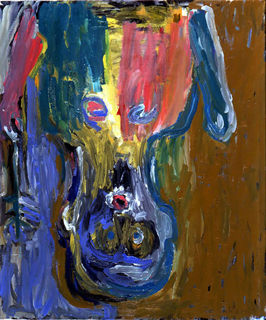
Here is what a mature artist who has never taken the fatal step of learning to draw can achieve when taking on a woman with a hat! Here everything is gloriously wrong, better still it is not even wrong in a good way. In this Tracy Emin avoids getting hardly anything right. My one minor criticism is that she got the crown on the head and that you can tell it is a crown, no body fluids either which is a pity.
I could not carry on and had to escape. I wandered for a bit around the galleries and as if he was haunting me there he was again. Unlike the first one there isn’t the nice abstract bit bottom left. Even though it looks as if he dashed it all down in a few minutes it is distractingly real, far more alas that a photo. What really puts Sargent way down in the minor league of portrait artists is that he always goes for the obvious and hangs them with the head at the top. Despite it all if he had never wasted those years learning to draw divinely and paint as if angels guided his brush he could I feel have been a half way decent artist.
I leave you with a proper bit of painting by the supreme George Baselitz. Here everything is perfect the paint is right out of the tube with none of that fancy mixing. The drawing is nonexistent. Best of all though I have a suspicion that might be excrement in the background!