Rob Adams a Painter's Blog painter's progress

September 10, 2013

A Watercolour Month in London and Wales

Back to watercolours this month. The oils have made a step forward but I don’t want to loose my edge with the wishy washy stuff. I need to do some experimenting to broaden my range a bit if I don’t watch it I become too literal and don’t do enough exaggeration to lift the painting from the mundane. This is a hard thing to judge as overcooking it can be worse than understating!

Watercolour is hard to beat for a quick sketch, you can get so much down in so little time. Some of this posts paintings are only tiny but they still carry invaluable information that will help in the studio. As usual I have been going out painting plein air rather too much and not doing enough studio painting. It is especially important to keep up the studio work in watercolour as many of the techniques require deftness and quickness of touch. If not practiced regularly these skills rapidly become unlearnt. Oddly I don’t find this with oils as the process is not as dynamic. With watercolours things have to be done at the right moment and with confidence, if you are tentative the moment to get a particular effect is lost. Watercolours also require a greater degree of planning. I like to have the sequence of washes worked out in my head before starting. Also their timings as at what stage of dryness one wash goes over another can make a huge difference. For instance lay a wash over another before it is ready and the two will merge into mud. Wait until it is too bone dry and the top wash will layover the other without interaction. Get it just right and the top wash will dissolve the lower one just here and there adding interest and granularity.

I have been off to beautiful Pembrokeshire again, lucky with the weather once more. As it was a family visit I didn’t do much painting but did plenty of looking. I also saw an exhibition of Keith Noble’s lovely watercolours. There is not much of his work on the web which is a pity as he has a wonderful touch with complete mastery of the technical elements. I think some of his work will be at the RSMA as he is a member so I will be looking out for them. Seeing someone else do fantastic work always inspires me, I want to go straight home and try to catch something of it myself. On the subject of the RSMA I have managed to get a picture in myself again which is the second year running. Details here: RSMA 2013

.

Plein air Thames, London, watercolour

After a bad day when I seemed to get nothing done I went up to town to catch the last of the light. The light was going so fast I went at this like a madman.

No drawing and I kept the palette deliberately narrow to speed things along It is just ultramarine and transparent red ochre, a tiny bit of cad red for the life

rings as I recall. The best thing was it lifted my mood and made the day feel worthwhile. 1/4 sheet of truly horrible Two Rivers paper, like blotting paper and

very irregularly sized, there was another two inches to the right which I had to crop off as it had two completely unsized areas. It is of course the Thames.

.

Hampton Court, Thames, watercolour

A Wapping Group day at Hampton Court. Lovely weather but I was rather slow to start. I did this wee 7in by 5in to get me going. Then I did a truly execrable

oil which made me grind to a halt again. The only solution being to slope off and eat a full English and read the paper!

.

Molesey, Hampton Court, Bridge St, watercolour

This is Bridge St. No more oils as the threaded bit on top of my tripod fell out and into the reeds. This is Bridge St in Molesey, over the river from Hampton

Court itself. About 8in by 11in. Hard work as it is a very complex subject. The sun was beating down and I was quite baked by the time I was done!

.

Thames, Molesey, watercolour

Another 5in by 7in. Molesey lock in the distance. Quite an easy subject and it was pub time once I was finished. Very pleasant to finish the day with a beer and a chat!

.

Newport, Pembrokeshire, Wales, sea, watercolour

Here we are in Newport Pembrokeshire. I have painted this scene many times but it always seems different. About 8in by 10in. It was quite breezy and

I struggled to keep the paper still. The key here was the the tone relation of the distant bay to the foreground. I actually painted the headland in the same

colours and tones as the foreground. Then at the very end I laid a wash of pure ultramarine over the nearby field to darken and mute it.

.

Newport bay, watercolor, Dinas head

I did this while waiting for areas of the previous painting to dry. It is Dinas head. Only 3in by 5in but enough there to tell the story.

.

Manorbier Castle, watercolour

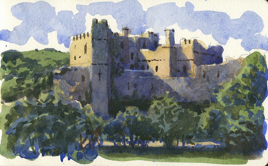
This is Manorbier Castle. The light was super it was a real pleasure to do this little 5in by 7in sketch.

.

Porthgain, pembrokeshire, Wales, Watercolour

This is Porthgain. Painted in an absolute gale I had to finish the boats after as the paper was flapping about too much. I often mute colours but this scene

was so full of delicious hues I didn’t hold back… a little bit technicolor but never mind! 9in by 11in. Another difficulty was that the wind was blowing the paint!

.

Porthgain, wales

Another from Porthgain. I found a sheltered spot to do this tiny 3in by 5in.

.

Whitesands, pembrokeshire, wales, watercolour

This is from a photo of an earlier visit but with the light of the recent one! It is Whitesands near St Davids. I liked the composition but the light wasn’t great.

However on this visit I took some pictures on a different beach where the light was super. Not too hard to graft the two together. 1/4 sheet Arches.

August 22, 2013

Style Wars

I have sort of touched on this previously but a few conversations this week have sort of focussed me on the issue. People both painters and  people who enjoy looking at paintings tend to like some things and not others. Painfully obvious of course. The problem is that they also tend to go further and lean towards believing what they like is worthy and what they don’t enjoy as worthless. I myself have plotted an erratic course through the landscape of art and at different times have liked and loathed many different styles. Now however we are in an age where nearly everything in the history of painting is available at the click of a mouse.

I have a large collection of art books which now never leave the shelves as there is better and wider information online than most of them contain. Indeed I have seriously thought of getting rid of them as they are almost never looked at. The books do provide another service though. They plot the course of my interests of things visual over the years. There are books on anatomy, carpets, Irish castles and insects, to name but a few. I can still recall the excitement when I found a book that inspired. I remember the fascination of delving through George Bain’s book on the construction of celtic art, which sent me on an orgy of drawing key patterns and brain boggling interlacements. That indeed was the pattern, discovery followed by practice and then on to another focus of interest. My library is quite wide and eclectic, consider how much more grist there is available for my mill compared to that of Rubens, but is still a mere slither compared to what is available online.

Young artists today are faced with a blizzard of imagery from all of mankind’s long history of visual creation. Search engines place everything on an equal footing, they don’t care about quality or provenance only keywords. With this in mind I wonder if it is now almost impossible to do anything wholly new. We have as it were mapped out most of the terrain available to explore and only a few ever reducing (and not necessarily interesting) corners are still left uncolonised. This I cannot help but feel spells an end to the linear flow of art history much loved by academics and critics. The same thing has already happened to some extent in music. A teenager’s iPod can contain everything from Bach to Led Zeppelin to some very current offering. They have essentially treated all that was available as some kind of cultural buffet and filled their plates with whatever took their fancy. This in turn has had an effect on music production which might draw from a hugely diverse mix of influences. The same is becoming true with painting I suspect.

This I cannot but help feel spells the end to both the contemporary and the so called modern. When a categorical term becomes so inclusive that nothing is excluded then its usefulness has as far as I can see ended. The establishments at all ends of the art spectrum are bravely battling to hold back the tide, but like Canute they are likely doomed to fail. The hard thing from my point of view is to envisage what the landscape might look like once the dust has settled. I’ll make the attempt to work out the possible results though this will likely be risible once the reality is there to be considered!

Firstly, I think your idiom of painting will in the future be entirely a matter of choice. Much in the way you might choose a medium or a composition. Already you see many artists who do both abstracts and representational. This could well be the norm in the future.

Secondly differentiation of whole categories of subject matter, type of execution, styles or idioms into high and low art may end. All the flavours of painting available which are currently assigned a different degrees of worthiness or status may therefore be equalised. It always makes me chuckle when I see auction and exhibition catalogues use the word “important”. My immediate feeling is to whom, sez who and why?

Thirdly a more useful way of assigning merit might well occur. At present we have what the Art critics say is good, what the Collectors collect, and what the Curators select. Notice we don’t have what the public likes in there. Now however we have the potential to assess better than ever what the public likes. What is more we could narrow it down to what different sections of population appreciate. The tastes of visually naive and the sophisticated and their different likings can be separated out. This in turn could be used to supply rankings of relative merit in varying idioms. No method of course would be without flaws and unfairness, but it would not be hard to be better and indeed more fair than the current elitist regime.

I wonder as well what categories of painting might be useful, here is a wild stab at it:

Expressionistic, the painting of feeling and emotion.

Observationalistic, the recording and fixing of perceived reality.

Imaginistic, the painting of dreams and imagination.

Analystic, the painting of texture, pattern and structure.

I don’t see any of these as exclusive, each might in some circumstances be a subset of one of the others. So a work might have any combination of each in any order. Each might be further broken down so that “Imaginistic” could contain Surrealism, Illustrative and perhaps Metaphysical content. It is very hard to visualise, I gave considerable thought as to whether there were any other possible categories. If anybody can think of a manner of painting that would fall outside of all these categories then I would be delighted and intrigued. At first I wondered if Symbolic was a category but on the whole I think it can be contained within Imaginistic and Analystic. We could maybe sink to the depths of a diagram at this point, I can only apologise for this new low, but it shows the possible interactions better than words can…

.

Diagram

As we are painters I have chosen a colour chart approach! You can see by the way the colours mix we can have any shade or mixture of my four elements. You might I hope place any painting you know approximately in this space. Plein air for example would be leaning towards the Observation corner, with a good dollop of Expression a certain amount of analysis and only a small dose of imagination. Surrealism would have a large proportion of Imagination with maybe less of the other three. This is not I am at pains to point out a diagram of all Art, where for example would you put photography? Perhaps in Observation, I did consider Perception and Experience as that heading but felt them a little too broad. The observation is done mechanically, but the decision to observe was made as in a painting. If anybody can think of a painting that falls outside these bounds let me know what it is and why, don’t mind my wild theorising being shot down in the least. One other thing I pondered was how I should arrange the influences around the square. Unfortunately none are ideal. A truer arrangement would be in 3D with each influence placed at the corner of a tetrahedron! Enough mad theorising some paintings!

.

Faversham, Kent, plein air oil painting

I have been going out of a Sunday with friends Tony Lawman and Graham Davies to paint which is very much fun. This is Faversham creek. 8in by 10in.

.

Faversham, Kent, oil painting

Don’t quite know what to think of this one, needs softening and merging somehow. The tonal contrasts are too brash. 10in by 14in oils.

.

Faversham, Kent, oil painting

Last one of the day and the best too. Faversham Creek again, the day steadily improved. 10in by 12in oils.

.

Faversham, kent, oil painting

Faversham again but painted last winter I would guess… I was sorting all my plein air stuff into locations when I came across this, the foreground wasn’t

finished, so a plein air I would guess, but I have no memory of painting it at all! I obviously didn’t like it at the time! 10in by 20in.

.

Tower Bridge, London, Thames, HMS Belfast, oil painting, Wapping Group

A day out with the Wappers, there were two more oils but I scraped them off, the light went horrible and flat. 16in by 10in oils.

.

Pool of London, Thames, watercolour

I should have stuck to watercolour sketches for the rest of the day. There’s a lesson for me, don’t paint unless the subject grabs you!

.

Queensborough, Sheppey, Kent, plein air

Another day out with the boys. This is Queensborough on the Isle of Sheppey. Lots of great subjects this is 10in by 16in. I did an earlier one but it is in

surgery I might post it if it survives!

.

Queensborough, Sheppey, Kent, watercolour

Last one from Queensborough, I liked it there lots to paint the town is paintable too.

« Newer PostsOlder Posts »

Powered by WordPress

error: Content is protected !!