Rob Adams a Painter's Blog painter's progress

August 16, 2013

The terror of white walls

Here is an area where I make mistakes repeatedly, and with the cost of mouldings expensive ones too. So I have been eyeing up other people’s choices with much interest in the past year or so. Here is the problem: Most gallery and household walls including my own are white. White is unfortunately just about the most unflattering hue to present a picture against in my opinion. Imagine the National gallery old masters hung against bleak white walls, even worse imagine them all “gallery wrapped”!

My instinctive tastes are inherited from my parents and I suppose reflect the 40’s and a bit of their parents taste from the 1890’s thrown in. So I tend to frame for an imaginary room with green William Morris wallpaper and possibly gas light. The results when placed on a white wall I have to admit to myself have not been pretty. I have used up most of my poorly chosen moulding and am trying to not make the same mistakes again, but am not exactly confident as to how I should go about it.

Another factor that makes matters worse is that a large 6ft wide abstract in primary tones will look great as just a bare canvas. It is beefy enough to hold its own against that wilderness of white. A 14in by 10 in plein air however does not stand a chance! It needs therefore some protection against the wall surface dominating and this means a frame. Also I need a standard frame I can’t go framing each oil painting separately, especially if they are ever shown together, there is nothing worse than a motley collection of varied frames.

The first thing that occurred to me is that looking at what others do the moulding needs to be quite substantial, around 100mm. Also it needs to be quite simple, no vine leaves! It does however need some depth to it so that it springs from the wall. I have seen quite a few framing jobs that essentially put a 6in white plank around the picture which I don’t like. Another factor is cost I am going to paint the frame so there is no point in buying an expensive moulding. To find a moulding that fulfils all these requirements is not easy!

Firstly some paintings, the usual mix of OK, so so and dire! I really must stop just painting whatever is around on days out. If nothing presents itself then just keep on looking until something does, don’t just paint because that is what you are there to do. Every time I sit down and paint something that doesn’t really grab me the results are poor, it is just time and materials wasted. It is I suppose unreasonable to expect to find a worthwhile subject every time you go out, especially if the light is no good. Better to come back having done a lot of looking and no painting than with dross that wasn’t worth the doing! So I will if I can stick to doing quick watercolour or small oil sketches if I am at all uncertain of the worth of the subject and only set to with the oils on a bigger panel if there is a good chance of a worthwhile painting. I have been pressing on with some larger pictures, they get easier the more I do. I don’t know why I find a 24inch wide canvas forbidding, it seems absurd since I have spent a large chunk of my life painting things 40ft across, but there it is.

.

Northumberland Avenue, London, Oil painting, city, urban

This is Northumberland Avenue 22in by 16in. Based on my plein air sketch last week and associated photos. I am getting better at transferring the

plein air colour and feel to a subject after the event. First I adjust the photo to look as much like the sketch in tone and colour as I can. This makes the whole

process a lot smoother.

.

Charing Cross Road, Rain, London, oil painting, urban, City

Another biggy, this is 24 by 18in. I did a plein air of this a year or so ago it was only 7in by 5in done hand held. I was very pleased with it and knew it

would make a good picture. Great fun to paint as I was pretty sure the result would be worthwhile. I’ll put the small sketch below for comparison.

.

Charing Cross Road, London, Plein air, oils

I really tried hard to keep the feel but not be too slavish in my reinterpreting it.

.

Sunbury, plein air, oils, Thames, river

Here is a prime example of a painting that I should not have bothered painting! There is nothing particularly wrong, it is just boring and not worth a

painting. A small watercolour in my sketchbook would have done the job. It is Sunbury on Thames 14in by 10in oils.

.

Sunbury on Thames, knot garden, plein air, watercolour

Here I did the right thing, the quick sketch serves the subject perfectly, which makes the 20mins well spent!

.

Richmond Hill, Thames, plein air, oils

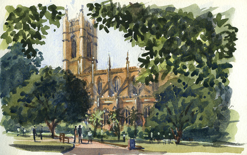
Driving back from Sunbury I took a wrong turn and ended up going over Richmond Hill. Seeing this who could resist? It was such a relief to be sitting in

front of a fantastic subject. I’m not sure that this does it justice, but the photos I took do it even less! 15in by 7.5in Oils.

.

Now back to those pesky frames, non frame nerds can back away!

.


As you see from the dimensions it is quite substantial and stands out from the wall 53mm. It also has a rebate that will take a canvas, many mouldings have a small rebate so the canvas

bulges out the back which makes fixing annoying. My next move is to try and work out what the finish should be. This is far from easy and not something I am confident about, so I

decided to treat it the same way as any commercial job. To this end I built myself a simple gallery space in 3D and hung my virtual pictures on the wall! With today’s technology I can

test different arrangements and see which will do the job best. This should mean less messing around when I come to actually paint them. Fortunately 20 years in the scenic art world has

given me the technical skill to apply finishes professionally. Due to this experience I also can make up the frames, which is just as well as the moulding is too big for any Morso! I’ll put a

series of images to show the development.

.

Here is my virtual gallery. I have made the computer model of the frames in scale. In olden days when we had deep red wall paper these gold frames were

just the thing… But on white gallery walls they look pretty grim.

.

Here I have simply painted white leaving the gold as an accent. Better already I hope you will agree. A little dead looking though.

.

I next tried grey and white as I have seen others do. Quite nice but very utilitarian and the white does not suit pictures with quite dark tones.

.

The same grey with gold accents. This works better and I will go with this. I can vary the grey depending on the tonality of the picture.

.

I added a slightly more realistic lighting to my model and tweaked the grey. Next I have to refine in the real world!

.

Here it is, a terrible photo but you get the idea. This frame has about 10 coats of paint as I experimented! I will I think do a lighter weight version for the

10in by 16in and below but this should look better than my previous attempts in an exhibition environment.

July 26, 2013

Relative Importance

Filed under: Drawing,London,Painting,Thames,Uncategorized,Watercolour — Rob Adams @ 3:53 pm

I expected after a while to run out of things to post about but it doesn’t seem to be happening so far. Which perhaps shows what a wide subject painting is. This instalment  is about relative importance, a something I am just starting to get to grips with myself. This is prompted by a very good article by Stapleton Kearns which is here. The subject is sometimes called subordination, or as I put it in the heading “Relative importance”.

Like all technical theories it needs to be considered as a factor not a rule! You can always find examples that break any rule successfully, but it is something to consider when making a picture. It underlies the problem of detail and why too much of it can often ruin an otherwise good painting. Subordination is of particular interest to a plein air painter attempting to get an impression down of a fleeting moment because it allows you do to break down what is key to a picture and what is merely there in a supporting role. When I look back at pictures that failed very often a lack in the focus on the centre of interest was the culprit, especially in plein air work.

A beautiful scene is all well and good but it is only an empty stage awaiting actors. What can be considered as a subject is pretty broad, anything from a splash of light in a distant field to an upfront figure in a street scene. A very simple example of this in action is the vignette where the edges of the picture fade out, or Richard Schmidt who fades out many of his pictures into abstract scumbling. These are both rather obvious examples the method works best to my mind when it is subtle, done too crudely you might as well paint an arrow on your picture with, “Look here you fool!” written on it… As with drama the hero must be engaging but the supporting players believable too.

One of the mistakes that many painters, both professional and amateur make is the paint the whole picture with the same intensity of gaze. It is a crime I am very often guilty of myself! So in a cityscape the windows of the buildings might be all painted to the same level with window bars and all the surrounds. The result of this , I fear, is a stiff deadness to the picture. As to why this is so is harder to work out. The real world is after all in the same fractal detail where ever we look. The answer, I think, is in how we look. We see in detail with only a tiny bit of the eye, the fovea, everything surrounding this is peripheral, much not even in colour. So what happens is that the eye moves, focusses and as it does so subordinates everything around. Try it yourself look at an object and fix your gaze. Then shift you attention to another object but do not move your eyes. This is not easy as your eyes want to flick to the next centre of interest but it quite possible with practice and valuable for an artist. What you find is that the objects outside your main focus are rendered by the brain in a pretty cursory manner, the basics are there but not much more.

So when you focus in our cityscape upon a taxi coming towards you, you actually cannot see those window bars you just see a dark blur where the window might be. This is why a painting done of the same subject with the focus on the taxi can have very basic indications of windows in the buildings and still seem to the viewer to be all there with nothing missing. This does not mean however that the drawing can be slapdash, that blur needs to be in the right place with the right tone etc and roughly the right shape! In practice you can supply a few bits of detail, a hint of a window bar here and a reflection there are all that is needed for the viewer to fill in the rest.

There is of course a slight conflict here, many viewers of pictures enjoy exploratory looking and will exclaim in admiration over the detail. Whereas a painter might pay a compliment as to the way certain elements are just suggested not defined. This might seem to be an unbridgeable divide but in practice this is not so. I have quite often received the “wonderful details” accolade or worse the “Just like a photo…” when in actual fact the detail was mostly  just hinted at. A few paintings so you can see me not taking my own advice…

.

The Boltons, Chelsea, pintar rapido, plein air, oils, London, porsche

This was my effort for the Pintar Rapido. No I didn’t win, or indeed sell my picture. I was quite pleased with this nonetheless, it was blindingly hot and

quite difficult light. You had to register before going out so it was impossible to paint early when the light was good. This is the Boltons in Kensington

and Chelsea. One of the most exclusive roads in the capital… 14in by 10in oils.

.

Chelsea, St Lukes, church, watercolour

I had to hang about the next day as I needed to collect my picture. I did this wee watercolour of St Lukes in Chelsea, too hot to do more! 7in by 5in.

.

Putney, Thames, Plein air, Wapping Group, oil painting

I am trying to get to as many Wapping Group days as possible. This one was a visit to Putney. Once again the day was very hot so painting from the shade

was favourite. It was quite hazy with the sun coming and going but I enjoyed painting this. I am using glaze medium to lay in the basic tones which means

using a white board. It is almost like watercolouring with the white of the board shining through. I like the method for the most part though you do tend to

loose the unity gained by using a toned board. The advantages are that the whole thing can be laid in very fast and as the glaze dries quickly it is ready to paint

over in minutes. This really reduces the problems with “pick” up and keeps the painting very clean.

.

Putney, thames, watercolour, plein air

I did a quick watercolour of the same scene, I like the way the different media tend to pick out different aspects of the same scene. 7in by 5in.

.

Putney, Thames, river, summer, plein air

I then turned 180 degrees and did up river, my heart wasn’t really in this but all good practice… looks like Italy! A pint of cold beer in the pub was very

welcome I can tell you! 12in by 10in oils.

.

Chelsea, London, street, sun, oil painting

I’m not sure if this is finished, it is Chelsea again I went back as I saw several possible paintings. I only drew out and laid in with glaze then the heat drove

me away. It was 35C! I carried on working from snaps but I might go back and finish on site if I get the right day. I am pleased with the feeling of heat but there

is something that worries me. I always hate it when there is something not quite right that I can’t put my finger on… any suggestions very welcome!

The car is a bit too dominant perhaps but I rather liked the bad parking! 20in by 12in oils.

.

Erith, Thames, watercolour, plein air

Another Wapping day though I saw no one else and couldn’t make the pub due to vegetable watering duties! This is Erith in Kent I rather liked this untidied

section of the river… but the riverside flat plague is infesting the river here too, this industrial stuff will all be gone. I painted this from a scrap of shade but felt

it would be easier to catch in an oil… 7in by 5in

.

Erith, Kent, Thames, Oils, plein air, Wapping Group

I gritted my teeth and did this in the full sun. I was right in thinking it would be easier in oils. I painted all the jetty and conveyer in a flat dark and then

worked all the other stuff around it. This keeps the darks thin, with a subject like this it takes very few marks to fill in the feeling of detail on top. 10in by 7in.

.

pochade

Some nerdy stuff now, I wanted a super light set up as I don’t like carrying a full pack around the city. The pochade box weighs only 875gm and the

whole lot you see above weighs in at 1.3 kilos including Zipshot tripod. It takes 14in by 10 in boards and can carry 2 wet paintings slid in the back.

.

pochade

Here it is packed up. To test it I went out to Northumberland Avenue near Charing Cross.

.

Northumberland Avenue, London, oil painting, plein air

This is Northumberland Avenue, some super light, Graham Davies and I painted away trying to catch the mood. A great place to paint as the pavement is

wide and in the evening the light streams down it giving a great effect. A lot to get down in an hour but plenty here to inspire a bigger picture! The new

light set up worked a treat and will make popping up to town to catch the evening light so much easier. 14in by 10in.

.

Helium, pochade

Finally my vision of a truly light weight painting set up, “The Helium Pochade” I’m sure it will be a winner!

« Newer PostsOlder Posts »

Powered by WordPress

error: Content is protected !!