Rob Adams a Painter's Blog painter's progress

July 22, 2014

Competitions, Clubs and Criticism

A lot of my painting days out are done as part of a group. With the Wapping Group painting every Wednesday and the Brass Monkeys every other Sunday I keep quite busy. I do feel perhaps I am not doing enough going out and painting by myself. The dynamic is quite different with a group of fellow painters, very pleasant of course with chatting and coffees to punctuate the painting. I think most of this posts offerings are in the group category. Rather a large gap in posting this time too as my laptop died and needed bits replacing.

I also attended the Pintar Rapido competition in Chelsea which was great fun. I was a little more organised this time and went there a few days before to decide on a subject. The previous year I wandered about looking for one and had to settle on a subject I wasn’t wholly in tune with.

The results when seen in the exhibition were as last year a mixture of all styles and levels of attainment. Interesting to see what I guess are art school students trying to paint the real world. They have almost no skills as such and have this naive idea that if they just go for it then a miracle will occur. Alas miracles are thin on the ground, but their self belief in unshakable. I talked to a few and they all seemed to feel skill was a minor consideration in painting. On the other hand they all seemed to admire it in others. I didn’t say I felt it was vital, as I wanted to gauge their feelings on the matter rather than impose my own views.

In the exhibition it was plain that some of the buyers didn’t think craft mattered either, but on the whole the well crafted sold better than the randomly intuitive, which is cheering. Another thing that struck me when whispering critical comments to a companion is how thin on the ground criticism is. We were whispering in case the artist was hovering nearby and our opinions overheard. In essence so that the person who might be the most likely benefit couldn’t possibly hear! Passing comment to the artist doesn’t really happen in the clubs either. I do sometimes offer an opinion if I see something really wrong that is easily corrected but try and restrain myself for the most part as offence is a very likely result.

It’s not that the criticism isn’t made, we judge and evaluate automatically. We also share our views with each other… but almost never with the artist themselves… which is odd really as they would surely be the ones most likely to get the most out of it. The result is that you tend to only hear anodyne  positives or inscrutable silences. I am in the habit of forcing the issue and asking for comments. This makes some uncomfortable and others will just tell you all is well whatever the real state of affairs!

Politeness is of course the reason for this lack of plain speaking. There is the uncomfortable fact that none of us welcome hearing that one of our efforts falls short and even less that it has fallen short in some way we hadn’t spotted. The truth is though we would all benefit from the clear sight of an uninvolved eye however bad the news, especially if that eye is educated.

What is needed I suppose is a forum where praise is banned and only observed room for improvement is mentioned. You would need rules of course. A comment like, “That is rubbish!” is of no use to any one. But a comment like “The perspective is out on that building.” or  “I’m not sure about that red patch as it takes the eye too much.” is useful as it gives a clue about putting something right. I have seen some attempts at this, the most successful being in the Life Drawing forum on WetCanvas. There people commented on anatomy and other aspects without too much bad feeling being expressed. However I think a forum where only critical comments were expressly required might work better. There are some I suppose for whom any negative comment is undermining and damaging for confidence, but IMO excellence in art (or indeed anything else) is a hard road and if you are that delicate then perhaps serious pursuit of it isn’t for you. On that harsh note some pictures… feel free to make painful but valid comments!


Erith, yacht club, drawing, Thames, Wapping Group

A day out with the Wappers at Erith Yacht Club. Very hot day and I was late getting there. I had just received a set of new sketch books with reproduction “Turner blue” paper. I hatched the sky but should have blocked it in with the white acrylic pen as the line work is too fussy. I might start to use white chalk as Turner himself did.


Erith, Thames, watercolour

I liked the way the light had developed so I did the same scene again. I am rather liking doing watercolour on the hot pressed paper. I tried using it years ago with little success but rather like its qualities now. I softened the clouds a little after this was scanned. I was pleased at how easy that was.


Amboise, france, watercolour, chateaux

Another historical paper effort. This is on “Girtin” type paper. Again an interesting effect. Wet into wet is almost imposssible as the paper cockles brutally.


Amboise, Romanesque, france, watercolour

This is the door of the church of St Denis in Amboise. The Romanesque part dates from 1107AD. Denis lost his head due to an axe. After his head was chopped off Denis is said to have picked it up and walked six miles from the summit of the hill preaching a sermon… 12in by 9in Watercolour. Done on Arches 140 paper from a large roll, I’m very glad I stocked up before the quality dropped!


Ransomes Dock, thames, London, Barge

Another Wapping day. This is Ransomes Dock near Albert Bridge. 10in by 10in. I thought of taking this further but decided not as it might ruin the feel which I rather liked.


Albert Bridge, Oil painting, plein air, thames, London

I had a short while on the foreshore to paint this as the tide raced in. Albert bridge is very pretty but I don’t like bridge pictures a great deal and wonder now why I bothered to paint this… dull but worthy alas! 10in by 16in.


portobello, london, pen and wash

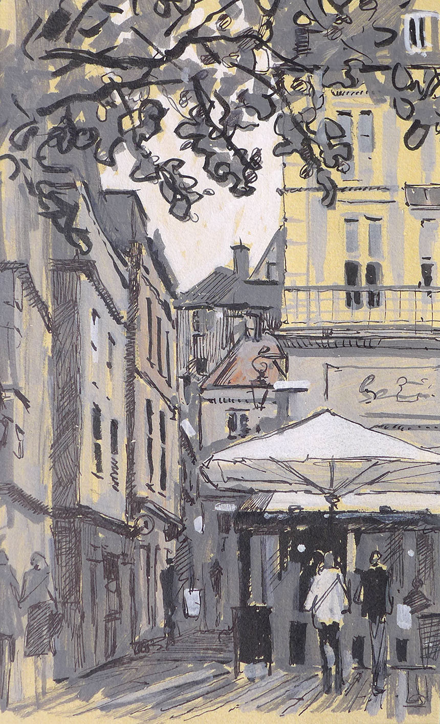
This is Portobello, a great day with the Brass Monkeys. The road was full of life despite is being a non market day. I am enjoying the pen and wash it is great fun to splash over the pen work.


portobello, london, watercolour

Another very quick sketch, leaving out the pen this time. Portobello again.


portobello, london, pen, drawing

Last one from Portobello… it’s that Turner blue again.


Sloane Sq, chelsea, London, Pintar Rapido

Here’s my effort from Pintar Rapido. Not the greatest photo of the painting as I forgot to snap it in the open air and had to take the picture in low light at the exhibition. 12in by 16in Sloane Square, Oils. I had set my heart on a rainy painting and the forecast looked to be on my side. When I arrived the streets were wet from earlier rain but that was the last rain we saw! The reflections therefore are imaginary. I enjoyed painting it hugely and was delighted that it sold. If the buyer reads this they are welcome to bring it to my studio in about 3 months as it will need varnishing!


Rob Adams, Pintar Rapido

Here I am painting away in a somewhat colour coordinated manner.

June 27, 2014

The Loire and Normandy

Filed under: Drawing,France,Painting,Watercolour — Tags: , , , , , , , , , , , — Rob Adams @ 4:06 pm

It is the holiday season again! As usual I went on the annual Wapping Group holiday, this time to Amboise on the Loire in France. Literally a busman’s holiday as we go in a coach in a group of about 20 painters and their partners. The great joy of these expeditions is that the whole thing is focussed around painting… er… well and eating too I suppose. I always have great dificulty deciding which media to take. I was intending not to take oils but relented at the last moment. A new addition to the watercolours was the pen. I had decided to start adding wash as well so I took some Noodlers inks which have a pleasing balance of mostly permanent but a fair bit of ink will dissolve into the wash.

I set off on these trips with a high degree of anticipation which is of course immediately dashed as soon as you are sitting before the subject. I did manage to force myself to be quite experimental, varying the media depending on subject and time available. The watercolours rather suffered as I didn’t quite get into my stride with them due to drawing a lot. Watercolour is one of those mediums that requires you to be in the zone if you want to paint them en plein air, which tends only to happen when you paint a string of them one after another. That said I am pretty pleased with the variety of my output.

A great advantage of this sort of coach based holiday is that you have to paint where you are taken. It is all too easy when touring by car to spend most of the trip driving around looking for a subject rather than trying to catch the flavour of a single place. I had been to Amboise 40 years ago so I was intruiged to see if I remembered much about it. I’ll do the pictures in sequence as much as I can. There will be another post though as the oils I brought back were left deliberately unresolved, but more on that  in my next post.


St malo, France, Brittany, pen and ink, drawing

St Malo where the ferry docked is a fascinating walled town. Full of up market shops and restaurants. The day however was grey, which was not great as the place is built out of quite a dark grey granite! I settled in the end for quite a wide perspective done from the city walls. This allowed a grand view down into the square where most of the restaurants were. The hardest thing here was to decide how to let the drawing fade off to the edges. I decided in the end to make the whole thing revolve around the tree and the white building to the left of it. Objects that were  towards the edge can then be simply indicated just by outlines. It is odd that the eye finds this perfectly understandable and acceptable.


St malo, France, drawing

Our visit to St Malo was only a few hours so this was my last there. I only had 15min so I blocked the whole thing in with acrylic markers. I bough two mid greys to add to my white which gives quite a  good range when combined with the black pen work. I deliberately kept the whole thing bold and kept the line work quite calligraphic.


Amboise, France, Loire, watercolour

I painted a couple of oils in the early part of the first day in Amboise. They will feature in the next post though. After eating I went down to the Loire and did this in the last of the light. Quite hard to see either my painting or the palette but still it captures the feel of the evening. I was so smothered in anti mosquito spray that I was a chemical hazard to myself and the surrounding wildlife!


Amboise, France, watercolour

Next morning I settled down to paint this small 7in by 5in watercolour. I tried to keep the whole thing light and airy and not over define. Quite a difficult perspective as none of the buildings were parallel to either the arch of each other. People are so important in this sort of painting, the scene would be very dull without them. I did not however want to tale them to a stage where you could engage with them as individuals. I still find this sort of fine judgement very hard to achieve.


Chenonceau, per cher, drawing, pen and ink

This is Chenonceau. There is a very famous and beautiful chateau there, but I decided quixotically not to paint it. There have been a thousand drawings of the chateau and I had seen it before so I walked into the town and drew this. The light was dull when I started then grew sunny, but I decided to stick with the soft light. Pen and ink is very good at describing buildings without needing strong shadow. The trick is to vary the textures and weight of the hatching to indicate the differing surfaces and planes. I will do a tutorial on pen hatching in a week or so as it is a technique many do not get the most out of.


Montrichard, Le Cher, Pen and ink, drawing

Our next stop was Montrichard, a small town on the river Cher. It had once been a very important place controlling a river crossing, but now a bit of a backwater. After wandering around I settled to do this using sepia ink I had mixed myself from two shades of Noodlers ink. A young child from the house behind me watched for a bit then got her siblings, they in turn brought the parents to see and finally the grand parents arrived to watch me to a finish! How odd it is that drawing and painting breaks through people’s reserve and makes them engage you.


Amboise, Chateaux, France, Watercolour, painting.

The next day was very hot indeed and I was faced with subjects that didn’t allow me any shade! This is part of the Chateaux of Amboise, there is another view of it later in this post that explains how unusual the building is. I struggled a bit to catch the feeling of it, bright sunny days are far from my favourite especially in the middle of the day. Still I got some better composed views in photos so this will help with the final studio picture. The washes were drying instantly which was very difficult.


Amboise, Chateaux, loire, france, pen and ink, drawing

I had drawn this view of Amboise 40 years ago, so was keen to have another go. I was sitting on the roof of a tower and the heat was quite something. I decided from the start to use two colours of ink, something I haven’t done before. Quite pleased with the result. By the time I had finished I was baked to a turn!


Amboise, Chateaux, France, Pen and ink, drawing

Last of the day I settled in the relative cool to draw this. I could not get far enough away really so the perspective is rather extreme. Mixing the inks again but less obviously.


Amboise, Chateaux, loire, france, watercolour

This was a real struggle. I was a little too early really. It made a better picture  an hour later. I had to risk life and limb to get by the waterside and was perched very uncomfortably on some rocks in the water. Looking at the photos I don’t think there is a larger painting from this viewpoint, so this will remain a sketch.


Amboise, chateaux, church, watercolour, france

This is the little church I painted earlier. This time it is seen from street level. I could not resist doing this though due the narrowness of the street the perspective was extreme. I had to position my stool near a wall and lean back. The light was racing so I had my work cut out getting it all in.


St Ceneri Le Gerei

This is a small chapel at St Ceneri le Gerei. We were there at lunch time so the light was directly overhead. I would have loved to do the trees all wet into wet but the heat was so extreme the paint dried instantly. I settled for putting in the tones and then washing quickly with water so the redisolved. Not ideal but needs must.


Dives sur Mer, france, pen and wash

Our next stop was Dives sur Mer, from where Bill the Conquerer set off to give us a good kicking. Badly bombed in the war but still some lovely things to draw. I drew this in the brown ink then washed over it and gave it body with the acrylic markers. I love this quick and direct way of sketching.


Dives sur Mer, France, Normandy, market hall, pen and wash

This was a scary subject. It is the market hall in Dives sur Mer. I drew it out in pencil and then inked the structure. To finish I washed over the whole thing so soften the inking then picked out the counter shapes in watercolour. There were more light sources than this but I decided to reduce it to just the one. I tried to keep the whole thing light and easy. With subjects as complex as this it is easy to get carried away with the detail and loose the character. I deliberately curved the perspective to draw the eye in but was artful not to push it to the point of “fisheye”.


That is it for this issue! I have as much again to come so it will need two posts.

« Newer PostsOlder Posts »

Powered by WordPress

error: Content is protected !!