Rob Adams a Painter's Blog painter's progress

July 12, 2017

Painting Holidays

Filed under: Drawing,France,Painting,Uncategorized,Watercolour — Tags: , , , , , , , , , , — Rob Adams @ 12:22 pm

For a number of years I have gone away in the summer with a group of other artists to paint in France. A coach load of painters all intending to paint a masterpiece or three. As you think about the trip in the weeks before you start to fantasise about the opportunities that are bound to occur for a great subject at a fantastic moment in time. So the coach arrives you disembark, media at the ready, and… Well just and… Reality just refuses to arrange itself into perfect subjects!

This time we were in the Ile De Re a place I had visited before and had mixed feelings about the place. On my previous visit I had experienced the great oil painting disaster. I had notably failed to produce a single half decent work in oils. In a way I suppose all that anticipatory build up is bound to result in deflation when the paintings refuse to fly off the brush.

So the coach has arrived and we disembark in St Malo…

St Malo, France, pen and ink, drawing

On my last visit here it was wet so it was a great pleasure to see it in the sun. I had decided before leaving to start with drawing to get myself in the groove. It was a good move I now feel as I enjoyed trying to catch the bustle of this very touristy town. Once the rough pencil outline was in I set about putting the key figures in. I have learnt over the years this is a good approach for me as I tend to get lured into overstating the architecture.

France, St Martin, Isle de Re, watercolour, painting

After a long coach drive we arrived in St Martin on the Ile de Re too late to paint. Next morning I was up early ready to go. I started to paint the harbour but it all went wrong… I don’t often tear up watercolours on the spot but I did this time. Slightly despondent but still as ever a sucker for punishment I set about a much harder subject. I had to be very quick as the light was on the move. From the start I simplified as much as possible and just focussed on the way the light was falling. My confidence restored a little I then retired for breakfast and strong coffee! 9in by 6in Watercolour.

Isle de Re, France, oil painting, plein air

With some trepidation I then set out on my first oil painting of the trip. I had nearly not packed my oils, but in the end decided to take only small boards and my 10in by 8in pochade. I had painted this square before in watercolour so I knew it was a reasonable subject. I forced myself not to rush and after drawing spent a fair while getting the tone relationships between the tree shadow, sky and lit wall right while still leaving enough headroom for a strong highlight. The sky had to be an unexpected tone for all that to happen so I’m glad I took the time. In any painting there tends to be a key relationship that needs to be just so. Spotting which one is key is another matter though. 10in by 7in oils.

Isle de Re, France, oil painting, plein air

My confidence boosted I set off up the town to do another. One nice thing about revisiting a destination was that I knew where some decent locations were and so didn’t have to spend time wandering and looking. Once again I looked at key tone arrangements and decided the church tower and sky relationship was the one to get right. Again the sky had to be a weightier tone than I would have painted it if I had just jumped in without thinking properly. 10in by 7in Oils.

Isle de Re, France, pen drawing

Next day I decided pen drawing was the way to go especially as this view could be drawn from the shade. Usually with pen drawings in the UK I would lighten the sky but here the heat and intense downward light on the ground made the relationships quite different. I think this is where I went astray on my previous visit. The only tricky bit on this was the road it would have been very easy to overdo the cobbles. Pen and Ink.

St martin, Isle de Re, France, watercolour

I took two goes at this as the light moved too quickly and I was in a rather exposed position partially blocking the pavement. I might do a studio one of this as I’m pleased with the overall feel but some bit of drawing are a little erratic in scale which undermines the feeling of distance. 10in by 8in Watercolour.

Sea mist, Isle de Re, watercolour, France

We had sea mist on a couple of days which was a real challenge. This is the gate to the prison. I should have stood to do this but made a poor decision to sit. I dislike the way nearby figures loom tall from this viewpoint and it undermines the scale of distant features. I was however pleased with the general mood. 9in by 7in Watercolour.

Isle de Re, beach, oil painting, plein air

As I walked further on the mist withdrew and once on the beach the light took on a fascinating character. In the Ile de Re the tide goes out for miles with the sea completely on the horizon. Only a few figures wandering in the shimmering heat punctuated the scene. I had considered painting a boat to two but didn’t have the will, so I set about doing this on a tiny board. As I worked a transit van belted past me across the mud and sand going out to the mussel beds, the tracks it left made the perfect lead in! I had to draw this quickly to a close as I and my tripod were slowly sinking into the wet sand. 8in by 5in Oils.

Isle de Re, France, oil painting, plein air

Another day and more morning sea mist. So difficult to keep the tones under control with this. The mist kept coming and going in waves so one second everything was ghosted and the next watery sunshine was breaking through. Very difficult but great fun to attempt to paint. I put a little too much colour but I was worried it would take on a wintery northern feel so went a little too far the other way. 10in by 8in Oils.

Pen and Ink, France, Isle de De, drawing

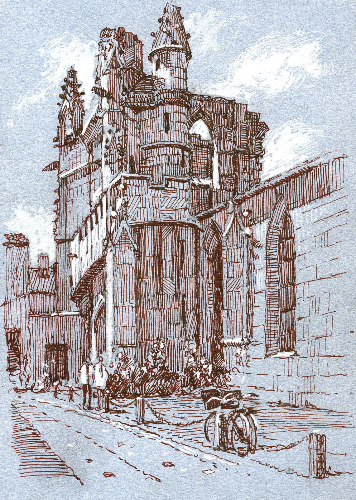
Later the same day I reverted to the pens as they do those middle of the day subjects quite well. Again I found myself using the paper colour more than I would at home, which certainly speeds things along. This is the back door to the prison and part of the wonderful defences of the town that were ordered to be built by Cardinal Richelieu, though what you see here was built by the famous engineer Vauban in the 1700’s. Pen and Ink.

Ile de Re, France, pen drawing, harbour

I am not a fan of harbours full of boats but as I sat eating my baguette I suddenly saw in my mind’s eye a way of rendering the mud. Unfortunately all the rest had to be drawn before I could put my theory into practice. I have to note the only boat so far! Pen and Ink.

Ile de Re, church, pen drawing

This is the sadly war damaged church. I had avoided drawing it before as aside from the main tower it is such an odd mish mash of repairs and alterations.  Drawing doesn’t get much harder than this! Pen and Ink

Nocturne, Ile De Re, oil painting

It has come a tradition  to go out and do nocturnes and this is my effort on the last evening. You never quite know what you are going to get until next day when you see your effort in the daylight. I was quite pleased that other than a vibrant streak of green in the sky I had more or less got things right. Probably more by luck than judgement though! 10in by 6in Oils.

Port en Bessin, France, Oil painting

Here we are further North in Port en Bessin in Normandy. It is a busy working port and a welcome contrast to the touristy Ile de Re. The change in the light from being a couple of hundred K’s North was striking. This needs some figures to cut across the cars but I doubt I will ever bother to actually put them in. It was very breezy and I had to hang on to the easel the whole time. 10in by 8in Oils.

Port en Bessin, France, pen drawing, fishing boats

There are wonderful boat repair yards in the town which patch up the chunky fishing boats that ply the channel. I had to sit peering through the railings to do this, Pen and Ink.

Port en Bessin, France drawing, harbour, pen and ink

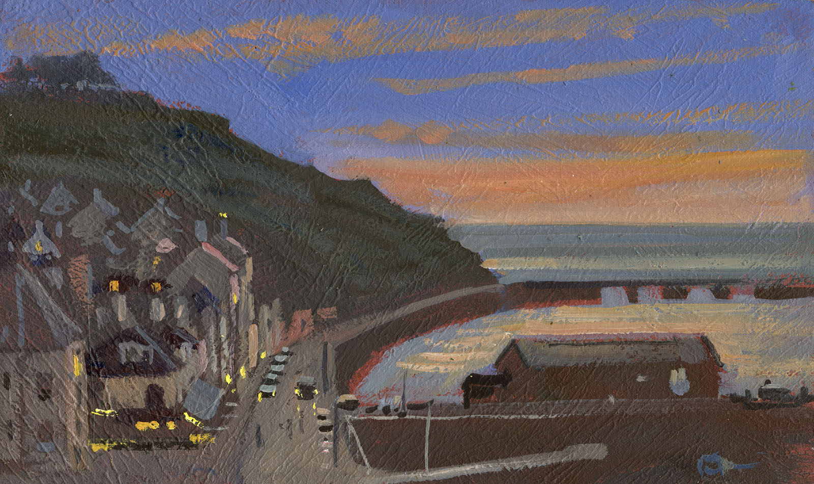
The town has hills each side of it which give great views of the town and outer harbour. I had decided to relax and just draw during the day and only paint in the evening when the light was best. Pen and Ink.

Port en Bessin, France, drawing, pen and ink

The same view but later and further down. A hard subject and stretching the limits of pen and ink. Here I used my wide fude fountain pen the block in the large areas of dark. I have added this and a brush pen all made by Sailor in Japan to allow me to get a different feel and add weight to some of my pen drawings.

Port en Bessin, pen drawing

The next evening actually down in the town but the same view. I used the fude a lot in this it certainly speeds the work and gives a bolder less delicate feel to the end result.

Port en Bessin, oil painting, plein air

A before supper painting as the sun dropped, very hard to get the tones right to give some idea of the dazzling light. Oils 10in by 8in.

Port en Bessin, oil painting, plein air

Here is the same view after supper and a bottle of wine! 10in by 7in Oils.

Port en Bessin, harbour, fishing boats, watercolour

I had been chiding myself for avoiding the fishing boats in the harbour so I went out to assuage my conscience. Not as painful as I expected as I took my time and got the basics of the drawing properly resolved before painting. 11in by 9in watercolour.

Bayeux, cathedral, drawing, pen and ink, France

Finally a visit to Bayeux, I love the fine cathedral and how it stands over the very fine town. So that’s it back to battling with the summer greens in Dorset!

April 10, 2017

Chairs

Chairs are interesting objects, they have been around for a very long time and have many variations. What I am interested in here though is the chair as an everyday object which is a more recent arrival. In earlier times and cultures chairs were really thrones as they indicated status. Ordinary folk sat on floors, benches, chests or stools. Even when chairs arrived into domestic use  it was only the master of the house who had one, hence the word “chairman” to indicate precedence.

A chair is a sort of seat, but by sitting on an object you do not make it a chair. So if you sit on a rock it briefly becomes a seat not a chair. A chair is a seat for one person and has a back, no back and it is a stool rather than a chair. A chair can have arms and be upholstered. It can rock, it can fold, you can have one in your garden or your kitchen, your dentist and your barber both possess them.

My interest here though is in the chair as an everyday object that combines both aesthetic and practical qualities.

If a man with little skill screws together a few offcuts of wood with no particular care, other than to conform to the basic chair shapes, the result might have perfectly good utility. It might even be comfortable. It is unlikely however to be beautiful or desirable as an object.

If a master craftsman makes a chair it will also conform to the general shape, it may or may not be comfortable. I think it  would almost certainly be more pleasing to the hand and eye and definitely more desirable as an indicator of the owner’s status and discernment. It might however be no better or even worse than the rough one as far as utility goes.

You can with a bit of thought quantify the different qualities that could be embodied in this common object.

  1. Utility. You must be able to sit on it. If a Dadaist adds spikes to the seat then it is no longer a chair.
  2. Quality of materials. A chair can be made of cheap stuff or of valuable stuff. Gold or withies.
  3. Individuality of making. It can be made in a factory, or even nowadays with almost no human hand at all in vast numbers. It can be made by the hand of one individual, or several, or many.
  4. Quality of making. A person with no skill might knock one up, or a skilled bodger might turn the parts to one. A CNC machine might dice up wood into chair parts or one of Thomas Chippendale’s craftsmen might hand carve the elements to an elegant plan.
  5. History. It might have been made, owned or sat upon by someone of note. It might be rare, only a few having been made.
  6. Design, decoration, elegance and other aesthetic considerations.
  7. Value. this might depend on all of the above. As well as rarity and state of repair.

Looking at the list above you can see any specific chair might have more or less of any of the above qualities. The summation of these attributes might all contribute to the desirability or otherwise of the chair. They are all, after no 1, add ons to the basic chairness, things that are not necessary for its basic usage.

I am of course considering chairs for the possible parallels to paintings. Chairs have the advantage of being shorn of most of the egotistical and mystical baggage that anything labeled “art” carries.

So I will go back through my list of attributes of chairs and consider how they might relate to the object called a painting.

  1. Utility. A painting’s purpose is to be decorative. Many artists will raise their hackles at the idea, but I cannot think of any painting that does not have decorative as a part of its makeup. Paintings are made to place in or on manmade structures. They take their place there with whatever else is present. Their function is to supply foci and visual interest, or to signal the wealth and status of the owner whether an individual or an institution. If your painting for example is painted in dry ice and will last only a moment then it fails the test of utility. Paintings of course have another utility that chairs may have a little of but paintings should have in greater degree. They are decorative as I have already stated, but they must also engage with the senses as window does, as openings to another place. They must take the mind from the space the painting is in and transport it elsewhere.
  2. Quality of materials. We accept paintings can be great whatever the quality of the materials. For example The Scream by Munch in painted on cardboard. Generally though I cannot see why paintings should not be marked up or down for quality of paint, substrate etc. Such factors have a direct bearing upon longevity and durability. There are many paintings whose worth has declined due to age and decay.
  3. Individuality of Making. This is plainly of more importance in a painting than in chair. Nonetheless many valuable and important paintings are the work of more than one hand. The increase in concern about this factor is perhaps quite recent, although many contemporary artists such as Bridgit Riley have for many years produced their work by using teams of people. Damian Hurst also commissions or employs others to make his work. Chippendale or Sheraton did not personally construct their famous chairs. Due to this I don’t see why we should care too much about who actually makes our paintings either. Indeed some painting equivalents such as photos are created by people pointing cameras and are displayed entirely through the use of machines.
  4. Quality of making. Many would say this has little or no bearing on a good or bad painting. I disagree, the degree of skill of the makers, whosoever they may be, impinges upon most of the other considerations we take to determine the worth of an object both commercially and aesthetically.
  5. History. Or as they say in the art world, provenance. With painting this is mostly concerned with being sure the object is as advertised and not a fake. Perhaps not as important as we believe. A painting being faked does not necessarily impinge on any other factor, especially if it is successful one that has not been spotted.
  6. Design, decorative and aesthetic quality. Well again the modern artist might quake at the idea of being decorative, but as per attribute 1. pretty much the whole reason for bringing the object into existence is its decorative usage. A painting that cannot be displayed in a space is a bit like a chair with spikes on the seat.
  7. Value. This is just about the same as for chairs, except of the role galleries play in bidding up or buying their own work in order to protect the value of those in stock or already sold to collectors.
  8. Imaginary, attributes. Here is perhaps where paintings can differ somewhat. A Russian icon for example has an extra attribute and use as an object of prayer and meditation. However these attributes are not embodied in the object itself but in the user (Value and History are much the same in this regard). Chairs could have this quality too children might use a chair in an imaginary game as a fort or a car. Although these qualities are imaginary the perception that the object might possess them nonetheless impinges on both Utility and Value.

Gore Vidal said, “Craft is always the same, but art must always be different.” A sentiment most contemporary artists and my past self would have agreed with. I now lean towards the belief that craft is inextricably interlinked with art and there is little chance of art without skill, not because the skill is necessarily evident in the work, but due to what the learning of a skill does to a person. In music a skilled musician might play a simple piece that a beginner might manage, but  the rendition will still likely be more nuanced and deeper when played by the experienced player. For paintings if they do not, when examined, cut through the wall upon which they reside and transport you then they are not doing their job. You would not read novel that did not take you elsewhere and neither perhaps should you bother to value or attend very much to a painting that does not manage the same feat.

After all that you are probably feeling a little faint, so here are some soothing watercolours.


Regents Street, London, plein air, watercolour, painting

A visit to London to set up the Wapping Group show at the Mall. Also a chance to snatch a few brief moments to paint the city. This is Regents St. I have made small boards to clip to my smaller watercolour palette so I can paint standing up holding the painting in one hand. This worked fine but I should have taken single sheets of paper rather than my Moleskin. Although the book is small and light it starts to feel like it weighs a ton after 30min of painting. This is a backwards watercolour so I did all the dark accents first and then added washes over the top. 7in by 5in watercolour.

Princes St, city of London, watercolour, plein air, painting

This is looking down Princes St towards the Exchange. I have thought about doing this scene several times but this is the first time the light was really good. Another reverse watercolour, some accents are under the washes others to strengthen over. 7in by 5in Watercolour.


Friendly St, Deptford, London, Watercolour, plein air, painting

It was nice to visit my old stamping grounds. This is Friendly St in Deptford. The light was fantastic I could have painted all day. 7in by 5in Watercolour.


St Martins Lane, London, watercolour, plein air, painting

Last one from London, this is St Martins Lane. A bit of a rush job but I only had 30min or so before I had to do my stint watching over the exhibition. 7in by 5in Watercolour.

Dancing Ledge, Dorset, sea, Cliffs, watercolour, plein air, painting

This is the view you get as you walk down to Dancing Ledge on the Purbeck coast. More of this next time as I have been trying to get some coastal pictures done. The trouble is that the sunrises and sunsets are getting further apart with a painting wilderness in-between. I only got the drawing, sea and sky done before I had to move as it was a Sunday and it was busier than London had been! 9in by 6in Watercolour.

Satans Square, Dorset, Sutton Waldron, watercolour, plein air, painting

I posted a previous watercolour of this which is here for comparison. The spring is well underway and all those glorious purples and russets are being overwhelmed by a tide of green. I know it is odd, but as painter I am always a little sad to see the winter go as it is better for painting really. The light is low all day and the colours are more varied. There’s no getting around it that green paintings don’t sell for some reason. Most painters avoid the issue by painting the shrubbery in any colour but the one they see… but I feel I should give it a go despite the certainty the result will be in my attic until I pop my clogs!

I shall have to post again soon as my painting is getting so far ahead of my blogging that I shall never catch up…

« Newer PostsOlder Posts »

Powered by WordPress

error: Content is protected !!