When I was first at art college American painting was the preeminent influence. We all studied Barnet Newman, the sainted Rothko etc. I tried very hard to like them and almost succeeded in persuading myself that I saw wonderful things in their works. We were repeatedly told that this sort of work was “hard” the subtext being that if you didn’t go faint with admiration you were a bit dim. Actually their work is I think relatively straightforward.
The influence of architectural spaces upon what artists produce is not often mentioned by art writers, but to my mind the influence is huge. Ecclesiastical spaces shaped much early western art and domestic lamplit spaces the later 19th century. The abstract works seem to me essentially decorative in nature made to fit the large, bright, clean spaces that the new trends in architecture were providing. That is of course the environment where they still work best. It is a sort of art that is very dependent on the context of its display. Hence the way that most of such work underwhelms in published form and when displayed on screen.
So to Jackson Pollock, is there more to be said on him? He is a hero to the true believers in the modern art pantheon, a boogie man to the deriders of any new art. I find him interesting because he brings into focus the problems of artworks relating to the societies that produce them. We today have an art that is state backed that has little vernacular acceptance. So much so I wonder if it is why so few people have original works upon their walls. A relatively small intellectual elite controls the teaching and all the state funds, an elite that I suspect has little interest in what the brute ill educated masses may or may not enjoy looking at. Pollock was one of those who inadvertently brought us to this point.
When he was starting Pollock was I think a pretty average mural painter working for Thomas Hart Benton. Some art writers claim to see the first flowering of genius, but I cannot help but think it wishful thinking on their part. He like many other darlings of the art historical world has a cracking back story of dissolute behaviour that you can really get your teeth into as writer. Some quotes:
“Today painters do not have to go to a subject matter outside of themselves. Most modern painters work from a different source. They work from within.”
“Every good painter paints what he is.”
“The modern artist is working with space and time, and expressing his feelings rather than illustrating.”
All his quotes that don’t deal with practical,” Why do I paint on the floor?” stuff, are of this ilk.
He is basically quoting from the Surrealists and others who with the arrival of photography wish to paint where the camera cannot go IE their own mental goings on. Picasso once wrote:
“Painting is not an aesthetic operation; it is a form of magic designed as a mediation between this strange and hostile world and us; a way of seizing the power by giving form to our terrors as well as our desires. When I came to that realisation, I knew I had found my way.”
He is in effect offering art as quasi-magical therapy for both artist and viewer.
It is an intellectual position fostered by the ideas of Jung and Freud that is very much to the fore in the intellectual landscape most artist’s today, whether they are abstract or representational. The position is usually stated in the view that a painter’s real underlying subject is themselves and the work at the end of the day is done purely to satisfy and give voice to the artist’s interior hungers, hopes and hang-ups. We do rather love the thought that there is an interior heart spring of creativity that we can reach out to and release to flow into the world. Our inner self embodied in our creation. We love the idea that this force that originated from our own veiled interior does, via this spiritual energy transfer to canvas, reaches out and touches the heart of another. We like, to put it as simply as possible, to believe in magic. The thought that you or I are a magic person producing magical objects is flattering and beguiling at the same time. What person if told that they are “special” in some way would wish to break or deny the spell?
I wouldn’t bother questioning it too much myself but for the fact I am beginning to think it damages my own work to believe in such an idea, or worse allow it to guide me or beguile me. Over the years I have in discussions with people said that I don’t like Pollock’s paintings. I was wrong to do so. How could you not like them? Splashes of paint are beautiful in an old fashioned eye-candy way. I worked for many years doing scenic art. Scenic art has used the “lay and splash” as a method of building up abstract textures for many hundreds of years. I have a very strong suspicion that Pollock had encountered this being done in Thomas Hart Benton’s studio as the technique was then and is now very widespread.
Another factor with his work is that fakes are very easy to make and very hard to prove one way or another. If you got all the material and chemical stuff right indeed no one, even the experts, could tell a fake one from a real one. In any case it is not doing the art part of the likeness that is difficult but the ageing and composition of materials. At that point to my mind authenticity is irrelevant. So Pollock’s place in history is not due to the making of the objects. Anyone with a wee bit of practice could make a Pollock that was indistinguishable from a real one and just as nice to look at. I have done so myself on occasions to supply backgrounds for fashion photos. This is such a problem that the Pollock-Krasner Authentication Board was set up to attempt to police the issue.
If the artwork itself and who made it are of no particular significance we have to look elsewhere for his importance. We might perhaps say he or his agent were the first persons to put such works on a wall and offered for them to be considered as art. However sand painters and aboriginal artists already existed so we would have to limit this claim of primacy to introducing looking at such things in such a way into the western art tradition.
So when you look at a Pollock in a gallery or the atrium of a large office building it will look nice. It will give you visual pleasure. As with all such moments of appreciation you may well have a moment of introspection, you might even have a moment of enlightenment. What is more all of these sensations are entirely authentic. However you could have drilled up a well worn section of the pavement outside and mounted it up on the wall with some juicy provenance and got much the same result. If you take the time to look, many such things are beautiful to look at. I am not by the way saying that bringing such unnoticed beauty to people’s attention is a bad or worthless thing!
Causality is a great human weakness. We are in general quite poor at making logical causal chains where some of the links are hidden:
“I went to the doctor, he gave me medicine, I got better, the medicine cured me.”
The weak link is assuming that you would not have got better anyhow and that the medicine had anything to do with it. You are not able to view the internal goings on of your own body. That being the case then the whole causal chain is dubious. Hence the success of snake oil purveyors! It is because we tend to make these ad hoc assumptions about cause and effect that even the cleverest of us can misinterpret the reasons and causers of our own reactions:
“I went to the Gallery, I saw the Jackson Pollock’s, I was really blow away by the exhibition: Jackson Pollock is an amazing and important painter.”
It is important to consider the act of going to the gallery here. It is a key event in the chain. A gallery situation carries the expectation of an exciting aesthetic experience. We know from research into human motivation that people are astonishingly impressionable. If we go to a gallery expecting one thing and find another we might express our disappointment by unjustly disliking the work. But in Pollock’s case his paintings are pleasant to look at and are likely to confirm expectations and very likely to exceed them as reproductions are very poor at conveying impressive scale. Bearing this in mind it is hardly surprising they are on the whole accepted and generally lauded. Even someone who has reservations about modern art will go and think, “Those huge paint splashes look pretty impressive.” They then might say, “I don’t usually like modern stuff but he is a wonderful artist.” You have to consider that this is perhaps not all Jackson’s doing, it is in the nature of paint splashes to look nice and any old competently made splashes and drips presented in the same way would have been just as effective!
The very idea of placing human made objects into a secular shrines and worshiping them is on old idea remade for today. Almost every religious building throughout history has operated in much the same manner. It does make it very hard to assess the actual quality of what is displayed. This is no problem for a casual viewer and their enjoyment, but very relevant to an artist who needs perhaps to make a more level headed assessment.
Bees make hives, they are beautiful if considered aesthetically. Humans make stuff too, some of it we find beautiful. That is I’m afraid just about the whole story. If you look at a landscape and find it appealing, or if you look at at a landscape painting and find that appealing, it is much the same thing: Appreciating some part of the natural world in which you live. The advantage of a landscape painting or a Pollock is you can hang it on your wall at home. Whether it continues to reward or not when you see it every day is maybe a better test of quality than either art history’s or indeed my own unfashionable opinions!
Now a few random splashes of my own!
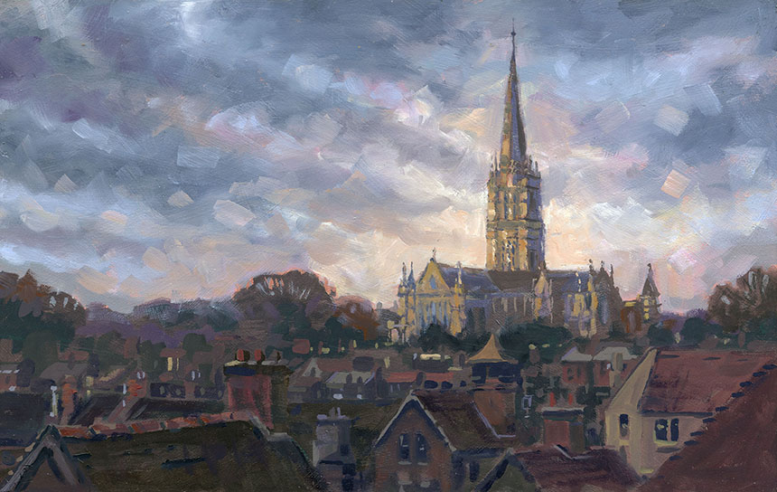
This is of course Salisbury cathedral. I did a pen and ink some while ago from a snap taken from a car window as we paused in traffic on the bypass. The resultant photo was very indistinct but with some imagination the drawing worked rather well and promptly sold. On a later visit I noticed that one of the multi-storey car parks must benefit from the same outlook. On driving up to the top level sure enough the view was fantastic. Not so the light however. As I painted this the pen drawing kept coming to mind so I allowed myself to add some imaginary drama to the scene. I must return either at the beginning or end of the day and do it again. 16in by 10in oils.

I didn’t have to go far for this one, it is my house on the left! This is Child Okeford very early on a Sunday morning. It was so quiet that nobody passed by except a lone cyclist, anyone with any sense was still in bed. I had rained just previously so the light on the road was amazing. I blocked this in very simply in 3 areas: sky, road and the rest using only 3 greys. Once the board was covered I just picked out areas in as few extra tones as possible. Oils 14in by 10in.

This is Knowleton, we went to paint the church set in its earlier earthwork ring. I proceeded to paint it but the result was dire, so I went into the nearby lane and painted this. A bit of nothing but it improved my mood after the previous abject failure. 10in by 6in oils.
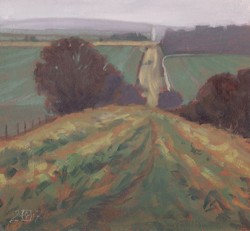
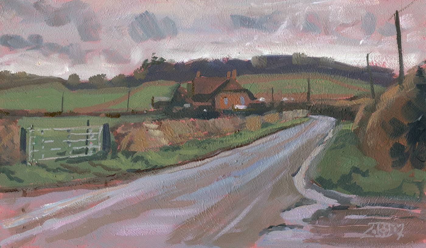
Onward from Knowlton we went and painted Ackling Dyke in the rain. Ackling dyke is a roman road that runs from Badbury rings to the south to Old Sarum near Salisbury. The rain was very fine and constantly blew over both painting and palette making a form of mayonnaise. The whole scene was wonderfully subtle in tone and colour and a joy to paint. For others in the same conditions; if you lay a bit of kitchen roll over your painting or palette it will pick up the water but not really lift any paint at all allowing you to carry on until the next mop up. 10in by 10in oils.
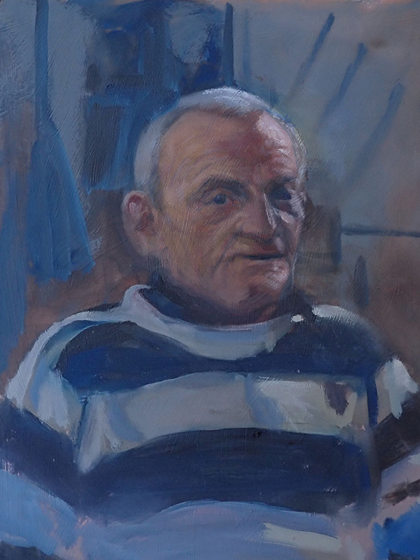
The first of what I hope will be a few portraits as a friend and I are attempting to do a regular set of portrait sittings if we can find the willing victims. This is the voluble Dave who told us his life story while we painted. We only got him to hold position a few times as it was quite fun watching his face change as his expressions changed. With only two hours to paint this is what I came away with.

After cropping and initial fiddling using photos I ended up with this which sort of worked likeness wise. 10in by 14in oils.
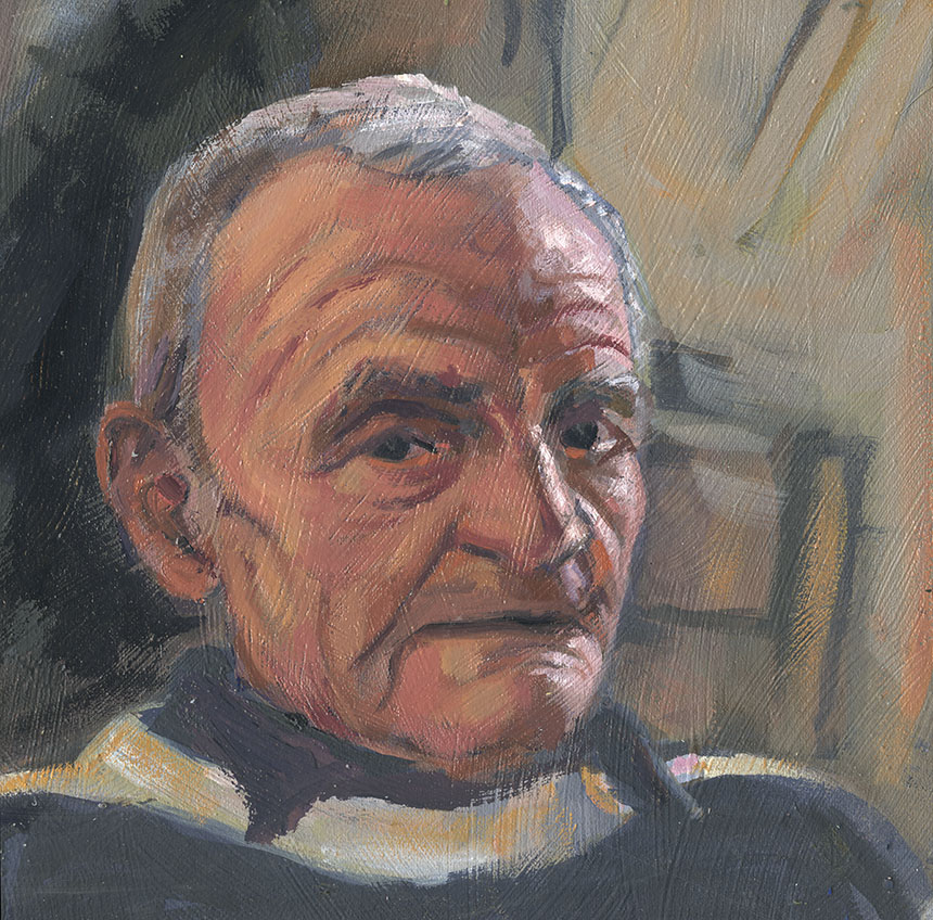
In the end I cropped even tighter and corrected a few more inaccuracies. I find I tend to paint and repaint a bit until it has the right balance between painterly qualities and accuracy. This means the painting gets too tight in the correcting phase and then need simplifying with fewer brush marks afterwards. 8in by 8in oils.

While Dave was posing I took a short video as he talked, so for a bit of fun I painted this from a section of the movie put on a repeating loop. I homed in on a bit where he stopped speaking and gave me a direct look. 12in by 10in oils.
That’s it watercolours next time.