Modern classical music does not generate large sales or indeed in the grander scheme of things many listeners. That said musicians often find it interesting and challenging to play. Why is this? The question was brought to mind by some very beautiful pen drawings I saw recently, (I won’t post them as I would not wish to offend the artist) the drawings in question were fantastically detailed and beautifully drawn. I admired the way various parts had been rendered with very fine strokes. I then leafed through a few more which were much the same all of which showed a staggering degree of concentration. However after the marvelling at the application and patience I quite quickly ran out of things to admire. Every part was complete and defined, there were no bits unresolved.
The next thought to strike me was to remember how when younger I used to enjoy doing much the same sort of thing. I used to do fine stipple work and hatched drawings for magazine illustrations, not as manically detailed as the drawings referred to above but still a lot of very fine work. I can well remember working on them. Stipple is built up in many layers of dots, thousands upon thousands of them in one drawing. Areas were conquered centimetre by centimetre, hour by hour. The activity is quite straightforward and almost meditative, I well remember being actually quite thrilled at the idea of taking on something really laborious.
The two thoughts are connected I think. We all admire something that has an obviously huge amount of labour. Both Musicians and Artists like the idea of taking on a technical challenge. I have noticed over the years that painters like pictures for quite different reasons to most casual viewers. Painters will admire brushwork, drawing or a particularly nifty composition. They will often ignore subject. I’m sure that trained musicians hear fascinating technical complexities in a Birtwhistle composition rather then the tuneless random sounds that I hear.
This brings me to the main thought of this post. Experts and collectors in any field will develop an ever more sophisticated appreciation of their subject. So wine experts will gurgle and spit and mutter unlikely metaphors for what they are experiencing. However I have read that blind tasting has shown that a substantial part of their refined appreciation is in their imagination rather in the taste of the plonk. It is I suspect the same with art experts, their reactions to any piece are a complex mix of previous experience, historical perspective, desire to be seen to be liking the right stuff etc. The actual visual experience is I think way down the pecking order as the source of the reactions provoked. In a way their experience has become jaded. This happens all the time in life, of the first 200 books you read in your life many will blow you away, but once you reading tally becomes nearer to 10,000 then you are harder to please.
So how to deal with this as a painter? Do I want to paint for my peers and connoisseurs? Well yes I would like to please them, but not I feel at the expense of excluding people with less refined (or maybe less jaded) sensibilities. Also you need to try and see your work without the refined appreciation of technique that having learnt to carry out the tricky business of painting has inevitably developed. The technical stuff, both conceptual and practical, should be there but never overwhelm.
Over the years of having people visit me I have noticed that there are “picture people” who look at every picture in the room and others to whom they are apparently invisible. There is no guessing who will be interested, some artists seem to not notice pictures at all yet my window cleaner, a man with little or no education, used to examine each one carefully. I asked him if he often went to galleries to look at pictures, but he said no he didn’t feel comfortable going in he didn’t feel they were of him. I wondered how many others feel the same. Junk shops are welcoming but picture galleries are somehow unwelcoming. I even feel it myself and the aloof staff of many galleries make you feel you should not linger unless you are going to buy.
A mixed rag bag of work this time, I have been very busy with all the seasonal diversions that my posting has got behind!
I have decided to learn how to do Lino cuts… I didn’t fancy all the acid and so forth for etching and really pen drawing fills that creative slot for me. It is the limitations of the medium that attracts.
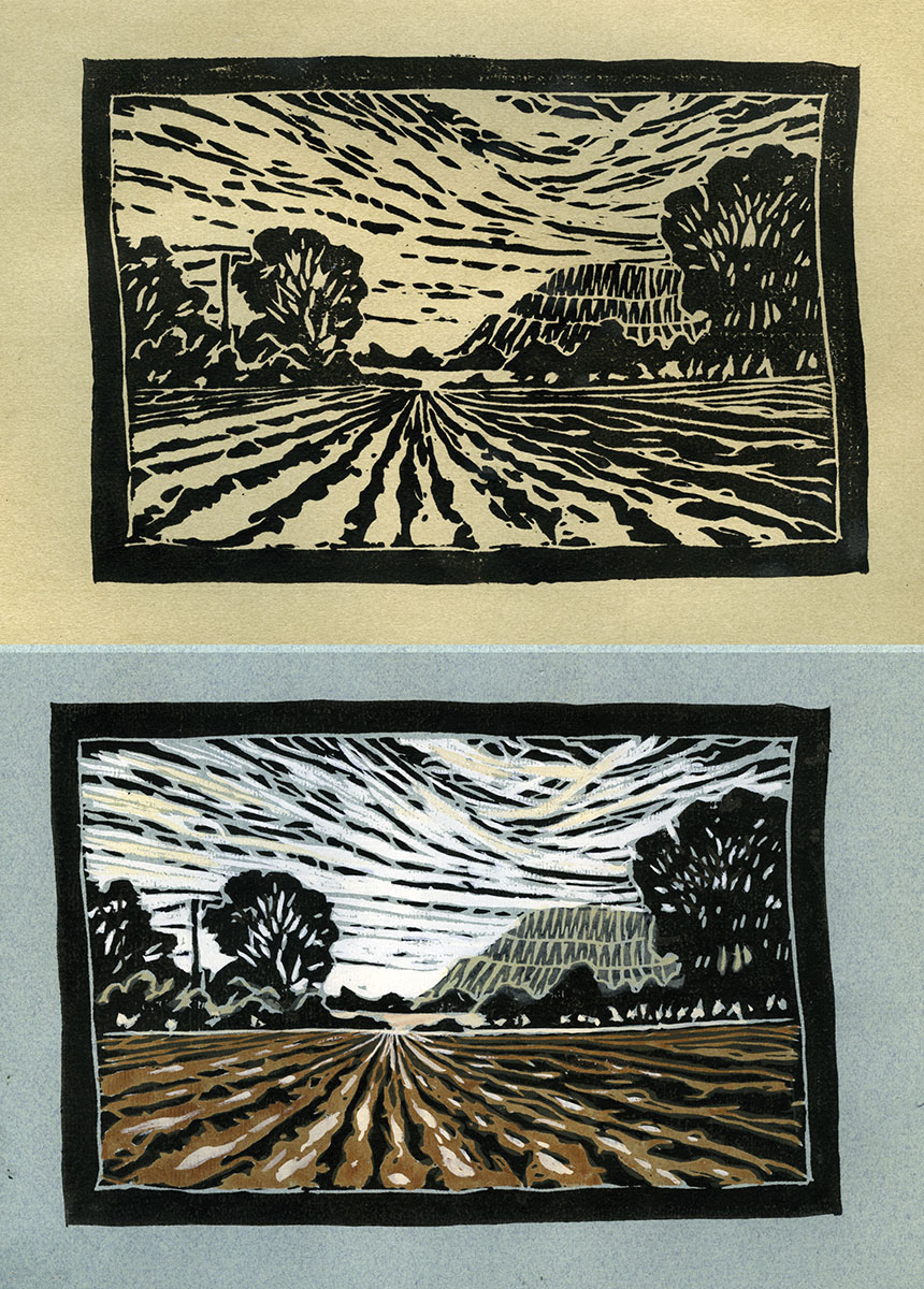
So here is my first attempt. The top one is as it comes out and the lower hand tinted. I was pleasantly surprised at how quick the process was. This is Hambledon Hill yet again.
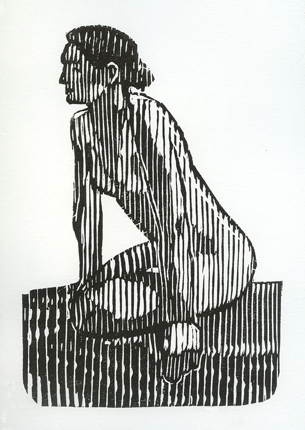
For my second attempt I went for something different. I have yet to develop a set of patterns to suggest various forms, here I am experimenting with a vertical flow. The previous one I did in old fashion lino. This one I did in Easycut. I have to say that the “easy” is a misnomer, it is actually I found more difficult. Being very rubbery lines close together tend to waver and each little curl of the offcuts has to be picked off. The softness also makes over cutting and getting width variations in one stroke distinctly harder. Ink wise the first one is in water based ink which has disadvantages also. It dries on the glass rolling out plate so you have to work fairly quickly. Also it is not really waterproof when dry which makes washing with colour afterwards a delicate business. The figure is done in oil based which I found much nicer. Easier to burnish to get solid blacks and properly waterproof. The advantage of water based they say is cleaning up, but I actually found the oil based easier to clean as well. The lesson seems to be that if anyone advertises a product as easy then take the claim with a pinch of salt!
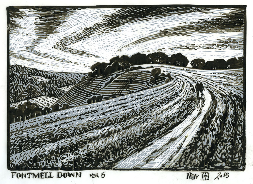
Here is my plan for the next print of Fontmell Down Dorset. I will be using 2 plates so planning is important! Not sure if this is quite there yet.

A bit of three point perspective of the wonderful Romsey Abbey in Hampshire. I got very into drawing this out! Acute views like this are all about compromises, I should probably do a studio version as some bits are a little awry.
This is the path to Hambledon hill fort. I am experimenting with colour mixed with the pen and ink. One great advantage of dull light is that you have plenty of time to work on site so I got most of this done bar the foreground. With pen and wash I try to do most of the washes first otherwise the pen work softens too much. Where I want the pen work softer I can of course add another layer of washes on top, which is what happened here. The misty distance has a glaze of white over to give atmosphere.
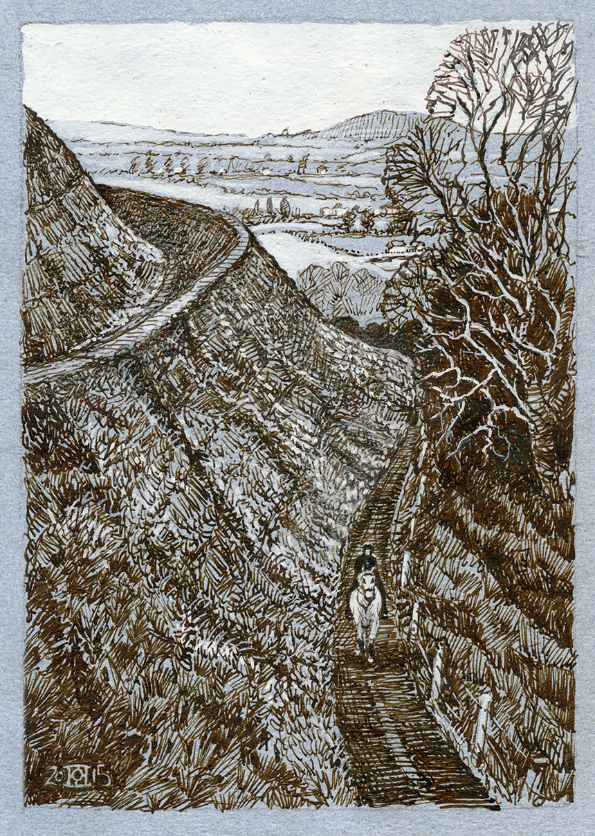
Bit of a strange one. A very grey day on Hambledon Hill. I had been stuck indoors due to the monsoon and was desperate to do something but the light was terribly dull and I couldn’t settle. In the end I did this but probably shouldn’t have bothered! The lady on a white horse looked great though and I could not resist trying to put her in.
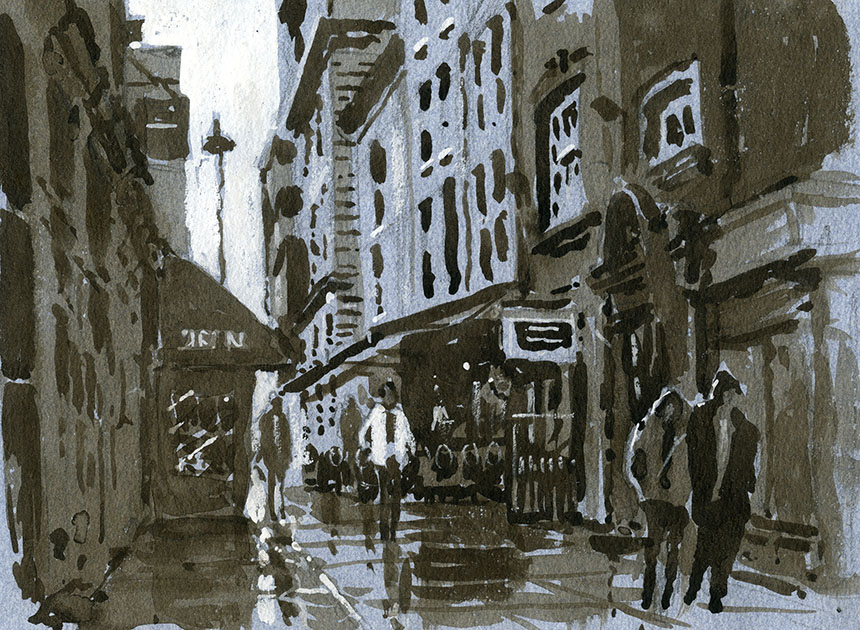
A visit to London, this is Shepherd Market. I love the rain in London and the way it brings the light down into the street. I intended to add pen but it didn’t need it in the end.

I had to have two goes at this as the first session got rained off. This is Curzon St. I love picking apart these city scenes. When you first look it all seems too much but once you are started the really important bits soon take over.

I nearly didn’t do this one of Piccadilly but having taken a snap on my phone I thought it looked interesting. It is easy to get put off by a busy scene like this, it can seem a bit overwhelming. Actually this was quite quick to do as it is just 3 washes with detail picked out on top. So after drawing the dark righthand side and the street went in in one wash. Next came the lighter lefthand buildings and finally the pavement tone. After that I drew in the darks and dark detail in with a brush. Then just the highlights and touches of colour to finish. People often ask me how I get the cars to look right, well there is no secret, just practice them draw them over and over until the basic shapes are in your memory. Once you have the ability to draw a generic car without one being present then customising them for an individual scene is much easier. Also lighting can be picked off any car as it goes by. If you wait another will be along in a second! That said the white car I partially cribbed from a snap on my phone as it was key to the whole picture. I was done in about 40min.
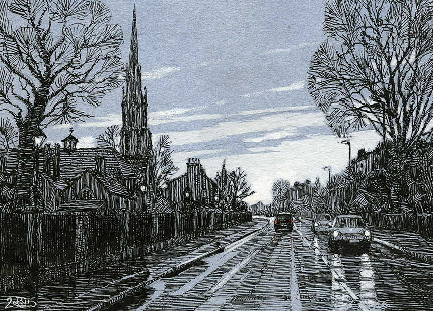
Wonderful light and rain as I was driving home to Dorset. This is Holy Trinity West Hill Wandsworth. No I didn’t sit in the road drawing! I took a snap when stuck in traffic not really thinking of doing anything from it, but when I looked at my photos it rather took my fancy. A lot of imagination here as the phone snap was very blurry through the windscreen!


