Rob Adams a Painter's Blog painter's progress

June 1, 2014

A visit to Florence

Filed under: Drawing,Italy,Painting,Uncategorized — Tags: , , , , , , , — Rob Adams @ 4:20 pm

A very quick visit to Florence is my first trip abroad for the year. Once travel was deducted then we only had 3 days, not long for one of the world’s most famous and beautiful cities. I had been anticipating the paintings I would do, the piazzas, the magnificent buildings and the iconic views of the Arno. I knew in my heart of hearts of course that 3 days was not long enough for very much to get done.

The first thing that occurs is that the reality entirely overwhelms the previous imagination. I had been to Florence before but only for a day. You soon realise that to pick a picture out from this wealth of material is not as easy as it should be. There is also the problem that once you have spotted a likely subject then being able to position yourself so as to be able to paint it is nigh on impossible. In Florence with its narrow streets and thronging tourists all the more so.

So eventually the paints hardly came out at all. Fortunately my current love affair with pen drawing came to my rescue. With the necessities so simple and portable the medium was ideal for snatching a few glimpses of what surrounded me. With the sort of architecture on display in Florence almost nothing is simple though. Classical buildings of whatever sort need careful drawing. If you get those proportions wrong then it will always look terrible.

Also a large amount of time is needed for just wandering and looking. How artists managed before photography is a wonder… or you think it is until you look at the paintings done before. Turner’s “on site” sketches are are a marvel of brevity. He does not even attempt to do a finished work. He just notes the basics and then essentially makes it up when he gets home. Rembrandt does quick calligraphic drawings in reed pen and ink, he does no complete rendering. Even Sargent surely the master of topographical sketching keeps his work simple and fluid. Sargent mind you was well within the age of photography and his painting of Paul Helleu and the existing photo of the scene make it likely he used the medium as reference more than we might think. For an artist not to be interested and influenced by the photographic image was already unlikely.

I have a rapidly approaching visit to France so I need to establish my strategy. Last year I spent a fair amount of time painting oils, none of which I liked, so this time I wonder whether to take oils at all. The risk is they are more of a distraction than a help. I certainly did not miss them on this trip, though I do hope to get a few oil studies done from the many photos I took.

There is another strangeness that life presents one with. I took 482 photographs on the visit, assuming a 10hr rubbernecking regime that is about 16 an hour or about 1 every 4 min. Yet after going through them my “possible” paintings folder contains 9 images. So if the past is anything to go by this will translate into 3 or so pictures, which means a rate of well over a hundred snaps per final painting..!

Drawing, Florence, Italy, St Croce, Dante

First day and we were on the impressive Piazza San Croce. Avoiding the main view of the church I sat in the main doorway and sketched the view to the right. The lions are guarding an immense statue of Dante. I liked the figures passing to and fro. Every now and again a scrum of people queueing would completely block my view and I would have to work on the few bits I could see!


San Croce, Piazza, Florence, Italy, drawing, watercolour

San Croce again, I must have been mad to take on this at 5in by 7in… I was forced to use gouache to sort out the facade. Once again my view was very restricted with tour guides mustering their troops just in front of us. They could plainly see we were painting the church but stood directly before us blocking the view anyhow.


Piazza Santo Spirito, Florence, Italy, drawing, pen

In the evening I walked out of the tourist zone and found the Piazza Santo Spirito. I would have liked to return to paint but time didn’t allow.


Florence, drawing, dome, pen, Italy

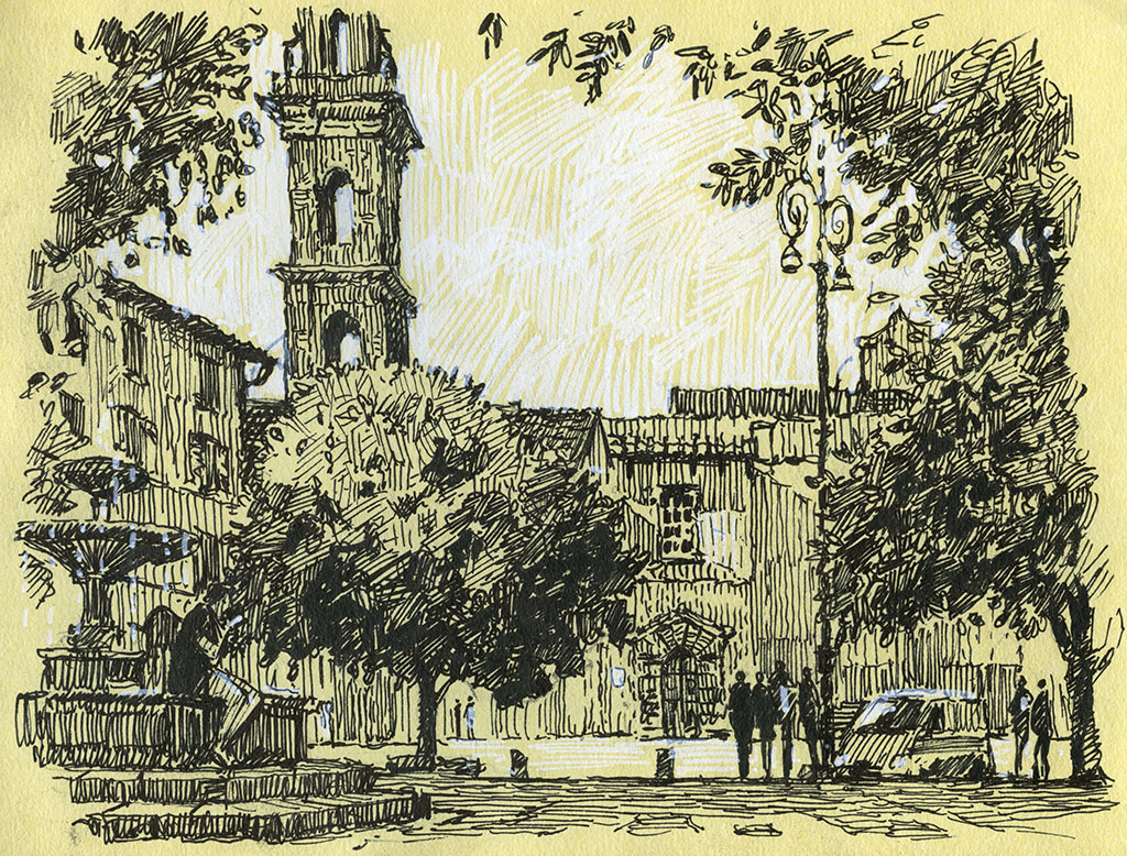
The next day we escaped the city and went up to San Miniato al Monte which stands high above the city. Nearby is the Piazza del Michelangelo where all the tourists go. Only 300 mtrs away but very few of the tourists could be arsed to walk to the Abbey and preferred to stay in the Piazza which is essentially a coach park with gazillions of huxters. Nice for us, but makes you sad for mankind. The abbey had graves either side of the steep steps leading up and I thought they made an interesting lead in to what is an iconic view.

Florence, italy, duomo, watercolour

Ok so I couldn’t resist the view. It came out fairly well at the second attempt. The first time around I got the trees too dark so had to abandon it. 8in by 10in watercolour.


Piazza di Santa Trinita, florence, italy, drawing, pen

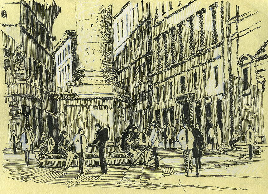
Back to my trusty pens in the evening! This is Piazza di Santa Trinita. There is a large column with the figure of Lady Justice atop it. I liked the changing perspectives of the triangular piazza and the people congregating at the column’s base.


Florence, italy, statue, bronze, drawing

On the final day I went walkabout to see as much of the city as I could. I only paused for a couple of times to sketch details. This is the head of a bronze saint on the Tabernacle of Santa Maria di Tromba. I did the wash first and the pen later, I needed a few touches of white to sort out that beard!


Italy, Florence, knocker, drawing

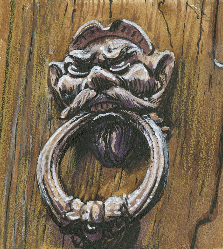
Later this took my eye, there were many grand lion headed knockers, but this one was especially silly. Pen and wash.


People sketches, florence

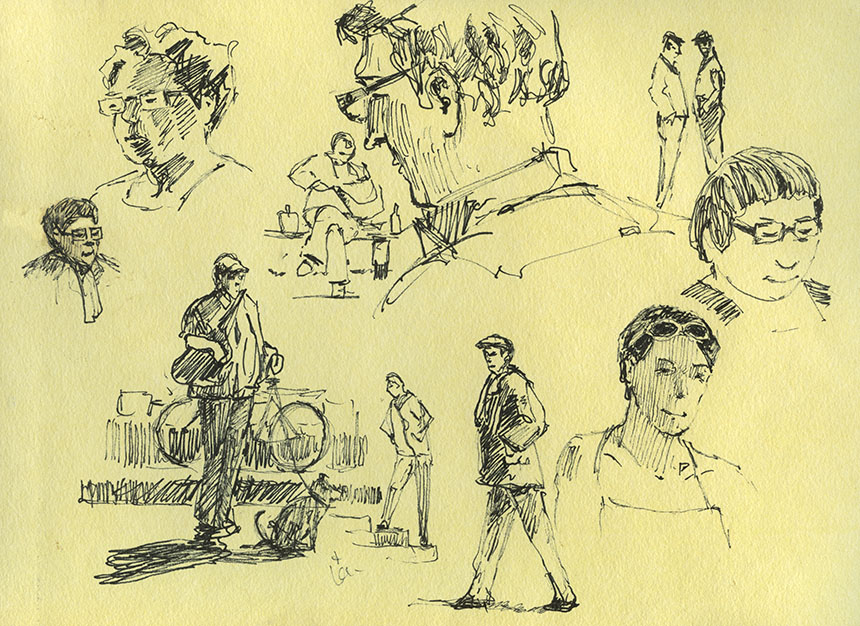
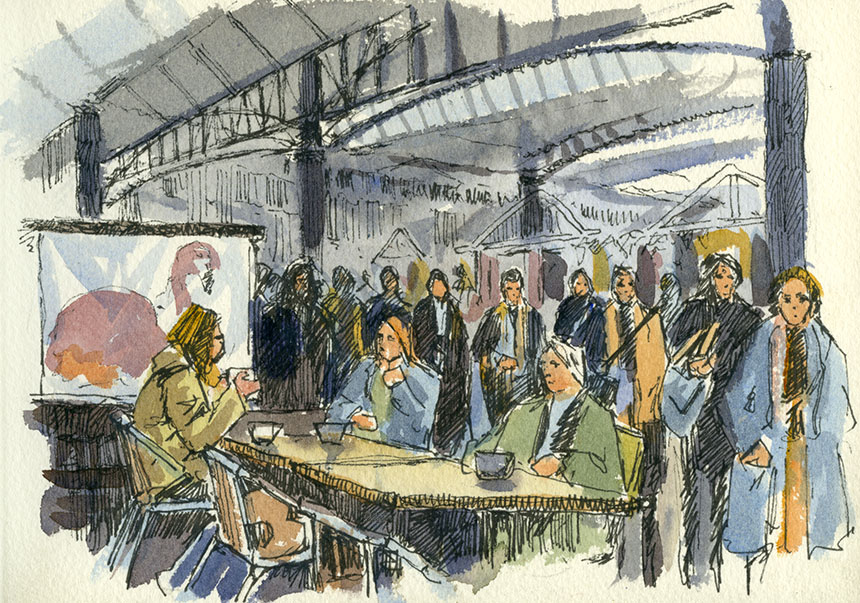
From my seat in a restaurant I sketched other diners and passers by.


Ponte Vecchio. florence, italy, drawing

Last morning and we sallied forth just after dawn to draw the famous Ponte Vecchio. Florence is a mad rush of delivery vans preparing for the next deluge of visitors first thing. You take your life in your hands if you try to cross any piazza as lorries drive at top speed from all directions.

May 24, 2014

Focus

This is a subject I am very much feeling my way with. Having been painting pictures for framing for a little while now and looking at a huge swathe of paintings by others I have come up against the issue of hardness or softness of edges. People talk a fair bit about the importance of edges and getting the mix of lost and found edges right, but no one talks a great deal about why this might be so.

If you stand before a scene in ordinary light then the edges of everything look pretty crisp. They even look crisp in fog! So why would we like blurry edges in paintings if we don’t have them in real life? Indeed can you think of anything other than a bank of fog that actually has a blurry edge? Some close too things have soft edges such as curved surfaces where one eye sees further round the curve than the other. This incidentally only happens on vertical or nearly so curved surfaces such as a cylinder sitting on its round end. If you rotate the cylinder to lie on its curved surface then the now horizontal edge will be sharp due to out eyes being side by side.

The other effect we see in photography is soft focus. Our eyes do it too. This is what is called depth of field. Depending on the light levels if we focus on a nearby object then the distant one will be soft and if we then focus on the distance the nearby object will in turn become blurred. The human eye does a different sort of soft focus in that objects in the centre of out attention will be sharp but those on the peripherally will be soft and ill defined. Try it your self, I am amazed at how amorphous even objects a little off the central axis become. It is a little hard to stop your eyes following your attention and moving!

How we actually take in the world is by scanning our surroundings in little darts and jumps called saccades. Our brains are not fast enough to process fast movement, if you try waving your fingers in front of your face you will find that they become blurred quite soon. So the eye moves in sudden jumps and pauses as it picks out information from our surroundings.

Yet another aspect of visual definition is specificity, so a tree will not usually be as visually defined as a person. If you did a picture with blurry people and sharp trees then people would find it a little odd. The same painting with blurry trees and defined people would however be quite unremarkable.

So as you see we have a quite a few reasons to be blurry in our paintings! This in turn makes softening and hardening of edges quite a powerful tool in the painter’s tool box. When I look at other painters and indeed myself I suspect people learn to use softening of edges in an empirical, this works, that doesn’t manner. Having thought it through a bit I think it might be exploited in quite a few interesting ways.

An extra layer of complexity is caused I think due to the fact that the same visual system is being used by the viewer of a painting as the painter. If the trees in a painting are soft then a viewer will appreciate mood and colour but not so much form or botanical detail (painters of course will admire the soft edges but they are just weird!) . The non painting eye will move on to whatever in the picture is more defined but the softer areas will still be supplying mood. It is immediately apparent to me that having things inappropriately over-defined in an area of a picture can be a distraction and weaken the overall impact.

I am of course talking about a certain type of picture, the impression of time, place and weather. People tend to confuse the different ways we can read a picture, so a detailed picture is inviting a different sort of looking and appreciation than an impression. They are not I feel better or worse per se. Indeed you could maybe mix the two if you were very clever.

Where I need to improve the control of focus is in my oil paintings. With watercolour I tend to use wet edges and so forth automatically, but with oils I have to think it through. Also with watercolours you are often working from the very amorphous to the definite as a matter of course. There it is that is the nature of painting there is always more to learn and deficiencies to make good! Enough complaining, a few drawings and paintings.

Tower Hill, London, watercolour

I am in a quandary with paper at present. Arches, my favourite paper has become very poor in quality of late. I have a couple of rolls which will keep me going a few years in the studio, but for painting en plein air I used the glued blocks. These alas have become very poorly sized as have the single sheets, making the washes dry dull and lifeless. The surface of the paper is not as tough as it should be either so lifting out becomes a risky process.

As an experiment I have bought some paper from the Ruscombe Mill in France. They make recreations of historical papers. So I bought a few sheets of David Cox and some Thomas Girtin types. The paper is much lighter in weight than we use now and must be stretched. Also it has more inclusions and is less white. I must admit I was slightly horrified at the uneven surface when I first unpacked it. None the less I stretched up some and took it out.

The one above is done on the David Cox. The paper contracts fiercely when stretched so I had to use my Artmate. As always when using a new paper you have to just dive in and I found it hard going at first. It doesn’t react well to wet into wet so washes must be laid cleanly and in one go. The scene above was done in around 45min and could have done with more careful drawing out. Altogether though it has quite a pleasant quality and now I know what it does well I can try and exploit its qualities. The paper is very very tough so lifting out is easy. Its weakness is that washes even when quite concentrated dry a little pale.

I did this sitting just by the Tower of London looking towards the city. 10in by 14in.


St Katherines Dock, London, watercolour

Second one of the day. It was a Wapping Group day so I sat near the Dickens Inn at St Katherines Dock. This is the Thomas Girtin paper. It is less white a sort of soft buff colour. Unlike the David Cox it took to wet into wet well as you can see by the softer feel. Also stronger tones were easier to achieve. All in all very pleasant to paint on, I shall be intrigued to try a larger painting as this one is only 5in by 10in. Strong whites will need to be painted in with body colour, which is of course just how Girtin often worked.


Spitalfields Market, London, drawing

The Brass Monkeys were at Spitalfields. We met at one of the cafes in the Market. While I drank my coffee and chatted I drew the passers by. I am going to try and add a little more character to the figures in my drawings to make them a little less architecty . Generic figures are OK but ones that tell a bit of a story are better I am beginning to think. 5in by 7in.


Spitalfields, London, Hawksmoor, drawing, pen

This is the view down Brush St to Nicholas Hawksmoor’s Christchurch. I had to hatch the sky later as no time to do on site. 7in by 9in. Here generic figures are fine as the church is the star.


Brush St, Spitalfields, London pen drawing, shop

A smaller pen sketch also in Brush St. Here I could have done with some more definitive types of people. 5in by 7in.


South Bank, Thames, London, pen and ink, Drawing

Sorry, yet more drawing… it is just a way of avoiding the oil paints maybe! Here I struggled to find something to make a picture of and abandoned two at the pencil stage. Then this confident young man walked past plainly on a mission unlike the dawdling tourists. I drew him in first and then built the rest of the picture around him. This is also on Ruscombe paper, quite resistant to draw on but gives a nice quality in the final result. This is the South Bank and another day out with the Wappers. 6in by 8in.


South Bank, Thames, London, Ice cream van, pen drawing

I am off to Florence for a painting trip so my next move was to go shopping to stock up on pens. I found this odd white pen which allowed hatching on the cream paper. Interesting effect, I shall be using it more. 6in by 8in.


Nude, Life drawing

A few life drawings to finish off. I was trying to keep things simple so just black and white.


nude, life drawing

I added red here and regretted it slightly.
Life drawing, nude

Last one, learnt my lesson and went back to black and white! Next post should be the glories of Florence…

« Newer PostsOlder Posts »

Powered by WordPress

error: Content is protected !!