Detail. Many artists make it their life’s work to eliminate it. Simplify, combine and other words to reduce and edit litter “how to paint” books. To be detailed is for many painters a crime against art. I have more than a little sympathy with that view. I try to refine and simplify in my own work. The general public however disagrees. They love detail, the more of it the better. This creates a dilemma, to impress your peers you need to show a sophisticated reduction of content, for the general viewer they want to revel in the small touches.
Artists dismiss the overly photographic. I generally agree here too. What I ask is the point of copying a photograph into a handmade version in paint? The public however disagrees here too, with artists cringing at that innocently given accolade, “Oh it’s just like a photo!” Even people given to trawling the web looking at paintings disagree. Looking at Facebook pages that collect art the more photographic in quality the more “likes”. From my perspective as a painter the public has bad taste and does not know good painting when it sees it.
Oh how arrogant that sounds! It is a thread that runs through all the arts to some degree. In music composers don’t want to compose nice Mozarty tunes they want their compositions to be difficult and demanding of the listener. Literary critics want serious incisive writing, the public want page turners. In TV the public has won, with anything intelligent ghettoised to Beeb 4 and watched by about 3 people. I could do a rant here on reality TV, soaps and food porn but that would be too easy. Instead I have to ask, “Am I wrong?”
Becoming an expert at something or indeed an aficionado changes how you see the subject you are involved in. Painters see a different picture from the casual viewer. Where I see elegant simplification the uneducated might just see crude and childlike! At a certain point in elevated sophistication the viewer takes on more and more of the responsibility until we reach Malevitch’s black square or Cage’s silence where everything comes from the audience and nothing from the artist. Art critics and art fans, work hard to see what they see. They imagine of course that these aesthetic feelings come from the art and not from themselves though logic would say otherwise.
So what is a painter to do. If I paint something the man or woman in the street might like, then the art establishment will dismiss me. If I paint to please the establishment and other painters, the general public will mostly turn aside. It is popular to think that the public’s taste “lags behind” and will in due course catch up. Well it’s been a hundred years and there is no sign of it catching up so far! The uncomfortable truth is that such a view is arrogant and almost certainly untrue.
The public’s taste is as it is because they are not painters, they are lookers. They judge a painting upon what they see around them and by photographs of reality. All your colour harmonies and compositional tricks for the most part are unnoticed. For a portrait they will just say, “It don’t look like her much!” they wont admire your deft scumbling of the background or the subtle passage of brushwork that defines the cheek.
The choice for the painter is a little bleak. Paint to please yourself and hopefully a small group of connoisseurs or “sell out” and do crowd pleasing potboilers. You can of course widen your market by painting those pictures that the amateur would like to paint but can’t quite pull off, but even this might attract scorn from your fellow artists.
This disconnect is quite recent. The high Victorian 19th Century paintings with their syrupy sentiment and moral certainty appealed both the the public and the connoisseurs and critics of the time as well. We cringe now at the paintings of puppies looking up adoringly at sweet children but I suspect that they would still be very much to current unsophisticated taste. In music they try to “educate” the public by doing a Mozart symphony and then tacking a bit of Shostakovich for them to sit through as well. A policy I have always found irritating and rather patronising.
The ideal of course would be to please everybody, but that is not going to happen. I have my own cringeometer which determines a step to far. I can only show this by example…
.

Here is an unlikely scene. A painting by Solomon J Solomon a painter of over heated romantic scenes and
one of the inventors of camouflage netting. Daft though this painting is there is a lot I like. The Saint’s head
is very well modelled and executed. It makes me chuckle however that St George finishes off the dragon with
one hand whilst hoisting the maiden with the other! Who said men can’t multitask?
.

More maiden rescuing, a growth industry in the middle ages it would seem. This is Frank Dicksee, I find it hard to like anything here.
Why? It is hard to say, the maidens expression is vapid the colouring is generally a bit over rich. The lighting is inconsistent with the lady
being lit by a different day. The drawing isn’t too bad, but at the end of the day I look and don’t like. Frank got knighted but Solomon didn’t!
.

Here is Arthur Rackham. I like almost everything here. Beautiful muted tones. Exquisite drawing, sweet but
the girl’s gaze holds ours which changes the mood.
.
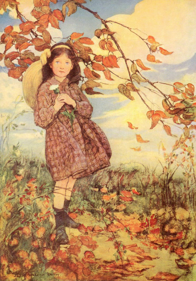
Another girl in the woods… this time by Jesse Wilcox Smith. It is perfectly well drawn and painted. The palette is restricted.
The girl’s gaze meets ours… but I hate it!
.
We reserve especial scorn for those who churn out the same old painting just because it sells. We call the artists hacks and their works potboilers, though I dare say their children were better fed than the more sternly aesthetic. I’ve done potboilers too, romance covers etc, I have also done plenty of paintings that would fail my own cringe test. Still I have this unfashionable urge to paint pictures that people might like. This has lead me to tread the boundary between detailed and simplified, in truth both have their uses, I don’t want to disappoint a viewer that likes a close look nor do I want to lose the person who appreciates in a more general fashion. I am myself a person who appreciates and enjoys both qualities in a picture.
The problem I face is getting the two aspects to compliment each other. I am nearer to this in watercolour. I get people saying they love the detail, but in truth it is mostly absent and just suggested. Watercolour rather lends itself to this with the textures and abstract qualities of the washes standing in for observed detail. In oils I have to work a little harder, I end up blurring bits of detail to stop them catching the eye, but it would be better to paint them with the right degree of focus from the outset. Only a few pictures this post…
.

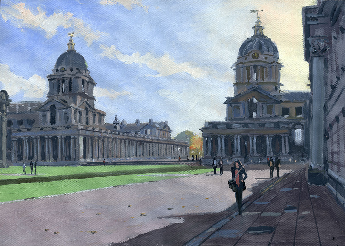
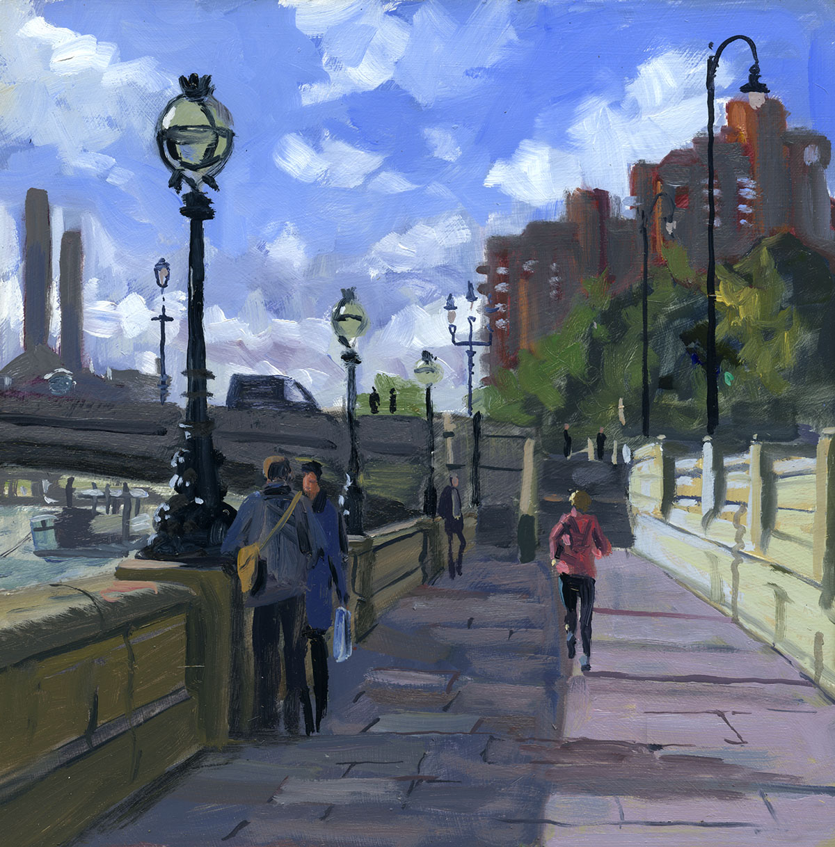
A commission, I don’t do many of these but this was quite fun. A hard subject to make a picture of as the views were very restricted. I went down a few
to try and get the light right. It is in Greenwich. 10in by 14in Oils.
.

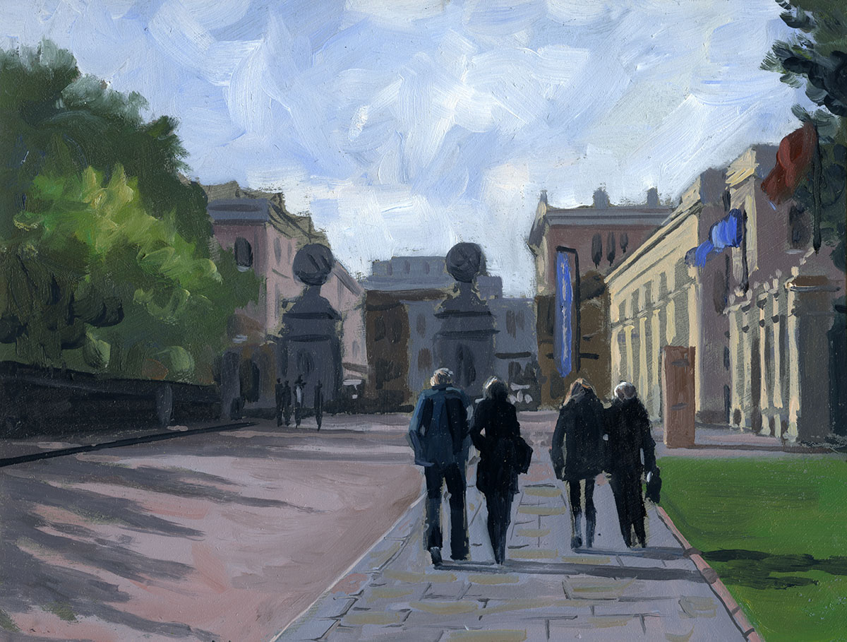
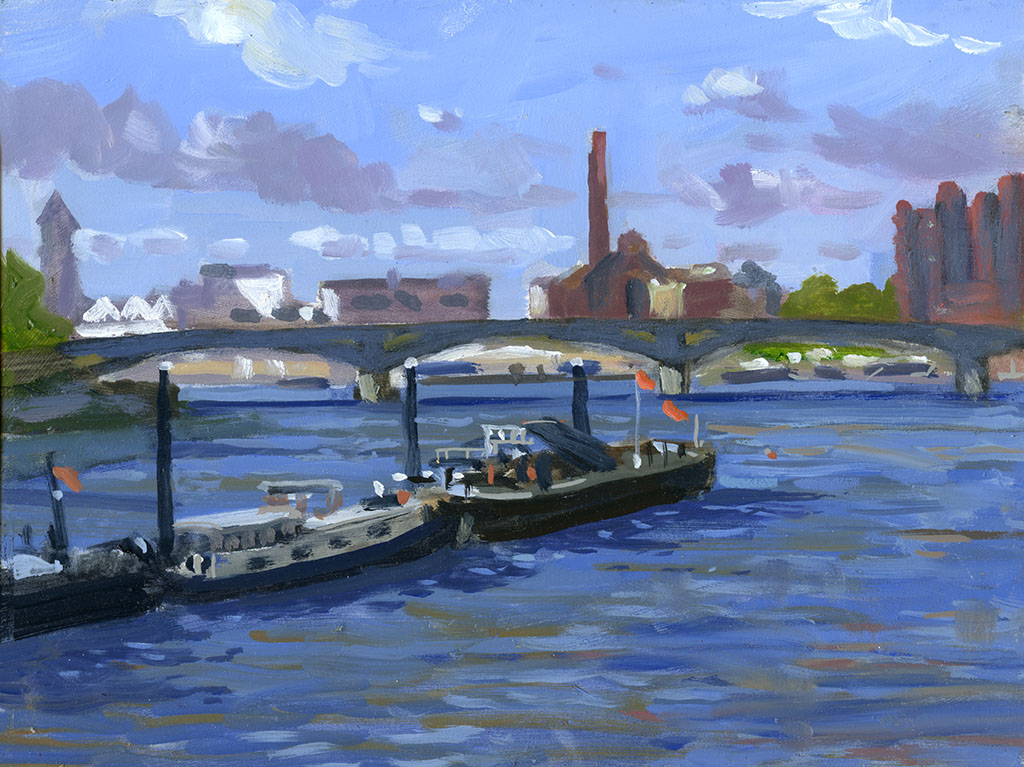
The Brass Monkeys had a wonderful day in Richmond. This is the view of the Thames that greeted me. Almost too perfect and changing so rapidly that
the result is a little rushed. I have a few references that combined with this sketch will make a great watercolour I hope. 10in by 16in. Oils.
.

I moved on to this. As soon as I started they folded up the blue tarpaulin so I had to mostly make it up! I am trying to take a few different proportioned
boards out with me, it is easy to get stuck with standard shapes. 10in by 10in oils.
.

After a very good lunch in the White Cross I thought I had better immortalise it. The light was fantastic and the colours in the trees lovely. I only got this
drawn and glazed in, but with the tones and colours more or less there, finishing took only half an hour at home. 10in by 14in. Oils.
.
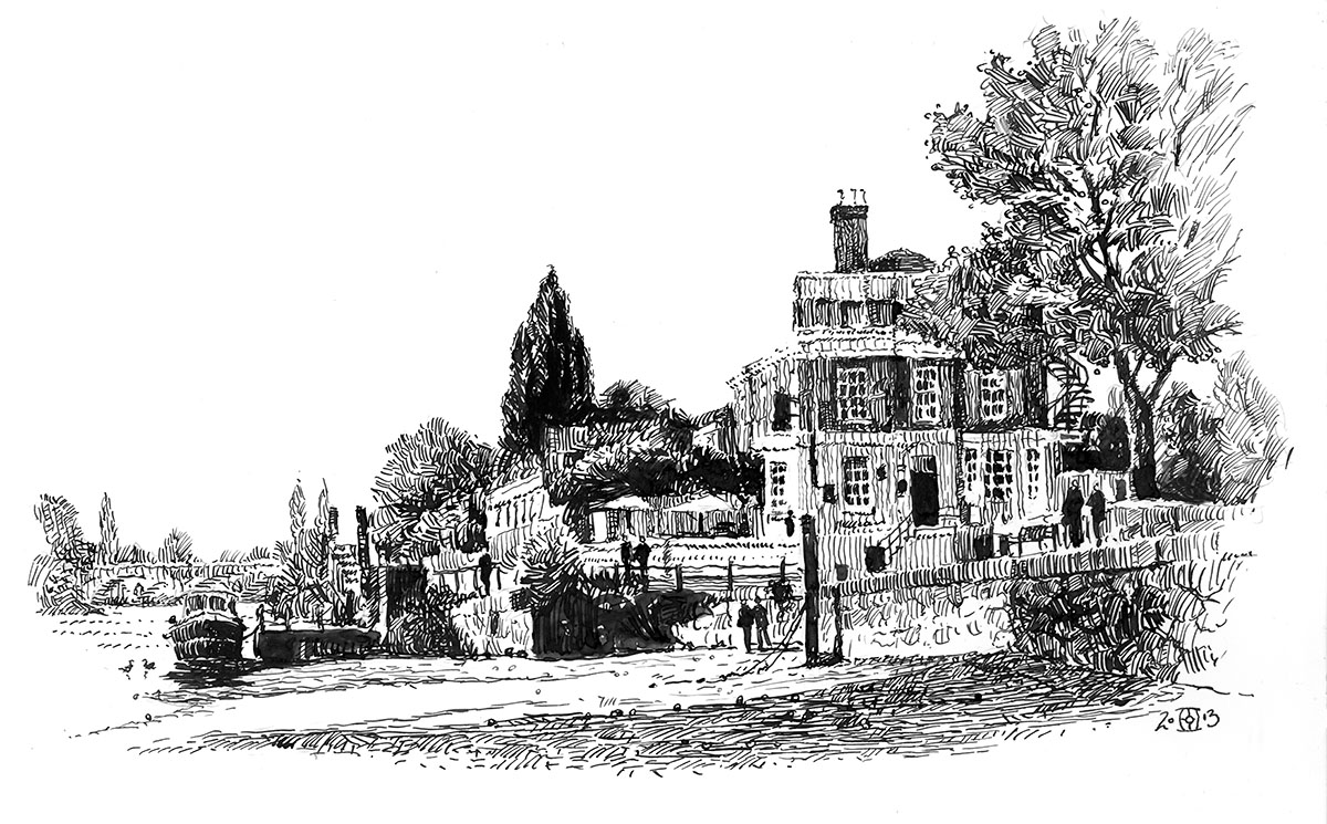
I thought the previous painting would make a good pen drawing to I dusted off my Gillott dip pen and set to. I don’t know why I don’t do more pen drawing
it is a great medium. I shall try and do more. A4 on Bristol board.