One of my greatest concerns is getting stuck in a rut. I can think of nothing worse than churning out the same old but slightly different painting again and again. Commercially this is a very foolish attitude. Looking at successful artists many hit on a winning formula and then stick to it… I just saw a load of fresh stuff by Andy Goldsworthy, ‘eco porn’ the rather cynical half of me mutters. Don’t get me wrong they are attractive and pretty… innocuous even, but the man hasn’t moved on in decades, I would go stark staring mad rearranging autumn leaves into pretty patterns every year for a decade! Indeed that is what we were encouraged to do at college in the 1970’s, find your “realm of concern” and then stick with it. The only way to become a serious artist was to find something really dreary like welding rusty girders together and then do nothing else for forty years. The theory was that if an artist had been doing the same thing for decades they must be doing “important” work. Indeed if you hit 5o years of doing something mindlessly tedious, Bridget Riley springs to mind, then they will give you a bonanza retrospective in the Tate Modern!
I do have some sympathy, I am disturbingly fond of slow tedious work myself it is engrossing in a ‘digging a ten foot hole with a teaspoon’ sort of way. Your troubles melt away as you incrementally conquer a couple of square feet of delicate pen hatching. However for me a large part of being a painter is getting better, being able to do something in a way I couldn’t do before. Inevitably as you get older the degrees of improvement get ever smaller, but that is just relativity at work. When you know almost nothing then big steps up are easy and almost inevitable if you work at it, after forty years or more though each step up the hill becomes ever harder to make.
You can however make improvement a bit more likely with a bit of planning. The simplest way is to try something new. Recently I have set about doing some printing which is something I have never done before. Although it is early days it has already taught me something by the requirement to massively simplify, that is I find proving useful in my oil painting. As I might only have four tones to play with in a lino cut I soon found those tones needed to be very carefully chosen and extremely accurate relative to each other. What, I couldn’t help but wonder, would be the result if I took that much care in setting out an oil painting? The answer is it makes the painting better balanced and more coherent. I then took it a step further and removed most of the colour from my initial block in, using only warm or cool greys. This had the immediate benefit of telling you if your tonal structure is working, with the colour gone it is considerably easier to get the contrasts working properly.
I think this way of working will mean economies as well. On my last outing I mixed a set of three base greys each in a warm or cool version, these can be mixed from left over paint. Also they can be mixed with basic earth colours which are inexpensive, there is not much difference between a student quality yellow ochre and a premium one as the basic ingredients are very cheap. With oils you can then “drift” colour in afterwards. The only hitch was in a few areas where I wanted a really clean hue I had to wipe off before applying fresh colour. I am setting off on a largish studio picture this week so I will see how the method works on a city scape. For landscapes it gives a unity that I have been struggling to find especially in the greens.
On another subject I have started a new painting group down here in Dorset called The Hardy Monkeys as I cannot easily get up to London to paint more than once a month. Only the two of us on the first one but I dare say it will grow. I’ll start with our first outing…

The very wonderful Corfe Castle was our first venue. We didn’t have to go far to get a great view. The light was poor but that is where pen and ink excels.

A very quick watercolour sketch in my Moleskin, I have been neglecting my sketchbooks of late, so it was good to slap this in without too much planning. 7in by 5in watercolour.
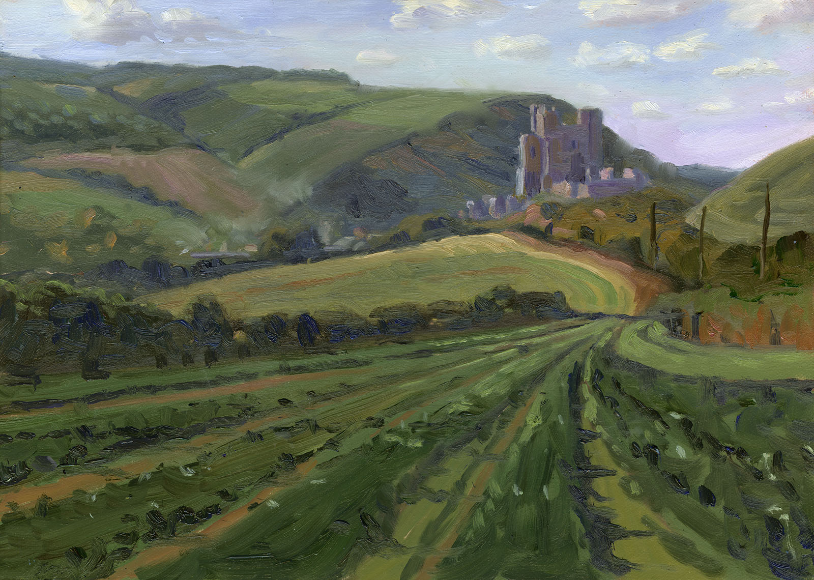
We drove this way and that to see what vies were available. The whole area has some great scenery aside from the dramatic gap and the castle so I will be going back to paint again. With this I blocked in with very muted colour and then added stronger tints by brushing in and mixing on the board. Slightly scary as when you first drop the colour in before brushing it around it looks miles to strong. One result of this method is that it is easier to allow your self room to punch up areas at the end to emphasise. It is all to easy to get into a position where you can’t go brighter, darker or stronger in hue, this approach makes that sort of cul-de-sac less likely. 14in by 10in oils.

This is the wonderful Rawlsbury Camp a bijou promontory fort from the Ironage. This was done from a photo and a watercolour. I used the structure from the photo and then referred to the mood and colour of the watercolour which is below. I didn’t quite stick to my greys approach but laid in with muted tones of greeny bluey grey. It was really interesting to do as more than a little imagination was required! In the end I put away both the photo ref and the watercolour and painted without reference. 16in b y 10in Oils.

Here is the watercolour mostly done on the spot. I didn’t stick exactly to the colour scheme as you can see. 7in by 5in Watercolour.

Earlier the same day I sketched at Maiden castle. Such a strange landscape, I am going to have to find a different approach if I am to do it justice. 7in by 5in Watercolour.

An outing to the wonderful Stourhead in Wiltshire. The autumn colours were in full swing. Another new thing I am attempting is to paint plein airs a little larger. I have made myself a new painting rig that allows much larger boards while still being light… a painting kit nerdy post will feature next time! Again I didn’t quite have the courage to lay in completely in greys, all that colour turned my head! I didn’t notice much difference painting on a larger 20in by 16in board, I just used bigger brushes! The image above is cut down to 20in by 14in as I though it made a better composition. Oils.

Mostly used the greys to lay in. This is Stourhead again as the day ended. I had to be very fast as the light was very much on the move. Using almost no colour at first made the lay in very quick and easy and left me plenty of tonal headroom for bright accents. The dark reflection is a little too heavy but I will dry brush it back in a day or so. 14in by 10in Oils.

At last I bit the bullet and laid in with just warm and cool greys! This is Shroton a village nearby. I had all my greys premixed in little pots. It was very hard to resist dipping into bits of colour but I resisted the temptation. This lay in only took 15 min, which was just as well as it was preparing to rain on me!

Here is the finished painting. I intended to take snaps as I worked but got so involved I forgot alas. It was amazingly easy to drop colour in with only a few bits of the sky needing to be wiped back. The watery sunshine came and went until the rain started which was a bonus. 16in by 10in Oils.
That’s it for this post… more autumn to come I hope as the November light is gorgeous.


