It happens to us all I’m afraid. Somehow it starts to feel that your painting is going nowhere and you can’t see the way forwards. I have been there so many times over my career that it is like an old acquaintance. I have not been helped this year so far by almost a full set of rejections from the open exhibitions. The New English, ROI, RBA, Threadneedle all passed over my work. I did get into the RSMA and the RWS so not a complete washout! I know all artists must feel the same, but when I go to the exhibitions it is hard to look at what has been deemed worthy and think, “Am I really worse than this?” I would love to see the choosing process, by my lights much of the content in these exhibitions is of quite a low to moderate technical standard. Only a very few would be considered good enough for commercial work.
One thing that does strike me is that what is chosen it for “poke my eye out” qualities. Most the chosen work leans towards the brash, only a few that are at all subtle gets through. This makes me suspect the paintings are “paraded” past the judges and most don’t get more than glanced at from a distance. I must be careful here lest I tread into “sour grapes” territory! I will in future selections choose more contrasty colourful pictures as I suspect that is what in being picked up on. This is a bit of a pity as my current interest is leaning towards more subtle close tones. I shall persist with the open exhibitions, learning what gets attention and what is likely to get passed over is very difficult, I’m told by long standing exhibitors that they can never see any rhyme or reason as to whether they get in or not, so I may just have to accept that it is a lottery. The lack of progress is disheartening though as until I have exhibited several times I am unlikely to be able to join any of these societies. If you are in the club you get your pictures in the open and other exhibitions with a degree of certainty. I can see I have started the process a little too late in life.
Back to the doldrums. I don’t seem to be able to complete studio pictures at present. I have six or seven looking at me with what I sometimes imagine to be resentment. None of them are at a stage where they could be written off as disastrous , but I don’t seem to have the will to get down to finishing them. The plein air work is mostly fine, but needs a certain extra something, to many of the paintings are pedestrian and fit only for the cupboard and eventual overpainting. I need to focus on painting fewer but choose the subjects more carefully. I tell myself again and again not to do a painting just because I am somewhere with the intention of painting, but only when the subject has really taken my imagination and I can see how it can be made into a good picture. It is very, very rare I find for a mediocre subject to make a good final painting, in fact I can’t recall ever having achieved it in all my years of painting! To get good pictures you must contrive to get yourself in front of good subject matter, but that alas is much easier said than done.
In order to get myself up and running again I intend to do another series of 10 or so London studio watercolours my eventual aim being to have enough of them for an eventual exhibition. To raise the stakes I also intend to complete another 10 oils in the same vein. Seeing as I’ve announced my intentions I hope to have painted myself into a corner and will have to set to!
This post is a sort of retrospective, I wish to sort of look back and take stock. This can be a depressing activity when you look back and find that there has been little or no improvement in 30 years! This is somewhat of an illusion though as a success can occur at any stage in a painting life. When I look back the number of successes compared to failures seems to fairly consistently improve and that is all I suspect anyone can hope for. My review will consist of a painting or two from each decade from the 70’s onwards. Starting in the 1970’s.

I was in my early years much more of a drawer than a painter, this must be 1970 as it is marked by my A level art teacher. She was called “Glam” as she was very tweedy in dress and not keen on fashion. She encouraged me to work in pen and ink. I remember her being furious with the examiners that I didn’t get a better grade at A level. I’m not sure I had studied other artists much at that stage. I do however remember cutting the pen and ink illustrations from the radio times, which as I recall were of a very high standard.

An early watercolour I guess from around 1979. Very little of my work was from life in this period. As is often the case looking back I like this much more now than I would have then.

A very rare item, an oil painting from the 1970’s. I had thought it later but the back says 1976. I would not have thought much of this at the time, but I quite like it now. It is an odd thing but you judge the past with the knowledge of the present. The 20 year old that painted this is a stranger to me now. Indeed I can’t really claim that it is one of my works, I vaguely recall I painted it in the company of my mother using her paints. Which makes sense as I didn’t own oil paints until I inherited my mother’s. The style is one that she would have approved of, she rather despaired of my love of science fiction illustrations and comics!

Into the 80’s. I don’t recall painting it, but it is Spain. Again with my mother’s oil paint. It is very thinly painted. I probably considered this just the beginning and would have made it much more finished. I have quite a few paintings from this period that are best forgotten as I didn’t know when to leave well alone! This is a period when I was studying perspective and trying to get my illustration work up to professional standards.

A watercolour from the very end of the 80’s. I remember the holiday, one of the last I took with my parents. I am sometimes amazed at the confidence I had then. Not entirely justified as the piles of failed efforts will attest. I seemed to set out on each painting with no fear at all. I am far less certain of success now, just something the years do to you I suppose. I start keeping watercolour sketch books from about this period.

As an aside this is where illustration was taking me. My whole focus was on improving enough to get comissions. I was going two nights a week to life drawing and learning how to use Gouache and an airbrush with dyes. This was one of my first jobs for a Puffin book. To my great disappointment they didn’t use it and commissioned another artist to do it again. During this period the only paintings other than illustrations were done during infrequent holidays.

In the 1990’s there was a brief foray into acrylics. I remember painting this with my mother’s easel weighed down with rocks due to the wind. I started with acrylics because drum scanning was coming into use and the artworks had to be flexible. Gouache if layered would crack when wrapped round the drum of the scanner. I can see the beginnings of my current style here.
This is an example from my sketch books of the period. The only watercolour painting I did was in these 7in by 5in sketchbooks. Nonetheless some of my favourite paintings are from this period. All the work on illustration was starting to make improvements in my off duty work.
Another from my small sketch books around 2003 I think. I had by now moved away from illustration and was doing scenic painting for film, advertising and television. I was quite rapidly making a name for myself in that area as I had the sculptural and construction skills that made me quite useful. It was far more fun and more pleasant than the illustration world where snobbish put downs and subtle humiliations were frequent… something that the picture painting/gallery world has unfortunately got elements of as well alas. In the Commercial world “what” you were more than “who” you were was the defining factor. I had rather forgotten that in the rest of the arts this is often not the case. Also in fairness it is a little odd coming from the commercial arena where I am somebody trusted with projects running into millions, into the picture painting world where I am a nobody makes a slightly uncomfortable contrast. Not that I can really expect any different.

I remember this day well. I went out with friends who painted scenery for the theatre. I painted this at a furious rate no more than 40 minutes. When I finished I was out of breath! It was in hindsight a turning point. I knew after painting this that sooner or later I would be leaving the very well paid and fun entertainments world and risking my arm as a “proper” painter. 2003 I would guess.

Later in 2008, I am beginning to paint more seriously now. Still in acrylics but I am considering oils and plotting how to give up most of my paying work but still retain enough to pay the bills. Just as well I was a little circumspect as the crash proceeded to erase a considerable chunk of my savings. This painting showed me I needed to start learning to paint in oils. With acrylics the edges are far harder to control. Bravura painting in acrylics has to be just that as the stuff becomes unworkable so quickly.

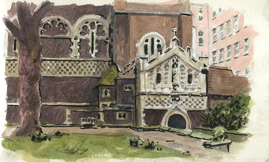
Here we are up to date. One of the rejects. Nonetheless a painting I am pleased with. The problem I now face is that for whatever reason my definition of a successful painting is not what either the traditionalists or the moderns would choose. Which doesn’t bode for an easy ride!

Last weeks effort. A lovely day in Chiswick looking towards Hammersmith Bridge. I always find this sort of very crisp sparkly day hard to paint. The tide was rapidly approaching and it was blowing a gale, to make matters harder still. This looks average when the board is just bare, but once it has a frame it looks fine. Some pictures need that supporting edge that a frame supplies. 16in by 10in

A very quick daub. Looking straight into the sun I was chased up the shore by the tide ending up 10ft away from where I started. Only a colour note really. 10in by 8in.